Communicating
Better Every Day
Bank Muscat. Brand Identity Guidelines 2019.Logo Rationale
Three Khanjars
Iconic Elements
Brand Marks
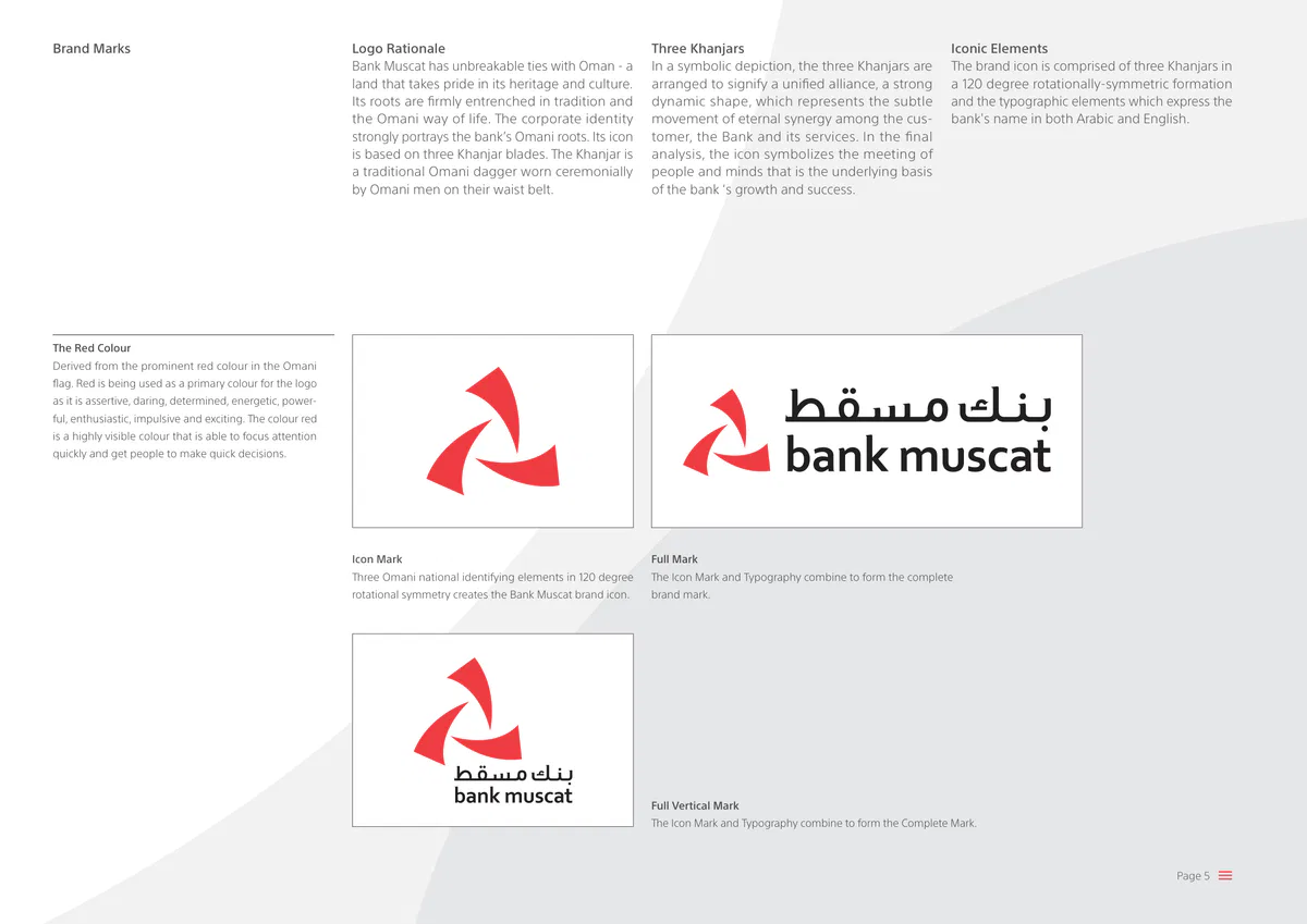
Bank Muscat has unbreakable ties with Oman - a
In a symbolic depiction, the three Khanjars are
The brand icon is comprised of three Khanjars in
land that takes pride in its heritage and culture.
arranged to signify a unified alliance, a strong
a 120 degree rotationally-symmetric formation
Its roots are firmly entrenched in tradition and
dynamic shape, which represents the subtle
and the typographic elements which express the
the Omani way of life. The corporate identity
movement of eternal synergy among the cus-
bank's name in both Arabic and English.
strongly portrays the bank’s Omani roots. Its icon
tomer, the Bank and its services. In the final
is based on three Khanjar blades. The Khanjar is
analysis, the icon symbolizes the meeting of
a traditional Omani dagger worn ceremonially
people and minds that is the underlying basis
by Omani men on their waist belt.
of the bank ‘s growth and success.
The Red Colour
Derived from the prominent red colour in the Omani
flag. Red is being used as a primary colour for the logo
as it is assertive, daring, determined, energetic, power-
ful, enthusiastic, impulsive and exciting. The colour red
is a highly visible colour that is able to focus attention
quickly and get people to make quick decisions.
Icon Mark
Full Mark
Three Omani national identifying elements in 120 degree
The Icon Mark and Typography combine to form the complete
rotational symmetry creates the Bank Muscat brand ic…Master Artworks
Use of Master Artworks
Brand Marks
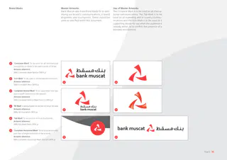
Bank Muscat uses three Brand Marks for to iden-
The Complete Mark is to be used on all interna-
tifying our brand's communications, it brand
tional communications. The Tab Mark is to be
properties and touchpoints. These should be
used on all marketing and in-country commu-
used as specified within this document.
nications and the Icon Mark is to be used as a
supporting device for use when the audience is
already within, or to confirm the presence of a
branded environment.
'Complete Mark' To be used on all international
01
touchpoints or media to be used outside of Oman.
Artwork reference:
BMU-Complete-Mark-TwoCol-CMYK.ai
'Icon Mark' To be used on all branded environments.
02
Artwork reference:
01
02
BMU-Icon-Mark-Red-CMYK.ai
'Complete Vertical Mark' To be used where ever you
03
have a width restriction in the artwork.
Artwork reference:
BMU-Complete-Vertical-Mark-TwoCol-CMYK.ai
'3D Mark' is being phased out and will no longer be used
04
Artwork reference:
04
03
BMU-3D-Icon-Mark-CMYK.ai
'Tab Mark' To be used on all local touchpoints.
05
Artwork reference:
BMU-Tab-Mark-Dark-CMYK.ai
'Complete Horizontal Mark' To be used where ever
06
you have a height restriction in the artwork.
Artwork reference:
05
06
BMU-Complete-Horizontal-Mark-TwoCol-CMYK.ai
Bank Muscat.
Brand Identity Guidelines 2019.
Page 6Restrictions on Master Art works
Brand Marks
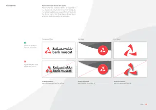
Please only use our Brand Marks as supplied in
our Master Identity Artworks archive. Kindly do
not add any additional visual effects or tricks to
the Brand Marks; the final Master Brand Mark
artworks are to be applied as provided.
Complete Mark
Tab Mark
Icon Mark
Please use the Brand
artworks as provided.
Do not apply any visual
effects what so ever.
Artwork reference:
Artwork reference:
Artwork reference:
BMU-Complete-Mark-TwoCol-CMYK.ai
BMU-Tab-Mark-Dark-CMYK.ai
BMU-Icon-Mark-Red-CMYK.ai
Bank Muscat.
Brand Identity Guidelines 2019.
Page 7Anatomy of the Complete Mark
Permissible Variations
Brand Marks
Our Complete Mark is comprised of a dual lan-
All permissible variations of this artwork will be
guage word mark and an iconic element. The
outlined in the following pages. Should you find
design of this artwork is set - you should only use
that a artwork has been adulterated in any way
permissible versions as provided in our Master
(stretched accidentally for example), please undo
Artwork Archive. Please do not re-invent any art-
any changes or import the master artwork file
work in any way, shape or form (using colour,
from the supplied archive again.
stretching, or distorting, for example.)
Complete Mark
Complete Mark Artwork
Dual language word mark
Icon
Artwork reference:
BMU-Complete-Mark-TwoCol-CMYK.ai
Bank Muscat.
Brand Identity Guidelines 2019.
Page 8Clear Space - Complete Mark
Brand Marks
The minimum acceptable artwork clear space
is illustrated here. For legibility, at least 0.5X of
the icon is to be left clear of other artworks or
typography. Judgement and discretion should
be applied by the designer to make the finished
art feel appropriate to the layout.
Mandatory Clear Space
0.5X
X
0.5X
X
0.5X
0.5X
Bank Muscat.
Brand Identity Guidelines 2019.
Page 9The Minimal Size for our Brand Mark
Brand Marks
The minimum acceptable size for our identity
mark is 24mm wide. Ideally, it should always be
rendered larger than this in our communications.
Complete Mark
98mm wide
40mm wide
24mm wide or 85pixel
Artwork References:
BMU-Complete-Mark-TwoCol-CMYK.ai
Bank Muscat.
Brand Identity Guidelines 2019.
Page 10Anatomy of the Complete Vertical Mark
Permissible Variations
Brand Marks
Our Complete Vertical Mark is comprised of a
All permissible variations of this artwork will be
dual language word mark and an iconic element.
outlined in the following pages. Should you find
The design of this artwork is set - you should
that a artwork has been adulterated in any way
only use permissible versions as provided in our
(stretched accidentally for example), please undo
Master Artwork Archive. Please do not re-invent
any changes or import the master artwork file
any artwork in any way, shape or form (using
from the supplied archive again.
colour, stretching, or distorting, for example.)
Complete Vertical Mark
Icon
Complete Mark Artwork
Dual language word mark
Artwork reference:
BMU-Complete-Vertical-Mark-TwoCol-CMYK.ai
Bank Muscat.
Brand Identity Guidelines 2019.
Page 11Clear Space - Complete Vertical Mark
Brand Marks
The minimum acceptable artwork clear space is
illustrated here. For legibility, at least 0.5X of the
height of the typography is to be left clear of
other artworks or typography. Judgement and
discretion should be applied by the designer to
make the finished art feel appropriate to the de-
sign of the artwork or layout.
Mandatory Clear Space
3X
X
X
X
Bank Muscat.
Brand Identity Guidelines 2019.
Page 12Anatomy of the Icon Mark
Permissible Variations
Brand Marks
Our Icon Mark is comprised of a three Khanjar-
All permissible variations of this artwork will be
derived elements in rotational symmetry. The
outlined in the following pages. Should you find
design of this artwork is set - you should only
that an artwork has been adulterated in any way
use permissible versions as provided. Please do
(stretched accidentally for example),please undo
not re-invent any artwork in any way, shape or
any changes or reimport the master artwork file
form (using colour, stretching, or distorting, for
from the supplied archive.
example.)
Icon Mark
Icon Mark Artwork
Icon
Artwork reference:
BMU-Icon-Mark-Red-CMYK.ai
Bank Muscat.
Brand Identity Guidelines 2019.
Page 13Clear Space - Icon Mark
Brand Marks
The minimum acceptable artwork clear space
is illustrated here. For legibility, at least 0.5X of
the icon is to be left clear of other artworks or
typography. Judgement and discretion should
be applied by the designer to make the finished
art feel appropriate to the layout.
Icon Mark
Mandatory Clear Space
0.5X
X
0.5X
X
0.5 X
0.5X
Bank Muscat.
Brand Identity Guidelines 2019.
Page 14Acceptable Variations - Complete Mark
Complete Mark - Foiling & Signage
Brand Marks
In typical applications, Bank Muscat uses our the
For prestige communications, or if constructing
Complete Mark in its two colour form, set against
signage, you may use a single metallic variation.
white. However, there may be occasions when a
Foiling may be in red, silver or black but must
single colour or a red colour field is required. In
not combine colours (i.e: red foil with black). The
such instances, you should use a reversed ver-
whole mark is to be foiled rather than a single
sion of the complete mark, as illustrated below.
element (i.e: red foil logo, printed word mark).
Preferred full colour artwork
Red, single colour artwork
Reversed artwork (on red colour field)
Monochrome artwork
Reversed artwork (on black colour field)
Logo in original colors (on black color field)
Artwork References:
BMU-Complete-Mark-TwoCol-CMYK.ai
BMU-Complete-Mark-Red-CMYK.ai
BMU-Complete-Mark-Reversed-White-CMYK.ai
BMU-Complete-Mark-Black-CMYK.ai
Bank Muscat.
Brand Identity Guidelines 2019.
Page 15Usage Restrictions - All Marks
Brand Marks
The artworks should only ever be used as per the
Master Artwork Archive. There are no exceptions
to this rule.. Do not bend, distort, wrap or abuse
the artworks in any way. The restrictions in the
following pages apply to all marks - Complete,
Tab or Icon only.
Busy photographic or illustrative surrounds
Patterned backgrounds
Reflections, glow and Lighting effects
Gradient surrounds
Wrapping
Drop shadows, bevels and other 3D effects
Sheering or warping
Skewing
Bank Muscat.
Brand Identity Guidelines 2019.
Page 16Usage Restrictions - Complete Mark
Brand Marks
The artwork should be used as supplied and not
adulterated at all. Do not rearrange or distort the
components. If you accidentally adjust an art-
work, delete it and re-import an original art work.
As with the rules on rearrangement, do not adjust
the text, resize or realign it in any way.
Resizing of type size ratios
Adjustment to vertical height of the Brand Mark
Adjustment to vertical height of the Brand Mark
Rearranged type elements either horizontally or vertically
Resizing or moving elements
Resizing or moving elements
Bank Muscat.
Brand Identity Guidelines 2019.
Page 17Usage Restrictions - Complete Mark
Brand Marks
Bank Muscat does not want you to add anything
to the Brand Mark or for you to create your own
version. Also, do not make patterns with it or use
the Brand Mark or any part of it as a bullet point.
Moreover, any acceptable usage of Bank Muscat's
Complete Mark will be set and outlined here in
this guideline document.
Adding things to the Brand Mark
Creating new version from Brand Mark components
Bullet list item here
Bullet list item here
Bullet list item here
Bullet list item here
Bullet list item here
Creating patterns from components
Creating bullets from the icon
Bank Muscat.
Brand Identity Guidelines 2019.
Page 18Previous Brand Marks
Restrictions on Use
Brand Marks
The bank has updated its identity a number of
Old marks such as the ones below are not to
times over the years and old brand marks exist
be used in any circumstance other than for the
especially when marketeers and channel partners
purpose of historical record keeping (history pres-
search for our identity online.
entations on the legacy of the brand).
Do not use old brand marks
Do not use old brand marks
Do not use old brand marks
Bank Muscat.
Brand Identity Guidelines 2019.
Page 19Anatomy of the Tab Mark
Permissible Variations
Brand Marks
Our Tab Mark is comprised of a Icon Roundel
All permissible variations of this artwork will be
and Tab. The design of this Tab Mark is set - you
outlined in the following pages. Should you find
should only use permissible versions as provided.
that an artwork has been adulterated in any way
Please do not re-invent any artwork in any way,
(stretched accidentally for example),please undo
shape or form (using colour, stretching, or dis-
any changes or reimport the master artwork file
torting, for example.)
from the supplied archive.
Tab Mark
Tab Mark Artwork
Icon Roundel
Tab
Artwork reference:
BMU-Tab-Mark-Dark-CMYK.ai
Bank Muscat.
Brand Identity Guidelines 2019.
Page 20Clear Space - Tab Mark
Brand Marks
The minimum acceptable artwork clear space is
illustrated here. For legibility, at least 0.5X of the
icon roundel is to be left clear of other artworks
or typography. Judgement and discretion should
be applied by the designer to make the finished
art feel appropriate to the layout.
4X
Tab Mark
Mandatory Clear Space
X
0.4X
0.4X
1.2X
0.4X
Bank Muscat.
Brand Identity Guidelines 2019.
Page 21The minimal size for our Tab Mark
Brand Marks
The minimum acceptable size for our Tab Mark is
24mm wide. Ideally, it should always be rendered
larger than this in our communications.
Tab Mark
86mm wide
40mm wide
24mm wide or 85pixel
Artwork References:
BMU-Tab-Mark-Dark-CMYK.ai
Bank Muscat.
Brand Identity Guidelines 2019.
Page 22Acceptable Variations - Tab Mark
Tab Mark - Foiling & Signage
Brand Marks
Standard usage will be the two colour Tab Mark
For prestige communications, or if constructing
against white. When used over a dark colour field
signage, you are to use the foiling artwork. Foiling
artwork or image you should use the Light Tab.
may be in single colours such as red, silver or
If your artwork is predominantly red or you are
black, clear or white as appropriate to the sub-
using a red colour field you are to use to Red
strate or layout.
Tab version.
Preferred full colour Dark Tab artwork
Light Tab dark backgrounds
Reverse Tab for red background usage
Light Tab gray backgrounds
Tinted Tab single colour applications
Monochrome Tab for black & white applications
Artwork References:
BMU-Tab-Mark-Dark-CMYK.ai
BMU-Tab-Mark-Light-CMYK.ai
BMU-Tab-Mark-Red-CMYK.ai
BMU-Tab-Mark-Foil-CMYK.ai
BMU-Tab-Mark-Red-Tint-CMYK.ai
BMU-Tab-Mark-Black-Tint-CMYK.ai
Keyline Tab for use in foiling only
Bank Muscat.
Brand Identity Guidelines 2019.
Page 23Usage Restrictions - Tab Mark
Brand Marks
The artworks should only ever be used as per the
Master Artwork Archive. There are no exceptions
to this rule.. Do not bend, distort, wrap or abuse
the artworks in any way. The restrictions in the
following pages apply to all marks - Complete,
Tab or Icon only.
Busy photographic or illustrative surrounds
Patterned backgrounds
Reflections, glow and blue effects
Gradient surrounds
Drop shadows
Skewing
Scaling or reproportioning
Resizing elements independently
Realigning elements to artwork areas
Flipping
Adding elements to the form such as key lines
Additional versions on same artwork
Bank Muscat.
Brand Identity Guidelines 2019.
Page 24Usage Restrictions - Tab Mark
Acceptable Variations
Brand Marks
Please do add anything to the Tab Mark or create
All acceptable applications of the Brand Mark will
your own version or variants. Also do not make
be set and outlined here in this guideline docu-
patterns with it or use the Brand Mark or any part
ment. Should you need specific guidance not
of it as a bullet point.
covered specifically, you can request this from
the Bank Muscat Marketing Team.
Creating patterns from components
Creating bullets from the icon
Adding things to the Brand Mark
Creating new version from Brand Mark components
Bank Muscat.
Brand Identity Guidelines 2019.
Page 25Reference Examples
Selecting the Right Tab
Brand Marks
On this page we can see two concept artworks
The Light Tab has been used on the left hand
that are applying the Tab Mark correctly. The Tab
concept as it uses a darker image while the Re-
Mark is highly affective at owning Bank Muscat's
versed Dark Tab has been used on the left hand
communication while allowing the artwork to fully
image as this artwork is predominantly red and
utilise the space to connect with our audience.
would not display correctly. Both uses are correct.
The communication is clear and direct.
Light Tab correctly applied to an press half page concept artwork for Baituna
Dark Tab Reversed correctly applied to an Al Mazyona concept artwork
Bank Muscat.
Brand Identity Guidelines 2019.
Page 26���� ����� ����� ������
����� ������
����� ��� ������� .������� ������ ��� ���� ����� �� ����� ����� ������ ����
��� �� ������ ������� ��� ���� ��� �� ���� ������ ���� .����� ������� ���������
.������� ������� ����� ���� (.) ������ ������� ����
���� ���
.���� ���
����� ��� ������ ���� ����� ����� ������
��� �� ����
.��� �� ����
(.) ������ ������� ���� ���� ������ ��� ����� ��� ����� ����� ������
����� ��� ����� ������� ���� ��� (.) ������ ������� ���� ��� ���� �
���� ��� ��� ���� ���� ����� ����� ������
.��� �� ���� .���� ���
��� �� ���� ���� ���
(.) ������ ������� ���� ��� �� ���� ��� ��� ����� ������� ����
(.) ������ ������� ���� ��� ��� ���� ��� ��� ����� ������� ���� ��� ���� �
Bank Muscat.
Brand Identity Guidelines 2019.
Page 37����� ������
��� �� ���� - �������
��� �� �� ���� "����" - ������� �����
��� �� ����� ��� �������� ������ ���� �� ����� ����� ����� ���� ��� ���� ���
�����" ������� ���� ��� .��� �� ���� ���� ������� ���� ����� ������ ���� �������� ���
."���� ������� ������� ���� ���� ���� ���� ���" ���� ��� .���- �� - ���� - �����
"�����" ��� ��� ��� .��� �� ���� ���� ��� ������� ������� ������ "��� �� ����
.���� ���� ����� ������� ������ ����� ������� ������ ����� ���� �
."��� �� ����" �� ��������
��� �� ����
���� ��� ��
�������� ������ ����� ������
������ �������� ����� ������ �����
����� ������ ����� ������ ����� ���� �
���� �����
����� ����
������ ��� �� �������
��� ��
��� ��
(����) ���� ��� (��) ����� �������� ������ ��� ��� ��� �� ������ ����� �������
������� ��� ������ �� (��) ����� ������ ��� ��� ��� �� ���� �����
Bank Muscat.
Brand Identity Guidelines 2019.
Page 38Slogan & Name Lock-up
The Slogan
The Bank Muscat name and slogan may be locked together in your com-
munications. When you do so, it should follow the principles we set out
on this page below. When used in a line, like a sentence, you should use
a period as punctuation, to ensure the slogan and brand name is read
correctly by the audience.
Bank Muscat.
Bank Muscat
Brand name & slogan stacked vertically
Better every day.
Better Everyday
Periods not required, mix of title and lower case, 'every day' should be one word
Lines are stacked, no periods, all title case, 'everyday' is one word
Brand name & slogan horizontal
Bank Muscat. Better Everyday.
Bank Muscat better every day.
Periods required, mix of title and lower case, 'every day' should be one word
Periods required, all title case, 'everyday' is one word
Bank Muscat.
Brand Identity Guidelines 2019.
Page 39English - Better Everyday
Messaging - Better 'XYZ' every day
The Slogan
The Bank Muscat slogan is a key component of our brand identity com-
When we communicate, we will establish why everyday life is better for
prising of two key words - 'Better' and 'Everyday'. This gives the meaning
our customers. For example, 'Better banking every day' will help our cus-
of 'doing better things to make everyday life better for our customers'. In
tomers have a better 'everyday life'. Here the words 'every' and 'day' are
our slogan, 'Everyday' should be as a single word.
used as single words.
Better every day
Better Everyday
Brand slogan
Slogan is two words, not three and not a mix of title and lower case
Slogan is two words in Title Case
Better banking
Better Banking
Headline using messaging platform
every day
Everyday
Headlines don't mix of sentence and lower case, 'every day' isn't one word
Headlines is in Sentence case, everyday is two words
Bank Muscat.
Brand Identity Guidelines 2019.
Page 40Bank Muscat's Typographic Overview
Contemporary Typography
Typography
Aa12?&%
Bank Muscat's typographic standards are clean,
SST Arabic was selected for its contemporary
approachable and simple, with a Light and ap-
personality and friendly, rounded character. It
proachable feeling to them. Bank Muscat uses a
produces an impression which helps our brand
single typeface for all graphic communications.
to feel approachable yet professional. SST Arabic
This font is SST Arabic and contains all the glyphs
has plenty of weights to give your communica-
required for Arabic and English messages.
tion emphasis and expression where required.
#�����
Buy the SST Arabic typeface from
www.myfonts.com
Bank Muscat.
Brand Identity Guidelines 2019.
Page 44Arabic Type
Lighter Typography
Bolder Emphasis
Typography
Bank Muscat typography held us represent our
Most of our headline and body copy will use
Bold can be used to emphasise text when used
friendly and personal nature to our audience.
Light weight with emphasis as required. Colour
against a photograph or artwork and to differen-
When used in combination with our images
emphasis is preferred on colour fields where as
tiate key words or product names in headlines.
and artworks, these typefaces help Bank Muscat
weight emphasis is preferred on imagery and
It should be used sparingly as it can convey a
����
create the right perception of a professional and
artworks - to maintain legibility. Body copy will
dominating tone.
reliable brand which helps make everyday life
use Light for most sizes but where legibility is
better for all.
compromised, regular weight will be applied.
Mostly used for body copy and headlines over colour
�����
fields. Light headlines help our content to feel approach-
able and welcoming.
Regular can be used for small copy where Light causes
legibility issues.
�����
Medium is used to differentiate our headlines when
we are using an image rather than a colour field. For
سميك
example, most of our advertising will use images and
two levels of differentiation - Light and Medium.
Mostly used when setting body copy so you can draw
attention to a section of copy by boldening the title.
Buy the SST Arabic typeface from
www.myfonts.com
Bank Muscat.
Brand Identity Gu…English Type
Lighter Typography
Bolder Emphasis
Typography
Bank Muscat typography held us represent our
Most of our headline and body copy will use
Bold can be used to emphasise text when used
friendly and personal nature to our audience.
Light weight with emphasis as required. Colour
against a photograph or artwork and to differen-
When used in combination with our images
emphasis is preferred on colour fields where as
tiate key words or product names in headlines.
and artworks, these typefaces help Bank Muscat
weight emphasis is preferred on imagery and
It should be used sparingly as it can convey a
Light
create the right perception of a professional and
artworks - to maintain legibility. Body copy will
dominating tone.
reliable brand which helps make everyday life
use Light for most sizes but where legibility is
better for all.
compromised, regular weight will be applied.
Mostly used for body copy and headlines over colour
fields. Light headlines help our content to feel approach-
able and welcoming.
Regular
Regular can be used for small copy where Light causes
legibility issues.
Medium
Medium is used to differentiate our headlines when
we are using an image rather than a colour field. For
Bold
example, most of our advertising will use images and
two levels of differentiation - Light and Medium.
Mostly used when setting body copy so you can draw
attention to a section of copy by boldening the title.
Buy the SST Arabic typeface from
www.myfonts.com
Bank Muscat.
Brand Identi…SST Arabic
SST Character Sets - Arabic Glyphs
Typography
SST Arabic comes in a range of weights and
The character set for SST Arabic across the dif-
we are only using the normal style (no italics).
ferent weights is outlined below on this layout for
You can use all the weights of the font in Bank
your reference. One the subsequent page you will
Muscat communications, but do so sparingly and
find the Latin (English) character sets. The usage
according to these principles.
for both are governed by the same principles.
� � � � � � � � � � � � �
Body copy always be set as 9 points and headlines size
SST Arabic Light
set as per templates. Alignment always be right in all
Good for use in headlines -
� � � � � � � � � � � �
arabic layouts.
do not use in smaller sizes.
! � <> () � ��������
Agencies can buy the SST Arabic typeface from
www.myfonts.com
� � � � � � � � � � � � �
SST Arabic Regular
Good for use in headlines -
� � � � � � � � � � � �
do not use in smaller sizes.
! � <> () � ��������
� � � � � � � � � � � � �
SST Arabic Medium
Good for use in headlines -
� � � � � � � � � � � �
do not use in smaller sizes.
! � <> () � ��������
ث ج ح خ د ذ ر ز س ش ص ض ط
SST Arabic Bold
Good for use in headlines -
ظ ع غ ف ق ك ل م ن و ه ي
do not use in smaller sizes.
١٢٣٤٥٦٧٨ () ٪؟ <> !
Bank Muscat.
Brand Identity Guidelines 2019.
Page 47SST Arabic
SST Character Sets - Arabic Glyphs
Typography
SST Arabic comes in a range of weights and
The character set for SST Arabic across the dif-
we are only using the normal style (no italics).
ferent weights is outlined below on this layout for
You can use all the weights of the font in Bank
your reference. One the previous page you will
Muscat communications, but do so sparingly and
find the Arabic character sets. The usage for both
according to these principles.
are governed by the same principles.
abcdefghijklmnopqrstuvwxyz
SST Arabic Light
Body copy always be set as 9 points and headlines size
Good for use in headlines -
set as per templates. Alignment always be left in all
ABCDEFGHIJKLMNOPQRSTUVWXYZ
do not use in smaller sizes.
english layouts.
1234567890!@#$%^&*()_+{}[]:";'<>,.
Agencies can buy the SST Arabic typeface from
www.myfonts.com
abcdefghijklmnopqrstuvwxyz
SST Arabic Regular
Good for use in headlines -
ABCDEFGHIJKLMNOPQRSTUVWXYZ
do not use in smaller sizes.
1234567890!@#$%^&*()_+{}[]:";'<>,.
abcdefghijklmnopqrstuvwxyz
SST Arabic Medium
Good for use in headlines -
ABCDEFGHIJKLMNOPQRSTUVWXYZ
do not use in smaller sizes.
1234567890!@#$%^&*()_+{}[]:";'<>,.
abcdefghijklmnopqrstuvwxyz
SST Arabic Bold
Good for use in headlines -
ABCDEFGHIJKLMNOPQRSTUVWXYZ
do not use in smaller sizes.
1234567890!@#$%^&*)(_+{}[]:";'><,.
Bank Muscat.
Brand Identity Guidelines 2019.
Page 48Colour Emphasis
Single Point of Emphasis
Typography
Your type designs will mostly be set on white
For emphasis, Bank Muscat prefers the use of
surrounds rather than colour fields. In this docu-
colour and a single point of differentiation. See
ment, Bank Muscat have provided guidance for
examples for more information.
both scenarios. On this page we focus on the
brand's type elements when set on white.
Sentence case 90% Black
Headlines are set using the SST Arabic Light font. Using
sentence case (colour emphasis over colour fields, bold
headlines emphasis in colour
emphasis over artwork or photography). Do not use
periods on headlines or sub-headlines.
Sub-headlines set in SST Arabic Light in a smaller size
Sub-headlines are set in SST Arabic Light in black, not
(at least -40%) using weighted emphasis
read. Using sentence case and medium emphasis. Do
not use periods on headlines or sub-headlines.
Column Header, Black, Medium Weight
Avoid orphan lines
Column Headers are in SST Arabic Medium, body copy
Column Headers are set in title case, all other
is set in 9pt SST Arabic Light. Do not use periods on
headlines are set in sentence case. Body text
Minis aut vel ilisi blan henim vel utat aut in
Column Headers.
used 100% black copy in 9pt Light, all copy
henis eum venibh Eraestrud doluptat lortie
should be set to a considered baseline grid.
molobor percidunt loreet, consequip eat in
ea niat nos nullaor tionsequisim delelam con-
Avoid Orphan lines and Widow words in your type
Tis …Weighted Emphasis
Single Point of Emphasis
Typography
Your type designs will mostly be set on white
For emphasis over artwork or photography, Bank
surrounds rather than colour fields. In this docu-
Muscat will weighted emphasis and a single
ment, Bank Muscat have provided guidance for
point of differentiation. See examples for more
both scenarios. On this page we focus on the
information on emphasising points in your copy.
brand's type elements when set on white.
Sentence case light headlines
Headlines are set using the SST Arabic Light font. Using
sentence case (colour emphasis over colour fields, bold
weighted emphasis
emphasis over artwork or photography). Do not use
periods on headlines or sub-headlines.
Sub-headlines set in SST Arabic Light in a smaller
Sub-headlines are set in SST Arabic Light, using sentence
size (at least -40%) using weighted emphasis
case and medium emphasis. Do not use periods on
headlines or sub-headlines.
Column Header, Black, Medium Weight
Avoid orphan lines
Column Headers are set in title case, all other
Column Headers are in SST Arabic Medium, body copy
headlines are set in sentence case. Body text
Minis aut vel ilisi blan henim vel utat aut in
is set in 9pt SST Arabic Light. Do not use periods on
used 100% white copy in 9pt Light, all copy
henis eum venibh Eraestrud doluptat lortie
Column Headers.
should be set to a considered baseline grid.
molobor percidunt loreet, consequip eat in
ea niat nos nullaor tionsequisim delelam con-
Tis nonsecte f…Type over light art
Single Point of Emphasis
Typography
When setting type over light coloured art and
Use only a single point of emphasis, weighting
photography, use black and emphasise using
the emphasised point. Do not use different sized
weight as you would do with a dark background.
headline, subhead or body copy. See examples
for more information.
Sentence case headlines
Headlines are set using the SST Arabic Light font. Using
sentence case (colour emphasis over colour fields, bold
weighted emphasis
emphasis over artwork or photography). Do not use
periods on headlines or sub-headlines.
Sub-headlines set in SST Arabic Light in a smaller
Sub-headlines are set in SST Arabic Light, using sentence
size (at least -40%) using weighted emphasis
case and medium emphasis. Do not use periods on
headlines or sub-headlines.
Column Header, Black, Medium Weight
Avoid orphan lines
Column Headers are set in title case, all other
Column Headers are in SST Arabic Medium, body copy
headlines are set in sentence case. Body text
Minis aut vel ilisi blan henim vel utat aut in
is set in 9pt SST Arabic Light. Do not use periods on
used 100% black copy in 9pt Light, all copy
henis eum venibh Eraestrud doluptat lortie
Column Headers.
should be set to a considered baseline grid.
molobor percidunt loreet, consequip eat in
ea niat nos nullaor tionsequisim delelam con-
Tis nonsecte feugueros nulputat praesse
sectem exerilis delisit ut wismod dolor susci
Avoid Orphan lines and Widow words in your type…Typography Styling - Colourfields
Typography
In many examples, you may wish to use colour fields to separate ele-
ments in your layouts. Bank Muscat has many options for how you
can achieve this including reversed options like the one on this page.
See examples for more information.
Two colour layout
Two colour reversed
Headlines are set using the SST Arabic Light font. Using
sentence case (colour emphasis over colour fields, bold
colour emphasis
colour emphasis
emphasis over artwork or photography). Do not use
periods on headlines or sub-headlines.
Sub-headlines set in SST Arabic Light
Sub-headlines set in SST Arabic Light
Sub-headlines are set in SST Arabic Light, using sentence
in a smaller size (at least -40%) using
in a smaller size (at least -40%) using
case and medium emphasis. Do not use periods on
headlines or sub-headlines.
weighted emphasis
weighted emphasis
Column Header, Black, Medium Weight
Column Header, Black, Medium Weight
Column Headers are in SST Arabic Medium, body copy
Column Headers are set in title case, all other headlines are set in
Column Headers are set in title case, all other headlines are set in
is set in 9pt SST Arabic Light. Do not use periods on
sentence case. Body text used 100% black copy in 9pt Light, all copy
sentence case. Body text used 100% black copy in 9pt Light, all copy
Column Headers.
should be set to a considered baseline grid.
should be set to a considered baseline grid.
Tis nonsecte feugueros nulputat praesse facipiecte doluptat…Typography styling - single colour uses
Typography
You may need to use single colour layouts and there are many options for
how you can achieve good typography in single colour instances such as
the one on this page. See examples for more information.
Single colour layout,
Single colour layout,
Headlines are in a 90% tint of red or black with emphasis
in 100% of the same colour.
colour emphasis
colour emphasis
Sub-headlines set in SST Arabic Light
Sub-headlines set in SST Arabic Light
Sub-headlines are in solid red or black with emphasis
in a smaller size (at least -40%) using
in a smaller size (at least -40%) using
in SST Arabic Medium
weighted emphasis
weighted emphasis
Column Header, Black, Medium Weight
Column Header, Black, Medium Weight
Column Headers are in solid red or black and weighted
Column Headers are set in title case, all other headlines are set in
Column Headers are set in title case, all other headlines are set in
in SST Arabic Bold
sentence case. Body text used 100% black copy in 9pt Light, all copy
sentence case. Body text used 100% black copy in 9pt Light, all copy
should be set to a considered baseline grid.
should be set to a considered baseline grid.
Tis nonsecte feugueros nulputat praesse facipiecte doluptat, sumsan
Tis nonsecte feugueros nulputat praesse facipiecte doluptat, sumsan
Body copy is also set in SST Arabic Light in solid red
hendre enum nibh elit lum.
hendre enum nibh elit lum.
or black.
Xer se dit eliquissent utem nulla feu feuguer il erci…Typography styling - single colour reversed
Typography
Single colour reverse layouts can also be used in your brand design work.
There are many options for how you can work with such restrictions, such
as the one on this page. See examples for more information.
Single colour layout
Single colour layout
Headlines are in a 40% tint of red or black with emphasis
in white.
tinted emphasis
tinted emphasis
Sub-headlines set in SST Arabic Light
Sub-headlines set in SST Arabic Light
Sub-headlines are in solid red or black with emphasis
in a smaller size (at least -40%) using
in a smaller size (at least -40%) using
in SST Arabic Medium
weighted emphasis
weighted emphasis
Column Header, Black, Medium Weight
Column Header, Black, Medium Weight
Column Headers are in white and weighted in SST
Column Headers are set in title case, all other headlines are set in
Column Headers are set in title case, all other headlines are set in
Arabic Bold
sentence case. Body text used 100% black copy in 9pt Light, all copy
sentence case. Body text used 100% black copy in 9pt Light, all copy
should be set to a considered baseline grid.
should be set to a considered baseline grid.
Tis nonsecte feugueros nulputat praesse facipiecte doluptat, sumsan
Tis nonsecte feugueros nulputat praesse facipiecte doluptat, sumsan
Body copy is also set in SST Arabic in white.
hendre enum nibh elit lum.
hendre enum nibh elit lum.
Xer se dit eliquissent utem nulla feu feuguer il ercil eu facilissenim
Xer se dit eliquissent u…Typography styling - Black Tints
Typography
Black tinted colourfields can be used on layouts so long as you use white
type on >50% tints and black type on >50% tints. See examples for more
information on how we use type and layout consistently.
Single colour layout
Single colour layout
Headlines are using light with weighted emphasis
in SST Arabic Medium.
weight emphasis
weight emphasis
Sub-headlines set in SST Arabic Light
Sub-headlines set in SST Arabic Light
Sub-headlines are using light with weighted emphasis
in a smaller size (at least -40%) using
in a smaller size (at least -40%) using
in SST Arabic Medium.
weighted emphasis
weighted emphasis
Column Header, Black, Medium Weight
Column Header, White , Medium Weight
Column Headers are weighted in SST Arabic Bold
Column Headers are set in title case, all other headlines are set in
Column Headers are set in title case, all other headlines are set in
sentence case. Body text used 100% black copy in 9pt Light, all copy
sentence case. Body text used 100% white copy in 9pt Light, all copy
should be set to a considered baseline grid.
should be set to a considered baseline grid.
Tis nonsecte feugueros nulputat praesse facipiecte doluptat, sumsan
Tis nonsecte feugueros nulputat praesse facipiecte doluptat, sumsan
Body copy is set in SST Arabic Light in 9pt
hendre enum nibh elit lum.
hendre enum nibh elit lum.
Xer se dit eliquissent utem nulla feu feuguer il ercil eu facilissenim
Xer se dit eliquissent utem nulla feu feuguer il erc…Reference Examples - Typography styling
Typography
As you can see from these reference examples, we can use different ty-
pographic treatments on different backgrounds and still achieve a very
consistent image for the brand. In this page (below), we are using colour
differentiation on the left where as on the right hand side we are using
weight emphasis - both let the key element of the headline stand out and
both are correctly applied.
Bank Muscat.
Brand Identity Guidelines 2019.
Page 56Type Over Images
Typography
When setting type over images, choose images that have low contrast
headline spaces. If you need to, you can also add a feather gradient
(changes opacity from one side to the other) in Indesign or Photoshop.
This can be used to balance the image area and improve type legibility.
Sentence case light
Headlines are set using the SST Arabic Light font. Using
headlines white with
sentence case with weighted emphasis. The image has
a black, feathered gradient applied from the left side of
weighted emphasis
the image to balance to high contrast beach and water
elements in the photograph.
Sub-headlines set in SST Arabic
Light in a smaller size (at least
-40%) using weighted emphasis
Bank Muscat.
Brand Identity Guidelines 2019.
Page 57Reference Examples - Type Over Images
Typography
The example artwork below shows how we treat images with light back-
grounds. In this instance, similar to the one before, we have applied a
feather gradient to the art so that the type area has low contrast and a light
tonality. This allows our typesetting adequate contrast and high visibility.
The image was selected for its light tonality and then,
with the application of a feather gradient, the back-
ground for the headline and copy gave adequate
contrast for the message to be clear.
Bank Muscat.
Brand Identity Guidelines 2019.
Page 58