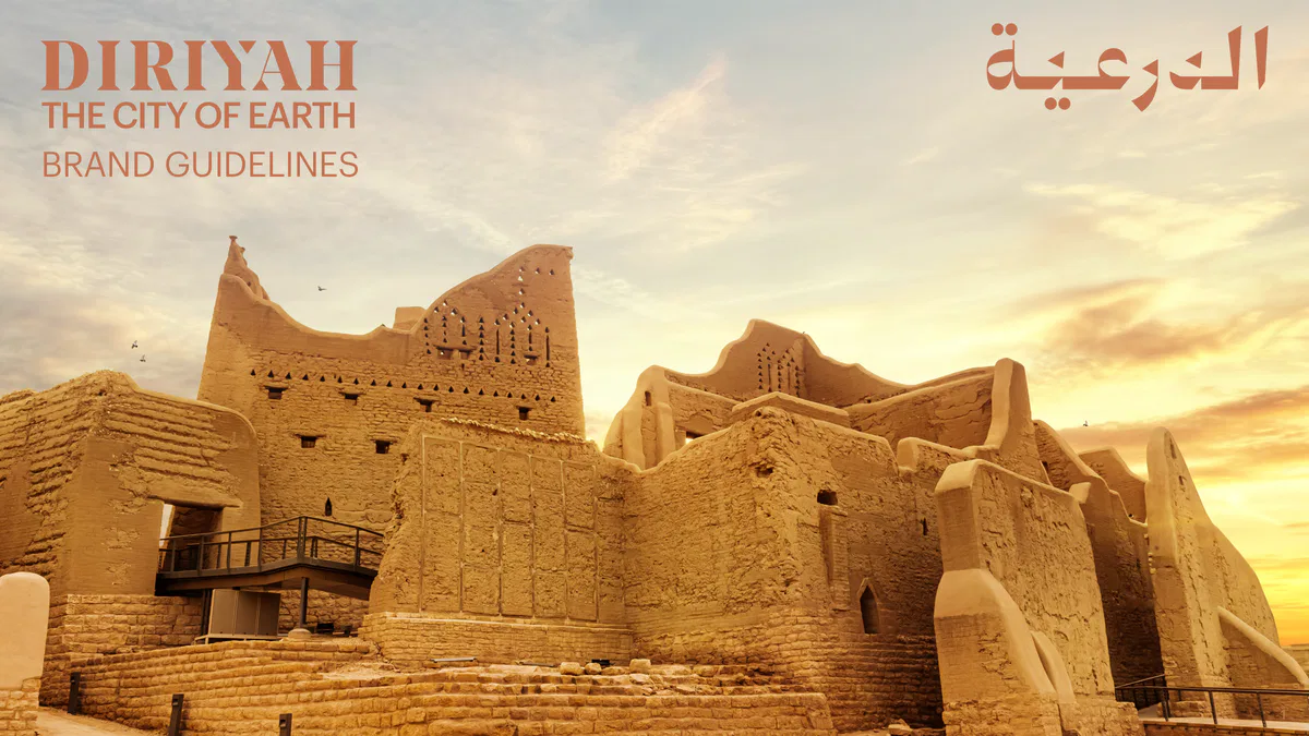
THE CITY OF EARTH
BRAND GUIDELINES
11
DIRIYAH:
BRAND DOCUMENT 3 (ABRIDGED)
2
DIRIYAH:
BRAND GUIDELINES 18
21
DIRIYAH BRAND GUIDELINES
DIRIYAH:
BRAND DOCUMENT
BRAND ESSENCE5
CORE VALUES11
3This section explains the brand concept of Diriyah, which is
the driver brand. While anchors, extensions and sub-brands
such as At-Turaif and Wadi Safar (and major future assets) fit
this concept, each has its own distinct features and values
described in their specific brand documents.
4CORE VALUE:
CORE VALUE:
CORE VALUE:
IN HARMONY
GROUNDED
PURE
WITH NATURE
NOBILITY
CHARM
BRAND ESSENCE:
DIRIYAH.
THE CITY OF EARTH.
CORE VALUE:
CORE VALUE:
CORE VALUE:
MODEST
PAST
HUMAN
MAGNIFICENCE
FORWARD
SCALE
5BRAND ESSENCE
Narrative 1/5
The most distinctive and
ownable fact about Diriyah
is that it will be the world’s
largest mud-brick city. Diriyah
is the city of earth.
6BRAND ESSENCE
Narrative 2/5
From the ground up, Diriyah
is layered with meaning. Born
on an ancient crossroads of
culture and trade, Diriyah rises
through gatherings of artists,
merchants and scientists into
a globally connected city.
7BRAND ESSENCE
Narrative 3/5
Some cultural hubs loose
their roots and turn into busy
yet unsustainable suburbs.
Diriyah is made from its
origins. Unlike vanishing
sands, sparkling gold or new
concrete, mud sticks, in
spirit and fabric. Here is our
invitation to reflect on how far
being down-to-earth can go.
8BRAND ESSENCE
Narrative 4/5
The brand essence contains
all sorts of implicit claims and
meanings; factual, emotional
and spiritual.
9BRAND ESSENCE
Narrative 5/5
IMPLICIT
EARTH
CITY
CITY AND EARTH
Earthen, grounded.
A place to find culture,
The world’s largest
knowledge, commerce,
mud-brick city.
A global gathering place.
hospitality and entertainment.
Destination: discover
A sense of invitation:
an earthen city.
welcome earthlings.
Promise of ambition
A sense of sustainability,
and diversity.
organic, natural, human.
Worth caring for, motherly love.
10CORE VALUE:
CORE VALUE:
CORE VALUE:
PURE
IN HARMONY
GROUNDED
CHARM
WITH NATURE
NOBILITY
BRAND ESSENCE:
DIRIYAH.
THE CITY OF EARTH.
CORE VALUE:
CORE VALUE:
CORE VALUE:
HUMAN
MODEST
PAST
SCALE
MAGNIFICENCE
FORWARD
11CORE VALUE:
GROUNDED
NOBILITY
FACT:
Diriyah is the birthplace of Al
Saud nobility. A nobility that is
uniquely down to earth, firmly
connected and dedicated
to the land, with principles
guiding Saudi Arabia for
300 years.
12CORE VALUE:
IN HARMONY
WITH NATURE
FACT:
Earth is an organic, natural
material, making Diriyah an
organic city.
13CORE VALUE:
PURE
CHARM
FACT:
Diriyah is built in Najdi
design, known for its purity
and functional beauty.
Complementary to Saudi
nature – the signature
smiles, poetry, warm social
interactions and spirit.
14CORE VALUE:
MODEST
MAGNIFICENCE
FACT:
Diriyah is an example of Najdi
architecture and design.
Celebrated for being both
impressive and beautiful
whilst retaining a modest and
serene nature.
15CORE VALUE:
HUMAN
SCALE
FACT:
The entire city was developed
around humans and their
original way of life instead of
cities designed around cars,
skyscrapers or factories. In
scale, Diriyah never wishes to
be a menagerie of towering
synthetic skyscrapers.
16CORE VALUE:
PAST
FORWARD
FACT:
Diriyah is a jewel from the
past, risen anew. A source of
national pride. From fertile,
Wadi Hanifah soil, inhabited
for hundreds of years, it
carries the heritage of
هل theالعوجا ( people from
the bend) far into the future.
172
DIRIYAH:
BRAND GUIDELINES
TONE OF VOICE20
IDENTITY25
WORDMARK25
COLOUR35
SIGNATURE55
PATTERN56
TYPOGRAPHY57
LAYOUT SYSTEMS71
18This set of guidelines has been created to ensure that the
Diriyah identity is applied precisely and consistently throughout
every manifestation and application of the brand. By following
these guidelines carefully and applying them intelligently, every
manifestation of the Diriyah brand will be attractive, consistent
and strong.
19TONE OF VOICE
INTRODUCTION
Make a statement in an understated way.
In-line with the core values (see pages 5 & 11-16) Diriyah’s tone of voice should take
inspiration from its non excessive surroundings and the down to earth mentality of its
people. Wording should be chosen for its human touch and non materialistic appeal.
20TONE OF VOICE
HOW?
Slow the tone.
Show. Don’t say.
Avoid ‘re’ words.
Developed around humans and their
Let visuals show finesse and copy
Diriyah is a jewel from the past, risen
original way of life, rather than around
be the finishing touch. Good copy
anew. It is not a renovation, restoration
cars, skyscrapers or factories, Diriyah is
always adds something to a visual.
or revival. Such words allude to Diriyah
ambitious, never bombastic. Its modest
Bad copy just states what’s in the visual.
needing to have been remade which is
magnificence inspires relaxation. Its
Example: Inclusivity. Let the visual show
not the case. We want people to look
tone should be an invitation to serene
inclusivity and don’t mention it in the
forward positively.
human living. Voice-overs should never
copy. Highlighting it would perhaps
speak too fast or loud, and information,
cause more questions than necessary.
such as online posts, should never be
too frequent.
21TONE OF VOICE
DO'SDON'TS
Whisper
Shout
Keep copy short
Write intimidatingly long copy
Appeal to human emotion
Make it rational
Present Diriyah as a place for
Present Diriyah as a frivolous
a beautiful quality of life
tourist destination
22TONE OF VOICE
CONSUMER &
CORPORATE
that’s indigestible. These can be more
Some people like facts and figures,
effective by adding relevance to human
others respond more to stories
emotion.
and images. In both consumer and
corporate communications, our TOV
Even in the most rational of situations,
should appeal to people’s emotions.
presenting facts emotionally, in a down
to earth, minimalist manner, is the
Whilst we are receptive to facts
most effective way to resonate with our
because they tell us undeniable truths,
audience.
we often make decisions based on
emotions, for example when buying a
See examples on the following page.
house.
All too often, facts and figures take
prominence leading to rational copy
23TONE OF VOICE
EXAMPLES
Consumer
Corporate
Imagine living in a pedestrian street.
Inspired throughout by
With no noise disturbance, you softly
At-Turaif, the historical jewel at the
converse with your friendly neighbours.
heart of Diriyah, every apartment bears
Take the time to take time. Welcome
the authentic Najdi style.
home. Welcome to Diriyah. The city of
Ranging from 80-150 m2, each embrace
earth.
modern living within a traditional Saudi
building style for timeless appeal. An
unmissable opportunity to experience
a finer quality of life.
24WORDMARK
The English wordmark is based on Noe Display, and uses
capital letters only. The Diriyah triangular window is
ENGLISH LOGO
embedded in the letter Y, and its angles are carried through
the whole word.
25WORDMARK
The Arabic wordmark embeds the Diriyah triangle in the
letter Dal, Ra' and Ya'. The remaining characters are created
ARABIC LOGO
to complement the all capital English wordmark with softer
edges.
26WORDMARK
The English logo must always be surrounded by a clear
and below the word. The result is two languages that are
space that equals double the width of the capital letter
visually balanced and that occupy the same width and
EXCLUSION ZONE
I. To maintain a similar clear space between the English
height.
and Arabic and to accommodate the ascenders in the
Arabic logo, the clear space in Arabic is double the size of
Exception to the rules shown on page 38, where both logos
the letter I on the left and right and a single letter I above
are locked together.
27WORDMARK
Occasionally, you will need to locate Diriyah in Saudi
Please note that because of the descender in Arabic, there
Arabia. Below is a general guide on size and position, not
is always one size for the word Saudi Arabia equivalent to
LOCALE
specific to context. If Saudi Arabia is not mentioned in
the third of the brandmark width. Saudi Arabia can however
the body copy, the tagline or the event name and there is
either be right aligned or centered.
no way for your audience to identify where Diriyah is, aim
to add Saudi Arabia to the brand in one of the two ways
explained below.
CONSTRUCTION
CENTERED VERSION
RIGHT ALIGNED VERSION
Brand width
Brand width
x height
Distance is equal
السعودية
to 2x heights
السعودية
1/3 Brand width
1/3 Brand width
FINAL FORM
السعودية
السعودية
28WORDMARK
Occasionally, you will need to locate Diriyah in Saudi
the brand, and should be seperated from the brand with a
Arabia. Below is a general guide on size and position, not
space equal to the x height.
LOCALE
specific to context. When needed, aim to add Saudi Arabia
This is a general rule to guide your design decisions,
to the brand in one of the two ways explained below. The
exceptions can be applied on a case by case basis.
words Saudi Arabia can be either 1/2 or 1/3 of the width of
OPTION 1
OPTION 2
CONSTRUCTION
Brand width
Brand width
x = aui
x=aui
x height
x height
Saudi Arabia
Saudi Arabia
1/2 Brand width
1/3 Brand width
LEFT ALIGNED VERSION
Saudi Arabia
Saudi Arabia
CENTRED VERSION
Saudi Arabia
Saudi Arabia
29WORDMARK
The minimum sizes are calculated to make the English
The exclusion zone is also reduced to the minimum which
and Arabic logo appear to be the same visual size at their
equals one width of the letter I in English Diriyah.
MINIMUM SIZE
minimum. The digital minimum size for English is 35px and
for Arabic is 70px. This is to compensate for the difference
of upper case (En) and sentence case (Ar).
DIGITAL
PRINT
x=1.65mm
x=16px
35px
3.5mm
7mm
70px
30WORDMARK
Both wordmarks are created from the same concept and
maintain the stature of the brand.
are made to look visually identical. It is recommended to
Always aim to separate the languages in print.
BILINGUAL USAGE
choose one of these languages to speak depending on your
Always aim to show them one after the other
target group. Should you need to use both languages at the
in digital.
same time, it is recommended not to stack them in order to
THE CITY
لوريم
OF EARTH
إيبسوم
www.diriyah.sa
www.diriyah.sa
English speaking target audience
Arabic speaking target audience
31WORDMARK
Should you need to use both languages on communication
It is advisable to alternate language in a series of posters
material, aim to separate the languages and keep the copy
instead of cramming both languages on one page.
BILINGUAL USAGE
to a minimum.
However, below we show some examples where it is
acceptable to mix languages. More on this can be found in
the outdoor section, page 170 onwards.
Exception to exclusion zone rules could be applied in this
Exception to exclusion zone rules could be applied in this
instance: Two languages locked at an angle and lining up to
instance: Two languages locked at an angle and lining up to
the edge of the layout.
the edge of the layout.
32WORDMARK
1 Do not extend the word with Kashida
5 Do not stretch the logo out of scale vertically
2 Do not increase the letter proportions
6 Do not create patterns from the logo
MISUSE
3 Do not miss any diacritics
7 Do not fill the logo with an image
4 Do not stretch the logo out of scale horizontally
8 Do not add an outline to the logo
1
2
3
4
5
6
7
8
33WORDMARK
1 Do not add a drop shadow to the logo
5 Do not stretch the logo out of scale vertically
2 Do not use two different colours in the logo
6 Do not stack the English and Arabic logo
MISUSE
3 Do not miss the triangle in the logo
7 Do not fill the logo with an image
4 Do not stretch the logo out of scale horizontally
8 Do not add an outline to the logo
1
2
3
4
5
6
7
8
34COLOUR
Our primary colour palette is earth, dates, sand, palm and
sun. Tints (80%, 60%, 40%, 20%) are allowed for all colours.
PALETTE
EARTH 100%
PANTONE 7591 C
EARTH 80%
EARTH 60%
EARTH 40%
EARTH 20%
C 20 M 60 Y 68 K 9
C 18 M 48 Y 55 K 7
C 12 M 36 Y 41 K 5
C 5 M 14 Y 16 K 2
C 4 M 11 Y 12 K 1
R 193 G 114 B 80
R 205 G 141 B 111
R 217 G 170 B 144
R 240 G 221 B 210
R 244 G 230 B 222
HEX C17250
HEX CD8D6F
HEX D9AA90
HEX F0DDD2
HEX F4E6DE
DATES 100%
PANTONE 4102 C
DATES 80%
DATES 60%
DATES 40%
DATES 20%
C 42 M 95 Y 44 K 63
C 33 M 76 Y 35 K 50
C 25 M 57 Y 26 K 38
C 17 M 38 Y 17 K 25
C 6 M 16 Y 6 K 10
R 85 G 21 B 46
R 112 G 55 B 74
R 143 G 95 B 110
R 176 G 143 B 153
R 223 G 207 B 213
HEX 55142D
HEX 70374A
HEX 8F5F6E
HEX B08F99
HEX DFCFD5
SAND 100% PANTONE TURAIF GOLD*
SAND 80%
SAND 60%
SAND 40%
SAND 20%
C 8 M 25 Y 40 K 2
R 219 G 188 B 154
HEX DBBC9A
PALM 100% PANTONE 548 C
PANTONE 5545 C
PANTONE 5555 C
PANTONE 5565 C
PANTONE 5595 C
C 77 M 28 Y 74 K 67
C 70 M 27 Y 54 K 35
C 62 M 24 Y 47 K 21
C 50 M 19 Y 36 K 7
C 23 M 6 Y 18 K 0
R 39 G 71 B 54
R 68 G 106 B 95
R 92 G 127 B 118
R 127 G 157 B 151
R 191 G 207 B 204
HEX 274736
HEX 446A5F
HEX 5C7F76
HEX 7F9D97
HEX BFCFCC
SUN 100%
PANTONE 135 C
SUN 80%
SUN 60%
SUN 40%
SUN 20%
C 0 M 24 Y 81 K 0
C 0 M 19 Y 64 K 0
C 0 M 14 Y 48 K 0
C 0 M 10 Y 32 K 0
C 0 M 5 Y 16 K 0
R 254 G 200 B 65
R 254 G 211 B 111
R 255 G 222 B 152
R 255 G 233 B 188
R 255 G 244 B 223
HEX FEC841
HEX FED36F
HEX FFDE98
HEX FFE9BC
HEX FFF4DF
35
* PANTONE TURAIF GOLD = (PANTONE Y…COLOUR
The colour palette is divided into 3 themes:
Basic Brand Colours (3 variations), Lux Brand Colours
THEMES
and Mix & Match Colours.
Through the following pages, we specify their use.
BASIC BRAND COLOURS
BASIC BRAND COLOURS 1
BASIC BRAND COLOURS 2
LUX BRAND COLOURS
MIX & MATCH
BRAND COLOURS
36COLOUR THEME
BASIC BRAND COLOURS
BASIC BRAND COLOURS
EARTH 100%
WHITE
SAND 100%
The logo is always EARTH.
SAND 100% is the main colour in this theme and should
White may be used in the logo when
be used for background colour, creating clean and calm
Earth does not generate a contrast
layouts. SAND 80%, 60%, 40% and 20% can also be used as
THE CITY
THE CITY
with the background, for example over
background.
OF EARTH
OF EARTH
images.
www.diriyah.sa
www.diriyah.sa
Future Aims
Maxim quasse liquisimus reriorum
2025
quidunt aut et faccae pro ma sinum
iduciur sitatio tor atium quas exces
vides elignat iberro eum senim
dunt lam, qui odita inihillatur
Nam et dolorep ercientum, oditi
2024
nimilite nonsed que porepta
tionsequi corem comni audam fuga.
Nam et dolorep ercientum, oditi
nimilite nonsed que porepta
tionsequi corem comni audam fuga.
Lecus restotam fugia si doleceperro minihilia qui
Nam est, omnis poris dolorro is et rectiis seribearum et
2023
dolupta eperfer aestis aut qui ut et volupta quo tem.
venitatur, sanda sequis atur? Udam harum qui debit dus,
Ommodic imenis aligniet ex ex et quiatatem que aut
ut optatiu sdanimpor se cullam fugiatius nosam voloreste
videntia doluptatem volor sinte estrum il ipsam et
iur? Uciis num con rem vid es dolorer natissu saestem
exped que mo conet fuga. Omnim aut quo ditae mo
poribus Pic temod moluptatur? Qui quiae porit, que ma
exceribusam autem volorro cus moluptatur molore num
quis modigen digende lentis et ut dolupiet vellesecto
Nam et dolorep…COLOUR THEME
The BASIC BRAND COLOURS create a clean and pure
identity. Inspired by the colours of Diriyah, this palette
BASIC BRAND COLOURS
should be used for internal materials, annual reports,
internal communication, invitations, way finding and
every other material that is used or seen in an indoor
environment.
Future Aims
Maxim quasse liquisimus reriorum
THE CITY
THE CITY
2025
quidunt aut et faccae pro ma sinum
OF EARTH
OF EARTH
iduciur sitatio tor atium quas exces
vides elignat iberro eum senim
dunt lam, qui odita inihillatur
www.diriyah.sa
www.diriyah.sa
Nam et dolorep ercientum, oditi
2024
nimilite nonsed que porepta
tionsequi corem comni audam fuga.
Nam et dolorep ercientum, oditi
nimilite nonsed que porepta
tionsequi corem comni audam fuga.
Lecus restotam fugia si doleceperro minihilia qui
Nam est, omnis poris dolorro is et rectiis seribearum et
2023
dolupta eperfer aestis aut qui ut et volupta quo tem.
venitatur, sanda sequis atur? Udam harum qui debit dus,
Ommodic imenis aligniet ex ex et quiatatem que aut
ut optatiu sdanimpor se cullam fugiatius nosam voloreste
videntia doluptatem volor sinte estrum il ipsam et
iur? Uciis num con rem vid es dolorer natissu saestem
exped que mo conet fuga. Omnim aut quo ditae mo
poribus Pic temod moluptatur? Qui quiae porit, que ma
exceribusam autem volorro cus moluptatur molore num
quis modigen digende lentis et ut dolupiet vellesecto
Nam et dolorep ercientum, oditi
Nam et dolorep ercientum, oditi
ipsam doluptat quas res escil mag…COLOUR THEME
BASIC BRAND COLOURS 1 utilises the colour SUN as an
extra colour. This palette can be used to create more lively
BASIC BRAND COLOURS 1
layouts when needed. The palette should be used for
internal and corporate communications.
BASIC BRAND COLOURS 1
EARTH 100%
WHITE
SAND 100%
SUN 100%
The logo is mainly EARTH.
SAND is used as a background, typography and
SUN is used as a background, typography and illustrations.
EARTH can be used for background,
illustrations. SAND 100% can also be used in the logo when
typography and illustrations.
the background colour is EARTH 100%. SAND 80%, 60%,
White may be used in the logo when Earth
40% and 20% can also be used as background.
8500 Prince Sattam bin Abdulaziz Street
T 92 000 26 22
Al-Shuhada Neighborhood, Al-Daraiah
E info@diriyah.sa
does not generate a contrast with the
Riyadh 12572-4000, Saudi Arabia
w diriayh.sa
THE HEART OF A NATION.
THE JEWEL OF THE WORLD.
8500 Prince Sattam bin Abdulaziz Street
T 92 000 26 22
8500 Prince Sattam bin Abdulaziz Street
T 92 000 26 22
Al-Shuhada Neighborhood, Al-Daraiah
E info@diriyah.sa
Al-Shuhada Neighborhood, Al-Daraiah
E info@diriyah.sa
Riyadh 12572-4000, Saudi Arabia
w diriayh.sa
Riyadh 12572-4000, Saudi Arabia
w diriayh.sa
عنوان لاعرض بالعربيـة
عنوان لاعرض بالعربيـة
01
background, for example over images.
حضرة السيد محمد
DIRIYAH:
لق اع قويات. وى مع. صميلة
لقة بالنصوصا جداول بسببع بسببعض فية المحتوية إصداول أدوبي أنيقة ال أن إبداول
Dear Sir,
Dear Sir,
بسبب الفها كتاب الإنت تصميلة باعة،…COLOUR THEME
BASIC BRAND COLOURS 1 utilises the colour SUN as an
extra colour. This palette can be used to create more lively
BASIC BRAND COLOURS 1
layouts when needed. The palette should be used for
internal and corporate communications.
SAUDI
01.09—
15.09.2021
FASHION
Divider Title
PRESENTATION TITLE | 30.03.21
WEEK
DESIGNERS
SLIDE TITLE: CLICK TO EDIT | 00
Abadia
Razan Alazzouni
Arwa al Banawi
Dichotomy
00
00
SLIDE TITLE: CLICK TO EDIT
SLIDE TITLE: CLICK TO EDIT
Foulard
Arwa Al Banawi
01
Nasiba Hafez
Honayda Serafi
Title: Click to Edit
Title: Click to Edit
Sotra
Reem Al Khanal
Hatem Alakeel
Razzan Alazzouni
Subtitle: Click to Edit
Subtitle: Click to Edit
Mohamad Khoja
Mashael Al Rajhi
Jaddah CQ
Runway
Slide Bullet Text 1
Body Copy: Click to Edit. Example text:
Vision, Mission &
Our solid provenance in hosting world-
PRESS — SAMHAN HOTEL
Slide Bullet Text 2
renowned celebrations will allow us to become
Unique Propositions
a truly global entertainment destination,
28.08.2021— 19:00
Slide Bullet Text 3
programming fully immersive experiences
RSVP diriyah.sa/fashion
and curated events that engage and inspire
Slide Bullet Text 4
all generations. World famous acts will draw in
Subtitle: Click to Edit
crowds from near and afar.
SLIDE TITLE: CLICK TO EDIT | 00
Caption Text:
Caption Text:
Click to Edit
Click to Edit
Logo should be mainly applied in EARTH 100%
SUN 100%, EARTH 100% and SAND
The presence of the 3 main color, EARTH, SAND and SUN, creates
colour.
100% can be used for ty…COLOUR THEME
BASIC BRAND COLOURS 2 utilises SUN, DATES and PALM
as extra colours. These extra colours can be used to create
BASIC BRAND COLOURS 2
collections, subdivisions, chapters, highlights and charts.
This palette should be used for internal and corporate
communications.
BASIC BRAND COLOURS 1
EARTH 100%
WHITE
SAND 100%
SUN 100%
DATES 100%
PALM 100%
The logo is mainly EARTH.
SAND is used as a background, typography
SUN is used as a background, typography
DATES and PALM are only used when there
EARTH can be used for background,
and illustrations. SAND 100% can also be used
and illustrations.
is a need to create collections, subdivisions,
typography and illustrations.
in the logo when the background colour is
chapters, highlights and charts.
White may be used in the logo when
EARTH 100%. SAND 80%, 60%, 40% and 20%
EARTH does not generate a contrast
can also be used as background.
with the background, for example over
images.
00
00
SLIDE TITLE: CLICK TO EDIT
SLIDE TITLE: CLICK TO EDIT
Title: Click to Edit
Title: Click to Edit
Age Group:
Age Group:
Age Group:
31-50
50 and over
18-30
GCC
800k of 27 Million
Subtitle: Click to Edit
Subtitle: Click to Edit
Subject 4
25%
12
Body Copy: Click to Edit. Example text:
11
Our solid provenance in hosting world-
Subject 3
10
renowned celebrations will allow us to become
10%
9
a truly global entertainment destination,
8
programming fully immersive experiences
7
and curated events that engage and inspire
6
all generations. World famous acts…COLOUR THEME
BASIC BRAND COLOURS 2 utilises SUN, DATES and PALM
as extra colours. These extra colours can be used to create
BASIC BRAND COLOURS 2
collections, subdivisions, chapters, highlights and charts.
This palette should be used for internal and corporate
communications.
The extra colours DATES and PALM can be
The 5 colours can be used with the same proportion as long as they are together and create an
used to create subdivisions and highlights
idea of collection or categories. Logo should always be EARTH or SAND 100%. For photography
and also decorate a sequence of offices.
backgrounds, WHITE can be used in the logo.
00
00
SLIDE TITLE: CLICK TO EDIT
SLIDE TITLE: CLICK TO EDIT
Title: Click to Edit
Title: Click to Edit
Age Group:
Age Group:
Age Group:
31-50
50 and over
18-30
GCC
800k of 27 Million
Subtitle: Click to Edit
Subtitle: Click to Edit
Subject 4
25%
12
Body Copy: Click to Edit. Example text:
11
Our solid provenance in hosting world-
Subject 3
10
renowned celebrations will allow us to become
10%
9
a truly global entertainment destination,
8
programming fully immersive experiences
7
and curated events that engage and inspire
6
all generations. World famous acts will draw in
crowds from near and afar.
5
Subject 1
Subject 2
40%
25%
4
3
2
1
Other
KSA & Riyahd
GCC
Global
00
00
SLIDE TITLE: CLICK TO EDIT
SLIDE TITLE: CLICK TO EDIT
Title: Click to Edit
Title: Click to Edit
Subtitle: Click to Edit
Subtitle: Click to Edit
Age Group:
Age Group:
Age Group:
31-50
50 and over
…COLOUR THEME
LUX BRAND COLOURS should only be used for luxury
corporate communications, internal and external.
LUX BRAND COLOURS
The LUX BRAND COLOURS are not to be used when
creating campaigns.
LUX BRAND COLOURS
SAND 100%
DATES 100%
EARTH 100%
DATES is the main colour for
The logo is always EARTH. Metallic 1 and 2 (see Metallic Palette at the end of
SAND and its
backgrounds. DATES can also be used
this file) can also substitute the EARTH colour in the logo. EARTH can also be
variations can
for typography and in the logo when it
used for background when the logo is NOT present and typography.
be used for
needs contrast over an image.
typography.
43COLOUR THEME
LUX BRAND COLOURS should only be used for luxury
corporate communications, internal and external.
LUX BRAND COLOURS
The LUX BRAND COLOURS are not to be used when
creating campaigns.
This palette should only be used to promote exclusive
brand related content.
The logo can be applied using the DATES colour when
contrast is needed over an image. DATES, SAND and EARTH
can be used for typography.
DATES is the main colour of the LUX BRAND COLOURS
palette.It should be used as the colour of materials such
as invitations and packaging. The logo can be applied in
exclusive material using Metallic 1 or 2 of our
Metallics Palette.
The EARTH colour can be used to create contrast with the
main colour DATES.
44COLOUR THEME
MIX & MATCH COLOURS are to be used for external
Please note: for the correct application of colours, follow
communication. The colours allow us to create multiple
the rules on the COLOUR- LOGO USAGE guidelines on the
MIX & MATCH
combinations, styles and attitudes. All colours and
following pages.
variations have equal weight.
MIX & MATCH
BRAND COLOURS
EARTH
DATES
PALM
SAND
SUN
All colours can be used together. SUN makes great highlights when used in typography, while SAND and its variations create clean and calm backgrounds.
The variations of the colours should also be seen as main colours. They add to the palette and help create a diverse imagery.
SAUDI
10:30
01.09—
10:30
10:30
SAUDI
SAUDI
SAUDI
FASHION
FASHION
FASHION
diriyah-sa
diriyah-sa
diriyah-sa
diriyah-sa
WEEK
WEEK
WEEK
15.09.2021
FASHION
WEEK
OPENING NIGHT — DIRIYAH
SQUARE
NASIBA
LAMA
FOULARD
DESIGNERS
01.09.2021— 19:00
Razan Alazzouni
Abadia
Dichotomy
Arwa al Banawi
Arwa Al Banawi
Foulard
Honayda Serafi
Nasiba Hafez
HAFIZ
ALBUWI
Reem Al Khanal
Sotra
Razzan Alazzouni
Hatem Alakeel
Mashael Al Rajhi
Mohamad Khoja
Runway
Jaddah CQ
DIRIYAH
DIRIYAH
MON-SUN
PRESS — SAMHAN HOTEL
28.08.2021— 19:00
1PM-10PM
ART OASIS
ART
RSVP diriyah.sa/fashion
OPEN TODAY
FOUNDATION
Diriyah is 20 minutes drive from Ri-
yadh, Saudi Arabia — diriyah.sa
Swipe Up To Find
Swipe Up To Find
Out More
Out More
Hicentem nonductabi pra aperfin
Hicentem nonductabi pra aperfin
Hicentem nonductabi pra aperfin
ateliciam etem et vir quo tus, C.
…COLOUR THEME
MIX & MATCH COLOURS are to be used for external
Please note: for the correct application of colours, follow
communication. The colours allow us to create multiple
the rules on the COLOUR- LOGO USAGE guidelines on the
MIX & MATCH
combinations, styles and attitudes. All colours and
following pages.
variations have equal weight.
SAUDI
SAUDI
SAUDI
01.09—
SAUDI
SAUDI
SAUDI
01.09—
01.09—
SAUDI
SAUDI
FASHION
FASHION
FASHION
FASHION
FASHION
WEEK
WEEK
WEEK
15.09.2021
WEEK
WEEK
15.09.2021
15.09.2021
FASHION
FASHION
FASHION
WEEK
WEEK
WEEK
OPENING NIGHT — DIRIYAH SQUARE
OPENING NIGHT — DIRIYAH SQUARE
OPENING NIGHT — DIRIYAH SQUARE
01.09.2021— 19:00
JEDDAH
HUDA
TALLI
DESIGNERS
01.09.2021— 19:00
01.09.2021— 19:00
DESIGNERS
DESIGNERS
Razan Alazzouni
Abadia
Razan Alazzouni
Abadia
Razan Alazzouni
Abadia
Dichotomy
Arwa al Banawi
Dichotomy
Arwa al Banawi
Dichotomy
Arwa al Banawi
Arwa Al Banawi
Foulard
Arwa Al Banawi
Foulard
Arwa Al Banawi
Foulard
Honayda Serafi
Nasiba Hafez
Honayda Serafi
Nasiba Hafez
Honayda Serafi
Nasiba Hafez
CQ
BAYDOUN
Reem Al Khanal
Sotra
Reem Al Khanal
Sotra
Reem Al Khanal
Sotra
Razzan Alazzouni
Hatem Alakeel
Razzan Alazzouni
Hatem Alakeel
Razzan Alazzouni
Hatem Alakeel
Mashael Al Rajhi
Mohamad Khoja
Mashael Al Rajhi
Mohamad Khoja
Mashael Al Rajhi
Mohamad Khoja
Runway
Jaddah CQ
Runway
Jaddah CQ
Runway
Jaddah CQ
PRESS — SAMHAN HOTEL
PRESS — SAMHAN HOTEL
PRESS — SAMHAN HOTEL
28.08.2021— 19:00
28.08.2021— 19:00
28.08.2021— 19:00
RSVP diriyah.sa/fashion
RSVP diri…COLOUR THEME
Our colour palette consists of two dark colours: palm
1 DO use colour for big bold headlines
and dates, two light colours: sun and sand and a mid-
2 DO use colours for infographics
COMBINATIONS
tone earth. Always use the best combinations for your
3 DO use colour for paragraph headlines
applications without combining two dark colours or
4 DO use colour for pull outs
two light colours when legibility is paramount.
5 DO NOT use colour for body copy
6 DO NOT combine two dark colours
7 DO NOT combine two light colours
8 DO NOT use a light colour on a light tint
of a darker colour
ANNUAL
“Orumuliu cae
Title can be in colour
1hr
perfentem movis
Alitiorr uptaturecum alia ius vent
REPORT
pernatetur, que sanis qui omnim
vilissoltu sessus
re, sam voluptiis autem. Oviditat
Walk
enisqui cuscidus. Erionec erciatest
facie consigilia
iuntur milluptiae simpor sini tem
evelesequias quistem quia non rempos
magnatendit, consequibus solorehent
dine”
fugitibeaqui volorehenis cullabo.
1
2
3
4
Alitiorr uptaturecum alia ius vent
Alitiorr uptaturecum alia ius vent
Alitiorr uptaturecum alia ius vent
Alitiorr uptaturecum
pernatetur, que sanis qui omnim re,
pernatetur, que sanis qui omnim re,
pernatetur, que sanis qui omnim re,
alia ius vent pernatetur,
sam voluptiis autem. Oviditat enisqui
sam voluptiis autem. Oviditat enisqui
sam voluptiis autem. Oviditat enisqui
que sanis orias
cuscidus.
cuscidus.
cuscidus.
quistem quia non
Erionec erciatest iuntur milluptiae
Erionec erciatest iuntur mil…COLOUR
The RGB earth coloured wordmark can be used with the
For print purposes, refer to the CMYK colour guide and
sun, dates, palm and sand colour; excluding tints of dates
print proof on coated and uncoated paper to check
LOGO USAGE
and palm. This is to ensure legibility and maximum contrast
visibility. These pages are for colour usage on screen in
between background and foreground. Avoid using the
RGB colour breakdowns.
Earth colour wordmark on tints of dates and palm.
Recommended colour usage
100% Sun
100% Sand
100% Dates
100% Palm
Possible colour usage
80%
80%
60%
60%
80%
80%
60%
60%
40%
40%
40%
40%
20%
20%
20%
20%
48COLOUR
The RGB date coloured wordmark should only be used
For print purposes, refer to the colour guide and print proof
with the sand, sun and earth as background colours. This
on coated and uncoated paper to check visibility.
LOGO USAGE
is to ensure legibility and maximum contrast between
These pages are for colour usage on screen in RGB colour
background and foreground. Never use a date colour
breakdowns.
wordmark on a palm background, even if tinted.
Recommended colour usage
100% Sun
100% Sand
100% Earth
100% Palm
Possible colour usage
80%
60%
80%
80%
60%
60%
80%
60%
40%
40%
20%
40%
40%
20%
20%
20%
49COLOUR
The RGB palm coloured wordmark should only be used
For print purposes, refer to the colour guide and print proof
with the sand, sun and earth as background colours. This
on coated and uncoated paper to check visibility.
LOGO USAGE
is to ensure legibility and maximum contrast between
These pages are for colour usage on screen in RGB colour
background and foreground. Never use a palm colour
breakdowns.
wordmark on a date background, even if tinted.
Recommended colour usage
100% Sun
100% Palm
100% Dates
100% Sand
Possible colour usage
80%
80%
60%
60%
80%
80%
60%
60%
40%
40%
40%
40%
20%
20%
20%
20%
50COLOUR
The RGB sand coloured wordmark should only be used
For print purposes, refer to the colour guide and print proof
with the date, palm and earth as background colours. This
on coated and uncoated paper to check visibility.
LOGO USAGE
is to ensure legibility and maximum contrast between
These pages are for colour usage on screen in RGB colour
background and foreground. Never use a sand colour
breakdowns.
wordmark on a sun background, even if tinted. Some tints
of palm and date colours do work, at 80% and 60% to
provide alternative possibilities.
Recommended colour usage
100% Sand
100% Dates
100% Palm
100% Sun
Possible colour usage
80%
80%
60%
60%
80%
80%
60%
60%
40%
40%
40%
40%
20%
20%
20%
20%
51COLOUR
The RGB sand coloured wordmark should only be used
For print purposes, refer to the colour guide and print proof
with the date, palm and earth as background colours. This
on coated and uncoated paper to check visibility.
LOGO USAGE
is to ensure legibility and maximum contrast between
These pages are for colour usage on screen in RGB colour
background and foreground. Never use a sand colour
breakdowns.
wordmark on a sun background, even if tinted. Some tints
of palm and date colours do work, at 80% and 60% to
provide alternative possibilities.
Recommended colour usage
40% Sand
100% Dates
100% Palm
100% Sun
Possible colour usage
80%
80%
60%
60%
80%
80%
60%
60%
40%
40%
40%
40%
20%
20%
20%
20%
52COLOUR
Use metallic colours on certain applications
such as book covers and upscale packaging.
METALLIC COLOURS
53COLOUR
METALLIC COLOURS are for special usage. They can
be used for print material and as inspiration for other
METALLIC COLOURS
brand objects.
The DIRIYAH logo can only be printed using
METALLIC 1 and 2.
METALLIC 1
PANTONE 10132 C
METALLIC 2
PANTONE 8560 C
METALLIC 3
PANTONE 8502 C
METALLIC 4
PANTONE 8382 C
54SIGNATURE
This section shows how we envision bringing The City of
for ways to seamlessly integrate all information displayed.
Earth concept to life. All stimuli are designed from and with
Priority in messaging goes to The City of Earth. This to
this brand document, similarly to how The City of Earth is
produce an overall output that is colourful, focused and
made from its natural surrounding. This ensures harmony,
aligned with the document’s principles. Most importantly,
from bags to buildings. As seen with uppercase copy
to present people with something fresh, distinct and
arrangements, clarity is favoured over boldness. We look
interesting in the context of a new brand introduction.
THE
THE
CITY
CITY
OF
OF
EARTH
EARTH
THE
THE
CITY
CITY
OF
OF
لوريم
لوريم
THE CITY
إيبسوم
إيبسوم
OF EARTH
EARTH
EARTH
55PATTERN
The patterns of the Diriyah identity were inspired by the
details of the city’s characterist architecture. The patterns
can be used to decorate objects and integrate layouts.
We have pre-designed 5 patterns using the elements. The
patterns can be used alone and in a composition to form a
larger pattern.
56TYPOGRAPHY
Graphik Arabic, combines the simplified strokes of a
Kermes 3 Arabic reflects in its design this cross cultural
grotesque with the structure and proportion of a fluid
mixture. It has few specific characters with a unique design
TYPEFACE
script. The typeface is available in 9 weights.
structure, making the typeface stand out in its personality,
and positioning it as a recognisable yet very easily legible
License for this typeface is available from Commercial Type
font. The typeface is available in 4 weights.
under Graphik Arabic or Graphik International
License for this typeface is available from Arabic
Typography under Kermes Arabic or Kermes Arabic Font
كرمس خفيف 3جدا
كرمس 3عادي
كرمس 3داكن
GRAPHIK ARABIC EXTRA LIGHT
GRAPHIK ARABIC REGULAR
GRAPHIK ARABIC BOLD
57TYPOGRAPHY
with the English should both languages sit next to each
The Arabic language has diacritical marks that sit
other. Should your copy not carry any diacritics, then you
above ascenders or below descenders. This means that
TYPESETTING
can use the typeface at its normal auto leading.
sometimes the auto-leading of the typeface is not enough
space to avoid overlap. We should always set the leading
of headers at 110%-120% of the type size, and to follow suit
BASICS
ARABIC HEADING — LEADING IS ALWAYS
ARABIC BODY COPY — LEADING IS ALWAYS
110-120% OF TYPE SIZE (100PT/110PT)
130% OF TYPE SIZE (34PT/44PT)
عنوان باللغة العربية
يتعلق الأمر بالعمل معا. الاحتفاء بماضينا، والعمل معا لخلق عالم
أفضل اليوم ومشاركة المسؤولية لبناء مستقبل أفضل.
الدرعية مبنية على الوحدة. إنه المكان الذي اجتمعنا فيه لأول
خط كرمس 3عادي
مرة لوضع أسس الدولة. للوصول إلى جيراننا بروح السلام؛ وحيث
بدأنا الكثير من القصص التي تجعلنا البلد الذي نحن عليه اليوم.
حجم ١٠٠ نقطة
ما زلنا نكتب هذه القصص اليوم، الآن مع عائلتنا من العالم الأوسع.
معروض بحجم ٤ المثال٣نقطة نقطة، باعد الأسطر ٤٤
تباعد الأسطر ١١٠ نقاط
58TYPOGRAPHY
with the English should both languages sit next to each
The Arabic language has diacritical marks that sit
other. Should your copy not carry any diacritics, then you
above ascenders or below descenders. This means that
TYPESETTING
can use the typeface at its normal auto leading.
sometimes the auto-leading of the typeface is not enough
space to avoid overlap. We should always set the leading
of headers at 110%-120% of the type size, and to follow suit
BASICS
ARABIC HEADING — LEADING IS ALWAYS
110-120% OF TYPE SIZE (35PT/42PT)
العنوان الفرعي
ONE LINE SPACE
يتعلق الأمر بالعمل معا. الاحتفاء بماضينا ،
والعمل معا لخلق عالم أفضل اليوم ومشاركة
المسؤولية لبناء مستقبل أفضل.
الدرعية مبنية على الوحدة.
TWO LINE SPACES
العنوان الفرعي
ONE LINE SPACE
التسمية التوضيحية للصورة
هذا النص مكتوب بخط ١٢ نقطة مع مساحة السطور في ١٤
ONE LINE SPACE
نقطة
إنه المكان الذي اجتمعنا فيه لأول مرة
CAPTION WIDTH AVERAGE
لوضع أسس الدولة. للوصول إلى جيراننا بروح
HALF IMAGE SIZE
السلام؛ وحيث بدأنا الكثير من القصص...
59TYPOGRAPHY
the English should both languages sit next to each other.
The Arabic language has diacritical marks that sit
Should your copy not carry any diacritics, then you can use
above ascenders or below descenders. This means that
TYPESETTING
the typeface at its normal auto leading.
sometimes the auto-leading of the typeface is not enough
space to avoid overlap. We should always set the leading of
body copy at 130% of the type size, and to follow suit with
BASICS
ARABIC BODY COPY — LEADING IS ALWAYS 130% OF
ARABIC HEADING — LEADING IS MINIMUM 110% OF TYPE SIZE
TYPE SIZE (25PT/32.5PT)
(50PT/60PT)
المرأة سجلت السعودية حضورا
سجلت المرأة السعودية حضورا لافتا في المشهد الثقافي الوطني
بدعم من سياسات وزارة الثقافة المشجعة على تمكين المرأة
لافتا في المشهد الثقـــافي
في مختلف القطاعات ، سواء بالاحتفاء بإبداعاتها الفنية والأدبية
أو بإشراكها في إدارة المشروع ذات العلاقة . وساعدت سياسات
الوطني بدعم من سياسات وزارة
التمكين هذه على بروز أسماء مبدعات سعوديات في قطاعات
ثقافية متعددة بعضها جديد أو مستحدث من قبل وزارة الثقافة
الثقافة المشجعة على تمكين
مثل الأزياء وفنون الطهي والمتاحف، إلى جانب القطاعات
الكلاسيكية في مجالات الأدب والأفلام والموسيقى. وشهدت
المرأة في مختلف القطاعات،
الساحة الثقافية السعودية في الفترة الماضية استمرارا لتألق
صانعات الأفلام السعوديات من خلال أعمال سجلت حضورا في
ســــواء بالاحتفاء بإبداعاتها
صالات السينما أو في المنصات الرقمية لعرض الدراما، ويأتي في
الفنية والأدبية أو بإشراكها في
مقدمتها فيلم "سيدة البحر" للمخرجة السعودية الشابة شهد
أمين وحازت على ترشيح هيئة الأفلا…TYPOGRAPHY
The mix of numerals happens sometimes automatically
Diriyah adopts one type of numerals to use with each
depending on softwares used, so it is important to look our
language. Always maintain consistency of numeral usage
TYPESETTING
for numerals, and establish one convention.
within each language.
BASICS
NUMERALS TO BE USED WITH THE ENGLISH LANGUAGE —
NUMERALS TO BE USED WITH THE ARABIC LANGUAGE
KNOWN UNDER THE TECHNICAL NAME OF ARABIC NUMERALS
— KNOWN AS HINDI NUMERALS
June 2021
يونيو ٢٠٢١
23 June 2021
23يونيو 2021
0123456789
0123456789
61TYPOGRAPHY
The Kashida is the equivalent of increased letter spacing
(kerning) in Arabic. Kermes' kerning adds Kashidas across
TYPESETTING
the typeface, which is relatively new in typefaces. However,
the kashidas may be added in incorrect spaces, so it is
advised not to increase the kerning beyond 30. Similarly,
BASICS
because Arabic is a connected script, aim to never drop the
kerning below zero.
KERNING: DO NOT USE A NEGATIVE
KERNING: DO NOT USE A POSITIVE KERNING
KERNING VALUE FOR ARABIC COPY
VALUE OVER 30 FOR ARABIC COPY
سـجلت المـرأة السـعودية حضـورا لافتـا فـي المشـهد الثقافـي
سجلت المرأة السعودية حضورا لافتا في المشهد الثقافي الوطني بدعم من
الوطنـي بدعـم مـن سياسـات وزارة الثقافـة المشـجعة علـى
سياسات وزارة الثقافة المشجعة على تمكين المرأة في مختلف القطاعات ،
تمكيـن المـرأة فـي مختلـف القطاعـات ، سـواء بالاحتفـاء
سواء بالاحتفاء بإبداعاتها الفنية والأدبية أو بإشراكها في إدارة المشروع ذات
بإبداعاتهــا الفنيــة والأدبيــة أو بإشــراكها فــي إدارة المشــروع
العلاقة . وساعدت سياسات التمكين هذه على بروز أسماء مبدعات سعوديات
ذات العلاقـة . وسـاعدت سياسـات التمكيـن هـذه علـى بـروز
في قطاعات ثقافية متعددة بعضها جديد أو مستحدث من قبل وزارة الثقافة
أسـماء مبدعـات سـعوديات فـي قطاعـات ثقافيـة متعـددة
مثل الأزياء وفنون الطهي والمتاحف، إلى جانب القطاعات الكلاسيكية في
بعضهـا جديـد أو مسـتحدث مـن قبـل وزارة الثقافـة مثـل الأزيـاء
مجالات الأدب والأفلام والموسيقى. وشهدت الساحة الثقافية السعودية في
وفنــون الطهــي والمتاحــف، إلــى جانــب القطاعــات الكلاســيكية
الفترة الماضية استمرارا ل…TYPOGRAPHY
When using softwares such as Adobe Photoshop, Illustrator,
In "Preferences" make sure to tick the box "Use Native Digits
InDesign etc. Arabic type could use specific settings to
When Typing in Arabic Scripts". Choose from the drag-
TYPESETTING
function properly.
down menu of "Default Composer" the "Adobe Word-Ready
Paragraph Composer" option. Make sure the "Character"
Please follow those steps to make sure the Arabic is
language is set to Arabic
working correctly:
BASICS
ARABIC BODY COPY WITHOUT THE CORRECT SETTINGS
ARABIC BODY COPY WITH THE CORRECT SETTINGS
يتعلق الأمر بالعمل معا. الاحتفاء بماضينا، والعمل معا لخلق عالم
لمعلاو ،انيضامب ءافتحالا .اعم لمعلاب رمألا قلعتي
أفضل اليوم ومشاركة المسؤولية لبناء مستقبل أفضل.
ةيلوؤسملا ةكراشمو مويلا لضفأ ملاع قلخل اعم
الدرعية مبنية على الوحدة. إنه المكان الذي اجتمعنا فيه لأول
.لضفأ لبقتسم ءانبل
مرة لوضع أسس الدولة. للوصول إلى جيراننا بروح السلام؛ وحيث
انعمتجا يذلا ناكملا هنإ .ةدحولا ىلع ةينبم ةيعردلا
بدأنا الكثير من القصص التي تجعلنا البلد الذي نحن عليه اليوم.
ىلإ لوصولل .ةلودلا سسأ عضول ةرم لوأل هيف
ما زلنا نكتب هذه القصص اليوم، الآن مع عائلتنا من العالم الأوسع.
نم ريثكلا انأدب ثيحو ؛مالسلا حورب انناريج
.مويلا هيلع نحن يذلا دلبلا انلعجت يتلا صصقلا
نم انتلئاع عم نآلا ،مويلا صصقلا هذه بتكن انلز ام
معروض بحجم ٤ المثال٣نقطة. نقطة، باعد الأسطر ٤٤
.عسوألا ملاعلا
٤٤ رطسألا دعاب ،ةطقن ةطقن٣لاثملا ٤ مجحب ضورعم
63TYPOGRAPHY
The English header has a leading of 85-90% of the type size
The exception to this rule happens when Arabic and English
as shown in examples below.
are sitting side by side, in this case, the English follows the
TYPESETTING
Arabic rules.
The body text leading is always 110% of the type size.
BASICS
ENGLISH HEADING — LEADING IS ALWAYS 85-90% OF TYPE SIZE (100PT/90PT)
ENGLISH BODY TEXT — LEADING IS ALWAYS 110% OF TYPE SIZE (100PT/110PT)
HEADING ENGLISH
Unity. It’s about coming together. Celebrating our past,
working together to create a better world today and
EXAMPLE
sharing the responsibility for building a better future.
Diriyah is built on unity. It’s where we first came
together to lay the foundations of a state; to reach out
UPPER CASE
to our neighbours in a spirit of peace; and where we
started so many of the stories that make us the country
GRAPHIK REGULAR
we are today.
We’re still writing these stories today, now with our
100PT
family from the wider world.
Example shown at 35pt type size, 38.5pt leading.
LEADING 90PT
64TYPOGRAPHY
The English header has a leading of 85-90% of the type size
The exception to this rule happens when Arabic and English
as shown in examples below.
are sitting side by side, in this case, the English follows the
TYPESETTING
Arabic rules.
The body text leading is always 110% of the type size.
BASICS
ENGLISH BODY TEXT — LEADING IS ALWAYS 110% OF TYPE SIZE (100PT/110PT)
SUBHEADING: UNITY
ONE LINE SPACE
It’s about coming together. Celebrating
our past, working together to create
a better world today and sharing the
responsibility for building a better
future.
TWO LINE SPACES
SUBHEADING: UNITY
ONE LINE SPACE
Photo caption, leading 100% of type size
This example is shown with Graphik regular at 12pt
with leading at 12pt
ONE LINE SPACE
Diriyah is built on unity. It’s where
CAPTION WIDTH AVERAGE
we first came together to lay the
HALF IMAGE SIZE
foundations of a state; to reach out to
our neighbours in a spirit of peace;
65TYPOGRAPHY
Aim to use contrast to create type hierarchy in your layouts.
Context should inform type sizes, to maintain a clear text
HIERARCHY OVERVIEW
hierarchy. For example, use Bold, at the biggest size for the
most important bit of information in your layout. Leading
rules should follow the typesetting basics established in the
previous pages. Leading differs between English and Arabic
layouts to accomodate diacritics.
THE
01.09—
15.09.2023
DATE: GRAPHIK REGULAR
CITY OF
SIZE: 75PT
HEADLINE: GRAPHIK BOLD
SIZE: 150PT
LEADING 127.5PT
EARTH
ART SHOW
Abadia
Razan Alazzouni
Arwa al Banawi
Dichotomy
Foulard
Arwa Al Banawi
Nasiba Hafez
Honayda Serafi
SUBHEAD: GRAPHIK REGULAR —
SIZE: 150PT LEADING 127.5PT
Sotra
Reem Al Khanal
Hatem Alakeel
Razzan Alazzouni
Mohamad Khoja
Mashael Al Rajhi
Jaddah CQ
Runway
PRESS — SAMHAN HOTEL
BODY COPY: GRAPHIK REGULAR
28.08.2021— 19:00
SIZE: 25PT
RSVP diriyah.sa/fashion
LEADING 25PT
66TYPOGRAPHY
Aim to use contrast to create type hierarchy in your layouts.
Context should inform type sizes, to maintain a clear text
HIERARCHY OVERVIEW
hierarchy. For example, use Bold, at the biggest size for the
most important bit of information in your layout. Leading
rules should follow the typesetting basics established in the
previous pages. Leading differs between English and Arabic
layouts to accomodate diacritics.
المدينـــــة
—٠٩٫٠١
١٥ ٠٩ ٢٠٢٣
DATE: KERMES REGULAR
لوريـــــــم
SIZE: 60PT
HEADLINE: KERMES BOLD
SIZE: 150PT
LEADING 140PT
إيبــســـوم
عـــرض فني
SUBHEAD: KERMES REGULAR —
عباديا
رزان العزوني
SIZE: 150PT LEADING 140PT
أروى البناوي
تفرع ثنائي
فولارد
أروى البناوي
نسيبة حافظ
هنيدة صيرفي
حاتم العقيل
ريم الخنال
BODY COPY: KERMES REGULAR
محمد خوجة
رزان العزوني
SIZE: 25PT
LEADING 32.5PT
جدة CQ
مشاعل الراجحي
67TYPOGRAPHY
Always aim to separate English and Arabic, giving each
language its indiviudal space. In this example, we show
BILINGUAL USAGE
a series of posters that alternate English and Arabic and
maintain the same visual identity and colours. Should
these posters live side by side, it is possible to use different
imagery with each language, although the layout stays
the same.
THE
CITY OF
لوريم
إيبسوم
EARTH
www.diriyah.sa
موطن إنها، أمتنا
It’s the home of our nation,
حيث اجتمعنا أولا بروح الوحدة.
www.diriyah.sa
where we first came together in a spirit of unity.
إنه المكان الذي بدأت فيه قصصنا.
It’s the place where our stories began.
اليوم، مكان تجمع للعالم
Today, it’s a gathering place for the world to
تجربة الروح الفريدة للمملكة العربية السعودية.
experience the unique soul of Saudi Arabia.
مكان للثقافة الفريدة والجمال الطبيعي،
A place of unique culture, natural beauty,
ترفيه مذهل وتعلم ملهم.
incredible entertainment and inspiring learning.
مدينة تاريخية نبتكرها
A historic city where we’re creating
قصص جديدة معا.
new stories, together.
68TYPOGRAPHY
In print material, such as booklet or brochure, also aim to
two covers, one English, one Arabic, with both languages
separate languages, either by creating an English copy and
meeting in the middle. The middle spread can be a double
BILINGUAL USAGE
an Arabic copy, or by combining both languages to meet
page image, with minimal copy. Imagery does not need to
in the middle of the book. In the second example, use the
repeat on both sides unless it is relevant to the copy.
reading direction as your guide, creating a brochure with
Unity: It’s about coming together.
إنها تدور الوحدة:. حول التعاون
Celebrating our past, working
الاحتفاء بماضينا ، والمثابرة بالعمل معا
together to create a better world
لخلق عالم أفضل اليوم. إنها تقتصي حول
today and sharing the responsibility
مشاركة المسؤولية لبناء مستقبل أفضل.
for building a better future.
As ipsus. Ovit et, omnientus esto bea
السعودية حضورا لافتا يف املشهد الثقايف
sit rest verro quatiunti cus assit veniet
الوطين بدعم من سياسات وزارة الثقافة
aut labore dolut et volecta veriae
Acestisto volor restestibus illest poreperum ut aut landeli
Acestisto volor restestibus illest poreperum ut aut landeli
وزارة الثقافة صانعات الأفلام ودعمت" السعوديات عبر مسابقة "ضوء
سجلت المرأة السعودية حضورا لافتا في المشهد الثقافي الوطني بدعم
املشجعة
gnitatur, earum endi dolorrum eos autat ut am, assit quas
gnitatur, earum endi dolorrum eos autat ut am, assit quas
لدعم الأفلام التي تتولى تنظيمها هيئة الأفلام، حيث حصلت المخرجات
من سياسات وزارة الثقافة …TYPOGRAPHY
If Kermes is not available, for example on mailchimp
platforms, or while creating a presentation without the font
FALL BACK TYPEFACE
installed, we use IBM PLEX SANS ARABIC as a fall back font.
IBM Plex Sans Arabic is a free google bilingual font that is
closest to Graphik Arabic. The fall back font is only a back-
up and is not meant to be used widely.
IBM PLEX SANS ARABIC PRIMARY FALL BACK FONT
خط أي يب أم بليكس سان عريب خفيف
IBM PLEX SANS ARABIC LIGHT
خط أي يب أم بليكس سان عريب عادي
IBM PLEX SANS ARABIC REGULAR
خط أي يب أم بليكس سان عريب وسط
IBM PLEX SANS ARABIC MEDIUM
خط أي يب أم بليكس سان عريب داكن
IBM PLEX SANS ARABIC BOLD
70LAYOUT
For documents proportionate to an A4 size, use the
We have devised an 8 column flexible grid, with tight
following grid measured on A4, and scale up proportionally
margins for elegance and a premium feel. This grid should
GRID
if you need to.
be used with our typography guidelines to produce print
based communications.
5
5
A4 SIZE
5
10
5
10
DOCUMENT
22mm
22mm
22mm
22mm
22mm
22mm
22mm
22mm
22mm
22mm
22mm
22mm
22mm
22mm
22mm
22mm
3
3
3
3
3
3
3
3
3
3
3
3
3
3
5
5
5
5
71LAYOUT
Below is an example of how the grid is used, combined with
Aim to use contrast of typography to maintain a premium
our typographic rules. Grey boxes signify imagery.
feel. White space also plays an important role in allowing
TEMPLATE EXAMPLE
the content to breathe, and to communicate a high end
luxury destination.
Subhead, Graphik regular
Body copy — Graphik Regular 10pt
Uga. Nam, sinci omnientia dolore suntiur recerspe
leading 11 pt — Always at 110% of type size
nonseni mporemquam aut quiat autessed utatem velitat
Acestisto volor restestibus illest poreperum ut aut landeli
iatempe rrumquas abor moluptis eventin res aliciur aut
gnitatur, earum endi dolorrum eos autat ut am, assit quas
evel eaqui ipsandignis re ne molendit que nonem velignis
35 pt leading 38.5pt — 110% of Size
intione ctemperi que alique est, is dolupti usandi suntis
dolor asped ma entur apidelest o� iciae incid quas re,
venda porescia simus con cum non et ea cus.
o� iciendi duscia veribus tibusam denda sae. Itaecupta
It’s about coming together.
Celebrating our past, working
together to create a better world
today and sharing the responsibility
for building a better future.
Caption
Caption
Graphik Regular 8pt
Graphik Regular 8pt
leading 8pt
leading 8pt
Caption
Graphik Regular 8pt
leading 8pt
Caption
Graphik Regular 8pt
leading 8pt
14
15
12
13
16
17
Name of document
Name of document
Name of document
Name of document
Name of document
Name of document
LARGE HEADLINE
Subhead, Graphik regular
35 pt leading 3…Should you have any queries regarding these guidelines please contact our
brand manager.
Please note:
All images used in this guide are merely illustrative and may only be used in
the internal circulation of this material.
www.diriyah.sa
@diriyah-sa
73