المملـكــة العـربـيــة السـعـوديـــة
KINGDOM OF SAUDI ARABIA
BRAND IDENTITY MANUAL
www.moenergy.gov.saالمملـكــة العـربـيــة السـعـوديـــة
KINGDOM OF SAUDI ARABIA
1.0 BRAND BASIC
www.moenergy.gov.sa1.1 BRAND BASIC
BRAND VISUAL IDENTITY
It depicts the source of the World's energy, pulsing with vitality
and variety of innovations and dynamic. Representing the
Kingdom's essential role in producing and supplying energy
to Saudi Arabia and all the World.
Logo's auras depict the spaces of Ministry of Energy's integrated
production of energy in various types, from traditional to
renewable and nuclear energy in a harmonious motion. These
spaces that surrounding us, covering the globe and its energy
needs, and it's surrounding the map of Saudi Arabia, the home
of energy. The national symbol was designed in modern and
minimalist style.
The brand mark's colors are inspired by the specialization and
values of Ministry of Energy and the environment of Saudi Arabia,
in a harmonious color combination. Dark blue is a brand equity,
its emphasizes a professional international business sense,
leadership, reliability and marine energy sources. Gold represents
the wisdom, superiority, wealth and land energy sources. Sky Blue
represents efficiency, Dynamism, and sky energy sources. Green
represents Saudi's national color, sustainability and growth.
The brand mark employs a new typeface design that signals local
international leader, professional, modernity.
BRAND IDENTITY MANUAL
31.2 BRAND BASIC
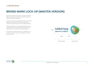
BRAND MARK LOCK-UP (MASTER VERSION)
Ministry of Energy's brand mark consists of glowing
globe's energy icon (called brand symbol) and the
brand name (called logotype).
Serving as the main brand signature, the brand mark
appears in the shown lockup in a dynamic and
modern horizontal flow, in Arabic reading direction.
The figure displays the lockup guidelines which are
only relevant when a brand mark reconstruction is
needed, such as to build a 3D implementation.
X
44%X
Use always the master file, which is available in all
common formats, and do not attempt to re-build
the brand mark.
X
20%X
135%X
Brand Symbol
Brand Logotyoe
BRAND IDENTITY MANUAL
41.3 BRAND BASIC
BRAND MARK LOCK-UP (VERTICAL VERSION)
In rare cases, the use of a vertically configured brand
mark is necessary, such as on pylon signs.
The shown lockup offers the solution, using a central
alignment of all brand mark components as
demonstrated.
X
Use always the master file, which is available in all
common formats, and do not attempt to re-build
the brand mark.
X
20%X
44%X
135%X
BRAND IDENTITY MANUAL
51.4 BRAND BASIC
BRAND MARK SPACING
To protect the brand mark from overlapping other
elements, and to maintain its appearance optimally,
it must be protected with a clear space surrounded
by all sides.
The brand marks should always be protected at
a distance of a half of the symbol height from the
upper and bottom edge and half of the symbol width
from right and left edge of any print or on-screen
application.
X
This applies to all versions of the brand mark. Its
placement on right and correctly measured spacing
from the edge relative to the brand mark will ensure
a consistent identity.
50%X
The shown guideline defines the ideal clear space
around the brand mark, and it demonstrates how
the logo fills the rectangle space, leaving the
minimum clear spaces on all sides of the brand
50%X
mark.
BRAND IDENTITY MANUAL
61.5 BRAND BASIC
BRAND MARK PLACEMENT
Correct placement of the brand mark will help ensure the integrity of Ministry of Energy's visual identity.
Whenever possible, the brandmark should appear in the upper right on Arabic or bilingual applications and in the upper left on English applications.
If the format is vertical or narrow, like a pylon, the brandmark should appear in the upper center with consideration of the clear space guide.
ENGLISH CONTENT
محتوى عربي
Lorem ipsum dolor sit amet, consectetur adipisicing elit, sed do
لوريم إيبسوم هو ببساطة نص شكلي )بمعنى أن الغاية هي الشكل
eiusmod tempor incididunt ut labore et dolore magna aliqua. Ut
وليس المحتوى( ويستخدم في صناعات المطابع ودور النشر. كان لوريم
enim ad minim veniam, quis nostrud exercitation ullamco laboris
إيبسوم ولايزال المعيار للنص الشكلي منذ القرن الخامس عشر عندما
nisi ut aliquip.
قامت مطبعة مجهولة برص مجموعة من الأحرف بشكل عشوائي
أخذتها من نص.
BRAND IDENTITY MANUAL
71.6 BRAND BASIC
BRAND GRAPHICS
Our brand graphics expresses our visual identity
strengthening Ministry of Energy. It will be used
throughout the brand applications, creating
a unifıed visual style for the entire brand.
It depicts the source of energy in a vibrancy and
dynamic motion, it is a simplifıed and modern.
Primary Graphics
Supporting Graphics
Primary Reverse Graphics
BRAND IDENTITY MANUAL
81.7 BRAND BASIC
HIERARCHY
The brand mark represents Ministry of Energy as
a signature, and therefore appears in every touch
point with its audience. To manage this brand
behaviour, follow here shown branding hierarchy:
1st Rank Branding
المملـكــة العـربـيــة السـعـوديـــة
KINGDOM OF SAUDI ARABIA
This is the main form of branding, using the full
brand mark for the master and sub-brands alike.
الاسم الثلاثي للموظف
It is used mainly in brand applications for
المسمى الوظيفي
employee@me.gov.sa
recognition and communication purposes.
2nd Rank Branding
The brand symbol represents Ministry of Energy
when an application does not allow the use of a full
brand mark.
1st Rank Branding
2nd Rank Branding
BRAND IDENTITY MANUAL
91.8 BRAND BASIC
MININUM SIZE
To ensure sufficient branding, apply the minimum
size rule when placing the brand mark on any
communication or advertising material.
Brand identity applications reproduce the logo in an
optimum size, please use the provided templates.
10 MM
Some applications may require micro sizes. As
example: fitting a small area on a plastic card, in
such cases the use of the micro size mono-color logo
is only allowed and considered exceptional. Further
10 MM
size reduction is not permitted.
Size measurement is based on the height/width of
Minsitry of Energy symbol.
Mininum Size
5 MM
5 MM
Micro Size
BRAND IDENTITY MANUAL
101.9 BRAND BASIC
BRAND MARK VERSIONS
The preferred reproduction of Ministry of Energy
brand mark is in its positive full color version on
white background.
Alternatively, the logo may be reversed only out of
Ministry of Energy dark Blue background color from
the brand primary palette, in order to secure enough
contrast for proper visibility and brand recognition
Main Version
Main Reverse Version
purpose.
Use the monochrome (single color) version for
special reproduction, such as special ink and paint.
The monochrome reverse is the main brand mark
version in use for logo placement on color
backgrounds.
When production limitation exists and the use of a
full color logo is not possible, the grayscale version is
to be applied and not an automatic conversion.
Monochrome Version
Monochrome Reverse Version
Rarely, the use of bitmap (black and white) version is
necessary. Example: fax transmissions, stamps and
film exposure for special finishes such as foil
blocking and embossing dyes.
Grayscale Version
Bitmap Version
BRAND IDENTITY MANUAL
111.10 BRAND BASIC
ACCEPTABLE BACKGROUNDS
The figures demonstrate examples of permitted
backgrounds for placing Ministry of Energy's
brandmark. The main focus is on securing enough
visibility and contrast to preserve visibility and
maintain consistent branding.
Ministry of Energy's brandmark shall preferably
appear on white background or dark Blue
background. It is NOT permitted to place the main
logo versions on another background colors.
White
Dark Blue
BRAND IDENTITY MANUAL
121.11 BRAND BASIC
UNACCEPTABLE BACKGROUNDS
The figures show examples of non-permitted brand
mark placements. Reason here is the reduced
contrast and loss of logo clarity.
Avoid using alien colors and apply a suitable color
from the supporting palette for placing the positive
brandmark version on solid backgrounds. Primary
colors offer tints for the same purpose.
Do not place on a corporate color with insufficient contrast
Heterogeneous, busy or patterned photographic
backgrounds harm the needed brand mark visibility
and are therefore not permitted.
Do not use gradient
Do not use an alien
or non-corporate color
Do not place the logo on the heterogeneous photographic background
BRAND IDENTITY MANUAL
131.12 BRAND BASIC
MISUSE
Shown in the figures are some unacceptable
uses of Ministry of Energy's brand mark. The
brand mark should always be reproduced
from the master artworks, do not reconstruct
the logo.
The brand mark should never be altered,
redrawn, recolored or manipulated in any
Do not use alien colors
Do not distort the logo
Do not alter the logo color
way. It is not allowed to append more
descriptors to the logo, such as department
names.
Please ensure that Ministry of Energy's brand
mark is used correctly at all times.
Do not reproduce
Do not reproduce with
Do not reproduce
Do not outline the logo
with low resolution
incorrect color values
Do not change component
Do not add elements
Do not remove elements
Scale Proportionally
proportion or configuration
(HOLD THE SHIFT BUTTON)
BRAND IDENTITY MANUAL
141.13 BRAND BASIC
PRIMARY BRAND COLORS
For consistent brand recognition, Ministry of Energy
owns a primary color that form the front line signals
with strong recall value. They are mainly present in
the brand mark and appear first in brand
Primary Colors Palette
applications. And it uses a set of secondary colors to
complement its brand personality expression and
Pantone 3025 C
support the use of prime colors.
100, 65, 37, 22
CMYK
Although Pantone® color values are available to
5, 72, 105
RGB
#054869
WEB
serve Ministry of Energy as spot colors where
applicable, the brand uses process color
reproduction - with CMYK values - in most brand
applications and communication. For digital
80%
60%
40%
20%
applications use the RGB and web values.
Use the full color brand mark unless a single color
Pantone 7548 C
Pantone 7481 C
Pantone 2995 C
Pantone Metallic 8580 C
production is inevitable, such as sticker, paint
0, 23, 100, 0
CMYK
75, 0 , 95, 0
CMYK
75, 7, 0, 0
CMYK
29, 49, 79, 19
CMYK
reproductions, and micro size logo.
254, 200, 11
RGB
35, 173, 55
RGB
0, 169, 224
RGB
162, 118, 64
RGB
#FEC80B
WEB
#23ad37
WEB
#00a9e0
WEB
#a27640
WEB
Do not use automatic conversion of the Pantone
values into process or additive colors.
80%
60%
40%
20%
80%
60%
40%
20%
80%
60%
40%
20%
80%
60%
40%
20%
BRAND IDENTITY MANUAL
151.14 BRAND BASIC
SECONDARY BRAND COLORS
Ministry of Energy uses a set of secondary colors to
complement its brand personality expression and
support the use of prime colors.
Secondary Colors Palette
This palette offers practical sets of colors that cover
all design needs, to communicate to a broad
Pantone 7536 C
Pantone 7536 C
Pantone Cool Gray 8 C
Pantone 5493 C
audience a variety of offerings and messages, and
stretch from light to dark, warm to cold and include
11, 13, 0, 35
0, 60, 0, 30
0, 0, 0, 60
53, 15, 25, 10
CMYK
CMYK
CMYK
CMYK
a range of neutral colors from the Pantone® color
168, 160, 134
91, 196, 191
140, 140, 140
125, 165, 175
RGB
RGB
RGB
RGB
#a8a086
#5bc4bf
#8c8c8c
#7DA5AF
WEB
WEB
WEB
WEB
matching system.
Please refer to the brand color system for more
guide on color usage.
80%
60%
40%
20%
80%
60%
40%
20%
80%
60%
40%
20%
80%
60%
40%
20%
In lieu of Ministry of Energy’s colors values, which
can be found in the current edition of the Pantone®
Pantone 3298 C
Pantone Black 6 C
Pantone 7468 C
Pantone 471 C
formula guide, when reproduction restricts the use
100, 9, 65, 41
CMYK
60, 40, 40, 100
60, 0, 6, 40
22, 70, 93, 10
CMYK
CMYK
CMYK
of spot colors, refer to alternate color values as
0, 106, 86
RGB
0, 0, 0
0, 122, 155
180, 86, 28
RGB
RGB
RGB
applicable.
#006A56
WEB
#000000
#007a9b
#B4561C
WEB
WEB
WEB
80%
60%
40%
20%
80%
60%
40%
20%
80%
60%
40%
20%
80%
60%
40%
20%
BRAND IDENTITY MANUAL
161.15 BRAND BASIC
COMBINING COLORS
Master Combination
To design the right color message, use a relevant
combination of brand colors. The shown
combinations are examples of different brand
expressions by varying their color stress.
Dominant colors are the most apparent in layouts
and are general mood setters. They stress headings,
titles, form background color or tone visual.
Subordinate colors support the dominant color,
occupy less space or have less weight. The are used
as graphic devices. Accents are fillers are normally
used as background, for framing text, elements
and imagery. Accents should be sparely applied.
Support Combination
Dominant
Subordinate
Accent
BRAND IDENTITY MANUAL
171.16 BRAND BASIC
COLOR SYSTEM
These color ranges have been specially selected to
support Ministry of Energy's visual identity. They
3025
form a corporate palette that expresses the brand
Metallic 8580
tte
Black 6
ale
attributes in the language of colors.
s P
80%
lor
Ministry of Energy's color palette includes a bright
Co
Cool Gray 8
60%
ry
color range and a dark or muted color range. The
2995
ma
colors serve as backgrounds for the corporate
Pri
40%
signature, area fillers and layout elements in all
applications, except for the official items (Example:
20%
stationery, only primary colors are used).
5493
7481
The selected collection provides enough flexibility
for a designer to create suitable color combinations
for all sorts of visual messages. It is allowed to use
Ministry of Energy primary colors & their tints
(down to 20%) in combination with solid colors or
7468
7548
tints from this palette only.
Se
co
nd
ary
C
7536
471
olo
rs
Pa
let
te
7536
3298
BRAND IDENTITY MANUAL
181.17 BRAND BASIC
COLOR SYSTEM USAGE
A color tint is a mixture of a color ink and white in
order to reduce its opacity and make it light and
Tone
transparent.
Ministry of Energy color tints should only be used in
support of primary and secondary colors as a way to
Tint
Tone
extend these full tone colors for specific application
needs, such as creating charts, graphs, video, web or
user interfaces, and layout backgrounds in general.
Tint
Tone
Tints can be used to create layout hierarchy,
separate color spaces, construct overlays and extend
core colors. They can extend the range of primary
and secondary colors, it is important though to be
Tint
judicious when using the combination of colors: too
many colors can create unwanted complexity in a
design.
MAIN HEADLINE
SUB-HEADING
Tints should never be used independently from full
Paragraph Heading in Fedra Sans Pro Bold
tone colors of the brand palettes.
Intro paragraph in Fedra Sans Pro Demi. Blind text accumsan et iusto
praesent luptatum delenit augue ipsum duis dolore te feugait facilisily
feugiat.
Paragraph Heading in Fedra Sans Pro Bold
– This paragraph of example copy shows how to form bulleted copy and
similar forms of text subdivisions to enable you to compare styles.
– This paragraph of example copy shows how to form bulleted copy to
compare styles, weights and sizes of type that are available.
To highlight a part of the text: conse tetuer adip iscing elit.
Suspendisse sodales nulla. Etiam sed risus. Etiam velit. Nulla vel
…1.18 BRAND BASIC
COLOR SPACE
The big variety of Ministry of Energy’s
Communication Color Space
communication to such a broad audience demands
60%
17%
11%
3%
3%
5%
1%
not only careful selection of color tones, but also
combining them appropriately.
Shown is percentage of color space usage of
Ministry of Energy’s layout.
Visual Image
White Space
Dark Blue
Gold
Sky
GreenYellow
Blue
Communication Color Space
44%
30%
3%
3%
5%
14%
1%
20% Cool Gray 8
White Space
Dark Blue
Green
Sky
Gold
Yellow
Blue
Environmental Color Space
57%
27%
9%
1%
3%
3%
White Space
Dark Blue
Green
Sky
Gold
Yellow
Blue
BRAND IDENTITY MANUAL
201.19 BRAND BASIC
BRAND FONT
How to use Ministry of Energy brand font
To maintain a coherent brand identity, Ministry of Energy uses a set of compatible Arabic and Latin typefaces as its brand font.
These adjacent sets are supported by a family of weights; all together reflecting the brand through the use of typography design.
Arabic
Latin
ABCDEFGHIJKLMNOPQRSTUVWXYZ
أ ب ت ث ج ح خ د ذ ر ز س ش ص
Content text
Content text
abcdefghijklmnopqrstuvwxyz
ض ط ظ ع غ ف ق ك ل م ن ه و ي
Disclaimer
Disclaimer
0123456789!@#$%&
% $ # @ ! 9 8 7 6 5 4 3 2 1 0
Fedra Sans Pro Demi
Ministry of Energy Demi
Branding
Branding
ABCDEFGHIJKLMNOPQRSTUVWXYZ
أ ب ت ث ج ح خ د ذ ر ز س ش ص
Heading
Heading
Sub-Heading
Sub-Heading
abcdefghijklmnopqrstuvwxyz
ض ط ظ ع غ ف ق ك ل م ن ه و ي
Naming
Naming
Citation
Citation
0123456789!@#$%&
% $ # @ ! 9 8 7 6 5 4 3 2 1 0
Captions
Captions
Fedra Sans Pro Medium
Ministry of Energy Medium
ABCDEFGHIJKLMNOPQRSTUVWXYZ
أ ب ت ث ج ح خ د ذ ر ز س ش ص
Paragraph heading
Paragraph heading
Text highlight
Text highlight
abcdefghijklmnopqrstuvwxyz
ض ط ظ ع غ ف ق ك ل م ن ه و ي
Fine Print
Fine Print
Notes
Notes
0123456789!@#$%&
% $ # @ ! 9 8 7 6 5 4 3 2 1 0
Fedra Sans Pro Bold
Ministry of Energy Bold
BRAND IDENTITY MANUAL
211.20 BRAND BASIC
UNIVERSAL FONT
When to use Ministry of Energy universal fonts
To preserve the brand image, the use of this set of font is necessary for Microsoft Office applications, e-mail signature,
soft files that are involved via e-mail or any other method and to work universally on all common platforms.
Arabic
Latin
ABCDEFGHIJKLMNOPQRSTUVWXYZ
أ ب ت ث ج ح خ د ذ ر ز س ش ص
Content text
Content text
abcdefghijklmnopqrstuvwxyz
ض ط ظ ع غ ف ق ك ل م ن ه و ي
Disclaimer
Disclaimer
0123456789!@#$%&
% $ # @ ! 9 8 7 6 5 4 3 2 1 0
Segoe UI Regular
Segoe UI Regular
ABCDEFGHIJKLMNOPQRSTUVWXYZ
أ ب ت ث ج ح خ د ذ ر ز س ش ص
Heading
Heading
Sub-Heading
Sub-Heading
abcdefghijklmnopqrstuvwxyz
ض ط ظ ع غ ف ق ك ل م ن ه و ي
Naming
Naming
Citation
Citation
0123456789!@#$%&
% $ # @ ! 9 8 7 6 5 4 3 2 1 0
Captions
Captions
Segoe UI Semibold
Segoe UI Semibold
ABCDEFGHIJKLMNOPQRSTUVWXYZ
أ ب ت ث ج ح خ د ذ ر ز س ش ص
Paragraph heading
Paragraph heading
abcdefghijklmnopqrstuvwxyz
ض ط ظ ع غ ف ق ك ل م ن ه و ي
Text highlight
Text highlight
Fine Print
Fine Print
0123456789!@#$%&
% $ # @ ! 9 8 7 6 5 4 3 2 1 0
Notes
Notes
Segoe UI Bold
Segoe UI Bold
BRAND IDENTITY MANUAL
221.21 BRAND BASIC
TYPESETTING GUIDE
How to use the Brand fonts
Arabic
Latin
All applications shall follow a unified typographic style,
which requires adherence to a typesetting guide.
HEADINGS IN FEDRA SANS
العنوان الرئيسي بخط مينيستري
Using bold and light weights in Arabic, creates the
PRO MEDIUM, UPPERCASE
اوف إنيرجي ميديوم
needed text differentiation. In Latin, headings and titles
should always use title case (initial caps) and flush text
SUB-HEADING IN FEDRA SANS PRO
العناوين الفرعية بخط بخط مينيستري اوف
alignment. Central text alignment is not allowed. Key
MEDIUM, UPPERCASE
إنيرجي مديوم
messages that require extra stress can use the bold
weight, example: quotes. Use true end dashes ( – ) and
not hyphens ( - ).
رؤوس الفقرات بخط مينيستري اوف إنيرجي بولد
Paragraph Heading in Fedra Sans Pro Bold
نموذج لنص التقديم وهذا النص ليس للقراءة. فقد وضع
Intro paragraph in Fedra Sans Pro Demi. Blind text
في هذا المكان لملء الحيز الذي سيشغله النص الصحيح
accumsan et iusto praesent luptatum delenit augue
Arabic Specifications
لاحقا. وفائدته لنا في هذه المرحلة..
ipsum duis dolore te feugait facilisily feugiat.
– Main Headings: Ministry of Energy Medium
– Subheadings: Ministry of Energy Medium
رؤوس الفقرات بخط مينيستري اوف إنيرجي بولد
Paragraph Heading in Fedra Sans Pro Bold
– Paragraph Heading: Ministry of Energy Bold
– هذا النص ليس للقراءة.فقد وضع في هذا المكان لملء
– This paragraph of example copy shows how to
– Intro: Ministry of Energy Demi
الحيز الذي سيشغله النص اصحيح لاحقا، وفائدته لن…1.22 BRAND BASIC
BRAND IMAGERY
Our imagery is a visual expression tool of our brand personality. It has thus be
Ambitious, Inspiring, Seasoned, Dynamic, Engaging and Pioneer.
It is creating the scenes of our brand, and is integral to creating the consistent
look of what we want to express.
Our photography tells a visual story with two categories of images:
Overly Posed
Dated Technology
Our Partners and Our World.
These categories are described on the following pages, enabling you to choose
from the same catalog of stock images, however in a way that differentiates
Ministry of Energy brand.
General Rules
• We are real
We avoid staged and overly posed shots. Image situations should feel
Inappropriate Innuendo
Controversial Reference
authentic and with real people in credible situations.
• We are engaing
Our imagery shows the impact we have on people, individuals and the
society at large. We like to show persons in reaction with the world around
them and with partners. Our images depict true actions and achievements,
they are not clichet nor superficial.
• We are ambitious
Our look is impressive with high sense of aesthetics. Images should be
Cliché
Religious Implications
inspiring and appealing, never boring nor ordinary.
BRAND IDENTITY MANUAL
241.23 BRAND BASIC
BRAND IMAGERY
Broad Perspective
Human Gallery
OUR PARTNERS
THE PEOPLE WHO HAVE STAKE WITH US.
The “PARTNERS” image category includes awide
Personal Perspective
variety of people in many locations, with a diverse
range of business and energy needs.
Our partners range from investors, business leaders,
financiers down to the individual that cares for
producing energy.
Clearly defining your target audience before
choosing images will ensure greater success in
connecting with them.
Qualities to look for in images that reflect our work
are:
Ambitious
Inspiring
Seasoned
Dynamic
Local-Global
Modern
Visionary
Close-up Perspective
Engaging Perspective
BRAND IDENTITY MANUAL
251.24 BRAND BASIC
BRAND IMAGERY
Specialist in Action
Human Gallery
OUR WORLD
WHAT WE DO AND HOW WE DO IT.
This image category focuses on activity we are
Teamwork in Action
engaged in (something is happening, or happened).
These images provide a view into our world and the
future of energy, giving a glimpse of what is
possible.
Choose images that are aspirational and capture our
inventive culture and creativity.
Abstract imagery can also be used to represent the
energy, advancement and innovation of our
leadership.
Qualities to look for in images that reflect our work
are:
Inventive
Pioneer
Energy Abstract / Sensual
Superior
Professional
Genuine
Visionary
Aesthetic Gallery
Corporate Abstract / Sensual
Energy Field
BRAND IDENTITY MANUAL
26المملـكــة العـربـيــة السـعـوديـــة
KINGDOM OF SAUDI ARABIA
THANK YOU
www.moenergy.gov.sa