Misk Art Institute
Visual Identity
Guideline
VersionWelcome to the new
Misk Art Institute Style Guide
Misk Arts Institute
masterbrand
Introduction
If you make any piece of communication
or collaborate with us then this guide is
for you. It gives you all the tools to build
brand equity, attribution and recognition
in the great things we do.Contents
Misk Art Institute Style Guide
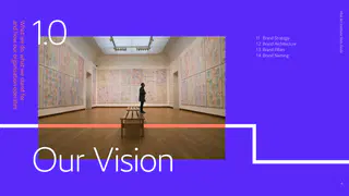
Our Vision
Brand Strategy
Brand Architecture
Brand Pillars
Brand Naming
Visual Identity
Our Logo
Our Color Palette
Our Typeface
Our Iconography
Our Graphic Lines
Our Imagery Principles
Our Layouts
Co-Branding
Single vs. Dual Language
Brand in UseMisk Art Institute Style Guide
What we do, what we stand for
and how our organisation operates
Brand Strategy
Brand Architecture
Brand Pillars
Brand Naming
Our VisionSets out what our customers and
Empowering the growth of a thriving, creative
Misk Art Institute Style Guide
Vision
partners expect from us and what
community. Making the arts accessible to all.
we expect from ourselves. Internally,
it articulates what everyone at MAI
must aspire to deliver on.
To empower emerging artists through our interconnected ecosystem of support,
Mission
expertise and education — unlocking opportunities and elevating the arts.
Unleashing artistic possibilities.
Essence
Narrative
We welcome you to Misk Art Institute.
Collaborative in spirit and diverse in thought, we encourage you to
join us. Our interconnected ecosystem of dynamic programmes,
A place of possibilities, a place for you to explore and feel inspired. We
Brand Strategy
publications, exhibitions, grants and more, invites artists from all art and
exist to empower local artists by bringing together support, expertise
design disciplines to discover, challenge, create and debate. Sharing our
and education for curious minds. Fuelling the creativity of tomorrow.
knowledge and passion for artistic expression — elevating, celebrating
Emboldened by our rich cultural heritage, we foster, propel and
and uniting our flourishing community.
champion the next generation of artists. Not only sharing impactful
art within society but nurturing a thriving community of national and
regional significance.
Values
Impactful
Genuine
Passionate
Collaborative
Future-looking, encouraging
Supporting, empowering and
Ins…We are a branded house. We focus
Misk Art Institute Style Guide
umbrella brand to build equity into
the masterbrand.
The Benefits of a Branded House
Strengthen MAI’s masterbrand
Addresses needs of key audiences
Makes implementation easier
– Improve awareness and consideration
–
– Give MAI teams a flexible and scalable
– Improve understanding of what MAI does
thread that links across exhibits and programs
system they can use to showcase cohesion
– Improve clarity, consistency and impact
–
across initiatives
of message
more intuitive
– Reduces the cost associated with
many sub-brands
Brand Architecture
Tier
Flagship
Tier
Is limited to
initiatives per Pillar, to ensure focus
Contains initiatives that occur more frequently, and that
are constantly refreshed
Should contain initiatives that:
Creates the foundations for the day-to-day activities at MAI
– Contribute the most in helping us realize our aspiration as a brand
Create the support and credibility behind each pillar
– Have the greatest reach
– Have the most impact
Creates awareness and shapes the strategic positioning of the MAI brand
Ensures the MAI story is consistently told across the yearMisk Art Institute Style Guide
Pillars
Misk Art
Artist Support
Exhibitions
Public
Research
Week
& Education
Programming
& Publications
Flagship / Tier
– Misk Art Week
– Residency
– The Art Library
– N/A
– MAI Flagship Exhibition
– Art Grant
Tier
– Art Week Talks
– Curatorial Collective
– Exhibitions Catalouges
– Educational Events
– Exhibition
Brand Pillars
Course
e.g. From the Studio
(Throughout the year)
– Research Commissions
– Art Week Workshops
– Creative Professional
– Workshops
– Art Grant Showcase
– Publications from MAI
– Art Week Exhibitions
Development Program
e.g. How to price
programs e.g. Forming
– Residency Showcase
your art work
– Art Week Events
– Master Classes
outlines
– Campaigns
– Educational Programs eg.
e.g. Share You Daily
Exhibition design training
– Talks e.g. Space A Tale Talk
– Internship ProgramMisk Art Institute takes a ‘fixed and flex’
Misk Art Institute Style Guide
approach to naming, based on the
two tiers.
Tier Initiatives / Flagship
For our Flagship / Tier initiatives
we used a fixed approach to naming.
Fixed Approach
Descriptive naming will create clarity and
help the target audience understand the
Misk Art + Descriptive Name
this naming structure will also significantly
build equity into the Misk Art brand name.
Misk Art + Week
Misk Art + Grant
Brand Naming
Misk Art + Residency
Fixed
Important Note
Tier
each occurrence e.g. annual publications or Misk Art Week, it is necessary to have the unique
name, followed by the fixed construct. For example ‘Misk Art Week’ or ‘Spaces in Between’.For our Tier initiatives we used
Misk Art Institute Style Guide
a flexible approach to naming.
Creative names can be given to
Tier Initiatives
transient initiatives as they are not
Flexible Approach
descriptor, shown here in purple, helps
Creative Name + Format
define what the initiative actually is,
especially to first-timers.
Share Your Daily + Campaign
Imprint + Exhibition
Brand Naming
Brace + Digital Art Exhibition
Flexible
Important Note
The format is necessary when the intended audiences sees the initiative
Tier
already have an understanding of what the initiative is.Misk Art Institute Style Guide
Our Visual
Identity
Overview
Our Logo
Our Color Palette
Our Typeface
Our Iconography
Our Graphic Lines
Our Imagery Principles
Our Layouts
Co-Branding
Single vs. Dual Language
The visual presentation of
Misk Art Institute’s brand promiseMisk Art Institute Style Guide
Humanist Sans Serif Typeface
Unleashing artistic possibilities
Arabic First Logo
Bold Monolithic Color Palette
Active Graphic Line
IconographyAlways leading with Arabic we use
Misk Art Institute Style Guide
the same logo for regional and
Our LogoOur Logo Rules
Misk Art Institute Style Guide
— Position top or bottom right
— Clearspace rule
Print mm
Partner
— Partnership alignment
Logo
— Minimum size
Digital
pxOur logo is one of the most recognisable
Misk Art Institute Style Guide
elements of our identity. To keep it that way
we must use it as consistently as possible.
We color the logo in three ways
— in either white, purple or black, whichever
has the greatest stand out against the
background. These examples show which
color logo to use on our color palette.
Our Logo
Color UseOur approach to color plays a key role
Misk Art Institute Style Guide
in making our brand feel distinctive,
– Primary Contrasting Colors
vibrant and inclusive.
We balance our white and purple
We have a primary palette of colors
primary colors with black and deep
blue. These four colors form our
– Using White
for use across the majority of Misk
primary color set.
White space is a key element, creating
communications; purple and white.Our
contemporary layouts which allow our
secondary palette of colors have been
content to stand out.
selected for their modernity and to
complement our primary palette.
– Primary Colors
We are a white and purple brand.
How we use our colors is critical in
making our visual identity a success.
Our Color Palette
– Color Groupings
We can use each secondary color individually
to complement our primary colors. We recommend
these color groupings when designing communications.
– Secondary Color palette
We have secondary colors, which
are used for secondary information.The proportions shown here are a general
Misk Art Institute Style Guide
guide to the use of primary colors on
applications. Remember to include plenty
of white space on layouts to allow the
content to breathe.
Primary Color Use
Deep Blue
Purple
White
BlackSecondary Deep Coral
Black
Primary Purple
Secondary Blue
Secondary Green
Secondary Yellow
White
Secondary Coral
Secondary Deep Blue
Secondary Purple
PMS Purple CWe’ve grounded our palette in the
Misk Art Institute Style Guide
psychology of colour. We can use
aspects of our personality.
Creativity & Curiosity
Growth, Renewal & Vigour
Grounded & Humble
Elegance & Gravitas
Human & Empathetic
Optimism & Imagination
Calm & Sophistication
Integrity & Knowledge
Purity & Simplicity
Energy & Warmth
Passion & ConfidenceOur colors are flexibile in their
Primary Palette
Secondary Palette
Misk Art Institute Style Guide
function across our visual assets.
The following pages show how we
use them together in application.
Background
Background*
Background*
Line graphic
Line graphic
Line graphic
Typography
Typography
Typography
Iconography
Iconography
Iconography
Background
Background*
Background*
Line graphic
Line graphic
Line graphic
How to use our colors
Typography
Typography
Typography
Iconography
Iconography
Iconography
Background
Background
Background
Line graphic
Line graphic
Line graphic
Typography
Typography
Typography
Iconography
Iconography
Iconography
Key:
Background
Background
Color used
Line graphic
Line graphic
Color not used
Typography
Typography
* For applications that allow for a second
Iconography
Iconography
layout e.g. inside brochures, websiteOur Color Blocks
Misk Art Institute Style Guide
Even though we have a broad range of
Mono color group
Deep Coral color group
Core color group
colors, we use our color selectively in the
following groups. The primary palette
should only be mixed with one color
from the secondary palette each time.
Coral color group
Magenta color group
Blue color group
Yellow color group
Green color groupHow to Use Our Color Blocks
Misk Art Institute Style Guide
The primary palette should only be mixed
Primary usage
Lead with primary colors and pops of one secondary color
with one color from the secondary palette
each time. Each color group should only
ever be used alone.
Mukooth
Mukooth
Mukooth
Mukooth
The exception for use of multiple secondary
colors is when using them
.—
.—
.—
.—
to help create pace / interest within
.
.
.
.
a document or assets like websites.
INSTAGRAM LIVE
INSTAGRAM LIVE
INSTAGRAM LIVE
INSTAGRAM LIVE
It is important to use our primary color,
white, to break up the document so that
the secondary palette does not become
Secondary usage
overused. On these applications our
Can be used for applications that allow a second layout
secondary color should always serve
as an unexpected surprise.
Magazine: Inside brochure spread
Website: Secondary information
Upcoming events
See all events
Culture
ENG Register | Sign in
Home Exhibition Activities Publications Education Calender About us Search
Re-
Welcome
National Day
Fully book
Misk Art
Celebrations
Fair
to Misk Art
cultivated
Jan
Feb
Institute
Week
Find out more
Find out more
Historical
Jeddah
Essi omnis et faceped quias est
omnimol orateca tquunto quam.
Soul of a nation
Feb
Find out more
being unleashed
Find out more
Currently showing
Past exhibition
Visit Archive
Exhibition Name – Artist name
View
Ro quatem quae maximendes sum nobis et voluptata nes
Ro quatem quae maximendes
doluptae exped modiorem audiciendis…Zarid Sans AL is a contemporary typeface
Misk Art Institute Style Guide
that is clean, direct and friendly.
Inspired by calligraphy and rendered
in a humanistic aspect, this typeface
is a modern interpretation of classic
traditions. Both the Arabic and Latin
for print and digital.Zarid
fonts are designed to be cohesive and
to balance expressiveness with legibility
Sans AL
Our TypefaceZarid has many weights and styles.
Misk Art Institute Style Guide
In order to ensure flexibility and clarity within
our brand system, we've curated
AaBb
the selection to three weights.
These three weights give us opportunity
Zarid Sans AL Extra Light
retaining a light and agile feel.
ABCDEFGHIJKLMNOPQRSTUVWXYZ
abcdefghijklmnopqrstuvwxyz
٠١٢٣٤٥٦٧٨٩٠
AaBb
Zarid Sans AL Regular
ABCDEFGHIJKLMNOPQRSTUVWXYZ
abcdefghijklmnopqrstuvwxyz
Our Typeface
AaBb
Zarid Sans AL Semi-bold
ABCDEFGHIJKLMNOPQRSTUVWXYZ
abcdefghijklmnopqrstuvwxyzOur Arabic font follows the same style
Misk Art Institute Style Guide
formula as our Latin font. Because the
we recommend using Zarid Sans AL
Regular for headlines to ensure we
create impact. The type hierarchy rules
are outlined for each Typeface on the
following pages.
Our TypefaceFor scenarios where our system font is not
Misk Art Institute Style Guide
available, use Helvetica Neue for Arabic and
Calibri for Latin.
Calibri Bold
Calibri Light
ABCDEFGHIJKLMNOPQRSTUVWXYZ
ABCDEFGHIJKLMNOPQRSTUVWXYZ
abcdefghijklmnopqrstuvwxyz
abcdefghijklmnopqrstuvwxyz
٠١٢٣٤٥٦٧٨٩٠
٠١٢٣٤٥٦٧٨٩٠
For small cap�ons and highlights
For headline and body content
Our System Fonts
Helvetica Neue Arabic Light
Helvetica Neue Arabic BoldPlease note that regardless of weight
Misk Art Institute Style Guide
or type size, kerning should be set to
Artist support
& Education
'Optical' and at -
Secondary Headlines
Regular is used for secondary
Art Dubai
headlines. It allows for legibility
of the type and is balanced in
weight against the Light Headlines.
Primary Headlines
Extra Light is used for headlines and
primary information. It brings the right
Modern
amount of weight to call attention, but is
light enough to look elegant and timeless.
Type Hierarchy Latin
Symposium
Number setting
Ensure you set numbers in
All Caps to ensure numbers
Dec. —
sit on the baseline.
Feb.
Subhead title
At que sitatia dolento rrumquae nonsect orepele ndictem
quunt quaest ut eos dis doluptat et aliquo millenis molor sit
Body copy and dense information
restis volorae eumquis es volent et int. Dae etur, odit omnim
Extra Light is used for dense blocks of
audiatia ipsuntis aped moluptatibus magnam incim aciet,
copy. It helps keep information clear and
quiduciis plibus reperatibus.
legible, without making it look heavy.
Subheads, CTAs and highlights
Endaeperis reria doluptas acculli tassitat vollaute qui
Semi-bold is used to highlight
voluptiam, cus quam que veliciures sitatque ommos. At que
For content on top of dark backgrounds,
information without overwhelming
Misk Lounge, Madinat Jumeirah,
sitatia dolento rrumquae nonsect orepele ndictem quunt
Art Dubai, Dubai, U.A.E.
quaest ut eos dis doluptat et aliquo millenis molor sit restis
Zarid …Please note that regardless of weight or
Misk Art Institute Style Guide
type size, kerning should be set to 'Optical'
and at
Secondary Headlines
Regular is used for secondary
headlines. It allows for legibility
of the type and is balanced in
weight against the Light Headlines.
Primary Headlines
Extra Light is used for headlines and
primary information. It brings the right
amount of weight to call attention, but is
light enough to look elegant and timeless.
Type Hierarchy Arabic
Number setting
Ensure you set numbers in
All Caps to ensure numbers
.—
sit on the baseline.
.
Body copy and dense information
Extra Light is used for dense blocks of
copy. It helps keep information clear and
legible, without making it look heavy.
Subheads, CTAs and highlights
Semi-bold is used to highlight
For content on top of dark backgrounds,
information without overwhelming
Misk Lounge, Madinat Jumeirah,
Art Dubai, Dubai, U.A.E.
Zarid Sans Regular can be substitute to
the page.
rd Dec.
th Feb.
increase readability.
miskartinstitute.orgWhen sourcing iconography from a library or
Misk Art Institute Style Guide
creating new assets, the following principles
should be adhered to.
Iconography Style
Our Iconography
Consistency
Clarity
Legibility
To achieve harmony and recall and
Whether literal or abstract an icon’s
Icons in their essence are ‘short hand’
consistency, icons should always
primary goal is to communicate a
visuals developed to communicate
maintain the same stylistic rules
concept quickly. When developing
used at small sizes, it is important when
throughout. For Misk, iconography is
icons using metaphors, always make
developing icons to stress test their
styled using a a single consistent key-
sure they are universally understood.
legibility at small scale in digital and
line treatment with no solid infill areas.
print communications.Misk Art Institute Style Guide
This way to
EVA ABHA
Workshops
Our Iconography
Level
Theatre ١
Guest speakers
& special events
Special Exhibit
Misk Art Grant:
MukoothOur secondary graphic lines have a range
Misk Art Institute Style Guide
of expressions. They can be subtle accents
in a layout that support our hero elements.
They can also stand alone or with typography
as a visual story about connection, journey
and community.
Connecting
the best of
Our Graphic Lines
local artists
industry & educationThe following are examples of the
Supportive and subtle
Straight lines
Misk Art Institute Style Guide
types of graphic lines that we use.
These are commonly used throughout our primary
design layouts. Single or multiple lines can be applied
vertically and horizontally.
Angled lines
These lines are slightly more expressive then our
straight lines. They bring dynamism to the layout
without taking too much attention away from the
Our Graphic Line Types
Curved lines
Curved lines veer into more expressive territory. It is
a good alternative option to angled lines, but should
be used in moderation. We keep the radius of the
curved line as circular as possible in order to ensure
balance and geometry.
Expressive lines
Expressive line graphics can be used in combination
with messaging to create playful and engaging
signature moments. We use these sparingly
so they have greater impact.
Expressive and Dynamic
Used for specific purposesConsider the following when creating or curating imagery:
Imagery is an important part of our identity,
Misk Art Institute Style Guide
having the ability to capture the audiences
imagination with compelling visual stories.
Showing a broad range of diverse content
speaks to our strengths as an arts institute.
Does it reflect our values?
Impactful
We must always seek to showcase the
Genuine
unique perspective of any event, programme,
Our images should link back to our values — communicating
Passionate
artist or initiative.
Collaborative
our progressive approach to social impact, genuine support and
empowerment for our artists, passion for the arts and collaborative
nature within our community.
Is it simple and impactful?
Keep images simple
by ensuring there is an
Images communicate best when they are trying to say as little
easily understood and
identifiable key theme.
as possible. An overly complicated visual or photograph leads to
a confused message. Simplicity ensures clarity of message and
Is it engaging and inspirational?
Always try to showcase
Imagery
the unique perspective
Whether it is through color, movement, texture or attitude — the tone of
of any event, programme,
artist or initiative.
images should always seek to intrigue, provoke thought and reflect the
‘power of art’. Showcasing elements that spark excitement, imagination
and creativity, always leaving the audience wanting to know more.Whether sourcing stock imagery or
Misk Art Institute Style Guide
footage, shooting your own pictures or
briefing a photographer/illustrator, we
must consider capturing the following
key aspects. Although the themes
may vary these principles are universal
across all of our imagery.
Individual engagement
Group engagement
A sense of place
A single focal point
Capture candid, authentic
Show interaction between the
Draw the viewer in and create
Keep it simple with a single
moments of a subject engaging
art and groups of observers.
intrigue by capturing a sense of
focal point, so our audience will
with the piece.
place, space and scale.
understand the message quickly.
Part of the process
Unexpected Perspectives
Dramatic activity
Spark the imagination
Imagery
Capture points in time, details
Seek unexpected perspectives
Create drama by capturing a
Use color, abstraction, detailed
throughout the process of a journey
to entice the viewer in and create
sense of movement and an active
textures or movement to
from idea to creation or
intrigue to encourage them to
participation in the creation and
ignite excitement, provoke the
a conversation to collaboration.
find out more.
experience of art.
imagination and spark creativity.The consistent use of our framework
Example
Misk Art Institute Style Guide
Leverages black and white as the unifying style
gives our brand a coherent and recognisable
look and feel.
As curators you have the flexibility to tell
on the exhibition theme or flagship initiative.
Here we show how groups of thematic
images can be used to create a sense
of identity for individual programmes.
Example
Uses colour and light as the unifying style
Please note: Whilst we have determined guiding
principles for all Misk Art photography – when selecting
photography from libraries, specifically for theme based
communications, first determine an appropriate thematic
image. This will form the foundation for further image
sourcing. Additional images should be sourced by
searching ( under)١ the photographers name and ( by)٢
image series. This will ensure a cohesive stylistic approach
is achieved as demonstrated opposite.
Example
Incorporates movement as the unifying style
ImageryWe can also make our imagery more
Misk Art Institute Style Guide
ownable by combining it with our line
graphic. Using an active line that interacts,
connects and highlights key parts of the
image, demonstrating our presence and
continued support.
Straight, angled, curved and expressive
line types may all be applied.
ImageryOur modular grid allows for flexibility
Misk Art Institute Style Guide
to place and align content vertically
or horizontally within the margins.
Square
Use the logo as a tool to measure the
columns by rows
columns, margins and rows in your grid. Start
Smaller formats have
with
columns for complex content and
less content, therefore
the grid should be
adjust the number to fit the format. Increase
pared down.
Margins are
or decrease the number of rows so that the
grid stays as square and modular as possible.
Our Logo (X)
The square footprint of our symbol
makes a good unit of measurement
This is our square grid example on an A
for our modular gird
x
mm portrait, landscape and square
format. This can be adapted in principle
to any format.
The Grid System
Our Layouts
A Portrait
A Landscape
columns by
rows
columns by
rowsLogo, Color and Content Furniture
Misk Art Institute Style Guide
Our logo is the anchor to our grid. Therefore,
it should always sit proudly on the top right
corner of the layout. By enforcing consistency,
our logo becomes the mnemonic device that
Strong anchor
Consistent placement
for the grid
for navigation
reinforces the presence of our brand.
We use full bleed colors for our layout
Exhibitions
Exhibitions
Exhibitions
backgrounds. Lead with White or Misk Purple
and use secondary colors for secondary colors
Mukooth
to highlight key information.
Art Dubai
Where possible, keep information in a
Modern
consistent position across materials for
a specific event or initiative. Keep as much
Roundtable
Symposium
clear space in layouts as possible
Muhannad
—
Shono
—
.—
Breaking it Down
Our Layouts
INSTAGRAM LIVE
.
Misk Lounge, Madinat Jumeirah,
Misk Lounge, Madinat Jumeirah,
Misk Lounge, Madinat Jumeirah,
Art Dubai, Dubai, U.A.E.
Art Dubai, Dubai, U.A.E.
Art Dubai, Dubai, U.A.E.
INSTAGRAM LIVE
rd Dec.
th Feb.
rd Dec.
th Feb.
rd Dec.
th Feb.
miskartinstitute.org
miskartinstitute.org
miskartinstitute.org
The text / copy shouldn't
dominate the page. However, it
can be moved around the grid
vertically or horizontallyHeadlines and Secondary Information
Misk Art Institute Style Guide
Headlines are the first level of information.
Therefore, it should take up a large area
of space in a layout. Our headlines can be
horizontal or vertical as long as it is legible.
Secondary information is also important,
Exhibitions
Exhibitions
Exhibitions
Therefore, it should be smaller than the
headline, but larger than other text.
Mukooth
Art Dubai
Modern
Roundtable
Symposium
Muhannad
—
Shono
—
.—
Breaking it Down
Secondary information
Our Layouts
INSTAGRAM LIVE
can vary in size, but
.
should not take
attention away from
the headlines
Misk Lounge, Madinat Jumeirah,
Misk Lounge, Madinat Jumeirah,
Misk Lounge, Madinat Jumeirah,
Art Dubai, Dubai, U.A.E.
Art Dubai, Dubai, U.A.E.
Art Dubai, Dubai, U.A.E.
INSTAGRAM LIVE
rd Dec.
th Feb.
rd Dec.
th Feb.
rd Dec.
th Feb.
miskartinstitute.org
miskartinstitute.org
miskartinstitute.org
Headlines can be horizontal
or verticalPhotography and Graphic Lines
Misk Art Institute Style Guide
Photography and graphic lines bring impact
to our layouts. By overlapping headlines with
our hero image, we bring depth and visual
interest to the design. In most cases we
only need one image, however for secondary
layouts, the grid can support multiple images.
Exhibitions
Exhibitions
Exhibitions
Our graphic line is the ‘red thread’ that ties
all the brand elements together. We use
Mukooth
the graphic lines to move the eye forward
Art Dubai
and connect it with all our images and
typography. For layouts like these, our graphic
Modern
language is simplified so that it doesn’t
Roundtable
Symposium
overwhelm the page.
Muhannad
—
Shono
—
.—
Breaking it Down
Our Layouts
INSTAGRAM LIVE
.
Misk Lounge, Madinat Jumeirah,
Misk Lounge, Madinat Jumeirah,
Misk Lounge, Madinat Jumeirah,
Art Dubai, Dubai, U.A.E.
Art Dubai, Dubai, U.A.E.
Art Dubai, Dubai, U.A.E.
INSTAGRAM LIVE
rd Dec.
th Feb.
rd Dec.
th Feb.
rd Dec.
th Feb.
miskartinstitute.org
miskartinstitute.org
miskartinstitute.org
Photography can be asymmetrical on the grid.
It can stand boldly at the centre.
Or in some instances, it can lead the eye forwardPrimary Layouts
Misk Art Institute Style Guide
These sample layouts represent the flexibility
within our brand system. They are used for
primary levels of communications and design.
Exhibitions
Exhibitions
Exhibitions
Mukooth
Art Dubai
Modern
Roundtable
Symposium
Muhannad
—
Shono
—
.—
Breaking it Down
Our Layouts
INSTAGRAM LIVE
.
Misk Lounge, Madinat Jumeirah,
Misk Lounge, Madinat Jumeirah,
Misk Lounge, Madinat Jumeirah,
Art Dubai, Dubai, U.A.E.
Art Dubai, Dubai, U.A.E.
Art Dubai, Dubai, U.A.E.
INSTAGRAM LIVE
rd Dec.
th Feb.
rd Dec.
th Feb.
rd Dec.
th Feb.
miskartinstitute.org
miskartinstitute.org
miskartinstitute.orgSecondary Layouts
Misk Art Institute Style Guide
Secondary layouts are for more in-depth
content. It uses the same modular grid, but
has the flexibility to adapt to a variety of
graphics, photography and information.
Education
Artist support
& Education
Events
Discover
Misk
Talks
Calling
Performances
At que sitatia dolento rrumquae
nonsect orepele ndictem quunt quaest
Workshops
Artists
ut eos dis doluptat et aliquo millenis
Art
molor sit restis volorae eumquis es
volent et int. Dae etur, odit omnim
audiatia ipsuntis aped moluptatibus
Exhibitions
magnam incim aciet, quiduciis plibus
ranti eperatibus.
Endaeperis reria doluptas acculli tassitat
vollaute qui voluptiam, cus quam que
veliciures sitatque ommos. At que
Save the date
sitatia dolento rrumquae nonsect
orepele ndictem quunt quaest ut eos
dis doluptat et aliquo millenis molor sit
Week
restis volorae eumquis es volent et int.
Breaking it Down
Our Layouts
Application opens
miskartinstitute.org
—
Misk Lounge, Madinat Jumeirah,
Misk Lounge, Madinat Jumeirah,
Art Dubai, Dubai, U.A.E.
Art Dubai, Dubai, U.A.E.
rd Dec.
th Feb.
rd Dec.
th Feb.
miskartinstitute.org
miskartinstitute.org
Layout with multiple images
Type-led layouts with full bleed images
Layouts with large graphic elementsSecondary Layouts
Misk Art Institute Style Guide
These sample layouts are examples of how
our modular grid is flexible yet still coherent
with the rest of our brand.
Education
Events
Artist support
& Education
Discover
Misk
Talks
Calling
Performances
At que sitatia dolento rrumquae
nonsect orepele ndictem quunt quaest
Workshops
Artists
ut eos dis doluptat et aliquo millenis
Art
molor sit restis volorae eumquis es
volent et int. Dae etur, odit omnim
audiatia ipsuntis aped moluptatibus
Exhibitions
magnam incim aciet, quiduciis plibus
ranti eperatibus.
Endaeperis reria doluptas acculli tassitat
vollaute qui voluptiam, cus quam que
veliciures sitatque ommos. At que
Save the date
sitatia dolento rrumquae nonsect
orepele ndictem quunt quaest ut eos
dis doluptat et aliquo millenis molor sit
Week
restis volorae eumquis es volent et int.
Breaking it Down
Our Layouts
Application opens
miskartinstitute.org
—
Misk Lounge, Madinat Jumeirah,
Misk Lounge, Madinat Jumeirah,
Art Dubai, Dubai, U.A.E.
Art Dubai, Dubai, U.A.E.
rd Dec.
th Feb.
rd Dec.
th Feb.
miskartinstitute.org
miskartinstitute.org
Type-led layouts with full bleed images
Layouts with large graphic elements
Creating a story vignette from multiple imagesLayouts: Instagram Posts
Misk Art Institute Style Guide
can be used for our social communications
that are shown here.
px
Initiative
Iste si auda
DATE
DATE
Initiative
Initiative
Talks
Events
Large
TIME
TIME
doluptat invel el
Artists
idus verest dest od
Headline
Large
mi, il iduciam, num
exeriaerum ides
Headline
acepere sequia im.
DATE
Large Headline
TIME
gathering for
Misk Art Festival
Source
Color frame
Image frame
Text quote
Statistical quote
In addition to the templates, we also
Full-bleed image
can create custom posts with the lines
interacting, connecting and highlighting
key parts of any image.Layouts: Twitter Posts
Misk Art Institute Style Guide
can be used for our social communications
that are shown here.
px
DATE
DATE
Large
Initiative
Initiative
Initiative
TIME
TIME
Large
Large
Headline
Headline
Headline
Extra subtitle text
DATE
Extra subtitle text
Extra subtitle text
TIME
Color frame
Image frame
Full-bleed image
Iste si auda doluptat invel
el idus verest dest od mi, il
Artists
iduciam, num exeriaerum
ides acepere sequia im.
gathering for
Source
Misk Art Festival
Text quote
Statistical quoteLayouts: Facebook Posts
Misk Art Institute Style Guide
can be used for our social communications
that are shown here.
px
DATE
Large
DATE
Initiative
Initiative
Initiative
Large
TIME
TIME
Large
Headline
Headline
Headline
Extra subtitle text
Extra subtitle text
DATE
Extra subtitle text
TIME
Color frame
Image frame
Full-bleed image
Iste si auda doluptat invel
el idus verest dest od mi, il
Artists
iduciam, num exeriaerum
ides acepere sequia im.
gathering for
Source
Misk Art Festival
Text quote
Statistical quoteCo-Branding:
Misk Art Institute Style Guide
Misk Foundation Endorsment
Conveying the relationship between MAI
and Misk Foundation will sometime be
a necessity across various communications.
We have specified four alternate
scenarios for its usage and placement.
No Endorsement
Light Endorsement
Joint Endorsement (Equal)
Joint Endorsement (Equal)
MAI only
Misk Foundation plays
MAI and Misk Foundation
MAI and Misk Foundation
a light supporting role
play equal roles
play equal roles
Co-Branding
Supported by the
Misk Foundation
There may be requests made for
No visual branding of
MAI logo appears in the top
MAI logo appears in the top or
a ‘side-by-side’ logo layout when
or bottom right corner, Misk
Misk Foundation
bottom right corner, written
co-branding with partners.
E.g. When inside MAI, i.e. in physical
E.g. When MF is organising an
E.g. When MF is organising an
and digital space, for all initiatives
E.g. When MF executives are
initiative and MAI plays a large role.
initiative and MAI plays a large role.
organised by MAI and for all regular
playing a role or when MF sponsors
MAI program collateral.
an initiative and an equity transfer
٪ of cases
Roughly
Roughly
٪ of cases
to MAI is required.
Roughly ٪ of cases
Roughly ٪ of casesCo-Branding: MAI Dominant
Misk Art Institute Style Guide
This scenario occurs when an MAI
program or initiative is being sponsored
or supported by a partner. The MAI
brand identity rules are followed, with
the MAI logo more prominent than
the partner organizations’ logo.
Co-Branding
In association with
In association with
The size relationship illustrates that this is an MAI
There may be occasions when further explanation
Multiple partners.
lead piece of communication, with the partner logo
is needed about what the role of the partner is.
This can be illustrated with the inclusion of a copy
line such as ‘In association with’ or ‘Sponsored by’.Co-Branding: Equal ownership
Misk Art Institute Style Guide
In situations where MAI partners
with another company on an initiative
the lead for the look and feel is taken
from whichever organisation is producing
the materials.
Co-Branding
In partnership with
There may be occasions when further
There may be requests made for a ‘side-by-side’
The size relationship illustrates that this
explanation is needed about what the role
logo layout when co-branding with partners.
is an equal partnership with the partner
between the two companies is. This can be
We have visualised this here where our logo is
in question. Their logo can be placed in
illustrated with the inclusion of a copy line such
shown alongside the partner logo at equal sizes.
as ‘In partnership with’.Co-Branding: Partner dominant
Misk Art Institute Style Guide
In situations where MAI is sponsoring or
endorsing an event that is led by a partner
brand. Design follows the style of the
partner brand and the MAI logo is used in
combination with agreed wording to show
relationship. In these situations we have two
simple requirements of our partner:
Co-Branding
Supported by the
Misk Foundation
The logo is reproduced as large as the visual
Both MAI and Misk foundation logos.
Both MAI and Misk foundation
system being used will allow and not smaller
written endorsement.
than our minimum size.
Minimum Size (height)
Print - mm
Digital -
pxCo-Branding: Publications & Catalogues
Misk Art Institute Style Guide
In situations where MAI has produced
catalogue content for museums or gallery
exhibitions, then the same co-branding rules
should apply. Regarding placement
of the logo, no logo assets should be placed
on the front of the catalogue. Instead the
MAI symbol should be placed at the top
of the spine. On the back cover, the logo
assets should be placed as shown here in
the bottom corners. Be sure to consider the
placement/crop of the visual used to ensure
that the logo assets are clearly legible.
Co-Branding
Supported by the
Misk Foundation
Back of catalogue
Spine
Back of catalogue — Co-brandedOur communications use only single language,
Misk Art Institute Style Guide
Posters (Single)
Instagram Post (Single)
for simplicity. However, in certain situations
(eg events, conferences, etc) it makes sense
Misk Art Week
to use dual branded signage, wayfinding
and merchandise.
Re-
Workshop
Workshop
Discover
Art
Save the date
Pricing
Single vs. Dual Language
Supported by
Misk Foundation
Tricolor
Artwork
Five Days of Inspiration,
Talks, & Live Performances
miskartinstitute.org
miskartinstitute.org
Merchandise (Dual)
Wayfinding (Dual)Misk Art Institute Style Guide
How our visual
identity comes to life
Website
Social
Print Adverts
Merchandise
Signage
Promotional
Powerpoint
Welcome Kit Ideas
Our Brand in UseWebsite
Misk Art Institute Style Guideocial: Instagram Stories
Misk Art Institute Style Guide
Misk Art Institute 1h
Misk Art Institute 1h
Misk Art Institute 1h
Misk Art Institute 1h
Misk Art Institute 1h
Mukooth
Tricolor
Artist Talks
Muhannad
Muhannad
Shono
Misk
Shono
.—
Art
Workshop
.
Book
Fair
INSTAGRAM LIVE
INSTAGRAM LIVE
Send message
Send message
Send message
Send message
Send messageSocial: Instagram Posts
Misk Art Institute Style Guide
Workshop
Open
Coming soon.
Applications
Workshops
Exhibitions
Exhibitions
Workshop
Misk Art week
Riyadh
Call
Intrct
Pricing
Mukooth
Tricolor
Curatorial
Artwork
Deadline
Nawaf AlNassar’s
Collective
Course
Live: Day
Art & NaturePrint Adverts
Misk Art Institute Style Guide
Misk Art Week
Misk Art Week
Re-
Misk Art
Week
Discover
Art
Save the date
Save the date
Supported by
Misk Foundation
Supported by
Misk Foundation
Five Days of Inspiration,
Five Days of Inspiration,
Talks, & Live Performances
Talks, & Live Performances
miskartinstitute.org
miskartinstitute.orgWelcome Kit - Digital Employee Hub
Merchandise: Art Postcards
Making the arts accessible.
Empowering the growth of
a thriving, creative community.
Postcards
Scan to learn more
Ahaad Alamoudi
Self-portrait as a pomegranateMerchandise: T-shirts
Misk Art Institute Style Guide
Art Guide
VolunteerSignage
Misk Art Institute Style GuidePromotional
Misk Art Institute Style GuidePowerpoint Template
Objectives
Locations
Section
Todays Agenda
Misk Art Institute |
Misk Art Institute |
Misk Art Institute |
Misk Art Institute |
Image Divider Title
Objective
Objective
Short Headline
Saudi Arabia
China
Private and confidential
Private and confidential
Private and confidential
Private and confidential
Welcome & Introductions
Short Headline
mins
Riyadh
Beijing
Nam intem aut dolorepe dolut optati
Nam intem aut dolorepe dolut optati
molore ommollis ius
AlUlaJeddah Khobar,
cusdae et am, soloris maximusam,
cusdae et am, soloris maximusam,
Italy
Abha Awammyeah
Creative Territories
voluptatem venit aut et.
voluptatem venit aut et.
Venice
mins
est modia quam et
AlDariyah AlSoudah
France
Damam
ius est modia quam et quaspel luptat
Break
quaspel luptat porio.
AlQassim
Paris
mins
Lorem
Objective
Objective
porio. Anducimaio. Apicil magnis alit as
Lorem
Germany
Nam intem aut dolorepe dolut optati
Nam intem aut dolorepe dolut optati
is necerum rem explant adicat assendit.
Anducimaio.
Berlin
Feedback Discussion
cusdae et am, soloris maximusam,
cusdae et am, soloris maximusam,
mins
Switzerland
voluptatem venit aut et.
voluptatem venit aut et.
Davos
Next Steps
mins
India
Objective
Objective
New Delhi
Nam intem aut dolorepe dolut optati
Nam intem aut dolorepe dolut optati
| Version
| Version
Supporting headline
UAE
cusdae et am, soloris maximusam,
cusdae et am, soloris maximusam,
Supporting headline
Sharjah
voluptatem venit aut et.
voluptatem venit aut et.
March
March
Countrie…Welcome Kit - Overview
Misk Art Institute Style Guide
Tote Bag
Notebook
Lanyard Pass
. Virtual Business card
Brand Values Pencil Set
Digital Employee Manual
Start
your
Welcome
journey
Alia Ahmed
Employee Manual
Assistant Curator
Welcome to your new creative
Misk Arts Institute
community — empowering you to
Riyadh, KSA
Start
help us unleash artistic possibilities.
Impactful
Impactful
Impactful
Share our values
Share our values
Share our values
Genuine
Genuine
Genuine
Share our values
Share our values
Share our values
Contact
Share our values
Share our values
Share our values
Passionate
Passionate
Passionate
About me
Share our values
Share our values
Share our values
Collaborative
Collaborative
Collaborative
Save to contactsWelcome Kit - Notebook
Misk Art Institute Style GuideWelcome Kit - Lanyard Pass
Misk Art Institute Style GuideWelcome Kit - Virtual Business Card
Misk Art Institute Style Guide
Alia Ahmed
Alia Ahmed
Assistant Curator
Assistant Curator
Misk Arts Institute
Misk Arts Institute
Riyadh, KSA
Riyadh, KSA
Contact
Contact
Alia Ahmed
About me
Email me
Assistant Curator
Call me
Misk Arts Institute
Riyadh, KSA
SMS me
Contact
About me
About me
Save to contacts
Save to contacts
Save to contactsWelcome Kit - Brand Values Pencil Set
Misk Art Institute Style Guide
Impactful
Impactful
Share our values
Share our values
Genuine
Genuine
Share our values
Share our values
Share our values
Share our values
Passionate
Passionate
Share our values
Share our values
Collaborative
Collaborative
Share
Impactful
Genuine
Future-looking, encouraging
Supporting, empowering and
experimentation and freedom in
giving confidence to emerging
self-expression, whilst delivering
and established artists, staying
real-world social impact.
true to our roots.
Passionate
Collaborative
our values
Inspiring creativity through
Facilitating the artistic community,
infinite possibilities, reawakening
inspiring cross-collaboration, dialogue
a love for the arts.
and debate.
Impactful
Share our valuesWelcome Kit - Digital Manual
Misk Art Institute Style Guide
Welcome
Employee Manual
Welcome to your new creative
community — empowering you to
Start
help us unleash artistic possibilities.
Content and full brief (tbc)Welcome Kit - Business Card
Misk Art Institute Style GuideWelcome Kit - QR Code Interactivity
Misk Art Institute Style Guide
Why
Workshop?
Get to
know
Misk
Start scanning
the QR codes
to learn more.
Our
History
Misk Art Institute is a new
artist-centered cultural
organization operating under
the auspices of the Misk
FoundationestablishedbyStationery – Letterhead & Envelope
Misk Art Institute Style Guide
Name Surname,
Adress line
Adress line
Region
Country
Postcode
Dear Name Surname,
Ut lati ut omniae ellandestia dolesti busam, essi de eicto berrovi tiuntiore ra vel magnis
quas sin porrum re pa non cumquiae. Tecus voluptae voloria dolorio nsequi ut ima dolores
nime nulpa dolorep rehende ndaniendus essit volore eostem volor as as dendit, que venis
porestiumqui tem sandebit quas et in renimus magnima ximaio. Itae voluptiur sinctur, aut
provid et rerciunt ent de nus.
Os ipsum dolo quas sim invelit experum quiatio core perchil latinti orioreratem eicilic tota
nos utet pres aboris audanis seria imin nonseque dolestio enit ea venectendel milibus
denimusam, temporerat. Uda coria quatiis maiorrorem quid eariant repuda vit enestisitat
quia et latibus aut incieni hiligniscius dolorerum atem sum consequos explis si ab ipsam
vellaborecum faccum vid quiatis.
Ab ilictae et hit, voluptatem aliaes et, sa quame pliquia sequoss inctiis rest quae. Nam ducit
alit, velit restiis a aut venihicid molo berspe adi omnimporro bla volupta dolorest facerehenis
pel ilis sendaec eprovita nia sit id quis moluptae asperibus ea plit pratemp orepudit elles
arument harum rest, unt explit aut aditias eost laut is dolorit, as res quamet vel ipici dus il
mo es earum litesti beaqui to con ratum
natiori oruptatur sento de explibus doluptur? Um iur, totatiur, omnis alia nim qui quamusam
hil incimus, ut voloreped essequia deligni musamus ciandis simili…Stationery – A Pocket Folder
Misk Art Institute Style Guide
Name Surname,
Adress line
Adress line
Region
Country
Postcode
Unleashing
Dear Name Surname,
Ut lati ut omniae ellandestia dolesti busam, essi de eicto berrovi tiuntiore ra vel magnis
quas sin porrum re pa non cumquiae. Tecus voluptae voloria dolorio nsequi ut ima dolores
nime nulpa dolorep rehende ndaniendus essit volore eostem volor as as dendit, que venis
porestiumqui tem sandebit quas et in renimus magnima ximaio. Itae voluptiur sinctur, aut
provid et rerciunt ent de nus.
artistic
Os ipsum dolo quas sim invelit experum quiatio core perchil latinti orioreratem eicilic tota
nos utet pres aboris audanis seria imin nonseque dolestio enit ea venectendel milibus
denimusam, temporerat. Uda coria quatiis maiorrorem quid eariant repuda vit enestisitat
quia et latibus aut incieni hiligniscius dolorerum atem sum consequos explis si ab ipsam
vellaborecum faccum vid quiatis.
Ab ilictae et hit, voluptatem aliaes et, sa quame pliquia sequoss inctiis rest quae. Nam ducit
alit, velit restiis a aut venihicid molo berspe adi omnimporro bla volupta dolorest facerehenis
pel ilis sendaec eprovita nia sit id quis moluptae asperibus ea plit pratemp orepudit elles
arument harum rest, unt explit aut aditias eost laut is dolorit, as res quamet vel ipici dus il
possibilities
mo es earum litesti beaqui to con ratum
natiori oruptatur sento de explibus doluptur? Um iur, totatiur, omnis alia nim qui quamusam
hil incimus, ut voloreped essequia de…If you have any questions or need help
implementing any aspect of the brand
identity, please contact the brand team.
Thank
You
Version