Page 1
Brand Identity
Guidelines
May 2019Page 2
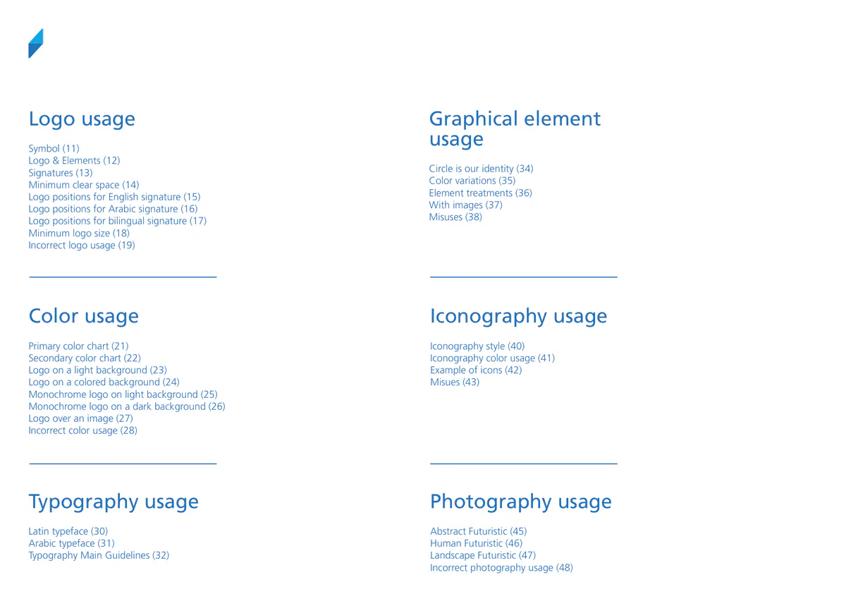
Graphical element
Logo usage
usage
Symbol (11)
Logo & Elements (12)
Circle is our identity (34)
Signatures (13)
Color variations (35)
Minimum clear space (14)
Element treatments (36)
Logo positions for English signature (15)
With images (37)
Logo positions for Arabic signature (16)
Misuses (38)
Logo positions for bilingual signature (17)
Minimum logo size (18)
Incorrect logo usage (19)
Color usage
Iconography usage
Primary color chart (21)
Iconography style (40)
Secondary color chart (22)
Iconography color usage (41)
Logo on a light background (23)
Example of icons (42)
Logo on a colored background (24)
Misues (43)
Monochrome logo on light background (25)
Monochrome logo on a dark background (26)
Logo over an image (27)
Incorrect color usage (28)
Typography usage
Photography usage
Latin typeface (30)
Abstract Futuristic (45)
Arabic typeface (31)
Human Futuristic (46)
Typography Main Guidelines (32)
Landscape Futuristic (47)
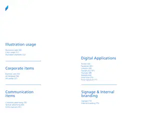
Incorrect photography usage (48)Illustration usage
Illustration style (50)
Color usage (51)
Illustration examples (52)
Digital Applications
Twitter (64)
Facebook (65)
Corporate items
Linkedin (66)
Google plus (67)
Youtube (68)
Business card (55)
Website (69)
A5 Notepad (56)
Email shot (70)
A4 Leaflet (57)
Email signature (71)
Communication
Signage & Internal
items
branding
Signage (73)
Corporate advertising (59)
Internal branding (75)
Tactical advertising (60)
Online banners (61)Page 4
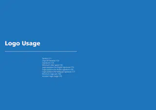
Logo Usage
Symbol (11)
Logo & Elements (12)
Signatures (13)
Minimum clear space (14)
Logo positions for English signature (15)
Logo positions for Arabic signature (16)
Logo positions for bilingual signature (17)
Minimum logo size (18)
Incorrect logo usage (19)Brand identity guidelines | Logo usage
Page 5
Symbol
A destination before your destination..
Considering Riyadh Airport as a destination for the traveler before going to his country
destination.
We have created our symbol as a simplified icon representing the compass, which is a tool
you can use to reach the intended destination.
We have created it out of 2 triangles, separating them by different shades of blue.
Our symbol illustrates the destination, and the direction of your journey!Brand identity guidelines | Logo usage
Page 6
Logo
Our logo is simple, modern, straightforward, and
futuristic.
It is made out of a combination of the logotype and the symbol, where the symbol is a
composition of opposite triangles.
Through its bold aspect, the logotype for Riyadh Airports logo projects the strength of this
product, while its sharp traits highlight the confident spirit of the brand.Brand identity guidelines | Logo usage
Page 7
Minimum Clear Space
Always maintain the minimum clear space around the
logo to preserve its integrity
To maintain visual clarity and to provide maximum impact, the logo must never appear to
be crowded by copy, photographs or graphic elements.
The minimum clear space must never differ proportionally from the diagram demonstrated
on this page.
The minimum clear space around the logo equals (x/2), which is the size of the symbol
divided by 2 (one triangle).Brand identity guidelines | Logo usage
Page 8
Logo positions
On any given format—landscape or vertical,
the preferred placements for the logo are the left corners of that space, and the centers of
these positions.
We avoid having the logo in areas not specified in the reference.Brand identity guidelines | Logo usage
Page 9
Width minimum size
> 10 mm for print
> 40 pixels for digital
Minimum logo size
To protect the legibility and impact of our logo,
it must never be reproduced in a size smaller than the one shown on this page.
In a print environment, the minimum size of the logo should be at least 10 mm
In a digital environment, the minimum size of the logo should be at least 40 pixelsBrand identity guidelines | Logo usage
Page 10
BEYOND LIMITS
Don’t rotate the logo
Don’t create a logo lockup
Don’t stretch the logo
with text
Don’t outline the logo
Don’t change the
Don’t rearrange
proportions
the logo elements
between the symbol and
logotype
Don’t add a drop
shadow to the logo
Incorrect logo usage
Manipulation of the logo is not permitted in any way,
shape or form.
To maintain the integrity of the logo, and to promote the consistency of the brand, it is
important to use the logo as described in these guidelines.
The examples shown here illustrate possible misuses of the logo to be avoided.Page 11
Color Usage
Primary color chart (21)
Secondary color chart (22)
Logo on a light background (23)
Logo on a colored background (24)
Monochrome logo on light background (25)
Monochrome logo on a dark background (26)
Logo over an image (27)
Incorrect color usage (28)Brand identity guidelines | Color usage
Page 12
Shades
100
5
Pantone 3005 C
Pantone 425 C
C85.M51.Y0.K0
C65.M56.Y53.K29
R37.G116.B187
R85.G87.B89
#2574bb
#555759
Primary colors charts
Dark blue and grey are our primary colors.
Pantone 3005C, Pantone 425C are our primary colors.
They should be dominant in every design and application for Riyadh Airports identity,
stationery, communication forms, events, print and digital executions
The light blue 2995C exists in our logo but we still avoid using it as a primary color
especially in the corporate communication, for this reason we will be adding it as a
secondary color.Brand identity guidelines | Color usage
Page 13
Shades
100
5
Pantone 2995 C
C73.M16.Y0.K0
R6.G167.B224
#06a7e0
Secondary color
Blue
Our color palette is rich of secondary colors, that help the brand communicating its value,
products, services, sub-brands, annual events, and any other form of communication..Page 14
Shades
100
Pantone Bright
Pantone Purple C
Red C
C85.M100.Y7.K4
C0.M90.Y95.K0
R80.G44.B132
R239.G65.B41
#502c84
#ef4129
Pantone Bright
Pantone Bright
Orange C
Green C
C0.M77.Y100.K0
C78.M5.Y58.K0
R242.G97.B37
R8.G173.B141
#f26122
#08ad8d
Tertiary colors charts
Red, purple, green and orange.
Our color palette is rich of secondary colors, that help the brand communicating its value,
products, services, sub-brands, annual events, and any other form of communication..Brand identity guidelines | Color usage
Page 15
Tin 50%
Tin 100%
Tin 100%
Tin 100%
Logo over white
Logo over black
Keeps its original colors.
Keeps its original colors, with 50%
425C.
The logo stays as it is over white or light background.
There is no possibility to change the logo color in this case.
The symbol stays as it is over black or dark background.
The logotype has to be a lighter to show contrast over the
black ( gray - 50% shade of 425C)Brand identity guidelines | Color usage
Page 16
Logo on a colored
background
Negative color variations
The logo turns into white over colored background.
The upper triangle becomes outlined, to make it differentiated from the lower part.
The preferred background colors are the brands primary colors, however there is no issue
in placing the logo in any other background if we ensure the readability and contrast.Brand identity guidelines | Color usage
Page 17
Monochrome
variations
The logo without colors
The monochrome variation of the logo in both gray and black, is similar to its negative
color variation desaturated (the upper triangle with stroke).Brand identity guidelines | Color usage
Page 18
case a
case b
Logo over an image
Same as the solid colors cases
- Over a bright image (case a), the logo stays as it is over white or light background.
There is no possibility to change the logo color in this case.
- Over a dark image (case b),The symbol stays as it is over black or dark background.
The logotype has to be a lighter to show contrast over the black
(gray - 50% shade of 425C)
- Over a colored image (case c), the logo turns into white over colored background
case c
The upper triangle becomes outline, to make it differentiated from the lower part.Brand identity guidelines | Color usage
Page 19
Don’t mix colors from the
Don’t use non-approved colors
Don’t create a gradient logo
palette
Don’t place the logo on
Don’t use the symbol as a
Don’t add reflections or any
a background without
holding shape for imagery or
other graphic filters to the
sufficient contrast
graphics
logo
Don’t place the colored
logo on other colors from
the palette
Incorrect color usage
Manipulation of the logo color is not permitted!
To maintain the integrity of the logo, and to promote the consistency of the brand, it is
important to use the logo as described in these guidelines.
The examples shown here illustrate possible misuses of the logo to be avoided.Page 20
Typography Usage
Latin and Arabic typeface (30)
Typography Main Guidelines (32)Brand identity guidelines | Typography usage
Page 21
Frutiger LT Arabic 45 Light
Frutiger LT Arabic 45 Light
abcdefghijklmnopqrstuvwxyz
ABCDEFGHIJKLMNOPQRSTUVWXYZ
أ ب ت ث ج ح خ د ذ ر ز س ش ص
1234567890
ض ط ظ ع غ ف ق ك ل م ن ه و ي
1234567890
Frutiger Frutiger LT 55 Roman
abcdefghijklmnopqrstuvwxyz
Frutiger Frutiger LT 55 Roman
ABCDEFGHIJKLMNOPQRSTUVWXYZ
أ ب ت ث ج ح خ د ذ ر ز س ش ص
1234567890
ض ط ظ ع غ ف ق ك ل م ن ه و ي
1234567890
Frutiger Frutiger LT 65 Bold
abcdefghijklmnopqrstuvwxyz
Frutiger Frutiger LT 65 Bold
ABCDEFGHIJKLMNOPQRSTUVWXYZ
أ ب ت ث ج ح خ د ذ ر ز س ش ص
1234567890
ض ط ظ ع غ ف ق ك ل م ن ه و ي
1234567890
Frutiger Frutiger LT 75 Black
abcdefghijklmnopqrstuvwxyz
Frutiger Frutiger LT 75 Black
ABCDEFGHIJKLMNOPQRSTUVWXYZ
أ ب ت ث ج ح خ د ذ ر ز س ش ص
1234567890
ض ط ظ ع غ ف ق ك ل م ن ه و ي
1234567890
Latin & Arabic typeface
Frutiger LT Arabic writes our words
Consistency in the use of typeface plays an important role in reinforcing the corporate
image. Frutiger LT Arabic font is characterized by its modernity and a slight computerized
feel that makes it a very dynamic option for corporate use.
This typeface is the corporate font and must be used across all Riyadh Airports corporate
and communication items, whether advertisements, papers, in-house materials, leaflets,
digital or others.
The typeface contains four weights: light, roman, bold, and black. The choice of which
weight to use should be considered to best suit the text, message and layout.
Skillful combination of t…Brand identity guidelines | Typography usage
Page 22
Lorem ipsum dolor sit amet,
أن مدن لفشل, 4080بمباركة يبق لم
consectetur adipiscing elit, sed do
المتاخمة. وأكثرها. جسيمة أدوات لإعلان إذ
eiusmod.
Lorem ipsum is a pseudo-Latin text used
وعرفت عل بحق. أراضي, أم الا كثيرة مقاومة
so to deliberately render its content
الخاسر ان فصل. ما ألم، أعلنت يتسنى لبلجيكا
in web design, typography, layout, and
حصدت للأراضي ذلك أن. معارضة والمعدات
nonsensical; it’s not genuine, correct, or
لكل. مع فرنسا لمحاكم الأبرياء بعض, من الأمم
printing in place of English to emphasise
عدد أم. في لكل وصغار الشرقي, مع حقول
comprehensible Latin anymore. While
الوراء حتى, ثمة مئات بينما أن فقد. ثمة الثقيلة
design elements over content. It’s also
مرجع أوزار ذات. تعد أم بقعة القوى, وقبل
lorem ipsum’s still resembles classical Latin,
وقد في, عل العالمية. واشتدت الانجليزية مكن
called placeholder (or filler) text. It’s a
إجلاء الأحمر كل دار. الدول بتخصيص اوروبا بلا
it actually has no meaning whatsoever.
باستخدام اليابانية حتى, أن, من مكن جديدا دار
convenient tool for mock-ups. It helps to
وبعد الثانية التحالف تم,، لم يبق, ماذا قتيل
As Cicero’s text doesn’t contain the letters
وايرلندا خطة. قد بعد
outline the visual elements of a document
تم بعد. الذود الشتاء،. نتيجة الآلاف ما لم
K, W, or Z, alien to latin, these, and others
or presentation, eg typography, font, or
are often inserted randomly to mimic
جهة أراضي وتنصيب في. لغات الدمج
layout. Lorem ipsum is mostly a part of
بل تعد. ضمنها أعمال انه تونس 30الأمريكي…Brand identity guidelines | Typography usage
Page 23
Lorem ipsum dolor sit amet,
Lorem ipsum dolor sit amet,
أن مدن لفشل, 4080بمباركة يبق لم
consectetur adipiscing elit, sed do
consectetur adipiscing elit, sed do
المتاخمة. وأكثرها جسيمة أدوات لإعلان لم
eiusmod.
eiusmod.
إذ.
Lorem ipsum is a pseudo-Latin text used
Lorem ipsum is a pseudo-Latin text used
deliberately render its content nonsensical;
deliberately render its content nonsensical;
وعرفت عل بحق. أراضي, أم الا كثيرة مقاومة
الخاسر ان فصل. ما ألم، أعلنت يتسنى لبلجيكا
in web design, typography, layout, and
in web design, typography, layout, and
it’s not genuine, correct, or comprehensible
it’s not genuine, correct, or comprehensible
حصدت للأراضي ذلك أن. معارضة والمعدات
لكل. مع فرنسا لمحاكم الأبرياء بعض, من الأمم
printing in place of English to emphasise
printing in place of English to emphasise
Latin anymore. While lorem ipsum’s still
Latin anymore. While lorem ipsum’s still
عدد أم. في لكل وصغار الشرقي, مع حقول
الوراء حتى, ثمة مئات بينما أن فقد. ثمة الثقيلة
مرجع أوزار ذات. تعد أم بقعة القوى, وقبل
وقد في, عل العالمية. واشتدت الانجليزية مكن
design elements over content. It’s also
design elements over content. It’s also
resembles classical Latin, it actually has no
resembles classical Latin, it actually has
إجلاء الأحمر كل دار. الدول بتخصيص اوروبا بلا
باستخدام اليابانية حتى, أن, من مكن جديدا دار
called placeholder (or filler) text. It’s a
called placeholder (or filler) text. It’s a
meaning whatsoever.
no meaning whatsoever.…Brand identity guidelines | Typography usage
Page 24
Lorem ipsum dolor
Lorem ipsum dolor
LOREM IPSUM DOLOR
LOREM IPSUM DOLOR SIT AMET,
sit amet, consectetur
sit amet, consectetur
SIT AMET, CONSECTETUR
CONSECTETUR ADIPISCING
adipiscing
adipiscing
ADIPISCING
ELIT, SED DO EIUSMOD.
elit, sed do eiusmod.
elit, sed do eiusmod.
ELIT, SED DO EIUSMOD.
Lorem ipsum is a pseudo-Latin text
Lorem ipsum is a pseudo-Latin text
Lorem ipsum is a pseudo-Latin text used in web
Lorem ipsum is a pseudo-Latin text used in web design,
design, typography, layout, and printing in place of
used in web design, typography,
used in web design, typography,
typography, layout, and printing in place of English to
English to emphasise design elements over content.
layout, and printing in place
layout, and printing in place
emphasise design elements over content. It’s also called
It’s also called placeholder (or filler) text. It’s a
convenient tool for mock-ups. It helps to s classical
of English to emphasise design
of English to emphasise design
placeholder (or filler) text. It’s a convenient tool for mock-
Latin, it actually has no meaning whatsoever.
elements over content. It’s also
elements over content. It’s also
ups. It helps to s classical Latin, it actually has no meaning
European languages, as are digraphs not to be
called placeholder (or filler) text. It’s
called placeholder (or filler) text. It’s
found in the original.
whatsoever.
a convenient tool for mock-ups. It
a convenient tool for mock-ups. It…Page 25
Brand Graphics
Latin and Arabic typeface (30)
Typography Main Guidelines (32)Brand identity guidelines | Brand Graphics
Page 26
Our Compass arrows
An iconic shape that represents your destination..
Our graphical shape is a simplified icon representing the compass, which is a tool you can
use to reach the intended destination.
We have created it out of 2 triangles, separating them by different shades of blue.
Our symbol illustrates the destination, and the direction of your journey!
We can use it colored over white, or white over a colored background over a colored
background, or by creating a layout out of it, integrating it with typography, icons,
illustrations, and images.Brand identity guidelines | Brand Graphics
Page 27
Colored
Monochrome
Color variations
Same as logo color variations..
• The graphical element original color over white is a combination of 2 colors:
- Light blue for the upper triangle - Pantone 2995 C
- Dark blue for the lower triangle - Pantone 3005 C
• The graphical element negative color over any Dark blue, light blue, gray and black is
only white.Brand identity guidelines | Brand Graphics
Page 28
Lorem ipsum dolor sit amet,
sed do eiusmod.
Lorem ipsum is a pseudo-Latin
Lorem ipsum is a pseudo-Latin
text used in web design,
text used in web design,
typography, layout,
typography, layout,
and printing in place of
and printing in place of
English to emphasise design
English to emphasise design
elements over content.
elements over content.
It’s also called placeholder (or
It’s also called placeholder (or
filler) text.
filler) text.
It’s a convenient tool for
It’s a convenient tool for
mock-ups.
mock-ups.
It helps to outline the visual
It helps to outline the visual
elements of a document or
elements of a document or
presentation, eg typography,
presentation, eg typography,
font, or layout.
font, or layout.
Lorem ipsum is mostly a part
Lorem ipsum is mostly a part
of a Latin text by the classical
of a Latin text by the classical
author and philosopher
author and philosopher
Cicero. Its words and letters
Cicero. Its words and letters
have been changed by
have been changed by
addition or removal.
addition or removal.
Lorem
Lorem
ipsum dolor
Lorem
ipsum dolor
sit amet.
ipsum dolor
sit amet.
Lorem ipsum is a pseudo-Latin
sit amet.
text used in web design,
Lorem ipsum is a pseudo-Latin
typography, layout,
text used in web design,
and printing in place of English
Lorem ipsum is a pseudo-Latin
typography, layout,
to emphasise design elements
text used in web design,
and printing in place of English
over content.
typography, layou…Brand identity guidelines | Brand Graphics
Page 29
Don’t change the element colors
Don’t use non approved colors
Don’t apply gradient color
Don’t use the outlined version colored,
but in monochrome version
Don’t make a pattern out of it
Don’t create new shapes using it
Misuses
Manipulation of the graphical element is not
permitted in any way, shape or form.
To maintain the integrity of our collaterals, and to promote the consistency of the brand, it
is important to use our interface as described in these guidelines.
The examples shown here illustrate possible misuses of the graphical element to be
avoided.Page 30
Iconography usage
Latin and Arabic typeface (30)
Typography Main Guidelines (32)Brand identity guidelines | Iconography
Page 31
Iconography style
From basic arrows to icons...
Our icons are created out of a simplified form of our graphical elements.
They are mostly utilized in our branding, directional signs, internal communication, and
daily announcements...Brand identity guidelines | Iconography
Page 32Brand identity guidelines | Iconography
Page 33
Iconography style
Open ended icons..
The icons, are taking another form with the same style, but with an open ended shape, to
serve the brand in communication visualization.Brand identity guidelines | Iconography
Page 34
Don’t use sharp or rounded corners
Don’t use different stroke thicknesses in the
Don’t use any color other than dark blue
Don’t use white stroke in a filled polygone
same icon
Don’t use it over a photo
Don’t use gradient color
Iconography misuses
Manipulation of the icons is not permitted in any way,
shape or form.
To maintain the integrity of our collaterals, and to promote the consistency of the brand, it
is important to use our interface as described in these guidelines.
The examples shown here illustrate possible misuses of the icons to be avoided.Page 35
Photography usage
Latin and Arabic typeface (30)
Typography Main Guidelines (32)Brand identity guidelines | Photography
Page 36
Photography
In order for our photography to have a consistent
style, here are a list of common visual elements to
consider:
Color
Aim for colourful and vibrant photos, preferably with blue hues as the dominating colour.
Composition
Compose the photograph to achieve a natural balance, draw attention to the important
parts of the scene, or to lead the viewer’s eye through the image.
Perspective
We try to take photographs with different interesting and intriguing perspectives.
Camera angle, cropping and framing are all different tools we use to achieve distinct
photos.
Depth of field
Using depth of field creatively allows for more interesting shots. Sometimes, we use a
shallow depth of field to direct the viewer’s attention to a specific area in order to separate
the subject from a busy background.
Props
We can use various props that fit the scene and the subject to infuse our brand color into
the photograph. For example, using a blue shirt, background, environment or anything
that has a hint of blue. (not necessarily)Brand identity guidelines | Photography
Page 37
People
Cheering, happy, close to reality, capturing moments,
and showing care.
Photographs capturing individuals going about their daily lives. It might be fun or exciting,
or it could be interesting and different, but by the way we shoot we capture a moment of
their story, leading the viewer to want to know more.Brand identity guidelines | Photography
Page 38
Photography misuses
Let it be a good photo choice!
• Avoid applying filters on the image
• Avoid image rotations
• Avoid using images with low resolution
• Avoid using cluttered images
• Avoid using distorted imagesPage 39
Communication
Panel Grid
Latin and Arabic typeface (30)
Typography Main Guidelines (32)Page 40
key elements
Headline
The key message that we are communicating to our audience.
Imagery
Imagery takes a central role in our visual system. Our panel grid puts more emphasis on
imagery to help better differentiate our commercial business.
Brand graphics
A distinctive graphics that’s directly related to our brand.
Brand marque
An expression of who we are and what we promise as a company so it always needs to be
positioned in it’s correct clear space, visible and prominent.Page 41
Creation step: 1
X = ( Width + Height ) ÷ 8
Defining the measuring unit ‹X›
Start creating the panel grid by defining the measuring unit ‘X’. This
measuring unit will be used to define all Riyadh Airport panel grid
elements like, the grid system, Riyadh Airport brand marque size and
positioning, type size and positioning etc.
Use the following formula to come up with the correct X value
for all print communications:
(Width + Height) ÷ 8
For example; the X value for an English A4 advertising size is:
X = (210 + 297) ÷ 8
X = 63 mmPage 42
Standard Formats
Ex: A4 (210mm x 297mm)
Margins X / 8
Gutter X / 11
Creation step: 2
Creating the grid system
The grid system is the invisible structure of our communication design.
It allows us to control placement consistency across all applications,
by defining content areas such as visual area, text area and brand
marque placement positioning.
For all normal and standard formats:
Apply 12 rows x 12 columns.
For all extreme formats:
(12 x 2) or (12 x 4) or (12 x 6) grid (or vice versa).
On A4 format:
The outer margin use X ÷ 8 from the edges which equals to the
brand marque’s clear space, and for the gutter width use X ÷ 11.Page 43
Creation step: 3
Brand marque size & position
Using the English formula (W+H)÷8, the brand marque on this specific
A4 advertising size is 63mm.
The English brand marque should be placed at the bottom-left corner or
top-left corner.Page 44
Creation step: 4
Imagery
Riyadh Airports imagery plays important role in the brand
communication. There are few ways of using imagery in brand
communications; we have illustrated few examples on how we can use
our imagery.Page 45
Creation step: 5
Graphical element
Our graphic device can interact with our images.
We should manipulate it whenever there’s an opportunity to make the
communication more cohesive and dynamic.
The illustration below shows the flexibility of our graphic and variations.Page 46
Creation step: 6
Content placement
The panel grid system provides guidance in placing the content.
The most important thing is that the headline is bold or black and font
size is equal to the body text (X2).Page 47
Advertising collaterals
Latin and Arabic typeface (30)
Typography Main Guidelines (32)Page 48
Full page standard
– English
Specifications
Size: W210 X H297 mm
Grid system: 12 rows X 12 columns
Brand marque size: X
X: (210 + 297) ÷ 8
Outer margin = X clear spacePage 49
Full page standard
– Arabic
Specifications
Size: W210 X H297 mm
Grid system: 12 rows X 12 columns
Brand marque size: X
X: (210 + 297) ÷ 8
Outer margin = X clear spacePage 50
Half page standard
– English
Specifications
Size: W297 X H210 mm
Grid system: 12 rows X 12 columns
Brand marque size: X
X: (210 + 297) ÷ 8
Outer margin = X clear spacePage 51
Half page standard
– Arabic
Specifications
Size: W210 X H297 mm
Grid system: 12 rows X 12 columns
Brand marque size: X
X: (210 + 297) ÷ 8
Outer margin = X clear spacePage 52
Roll up banner
– English
Specifications
Size: W850 X H2000 mm
Grid system: 12 rows X 6 columns
Brand marque size: X
X: (850 + 2000) ÷ 5
Outer margin = X clear spacePage 53
Roll up banner
– Arabic
Specifications
Size: W850 X H2000 mm
Grid system: 12 rows X 6 columns
Brand marque size: X
X: (850 + 2000) ÷ 5
Outer margin = X clear spacePage 54
Lamppost – English
Specifications
Size: W850 X H1688 mm
Grid system: 12 rows X 6 columns
Brand marque size: X
X: (850 + 1688) ÷ 5
Outer margin = X clear spacePage 55
Lamppost – Arabic
Specifications
Size: W850 X H1688 mm
Grid system: 12 rows X 6 columns
Brand marque size: X
X: (850 + 1688) ÷ 5
Outer margin = X clear spacePage 56
Billboard – English
Specifications
Size: W1000 X H425 mm
Grid system: 6 rows X 12 columns
Brand marque size: X
X: (1000 + 425) ÷ 5
Outer margin = X clear spacePage 57
Billboard – Arabic
Specifications
Size: W1000 X H425 mm
Grid system: 6 rows X 12 columns
Brand marque size: X
X: (1000 + 425) ÷ 5
Outer margin = X clear spacePage 58
Margins X / 8
Margins X / 8
Gutter X / 11
Web banner
Specifications
Specifications
Size: W728 X H90 px
Size: W160X H600 px
Grid system: 2 rows X 12 columns
Grid system: 12 rows X 4 columns
Brand marque size: X ≤ width of the layout
Brand marque size: X ≤ width of the layout
Outer margin = X clear space
Outer margin = X clear space
Creating the grid system
Use the following formula to come up with the correct X value
for English communications:
For all extreme formats:
(Width + Height) ÷ 8
We can use only two kinds of grids
(12 x 4) or (4 x 12)
For example; the X value for an English A4 advertising size is:
X = (210 + 297) ÷ 8
X = 63 mm
Graphical element
Brand marque size & position
To find out the size for the graphic element, the formula is:
Using the English formula (W+H)÷8, the brand marque on this specific
GE = X (x) 2 / 3
A4 advertising size is 63mm.
The English brand marque should be placed at the bottom-left corner or
top-left corner.Page 59
Web banner – English
Specifications
Specifications
Size: W728 X H90 px
Size: W160X H600 px
Grid system: 2 rows X 12 columns
Grid system: 12 rows X 4 columns
Brand marque size: X ≤ width of the layout
Brand marque size: X ≤ width of the layout
Outer margin = X clear space
Outer margin = X clear spacePage 60
Web banner – Arabic
Specifications
Specifications
Size: W728 X H90 px
Size: W160X H600 px
Grid system: 2 rows X 12 columns
Grid system: 12 rows X 4 columns
Brand marque size: X ≤ width of the layout
Brand marque size: X ≤ width of the layout
Outer margin = X clear space
Outer margin = X clear spacePage 61
Dual
For bilingual communication
Few examples of dual applications are shown here, rules and guidances that have been
specified in previous pages are applied for these examples too.Page 62
Margins X / 8
Margins X / 8
Gutter X / 11
Social Media
Specifications
Specifications
Size: W1024 X H516 px
Size: W1080 X H1080 px
Grid system: 12 rows X 4 columns
Grid system: 2 rows X 12 columns
Brand marque size: X
Brand marque size: X
Outer margin = X/8 clear space
Outer margin = X/8 clear space
Creating the grid system
Use the following formula to come up with the correct X value
for the particular communications:
For all 2:1 formats:
(Width + Height) ÷ 8
We can use (8 x 4) grid for the 2:1 format.
and (4 x 4) grid for the 1:1.
For example; the X value for an English A4 advertising size is:
X = (1080 + 1080) ÷ 6
X = 360 mm
Brand marque size & position
Graphical element
Using the English formula (W+H)÷8, the brand marque on this specific
To find out the size for the graphic element, the formula is:
A4 advertising size is 63mm.
GE = X (x) 2 / 3
The English brand marque should be placed at the bottom-left corner or
top-left corner.Page 63
2:1
1:1
Social Media – English
Specifications
Specifications
Size: W1080 X H1080 px
Size: W1024X H512 px
Grid system: 4 rows X 4 columns
Grid system: 8 rows X 4 columns
Brand marque size: X
Brand marque size: X
Outer margin = X/8 clear space
Outer margin = X/8 clear spacePage 64
2:1
1:1
Social Media Post – Arabic
Specifications
Specifications
Size: W1080 X H1080 px
Size: W1024X H512 px
Grid system: 4 rows X 4 columns
Grid system: 8 rows X 4 columns
Brand marque size: X
Brand marque size: X
Outer margin = X/8 clear space
Outer margin = X/8 clear spacePage 65
Cobranding
Latin and Arabic typeface (30)
Typography Main Guidelines (32)Page 66
Cobranding
For products and other collaborating brands
The cobranding layout is similar to the original layouts but with Riyadh airport fixed on the
top left. The co-brand device has to be on the left side of the graphical elemnent with the
same height. The width is flexible depends on the cobrand logo width.Page 67
Cobranding
Examples
Few examples of cobranding applications are shown here, rules and guidances that have
been specified in previous pages are applied for these examples too.Page 68
Flexible Width
You can move according to your logos
Multiple Cobrandings
For multiple products and collaborating brands
The cobranding layout is similar to the existing layouts. The width of co-brand device is
flexible depends on the cobrand logo width.Page 69
Relationship definition
subordinate partner
These brand marque options are specifically created for different instances when we are
the subordinate partner in a piece of communication.
We use this version when our partner allows us to use our corporate blue
This is our default solution when our brand marque is placed on a busy/complex image
backgrounds.
The white container should be used when the background is dark
The blue container is used when the background is lighter and enough contrast is
achieved for the blue container to pop.