Brand Guidelines
Communcation
2025
Solutions01 Brand Foundation
02 Logo
Index
03 Look & Feel
04 Photography
05 Graphic Elements
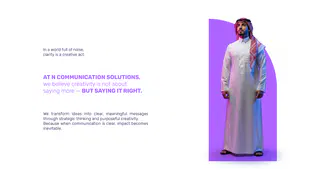
06 Applications01 Brand FoundationIn a world full of noise,
clarity is a creative act.
AT N COMMUNICATION SOLUTIONS,
we believe creativity is not about
saying more — BUT SAYING IT RIGHT.
We transform ideas into clear, meaningful messages
through strategic thinking and purposeful creativity.
Because when communication is clear, impact becomes
inevitable.Clarity is not a moment — it’s a mindset built for growth.
We exist to shape the future of communication by turning
complex ideas into clear, meaningful systems that evolve
across platforms, markets, and cultures.
Driven by strategic thinking and purposeful creativity, every message is
crafted with intention, every decision considers tomorrow, and every
partnership is built for long-term impact.
Because real communication doesn’t chase trends — it grows, adapts, and
lasts.PURPOSE OF THE GUIDE
This guide exists to protect clarity as N grows.
It defines how the brand looks, speaks, and behaves — ensuring consistency across every
platform, market, and future expansion.
More than rules, it is a shared reference that aligns teams, partners, and collaborators
around one clear vision:
to communicate with intention, intelligence, and lasting impact.
A GUIDE TO KEEP THE BRAND CLEAR — TODAY AND TOMORROW.
BRAND PERSONALITY
N is intelligent, confident, and intentional.
Not loud. Not playful. Not generic02 LogoThis is the main version of our logo,
Whenever possible, we will
prioritize the use of this version.A key part of maintaining a consistent look for the Communication
Solutions logo is to leave a clear, empty space around it that separates it
from any text, graphics, or other visual elements. Crowding the logo
reduces its clarity and impact.
The recommended clear space around the Communication Solutions logo
is equal to half the width of the logo.
The logo should always appear on its own. We do not recommend using
frames or boxes around it. However, in cases where framing is necessary,
it must be placed outside the minimum clear space.
We also need to ensure that our logo is easy to read at all times. When
reproducing the logo, its size and placement must be considered
carefully, keeping it within the safe area as shown.
Logo | Clear SpaceHorizontal
Vertical
The N logo is designed to adapt across different formats while maintaining clarity and consistency.
75 px
It is available in three approved versions: Horizontal, Vertical, and Icon Only.
Horizontal Logo
Used in wide layouts and applications where horizontal space allows for clear readability.
Vertical Logo
Icon Only
Used in stacked or compact layouts where vertical balance is required.
Minimum Size
Icon Only
Never use the N logo below 75 px.
Reserved for small-scale applications or situations where the full logo cannot be used, such as
Use official Final Artwork files only. No
favicons, social avatars, or brand marks.
modifications allowed.Misuse / Incorrect Usage
Avoid the following misuses to preserve
logo clarity and consistency
1
3
2
6
5
4
9
8
703 Look & FeelR=176 G=101 B=255
R=25 G=1 B=70
HEX b0 65 ff
HEX 19 1 46
RGB 176 101 255
RGB 25 1 70
CMYK 49 65 0 0
CMYK 96 100 30 49
LAB 57 51 -66
LAB 6 26 -38
GrayScale 45
GrayScale 94R=16 G=16 B=16
R=255 G=255 B=255
R=32 G=75 B=232
HEX 10 10 10
HEX ff ff ff
HEX 20 4b e8
RGB 16 16 16
RGB 255 255 255
RGB 32 75 232
CMYK 74 67 66 82
CMYK 0 0 0 0
CMYK 84 71 0 0
LAB 5 0 0
LAB 100 0 0
LAB 38 34 -85
GrayScale 94
GrayScale 0
GrayScale 69
Color Ratio
50%
30%
10%
10%حلول التواصل
Solutions
Communication
Rubik
Typeface04 PhotographyPhotography05 Graphic ElementsPatternPatternGraphic device
CREATIVITY
WITH
PURPOSE.Thank You