Al Jazeera Arabic Brand Guidelines - On AirAl Jazeera Arabic is a truly contemporary news channel,
aware of its relationship to digital media and aware of
its audience’s changing habit, while remaining true to a
noble tradition of journalism. We emphasize the content
produced at AJ because today more than ever, content
is king. Hence the need to ensure that engaging with the
content is effortless and enjoyable.DESIGN AT THE SERVICE OF
INFORMATION
Today, we’re flooded with a massive amount of data and we strongly believe that in order
to manage complexity, there’s nothing as powerful as simplicity.
A design that concentrates on readability and navigability, aims at creating the best
possible viewing experience.
- Inform rather than decorate.
- The power of simplicity.Manifesto
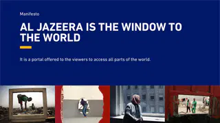
AL JAZEERA IS THE WINDOW TO
THE WORLD
It is a portal offered to the viewers to access all parts of the world.A STRONG EDITORIAL PHILOSOPHY
A channel which challenges perception, inspires the audiences and enhances the
understanding of what matters to them.A NEWS HUB FOR THE DIGITAL AGE
A consistent visual identity that gives strong foundations for designing across all
platforms : the new on-air design for AJ goes far beyond the TV set and becomes the
foundation of an identity project with more scope.A WHOLE SYSTEM, NOT JUST
A LOGO
The screens and their constant user interactions have brought the need for new branding
systems and vocabularies. Great contemporary brands, especially leading digital ones,
deploy a full in-depth brand identity, within which the logo is a part of a bigger systemCONCEPT THE MOVING FRAME
The moving frame acts as a close-up
- It helps decoding the world, isolating key information from the “noise”.
- The frame allows us to channel this massive flow of information and transforms it into clear and understandable form.
Highlighting the content
- The frame gives us the opportunity to outline text info, thus highlighting the content.
The screen within a screen
- The frame leads the viewer seamlessly from the TV screen to other platforms.
- It integrates the viewer within the content, thanks to new dialog spaces and speech bubbles. that has a powerful look & feel.CORE ELEMENTSCOLOUR PALETTE
The primary colour palette underpins the Al Jazeera Arabic brand. These colours also carry through to marketing
materials and all forms of communications.TYPOGRAPHY
Al Jazeera Arabic is the primary Arabic typeface. We use this in four different weights for all functional communications.
This is complemented by the DIN typeface to display numerals and words that cannot be displayed in arabic such as social
media hashtags.ICONS
A SET OF BOLD AND MINIMAL ICONS HAVE BEEN DEVELOPED THAT WORK AT ANY SIZE, ON ANY SURFACE AND ACROSS
ALL PLATFORMSLOGO
Our logo is our most important brand asset. It is a strong reflection of our heritage, our global presence, and our future. It
is recognisable across the world and needs to be treated with care in accordance with these guidelines.
The logo has two positions on screen. A lower right position is used during transmission, promos, news and programmes.
A central position is used at the end of channel generic promos.MASTER GRID AND SAFE AREAS
All design elemtents should fall within the master grid. This ensures consistency and
uniformity on screen.
Al Jazeera Arabic uses a saftey area for text and picture that is based on a 16:9 safe
area. The tag, logo and lower third should always be avoided.PROMOTIONS
A bold, dynamic and flexible promo system has been developed that aims to deliver
information quickly and concisely. Large typography is used to catch the eye of the
passing viewer. A subtle colour difference is used to separate news and programmes.PROMO SYSTEM - NEWS
Openers
Body of announcement
Outro options
Endboard
Title cards
1 Programme
Social display
2 Programmes
Media
3 Programmes
Coming nextPROMO SYSTEM - PROGRAMMES
Openers
Body of announcement
Outro options
Endboard
Title cards
1 Programme
Social display
2 Programmes
Media
3 Programmes
Coming nextNEWSLogo, Clock and TickersLower ThirdsBreaking NewsTags and Live BoxesPhonos and MapsFull Screen Graphics
Keypoints
Quotes
Side Panels
Agenda
News SummaryChartsSocial MediaTease and PromosPressSPORTSPORT
OVERVIEW OF KEYPOINTS, QUOTES AND SOCIAL MEDIABUSINESSBUSINESS
OVERVIEW OF KEYPOINTS, QUOTES AND SOCIAL MEDIAWEATHERWEATHER ICONS
A SET OF HIGH CONTRAST, MINIMAL ICONS HAVE BEEN DEVELOPED THAT WORK AT ANY SIZE, ON ANY SURFACE AND
ACROSS ALL PLATFORMSPROGRAMMESProgramme Generic On-Screen Architecture
All programming uses a set of generic screen architecture ensuring the brand stays
consistent. The use of neutral transparent black ensures harmony with all programmes
brands and gives a separation from newsProgramme Production Guidelines
This guide provides direction for the creation of all graphics, lower thirds, tags and end
credits. Safe areas, fonts and sizes are specificed along with exact pixel dimensions of all
elements.