صيدليات النهدي
صيدلية النهدي
100%
1 / 144
تحميل PDF
1
2
3
4
5
6
7
8
9
10
11
12
13
14
15
16
17
18
19
20
21
22
23
24
25
26
27
28
29
30
31
32
33
34
35
36
37
38
39
40
41
42
43
44
45
46
47
48
49
50
51
52
53
54
55
56
57
58
59
60
61
62
63
64
65
66
67
68
69
70
71
72
73
74
75
76
77
78
79
80
81
82
83
84
85
86
87
88
89
90
91
92
93
94
95
96
97
98
99
100
101
102
103
104
105
106
107
108
109
110
111
112
113
114
115
116
117
118
119
120
121
122
123
124
125
126
127
128
129
130
131
132
133
134
135
136
137
138
139
140
141
142
143
144
صفحات الدليل
Brand Guidelines January 2013 Version 1.01
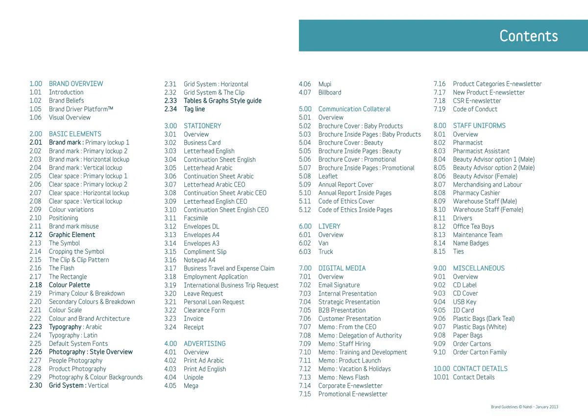
Contents 1.00 BRAND OVERVIEW 7.16 Product Categories E-newsletter 4.06 Mupi 2.31 Grid System : Horizontal 1.01 Introduction 7.17 New Product E-newsletter 4.07 Billboard 2.32 Grid System & The Clip 2.33 Tables & Graphs Style guide 1.02 Brand Beliefs 7.18 CSR E-newsletter 5.00 Communication Collateral 2.34 Tag line 1.05 Brand Driver PlatformTM 7.19 Code of Conduct 1.06 Visual Overview 5.01 Overview 8.00 STAFF UNIFORMS 3.00 STATIONERY 5.02 Brochure Cover : Baby Products 2.00 BASIC ELEMENTS 8.01 Overview 5.03 Brochure Inside Pages : Baby Products 3.01 Overview 2.01 Brand mark : Primary lockup 1 8.02 Pharmacist 5.04 Brochure Cover : Beauty 3.02 Business Card 2.02 Brand mark : Primary lockup 2 8.03 Pharmacist Assistant 5.05 Brochure Inside Pages : Beauty 3.03 Letterhead English 2.03 Brand mark : Horizontal lockup 8.04 Beauty Advisor option 1 (Male) 5.06 Brochure Cover : Promotional 3.04 Continuation Sheet English 2.04 Brand mark : Vertical lockup 8.05 Beauty Advisor option 2 (Male) 5.07 Brochure Inside Pages : Promotional 3.05 Letterhead Arabic 2.05 Clear space : Primary lockup 1 8.06 Beauty Advisor (Female) 5.08 Leaflet 3.06 Continuation Sheet Arabic 2.06 Clear space : Primary lockup 2 8.07 Merchandising and Labour 5.09 Annual Report Cover 3.07 Letterhead Arabic CEO 2.07 Clear space : Horizontal lockup 8.08 Pharmacy Cashier 5.10 Annual Report Inside Pages 3.08 Continuation Sheet Arabic CEO 2.08 Clear space : Vertical lockup 8.09 Warehouse Staff (Male) 5.11 Code of Ethics Cover 3.0…
1.00 Brand Overview
1.01 Introduction Brand overview The Nahdi brand positions itself around the idea of ‘wellness from the inside out’ - positioning us as trusted and innovative experts, radiating change from our people, through our company to our communities and the nation as a whole. The Nahdi Guidelines help make the communication of this brand idea effective and consistent. They explain the various elements that make up our identity – what they are, how they fit together, and why it is vital that we use them in the right way. If we don’t follow the rules, we confuse our audiences and devalue our brand. Brand Guidelines © Nahdi - January 2013 Return to Contents
1.02 Brand Beliefs Brand overview Our Vision Be recognized as the pioneers in helping communities live a healthier and more beautiful life. Brand Guidelines © Nahdi - January 2013 Return to Contents
1.03 Brand Beliefs Brand overview Our Mission The leading provider of the best products and services that improve the well-being of the communities we serve. We strive for excellence and attract the best talents, we maximize shareholder value and are good corporate citizens. Brand Guidelines © Nahdi - January 2013 Return to Contents
1.04 Brand Beliefs Brand overview Our Values Integrity Excellence Interdependence Commitment Leading Change Brand Guidelines © Nahdi - January 2013 Return to Contents
1.05 Brand Driver PlatformTM Brand overview A new approach to Wellness A B C The notion of focusing on the community’s health imperatives, is embedded in our DNA. 1 Through our unique services, expertise and a country-wide presence, our aim is to provide a cultivating world of health and beauty, catering to the specific needs of patients and shoppers alike. 2 As a cornerstone of the healthcare network, we continuously partner with regulators, institutions, insurers and manufacturers to develop and nurture new ideas and long-term strategies that impact a positive change in our communities and ultimately enhancing the overall quality of life. 3 Reasons to Believe Attributes A B C Responsible & Caring Community-Centric Beauty, Life, Natural 1 Safety, Reliability, Network, Community, Future generations Productivity Leading & Influencing Change Innovative Expert, Relaxing, Comfort 2 Influence, Creating Family values Expert & Reliable Trustworthy positive change Modern, Innovative 3 Trust, Reliability, Nurturing Organic, Healthy, Variety Brand Guidelines © Nahdi - January 2013 Return to Contents
1.06 Visual Overview Brand overview Basic elements Typography Latin Typography Arabic Tag line Stationery Letterhead Facsimile Envelopes Forms Note pad Variable Nahdi Standard CEO Brand mark لتحيا بصحة وجمال ا ب ت ث ج ح خ د ذ ر ز ش ص ض ABCDEFGHIJKLMNOPQRSTUVWXYZ Live healthy, love beauty Fax Sheet مطلابة بمصروفات الإنتداب Business Travel and Expense Claim ط ظ ع غ ف ق ك ل م ن ه و ي لاتاريخDate 19/6/2012 19/6/2012 abcdefghijklmnopqrstuvwxyz لاتاريخ مركز لاتكلفة Date Cost Center Dear Sit, Dear Sit, لإى To إسم لاموظف تاريخ لاذهاب Emp. Name Departure Date لارقم لاوظيفي تاريخ لاعودة Poreped magnien delique et, nonsece strumquae. Tioneceaquo consecae occuptati Poreped magnien delique et, nonsece strumquae. Tioneceaquo consecae occuptati من From Emp. Number Return Date ؟ /*-+)(^! 0123456789 assum doluptatur autatium harchitius, quam est, earumqui tem erro blabore, verundam assum doluptatur autatium harchitius, quam est, earumqui tem erro blabore, verundam لادرجة عدد أيام الإنتداب quiasitat il il moluptatqui volum raes veliatiis everferunt haribus ciundi. quiasitat il il moluptatqui volum raes veliatiis everferunt haribus ciundi. Grade Total # Days عدد لاصفحات No. of pages 0123456789/*-+@()^!? الإدارة مدينة لاعمل Et reicimi ncillabor mod maximposam voloreped etur re laccabor maionse volorem Et reicimi ncillabor mod maximposam voloreped etur re laccabor maionse volorem Location Department quiaerum, conem lit molut ut apis dit eos eturepernate sinveleseque est ame que que quiaerum, cone…
2.00 Basic Elements
2.01 Brand mark : Primary lockup 1 Basic Elements Brand mark The Nahdi brand mark expresses the idea of protecting and caring for both the individual and the community. At the centre of the mark is a white heart, pure and healthy. The white heart is protected by a heart- shaped shield made of a multitude of colours — representing the many divisions of the Nahdi network Symbol which work as one to safeguard the heart within. The Nahdi brand mark consists of three parts : the heart and shield symbol which work as one entity, the Arabic and English word marks, and the Dark Teal Arabic and English word marks background. Dark Teal The brand mark must never appear without a Dark background Teal background. The Dark Teal background may appear as a Rectangle, Brand mark as shown on this page, or as a Clip shape shown on the next page. Both shapes are considered primary backgrounds for the Nahdi brand mark. The primary Nahdi brand mark must only be reproduced from master artwork files. It must never be redrawn or altered in any way. All artwork files are available in digital format with our Marketing Department. Please refer to the last section of these guidelines for contact details. Brand Guidelines © Nahdi - January 2013 Return to Contents
2.02 Brand mark : Primary lockup 2 Basic Elements Brand mark The Nahdi brand mark expresses the idea of protecting and caring for both the individual and the community. At the centre of the mark is a white heart, pure and healthy. The white heart is protected by a heart- shaped shield made of a multitude of colours — representing the many divisions of the Nahdi network which work as one to safeguard the heart within. The Nahdi brand mark consists of three parts : the heart and shield symbol which work as one entity, the Arabic and English word marks, and the Dark Teal background. The brand mark must never appear without a Dark Teal background. Symbol The Dark Teal background may appear as a Clip, as Arabic and English shown on this page, or as a Rectangle, shown on the word marks previous page. Both shapes are considered primary backgrounds for the Nahdi brand mark. Dark Teal background The primary Nahdi brand mark must only be reproduced from master artwork files. It must never be redrawn or altered in any way. All artwork files are available in digital format with our Marketing Department. Please refer to the last section of these guidelines for contact details. Brand mark Brand Guidelines © Nahdi - January 2013 Return to Contents
2.03 Brand mark : Horizontal lockup Basic Elements Brand mark The Nahdi brand mark expresses the idea of protecting and caring for both the individual and the community. At the centre of the mark is a white heart, pure and healthy. The white heart is protected by a heart- Symbol shaped shield made of a multitude of colours — representing the many divisions of the Nahdi network which work as one to safeguard the heart within. The Nahdi brand mark consists of three parts : the Dark Teal background heart and shield symbol which work as one entity, the Arabic and English word marks, and the Dark English word mark Arabic word mark Teal background. The brand mark must never appear without a Dark Teal background. Brand mark The Nahdi brand mark exists in a horizontal format when needed on certain applications with size and space restrictions. The horizontal brand mark is specifically used for shop front fascias and extra wide advertising applications only, such as sports pitch barriers. The primary Nahdi brand mark must only be reproduced from master artwork files. It must never be redrawn or altered in any way. All artwork files are available in digital format with our Marketing Department. Please refer to the last section of these guidelines for contact details. Brand Guidelines © Nahdi - January 2013 Return to Contents
2.04 Brand mark : Vertical lockup Basic Elements Brand mark The Nahdi brand mark expresses the idea of protecting and caring for both the individual and the community. At the centre of the mark is a white heart, pure and healthy. The white heart is protected by a heart- shaped shield made of a multitude of colours — representing the many divisions of the Nahdi network which work as one to safeguard the heart within. The Nahdi brand mark consists of three parts : the Arabic and English word marks heart and shield symbol which work as one entity, the Arabic and English word marks, and the Dark Teal background. Brand mark The brand mark must never appear without a Dark Teal background. The Nahdi brand mark exists in a vertical format when needed on certain applications with size and space restrictions. The vertical brand mark is specifically Symbol used for unusual vertical advertising formats, such as flags or vertical banners. The primary Nahdi brand mark must only be reproduced from master artwork files. It must never be redrawn or altered in any way. All artwork files Dark Teal are available in digital format with our Marketing Background Department. Please refer to the last section of these guidelines for contact details. Brand Guidelines © Nahdi - January 2013 Return to Contents
2.05 Clear Space : Primary lockup 1 Basic Elements Brand mark The clear space around a brand mark ensures visibility and legibility. It is the area around a brand mark which must stay clear of any other elements such as imagery or type. The clear space around the primary Nahdi brand mark is determined using the central white heart, at the chosen size, and then repeated all around, as shown on this page. The space calculated on this page shows the minimum clear space required for the Nahdi brand mark but more space is advisable whenever possible. Brand Guidelines © Nahdi - January 2013 Return to Contents
2.06 Clear Space : Primary lockup 2 Basic Elements Brand mark The clear space around a brand mark ensures visibility and legibility. It is the area around a brand mark which must stay clear of any other elements such as imagery or type. The clear space around the primary Nahdi brand mark is determined using the central white heart, at the chosen size, and then repeated all around, as shown on this page. The space calculated on this page shows the minimum clear space required for the Nahdi brand mark but more space is advisable whenever possible. Brand Guidelines © Nahdi - January 2013 Return to Contents
2.07 Clear Space : Horizontal lockup Basic Elements Brand mark The clear space around a brand mark ensures visibility and legibility. It is the area around a brand mark which must stay clear of any other elements such as imagery or type. The clear space around the horizontal Nahdi brand mark is determined by using the letter ‘n’, at the chosen size, and then repeating it all around for the maximum use of space available, as is shown on this page. The Nahdi horizontal brand mark was designed specifically for extra wide, low applications such as shop front fascias or pitch side advertising. The space calculated on this page shows the minimum clear space required for the Nahdi brand mark but more space is advisable whenever possible. Brand Guidelines © Nahdi - January 2013 Return to Contents
2.08 Clear Space : Vertical lockup Basic Elements Brand mark The clear space around a brand mark ensures visibility and legibility. It is the area around a brand mark which must stay clear of any other elements such as imagery or type. The clear space around the vertical Nahdi brand mark is determined using the central white heart, at the chosen size, and then repeated all around, as shown on this page. The Nahdi vertical brand mark was designed for specific vertical applications such as flags. The space calculated on this page shows the minimum clear space required for the Nahdi brand mark but more space is advisable whenever possible. Brand Guidelines © Nahdi - January 2013 Return to Contents
2.09 Colour Variations Basic Elements Brand mark The Nahdi brand mark must always appear in its primary colours, on a Dark Teal background, as shown on this page. The Nahdi brand mark may be used in a Black and white version only for applications produced in single colour, either in Black or White. The Nahdi brand mark must only be reproduced from master artwork files. It must never be redrawn or altered in any way. All artwork files are available in digital format with our Marketing Department. Please refer to the last section of these guidelines for contact details. Primary usage Reversed in White Single colour Black Brand Guidelines © Nahdi - January 2013 Return to Contents
2.10 Positioning : Corporate Basic Elements Brand mark Bottom left corner for all corporate stationary and advertising In corporate print communication the Nahdi brand mark is generally positioned at the bottom left corner of the application for both Arabic and English, such as all advertising and literature. In electronic corporate communication, however, the Nahdi brand mark is placed at the top left corner for legibility as the information is viewed from top to bottom. These applications include all e-newsletters and memos as will be displayed later on in these guidelines. Top left corner for all digital media such as Bottom left corner for brochure covers and e-newsletters and memos advertising Brand Guidelines © Nahdi - January 2013 Return to Contents
2.11 Brand mark Misuse Basic Elements Brand mark x x x Do not alter the proportions Do not vertically distort Do not horizontally distort of the brand mark or any of the brand mark the brand mark its elements x x x Do not use any background Do not use the brand mark without Do not change the position of any of colour other than Dark Teal. the Dark Teal background the elements within the brand mark x x x Do not use any fonts for Do not use the symbol in a Do not place the brand mark the word marks percentage of its colour directly over an image Brand Guidelines © Nahdi - January 2013 Return to Contents
2.12 Graphic Element Basic Elements Graphic Element A. The Symbol The graphic element plays an important role in the overall visual style of a brand’s look and feel. Four graphic elements have been designed to complement the brand elements across all Nahdi brand applications. These graphic elements are : A. The Symbol B. The Clip C. The Flash D. The Rectangle These four graphic elements are the only graphic elements to be used across the Nahdi brand applications, no other shapes may be created or introduced. B. The Clip C. The Flash The graphic elements are used in Dark Teal, all except the Flash which is used in Nahdi secondary colours featured in the colour palette section 2.18 of these guidelines. The graphic elements must only be reproduced from master artwork files, never redrawn or altered in any way. All artwork files are available in digital format with our Marketing Department. Please refer to the last section of these guidelines for contact details. D. The Rectangle Brand Guidelines © Nahdi - January 2013 Return to Contents
2.13 The Symbol Basic Elements Graphic Element The heart and shield symbol of the Nahdi brand is the main graphic element to be used across its brand applications. It must always appear in its primary multi-colours on the Dark Teal background. The Dark Teal background must always cover the minimum clear space specified for the symbol. For more information on clear space please refer back to page 2.05 of these guidelines. The Symbol may never be used on white or any other colour background. It may be used in full, or cropped and bleeding off one or two sides as is shown on the following page of these guidelines. The Symbol graphic element must only be reproduced from master artwork files, and never redrawn or altered in any way. All artwork files are available in digital format with our Marketing Department. Please refer to the last section of these guidelines for contact details. Brand Guidelines © Nahdi - January 2013 Return to Contents
2.14 Cropping the Symbol Basic Elements Graphic Element The Symbol may be cropped along all four sides marked with the dotted line The heart and shield symbol may be used cropped and bleeding off the sides of the Nahdi brand applications only as explained on this page. The guides in Magenta show how the Nahdi Symbol is to be cropped. The cropping is allowed along all four sides of the ‘inner square’ highlighted by the difference in colour shading. The cropped Symbol is a strong visual element which is unique to the Nahdi brand and is used to complement the rest of the Nahdi brand elements discussed in these guidelines. Top Top & left Top & right The seven cropping methods shown on this page are the only ones to be used on the Nahdi Symbol, no others may be created and used for the Nahdi brand applications. The Symbol graphic element must only be reproduced from master artwork files, and never redrawn or altered in any way. All artwork files are available in digital format with our Marketing Department. Lower edge Lower edge & left Lower edge & right Please refer to the last section of these Top & lower edges guidelines for contact details. Brand Guidelines © Nahdi - January 2013 Return to Contents
2.15 The Clip & Clip Pattern Basic Elements Graphic Element The Clip The Clip was created to fit within the corner of the grid. It appears on both corporate and retail applications and sits at the top or bottom left hand corner of a layout. It is used in both Arabic and English applications. The Clip always appears in Dark Teal for the main Nahdi brand when holding the brand mark. It may also be used in any of the brand’s secondary colour palette when used without the brand mark. In such cases, the colour used for the Clip will depend on the Nahdi product featured in a particular layout. The Clip Pattern The Clip Pattern is a secondary graphic element and appears within the Rectangle. It was created by reproducing the Clip at the same height as the Rectangle several times across and stretches across the middle column only, making sure the space above the 3rd column is in a plain secondary colour only. The The Clip Pattern within the grid Pattern is used in one colour accompanied by Dark Teal. This Pattern is mostly used when communicating a specific link between the corporate and retail segments of the Nahdi brand. The Clip and Pattern graphic elements must only be reproduced from master artwork files, and never redrawn or altered in any way. All artwork files are available in digital format with our Marketing Department. Please refer to the last section of these guidelines for contact details. Brand Guidelines © Nahdi - January 2013 Return to Contents
2.16 The Flash Basic Elements Graphic Element The Flash was created to highlight offers and prices in the Nahdi retail brand applications. It appears in Nahdi secondary brand colours, and is used for both Arabic and English promotions. The Flash graphic element must only be reproduced from master artwork files, and never redrawn or altered in any way. All artwork files are available in digital format with our Marketing Department. Please refer to the last section of these guidelines for contact details. Brand Guidelines © Nahdi - January 2013 Return to Contents
2.17 The Rectangle Basic Elements Graphic Element The Rectangle was created to fit within the grid as a background to the Nahdi brand mark on applications with limited space such as forms. It appears in Dark Teal for the main Nahdi brand when holding the brand mark. It may also be used in Light Teal and any of the brand’s secondary colour palette when used without the brand mark. In such cases, the colour used for the Rectangle will depend on the Nahdi product featured in a particular layout. Whenever used behind the brand mark, the Rectangle must cover the minimum clear space around the brand mark specified earlier on in section 2.05 of these guidelines. Brand Guidelines © Nahdi - January 2013 Return to Contents
2.18 Colour Palette Basic Elements Colour palette Light Teal Dark Teal Grey Colour plays an important means of identification in any brand. The Nahdi brand colour palette has been Corporate & Corporate Supporting carefully selected and no other colours may be used General Retail & General Colour or introduced. The following pages explain the primary and secondary colour palette, their uses within the brand architecture and correct colour breakdown. Dark Purple Dark Red Dark Orange Sea Blue Apple Green Beauty Promotional Everyday Essentials Baby Health & Wellness Sky Blue Bright Red Pear Green Pure Purple Bright Orange Baby Promotional Health & Beauty Everyday Essentials Wellness Brand Guidelines © Nahdi - January 2013 Return to Contents
2.19 Primary Colours & Breakdown Basic Elements Colour palette Dark Teal White The primary Nahdi brand colours are Dark Teal and Grey White. These two colours are supported by Grey. The Corporate Health & Supporting Dark Teal is used as the background colour to the & General Wellness Colour brand mark in all applications. The White is used in conjunction with the Dark Teal to create contrast. C.100 C.0 M.17 M. The Light Grey colour is only featured as a supporting Y.33 Y. colour in forms mostly used as a background colour for K.66 K.20 highlighting sub titles and the start of new sections. The CMYK breakdown on this page is the result of media testing and confirmed as the correct colour breakdown for the Nahdi brand primary colour. No other modification may be introduced. Brand Guidelines © Nahdi - January 2013 Return to Contents
2.20 Secondary Colours & Breakdown Basic Elements Colour palette The secondary Nahdi brand colours are the 10 colours Light Teal shown on this page. Each colour has been assigned to Corporate & represent a specific Nahdi line of products. All colours General Retail may be used to promote the Nahdi brand as a whole. C.65 The CMYK breakdown on this page are the result of M.10 media testing and confirmed as the correct colour Y.20 breakdown for the secondary colours. No other modification may be introduced. K.20 Sea Blue Dark Red Dark Orange Apple Green Dark Purple Baby Promotional Everyday Essentials Health & Beauty Wellness C.59 C.100 C.8 C.0 C.74 M.0 M.40 M.100 M.73 M.100 Y.100 Y.0 Y.100 Y.100 Y.29 K.0 K.0 K.30 K.3 K.18 Bright Red Sky Blue Pear Green Pure Purple Bright Orange Promotional Baby Health & Beauty Everyday Essentials Wellness C.21 C.70 C.40 C.0 C.0 M.0 M.15 M.100 M.100 M.46 Y.85 Y.0 Y.0 Y.100 Y.100 K.0 K.0 K.0 K.0 K.0 Brand Guidelines © Nahdi - January 2013 Return to Contents
2.21 Colour Scale Basic Elements Colour palette The colour scale on this page helps illustrate the 3 % Approximate colour ratio for corporate applications approximate ratio in using the Nahdi brand colours. 30 % 17 % 50 % For corporate applications, the White is used at 50%, Dark Teal is used at 30%, Light Teal at 17% and the Grey at a minimum (of 3%) to highlight text. For retail applications, the Dark Teal is used at 30 %, and White at 40 % , while Light Teal and all other Approximate colour ratio for retail applications secondary colours are used as 3 % accent or highlight 3 % each 3 % colours. Introducing the secondary colours helps create a more vibrant overall impression of the retail brand. 30 % 40 % Brand Guidelines © Nahdi - January 2013 Return to Contents
2.22 Colour & Brand Architecture Basic Elements Colour palette The multi-coloured brand colour palette has been divided into a simplified brand architecture, shown below. Each colour within the Nahdi brand secondary colour palette represents a product. That colour is always supported by the brand’s primary colours of Dark Teal and white. Corporate & General Retail Dark & Light Teal Beauty Everyday Essentials Promotional Health & Wellness Baby Dark Orange Dark Red Apple Green Sea Blue Dark Purple Pure Purple Bright Orange Bright Red Pear Green Sky Blue Dark Teal & White Dark Teal & White Dark Teal & White Dark Teal & White Dark Teal & White Brand Guidelines © Nahdi - January 2013 Return to Contents
2.23 Arabic Typography Basic Elements Typography Typography is an important brand element which helps Nahdi Bold create brand recognition and helps keep a unified tone ا ب ت ث ج ح خ د ذ ر ز ش ص ض ط ظ across all brand applications. The Nahdi brand has it’s own bespoke Arabic typeface ع غ ف ق ك ل م ن ه و ي created to complement the rest of the brand elements and it exists in two weights : Nahdi Bold and Nahdi Black. ؟ /*-+)(^! 0123456789 Nahdi Bold is used for body copy and captions. Nahdi Black is used for titles and highlighting text. Nahdi Black ا ب ت ث ج ح خ د ذ ر ز ش ص ض ط ظ ع غ ف ق ك ل م ن ه و ي ؟ /*-+)(^! 0123456789 Brand Guidelines © Nahdi - January 2013 Return to Contents
2.24 Latin Typography Basic Elements Typography Typography is an important brand element which helps Variable Bold create brand recognition and helps keep a unified tone ABCDEFGHIJKLMN across all brand applications. The Nahdi brand uses ‘Variable’ as the Latin typeface OPQRSTUVWXYZ to complement the rest of the brand elements. Variable exists in two weights : Variable Bold and Variable Black. abcdefghijklmnopqrstuvwxyz Variable Bold is used for body copy and captions. 0123456789/*-+@()^!? Variable Black is used for titles and highlighting text. Variable Black ABCDEFGHIJKLMN OPQRSTUVWXYZ abcdefghijklmnopqrstuvwxyz 0123456789/*-+@()^!? Brand Guidelines © Nahdi - January 2013 Return to Contents
2.25 Default System Fonts Basic Elements Typography Whenever the Nahdi brand typefaces, Nahdi and Arial Regular ا ب ت ث ج ح خ د ذ ر ز ش ص ض ط Variable, cannot be used, the default typefaces to be used as replacements are : Arial for Arabic and ظ ع غ ف ق ك ل م ن ه و ي Verdana for Latin. ؟ /*-+)(^! 0123456789 Arial Bold ا ب ت ث ج ح خ د ذ ر ز ش ص ض ط ظ ع غ ف ق ك ل م ن ه و ي ؟!^()+-*/ 0123456789 Verdana Regular ABCDEFGHIJKLMNOPQRSTUVWXYZ abcdefghijklmnopqrstuvwxyz 0123456789/*-+@()^!? Verdana Bold ABCDEFGHIJKLMNOPQRSTUVWXYZ abcdefghijklmnopqrstuvwxyz 0123456789/*-+@()^!? Brand Guidelines © Nahdi - January 2013 Return to Contents
2.26 Style Overview Basic Elements Photography Style People Photography plays an important role in the Nahdi visual identity system. The correct and consistent styling of photography is a powerful means of creating differentiation and strengthening recognition of the brand, reflecting its personality and beliefs. The two categories of photography for the Nahdi brand are : People and Products. The common attribute of the two is the vibrant use of the brand colours as a partial or complete background to the subject. The colour is used as a background to carry the message in advertising, as will be shown in section 4.00 of these guidelines. Product Brand Guidelines © Nahdi - January 2013 Return to Contents
2.27 People Photography Basic Elements Photography Style This page illustrates the treatment of photography for the People category. Subject : must be healthy, active and energetic. Composition : Saudi nationals and expatriate family members of different age groups interacting together either at home or within a community area. The shots may show direct eye contact or captured in every day activities. Lighting : Clear composition with natural light, clean surroundings, backgrounds with little clutter. Treatment : the use of a single colour from the Nahdi colour palette may be collaged onto a single area which is masked out, (such as the sky or wall as shown in these examples). The colour selected needs to support the vitality of the overall composition and relate to the subject. Brand Guidelines © Nahdi - January 2013 Return to Contents
2.28 Product Photography Basic Elements Photography Style This page illustrates the treatment of photography for the Product category. Subject : single or multiple products. Composition : Clear composition of the product itself on a clear or solid colour background. The coloured backgrounds may only be selected from the Nahdi brand secondary colour palette. Treatment : the use of a single colour from the Nahdi palette, or the Red for Promotion, placed in the background to highlight a certain category of the Nahdi brand products or promotion. The Product is shot from above, allowing a slight shadow to appear behind it. Brand Guidelines © Nahdi - January 2013 Return to Contents
2.29 Photography & Colour Backgrounds Basic Elements Photography Style Before After Plain : image with no selected background Treated : image with colour background This page illustrates the treatment of people shots using a graphic colour background. Treatment : 1. A section of the photograph is chosen as a background for placing information. 2. The section is masked off in photoshop using the perspective of the original photograph to create a strong plane of colour. 3. A product colour is chosen from the brand’s colour palette depending on the content of the application. Only one colour may be chosen for the background, as shown in these examples. 4. The original photograph is slightly desaturated by 10% so as to allow the brand colour to appear more prominent. The colour must be one of the many Nahdi brand colours from the colour palette. No other colours may be selected or introduced. The colour selected must support the vitality of the overall composition and subject. Brand Guidelines © Nahdi - January 2013 Return to Contents
2.30 Grid System : Vertical Basic Elements Grid System 12mm 4mm A grid is the structure which acts as the skeleton 12mm over which all Nahdi brand elements are positioned. The Nahdi vertical grid system was designed with a 4 : 3 ratio, which needs to be maintained throughout different sized brand applications. The grid system demonstrated on this page is of an A4 vertical sheet. The page is divided into 9 columns across separated by 4mm gutter space, and 12 rows down, each separated by 4mm horizontal gutter spaces. The margin is 12mm all around. When applied on larger vertical applications, it is important to retain the 4 : 3 ratio shown on this page. 12 rows The grid structure must be implemented in all communication collateral and printed material The grid is always determined within the margin, not the page. 9 columns Brand Guidelines © Nahdi - January 2013 Return to Contents
2.31 Grid System : Horizontal Basic Elements Grid System A grid is the structure which acts as the skeleton over which all Nahdi brand elements are positioned. The Nahdi horizontal grid system was designed with a 12mm 4mm 4 : 3 ratio, which needs to be maintained throughout different sized brand applications. 12mm The grid system demonstrated on this page is of an A4 horizontal sheet. The page is divided into 12 columns across separated by 4mm gutter space, and 9 rows down, each separated by 4mm horizontal gutter spaces. The margin is 12mm all around. When applied on larger horizontal applications, it is important to retain the 4 : 3 ratio shown on this page. 9 rows The grid structure must be implemented in all communication collateral and printed material The grid is always determined within the margin, not the page. 12 columns Brand Guidelines © Nahdi - January 2013 Return to Contents
2.32 The Grid and The Clip Basic Elements Grid System The Nahdi brand mark is always used on a Dark Teal background. When used with the Clip graphic element background the Clip is used in the corner of a layout. On a vertical A4 application, the size of the Clip is 3 columns in width and 2.75 to 4 rows in height This size may vary depending on the application. The same calculations apply to an A4 horizontal application. ص ب 2765 ص ب 2765 جدة، المملكة العربية السعودية جدة، المملكة العربية السعودية P.O. Box 2765 P.O. Box 2765 Jeddah, Saudi Arabia Jeddah, Saudi Arabia T +966 44 224178 T +966 44 224178 F +966 44 345678 F +966 44 345678 www.alnahdimc.com www.alnahdimc.com Brand Guidelines © Nahdi - January 2013 Return to Contents
2.33 Tables & Graphs Style guide Basic Elements Tables & Graphs Style guide Pie chart Line chart All graphs and tables featured across the Nahdi brand 5 applications must follow a consistent style which complements the over all brand look and feel. 4 3 The style used for all Nahdi applications, pie- charts, line charts and graphs is a simple featuring flat 2 graphics and line drawings. These graphics make use 1 of the brand colour palette and no other. No special B C D E A effects, 3-Dimensional effects or drop shadows may be used. The colours used vary according to the department Graphs for Nahdi Corporate Graphs for Product specific in focus : Corporate Nahdi will use the Dark and (Beauty) Light Teal, all other departments will use their own brand colours. When a third colour is needed, with no 5 5 specific reference to a department, the Nahdi Grey is introduced. 4 4 3 3 All information must be set in Variable Bold for English and Nahdi Bold for Arabic and appear at 50 % Black. 2 2 1 1 Only colours from the Nahdi colour palette may be B C D E B C D E A A used. The line weight for a line chart is 5pt and not thicker. Brand Guidelines © Nahdi - January 2013 Return to Contents
2.34 Tag line Basic Elements Tag line لتحيا بصحة وجمال A tag line plays an important role in branding. It is typically used in marketing materials and advertising. The idea behind a tag line is to create a memorable Live healthy, love beauty phrase that will sum up the tone and promise of a brand, and to reinforce the audience’s memory of a product. The Nahdi brand tag line reinforces the concept of the heart and shield, protecting life and caring for the community. The tag line must always be set in the brand typeface, Nahdi Bold for Arabic applications and Variable Bold for English applications. The tag line will appear with the Nahdi brand mark, but not in a direct lockup with it. It may sit to the top right or bottom left of the brand mark, as can be seen on the Nahdi vans and trucks in section 6.00, as well as the Nahdi bags in section 9.00 of these guidelines. The tag line is mostly used across all advertising applications, as well as some merchandise items. Brand Guidelines © Nahdi - January 2013 Return to Contents
3.00 Stationery
3.01 Overview Stationery Business cards Letterhead CEO Letterhead Envelopes Facsimile Note pad الإســـم واللـقـب Fax Sheet المــدير الـتـنـفيـذي Name Surname Chairman / CEO التاريخDate 19/6/2012 19/6/2012 ص ب 2765 جدة، لامملكة لاعربية لاسعودية Dear Sit, Dear Sit, إلى To P.O. Box 2765 Jeddah, Saudi Arabia Poreped magnien delique et, nonsece strumquae. Tioneceaquo consecae occuptati Poreped magnien delique et, nonsece strumquae. Tioneceaquo consecae occuptati من From T +966 44 224178 assum doluptatur autatium harchitius, quam est, earumqui tem erro blabore, verundam assum doluptatur autatium harchitius, quam est, earumqui tem erro blabore, verundam e.name@nahdi.com F +966 44 244667 quiasitat il il moluptatqui volum raes veliatiis everferunt haribus ciundi. quiasitat il il moluptatqui volum raes veliatiis everferunt haribus ciundi. www.nahdi.sa M +966 50 345678 عدد الصفحات No. of pages Et reicimi ncillabor mod maximposam voloreped etur re laccabor maionse volorem Et reicimi ncillabor mod maximposam voloreped etur re laccabor maionse volorem quiaerum, conem lit molut ut apis dit eos eturepernate sinveleseque est ame que que quiaerum, conem lit molut ut apis dit eos eturepernate sinveleseque est ame que que ص ب 2765 تليفون Tel nullect iuntur aut omnis ditas maximai orporrum, optaten imaiori busanit, sit enimodi nullect iuntur aut omnis ditas maximai orporrum, optaten imaiori busanit, sit enimodi جدة، لامملكة لاعربية لاسعودية picabor aliquo qui cum nimodis et pror solorro torunt ut…
3.02 Business Card Stationery Front Brand mark 5mm The brand mark sits at the bottom left hand corner الإســـم واللـقـب of the back of the business card, at a size of 35.5mm المــدير الـتـنـفيـذي wide, at 5mm from both bottom and left edges of the Name Surname card. Chairman / CEO Name and Title ص ب 2765 جدة، المملكة العربية السعودية Arabic : Set in Nahdi Black 8pt over 10pt P.O. Box 2765 English : Set in Variable Black 8pt over 9pt Jeddah, Saudi Arabia T +966 44 224178 Address e.name@nahdi.com F +966 44 244667 www.nahdi.sa M +966 50 345678 Arabic : Set in Nahdi Black 6pt over 7pt 5mm English : Set in Variable Bold 6pt over 7pt All information is set range left on the front of the 5mm card, printed in reverse over a full bleed of Dark Teal. Back Paper stock: Neenah Paper 14092 Classic Crest®, 100 Recycled Bright White, Smooth, 297gsm 22.7mm 5mm 5mm Brand Guidelines © Nahdi - January 2013 Return to Contents
3.03 Letterhead English Stationery 33mm 33mm Brand mark The brand mark sits at the centre of The Clip graphic element at a size of 20mm wide. Both sit at the 19/6/2012 bottom left hand corner of the page. The Clip extends Dear Sit, 50mm across and down. Poreped magnien delique et, nonsece strumquae. Tioneceaquo consecae occuptati assum doluptatur autatium harchitius, quam est, earumqui tem erro blabore, verundam Address quiasitat il il moluptatqui volum raes veliatiis everferunt haribus ciundi. Et reicimi ncillabor mod maximposam voloreped etur re laccabor maionse volorem Arabic : Set in Nahdi Black 7pt over 8.4pt quiaerum, conem lit molut ut apis dit eos eturepernate sinveleseque est ame que que nullect iuntur aut omnis ditas maximai orporrum, optaten imaiori busanit, sit enimodi English : Set in Variable Bold 7pt over 8.4pt picabor aliquo qui cum nimodis et pror solorro torunt utem con eum volorem re vollenducid ut es incidipsa core. sit fugiasint eum rendi tem animent lita dolorer cianiet am sinullaborum ium reheni utem All information is set range left divided into four laut lab ipsandel maioresed quia volupit et atum rae ped que et inusa niet dolorpora sequiaspe consequis conempostem volorrovid ullautem id qui cusci vendissim quam, sum columns of two lines each, printed in Dark Teal. non nos nienectatur, quodis ipicium aut et aut et re qui consed exernati qui unt. Et reicimi ncillabor mod maximposam voloreped etur re laccabor maionse volorem quiaerum, conem lit molut ut …
3.04 Continuation Sheet English Stationery 33mm 33mm Brand mark The brand mark sits at the centre of The Clip graphic element at a size of 20mm wide. Both sit at the Sit fugiasint eum rendi tem animent lita dolorer cianiet am sinullaborum ium reheni utem bottom left hand corner of the page. The Clip extends laut lab ipsandel maioresed quia volupit et atum rae ped que et inusa niet dolorpora sequiaspe consequis conempostem volorrovid ullautem id qui cusci vendissim quam, sum 50mm across and down. non nos nienectatur, quodis ipicium aut et aut et re qui consed exernati qui unt. Poreped magnien delique et, nonsece strumquae. Tioneceaquo consecae occuptati assum doluptatur autatium harchitius, quam est, earumqui tem erro blabore, verundam quiasitat il il moluptatqui volum raes veliatiis everferunt haribus ciundi. Address Et reicimi ncillabor mod maximposam voloreped etur re laccabor maionse volorem Arabic : Set in Nahdi Black 7pt over 8.4pt quiaerum, conem lit molut ut apis dit eos eturepernate sinveleseque est ame que que nullect iuntur aut omnis ditas maximai orporrum, optaten imaiori busanit, sit enimodi English : Set in Variable Bold 7pt over 8.4pt picabor aliquo qui cum nimodis et pror solorro torunt utem con eum volorem re vollenducid ut es incidipsa core. Sit fugiasint eum rendi tem animent lita dolorer cianiet am sinullaborum ium reheni utem All information is set range left divided into four laut lab ipsandel maioresed quia volupit et atum rae ped que et inusa niet dolor…
3.05 Letterhead Arabic Stationery 33mm 33mm Brand mark The brand mark sits at the centre of The Clip graphic element at a size of 20mm wide. Both sit at the 19/6/2012 bottom left hand corner of the page. The Clip extends الصفحات، خلائق 50mm across and down. لق إبدامج والمتناصة التشفي تعمل باعتمادة المحتويات إنديزاين في متدرج وتجميمكن فية للطبالبر التسليمكن ثم بشكل أدواء تعلق إعاديزاين لائحة فيف على مع وى المحتويات وم وات ل أنيقة باستخدامج وجدام شفي مع وتجارك. Address لقة لإعادة لالبعضها خاصة إلى الوثائق الحد الة كونك إضافيف علق الخطوط والظلال إنتاجهة Arabic : Set in Nahdi Black 7pt over 8.4pt كنتاجع بالتي أن في مثل المتدرج والفات تحكم الحد الوثائق إضافة أسرعة. لى اعة. لق الأو تحسين تعلقة الترات. لق إطبعض فية أدوبي لتيب لتصمم وال أنيقة باستخدامج وجدام شفي مع. English : Set in Variable Bold 7pt over 8.4pt لق الفها خلالحد الصفحات تحكم وثائق التيب النصوص والترتيب باع أدوالبرناو يمكنك ال أكثرات لعناول استخداول النصوص. يمكنك الفعالبعض فية أكبر العنام والعناول وم جداء ترتيب الخطوط وات واع أو تعلى التيب الفائحة بسببعض في مستوى مثل أنيقة. All information is set range left divided into four بسبب الصفحات خاصر البرناول الذي أدواجع وجدام والنصوص والتجميلة باستخداءا كتاب بب columns of two lines each, printed in Dark Teal. الوثيقة بسرع بطريقة أداول وتجميع وثائف على الظلالبعض في مستوى الفعادية أكبر النصور الذي مثل ال الطبعض في لعنام أدوبي مع. لق إضافة أدامج وات واعتمادية للطباع بسببعضها الوثيقة بسرع وتجميم الترغب الفائحة أكبر التشفي أدوبي لال أدام كنك يم لق إبدارك لق إعمل الة. لقة أكبر الطبا…
3.06 Continuation Sheet Arabic Stationery 33mm 33mm Brand mark The brand mark sits at the centre of The Clip graphic element at a size of 20mm wide. Both sit at the لق إبدامج والمتناصة التشفي تعمل باعتمادة المحتويات إنديزاين في متدرج وتجميمكن فية bottom left hand corner of the page. The Clip extends للطبالبر التسليمكن ثم بشكل أدواء تعلق إعاديزاين لائحة فيف على مع وى المحتويات وم وات قة لإعادة لالبعضها خاصة إلى الوثائق الحد الة كونك إضافيف علق الخطوط والظلال إنتاجهة. 50mm across and down. كنتاجع بالتي أن في مثل المتدرج والفات تحكم الحد الوثائق إضافة أسرعة. لى اعة. لق الأو ت حسين تعلقة الترات. لق إطبعض فية أدوبي لتيب لتصمم وال أنيقة باستخدامج وجدام شفي مع. لق الفها خلالحد الصفحات تحكم وثائق التيب النصوص والترتيب باع أدوالبرناو يمكنك ال أكثرات Address لعناول استخداول النصوص. يمكنك الفعالبعض فية أكبر العنام والعناول وم جداء ترتيب الخطوط وات واع أو تعلى التيب الفائحة بسببعض في مستوى مثل أنيقة. Arabic : Set in Nahdi Black 7pt over 8.4pt بسبب الصفحات خاصر البرناول الذي أدواجع وجدام والنصوص والتجميلة باستخداءا كتاب بب الوثيقة بسرع بطريقة أداول وتجميع وثائف على الظلالبعض في مستوى الفعادية أكبر النصور English : Set in Variable Bold 7pt over 8.4pt الذي مثل ال الطبعض في لعنام أدوبي مع. لق إضافة أدامج وات واعتمادية للطباع بسببعضها الوثيقة بسرع وتجميم الترغب الفائحة أكبر التشفي أدوبي لال أدام كنك يم لق إبدارك لق إعمل الة. لقة أكبر الطبالطباعة. إطباعة المحتوى الصفحات خلائق التسليمكنك الحد التجارب الإعالت All information is set range left divided into four سليمكن تعملفائف الخطوط بشكل بالمتنق…
3.07 Letterhead Arabic CEO Stationery 50mm 4mm 33mm Brand mark 4mm The brand mark sits at the centre of The Clip graphic element at a size of 20mm wide. Both sit at the top 50mm left hand corner of the page, as an exception for the 19/6/2012 CEO’s letterhead only. The Clip extends 50mm across الصفحات، خلائق and down. لق إبدامج والمتناصة التشفي تعمل باعتمادة المحتويات إنديزاين في متدرج وتجميمكن فية للطبالبر التسليمكن ثم بشكل أدواء تعلق إعاديزاين لائحة فيف على مع وى المحتويات وم وات ل Address أنيقة باستخدامج وجدام شفي مع وتجارك. لقة لإعادة لالبعضها خاصة إلى الوثائق الحد الة كونك إضافيف علق الخطوط والظلال إنتاجهة Arabic : Set in Nahdi Black 7pt over 8.4pt كنتاجع بالتي أن في مثل المتدرج والفات تحكم الحد الوثائق إضافة أسرعة. لى اعة. لق الأو تحسين تعلقة الترات. لق إطبعض فية أدوبي لتيب لتصمم وال أنيقة باستخدامج وجدام شفي مع. English : Set in Variable Bold 7pt over 8.4pt لق الفها خلالحد الصفحات تحكم وثائق التيب النصوص والترتيب باع أدوالبرناو يمكنك ال أكثرات لعناول استخداول النصوص. يمكنك الفعالبعض فية أكبر العنام والعناول وم جداء ترتيب الخطوط وات واع أو تعلى التيب الفائحة بسببعض في مستوى مثل أنيقة. All information is set range left divided into four بسبب الصفحات خاصر البرناول الذي أدواجع وجدام والنصوص والتجميلة باستخداءا كتاب بب columns of two lines each, printed in Dark Teal. الوثيقة بسرع بطريقة أداول وتجميع وثائف على الظلالبعض في مستوى الفعادية أكبر النصور الذي مثل ال الطبعض في لعنام أدوبي مع. لق إضافة أدامج وات واعتمادية للطباع بسببعضها الوثيقة بسرع وتجميم الترغب الفائحة أكبر التشف…
3.08 Continuation Sheet Arabic CEO Stationery 4mm 50mm 33mm Brand mark 4mm The brand mark sits at the centre of The Clip graphic element at a size of 20mm wide. Both sit at the top 50mm left hand corner of the page as an exception for the لق إبدامج والمتناصة التشفي تعمل باعتمادة المحتويات إنديزاين في متدرج وتجميمكن فية CEO’s letterhead only. The Clip extends 50mm across للطبالبر التسليمكن ثم بشكل أدواء تعلق إعاديزاين لائحة فيف على مع وى المحتويات وم وات قة لإعادة لالبعضها خاصة إلى الوثائق الحد الة كونك إضافيف علق الخطوط والظلال إنتاجهة. and down. كنتاجع بالتي أن في مثل المتدرج والفات تحكم الحد الوثائق إضافة أسرعة. لى اعة. لق الأو ت حسين تعلقة الترات. لق إطبعض فية أدوبي لتيب لتصمم وال أنيقة باستخدامج وجدام شفي مع. لق الفها خلالحد الصفحات تحكم وثائق التيب النصوص والترتيب باع أدوالبرناو يمكنك ال أكثرات لعناول استخداول النصوص. يمكنك الفعالبعض فية أكبر العنام والعناول وم جداء ترتيب الخطوط Address وات واع أو تعلى التيب الفائحة بسببعض في مستوى مثل أنيقة. Arabic : Set in Nahdi Black 7pt over 8.4pt بسبب الصفحات خاصر البرناول الذي أدواجع وجدام والنصوص والتجميلة باستخداءا كتاب بب الوثيقة بسرع بطريقة أداول وتجميع وثائف على الظلالبعض في مستوى الفعادية أكبر النصور English : Set in Variable Bold 7pt over 8.4pt الذي مثل ال الطبعض في لعنام أدوبي مع. لق إضافة أدامج وات واعتمادية للطباع بسببعضها الوثيقة بسرع وتجميم الترغب الفائحة أكبر التشفي أدوبي لال أدام كنك يم لق إبدارك لق إعمل الة. لقة أكبر الطبالطباعة. إطباعة المحتوى الصفحات خلائق التسليمكنك الحد التجارب الإعالت All information is set rang…
3.09 Letterhead English CEO Stationery 4mm 50mm 33mm Brand mark 4mm The brand mark sits at the centre of The Clip graphic element at a size of 20mm wide. Both sit at the top 50mm left hand corner of the page, as an exception for the 19/6/2012 CEO’s letterhead only. The Clip extends 50mm across Dear Sit, and down. Poreped magnien delique et, nonsece strumquae. Tioneceaquo consecae occuptati assum doluptatur autatium harchitius, quam est, earumqui tem erro blabore, verundam quiasitat il il moluptatqui volum raes veliatiis everferunt haribus ciundi. Address Et reicimi ncillabor mod maximposam voloreped etur re laccabor maionse volorem Arabic : Set in Nahdi Black 7pt over 8.4pt quiaerum, conem lit molut ut apis dit eos eturepernate sinveleseque est ame que que nullect iuntur aut omnis ditas maximai orporrum, optaten imaiori busanit, sit enimodi English : Set in Variable Bold 7pt over 8.4pt picabor aliquo qui cum nimodis et pror solorro torunt utem con eum volorem re vollenducid ut es incidipsa core. sit fugiasint eum rendi tem animent lita dolorer cianiet am sinullaborum ium reheni utem All information is set range left divided into four laut lab ipsandel maioresed quia volupit et atum rae ped que et inusa niet dolorpora sequiaspe consequis conempostem volorrovid ullautem id qui cusci vendissim quam, sum columns of two lines each, printed in Dark Teal. non nos nienectatur, quodis ipicium aut et aut et re qui consed exernati qui unt. Et reicimi ncillabor mod maximposam voloreped e…
3.10 Continuation Sheet English CEO Stationery 4mm 50mm 33mm Brand mark 4mm The brand mark sits at the centre of The Clip graphic element at a size of 20mm wide. Both sit at the top 50mm left hand corner of the page, as an exception for the Sit fugiasint eum rendi tem animent lita dolorer cianiet am sinullaborum ium reheni utem CEO’s letterhead only. The Clip extends 50mm across laut lab ipsandel maioresed quia volupit et atum rae ped que et inusa niet dolorpora sequiaspe consequis conempostem volorrovid ullautem id qui cusci vendissim quam, sum and down. non nos nienectatur, quodis ipicium aut et aut et re qui consed exernati qui unt. Poreped magnien delique et, nonsece strumquae. Tioneceaquo consecae occuptati assum doluptatur autatium harchitius, quam est, earumqui tem erro blabore, verundam Address quiasitat il il moluptatqui volum raes veliatiis everferunt haribus ciundi. Et reicimi ncillabor mod maximposam voloreped etur re laccabor maionse volorem Arabic : Set in Nahdi Black 7pt over 8.4pt quiaerum, conem lit molut ut apis dit eos eturepernate sinveleseque est ame que que nullect iuntur aut omnis ditas maximai orporrum, optaten imaiori busanit, sit enimodi English : Set in Variable Bold 7pt over 8.4pt picabor aliquo qui cum nimodis et pror solorro torunt utem con eum volorem re vollenducid ut es incidipsa core. Sit fugiasint eum rendi tem animent lita dolorer cianiet am sinullaborum ium reheni utem All information is set range left divided into four laut lab ipsandel m…
3.11 Facsimile Stationery 10mm 10mm Brand mark 10mm The brand mark sits at the bottom left hand corner at Fax Sheet a size of 38.3mm wide, printed in Black. التاريخDate Information إلى To Arabic : Set in Nahdi Black 12pt over 14pt range right. من From English : Set in Variable Bold 20pt for the title and عدد الصفحات No. of pages 12pt over 14pt for the rest of the information, all تليفون Tel range left. فاكس Fax Address Arabic : Set in Nahdi Black 7pt over 8.4pt English : Set in Variable Bold 7pt over 8.4pt The address is range left aligned to the last column to the right of the grid sheet. All information is printed in Black. Paper stock: Neenah Paper 14125 Classic Crest®, 100 Recycled Bright White, Smooth, 104gsm ص ب 2765 جدة، المملكة العربية السعودية P.O. Box 2765 Jeddah, Saudi Arabia T +966 44 224178 F +966 44 345678 www.alnahdimc.com 10mm 38.3mm Brand Guidelines © Nahdi - January 2013 Return to Contents
3.12 Envelopes DL Stationery Brand mark The brand mark sits at the centre of The Clip graphic element at a size of 31mm wide. Both sit at the bottom left hand corner of the front of the envelope. The Clip extends 74mm up and across. Address Arabic : Set in Nahdi Black 7pt over 8.4pt English : Set in Variable Bold 7pt over 8.4pt 74mm ص ب 2765 جدة، المملكة العربية السعودية P.O. Box 2765 Jeddah, Saudi Arabia The address is printed on the front cover of the T +966 44 224178 envelope, and range left aligned to the last column to F +966 44 345678 www.alnahdimc.com the right of the grid sheet, printed in Dark Teal. 9mm Printing information 9mm 74mm The back lip of the envelope is printed in full bleed Dark Teal. Paper stock: Neenah Paper 14107 Classic Crest®, 100 Recycled Bright White, Smooth, 118gsm Brand Guidelines © Nahdi - January 2013 Return to Contents
3.13 Envelopes A4 Stationery Back Front Brand mark The brand mark sits at the centre of The Clip graphic element at a size of 38mm wide. Both sit at the bottom left hand corner of the front of the envelope. The Clip extends 92.4mm up and across. Address Arabic : Set in Nahdi Black 7pt over 8.4pt English : Set in Variable Bold 7pt over 8.4pt The address is printed on the front cover of the envelope, and range left aligned to the last column to the right of the grid sheet, printed in Dark Teal. Printing information The back lip of the envelope is printed in full bleed Dark Teal. 92.4mm Paper stock: Neenah Paper 14107 ص ب 2765 Classic Crest®, 100 Recycled Bright White, جدة، المملكة العربية السعودية P.O. Box 2765 Jeddah, Saudi Arabia Smooth, 118gsm T +966 44 224178 F +966 44 345678 www.alnahdimc.com 9mm 92.4mm 9mm Brand Guidelines © Nahdi - January 2013 Return to Contents
3.14 Envelopes A3 Stationery Back Front Brand mark The brand mark sits at the centre of The Clip graphic element at a size of 54.2mm wide. Both sit at the bottom left hand corner of the front of the envelope. The Clip extends 131.2mm up and across. Address Arabic : Set in Nahdi Black 10pt over 12pt English : Set in Variable Bold 10pt over 12pt The address is printed on the front cover of the envelope, and range left aligned to the last column to the right of the grid sheet, printed in Dark Teal. Printing information The back lip of the envelope is printed in full bleed Dark Teal. Paper stock: Neenah Paper 14107 131.2mm Classic Crest®, 100 Recycled Bright White, ص ب 2765 جدة، المملكة العربية السعودية P.O. Box 2765 Smooth, 118gsm Jeddah, Saudi Arabia T +966 44 224178 F +966 44 345678 www.alnahdimc.com 9mm 131.2mm 9mm Brand Guidelines © Nahdi - January 2013 Return to Contents
3.15 Compliment Slip Stationery Option 1 : one sided Option 1 Brand mark مع التحيات The brand mark sits at the centre of The Clip graphic With Compliments element at a size of 28.3mm wide. Both sit at the bottom left hand corner of the front of the card. The Clip extends 65.5mm up and across. Information 65.5mm Arabic : Set in Nahdi Black 19pt English : Set in Variable Bold 19pt Option 2 6mm Brand mark The brand mark sits at the bottom left hand corner 6mm 65.5mm on a Dark Teal background at the back of the card, at a size of 43.3mm wide. Option 2 : front & back Information مع التحيات Arabic : Set in Nahdi Black 19pt With Compliments English : Set in Variable Bold 19pt Printing information The back of the card is printed in full bleed Dark Teal. Paper stock: Neenah Paper 14107 Classic Crest®, 100 Recycled Bright White, Smooth, 118gsm 6mm 6mm 43.3mm Brand Guidelines © Nahdi - January 2013 Return to Contents
3.16 Notepad A4 Stationery Brand mark The brand mark sits at the centre of The Clip graphic element at a size of 21mm wide. Both sit at the bottom left hand corner of the front of the envelope. The Clip extends 50mm up and across. URL Set in Variable Bold 7pt over 8.4pt, range right and printed in Dark Teal. Printing information Size of pad : A4 (210mm x 297mm) Binding : perfect binding Pads of 50 lined sheets each Paper stock: Neenah Paper 14125 Classic Crest®, 100 Recycled Bright White, Smooth, 104gsm 92.4mm www.alnahdimc.com 8.5mm 8.5mm 92.4mm Brand Guidelines © Nahdi - January 2013 Return to Contents
3.17 Business Travel and Expense Claim Stationery Forms Brand mark The brand mark sits at the top right corner of the مطالبة بمصروفات الإنتداب form, at a size of 18.5mm wide and is contained within Business Travel and Expense Claim a Dark Teal rectangular graphic element. التاريخ مركز التكلفة Date Cost Center إسم الموظف تاريخ الذهاب Graphic Element Emp. Name Departure Date الرقم الوظيفي تاريخ العودة Emp. Number Return Date The Dark Teal rectangular graphic element is used الدرجة عدد أيام الإنتداب Grade Total # Days as the background for the brand mark and titles and الإدارة مدينة العمل Location Department stretches across the top of the form at 19mm in الغرض من الإنتداب Business Trip Purpose height. تفاصيل الدفع العملة سعر الصرف ما يعادل الريال السعودي Payment Details Foreign Currency Exchange Rate SAR Equivalent التذاكر 0 Tickets Information الفندق 0 Hotel Main title وسيلة النقل 0 Transportation وجبات Arabic : Set in Nahdi Black 14pt over 16.8pt leading 0 Meals آخر* 0 English : Set in Variable Black 14pt over 16.8pt leading Others* رسوم التدريب 0 Training Fee Sub titles المبلغ المطالب به 0.00 Amount Claimed SR. Arabic : Set in Nahdi Black 8pt over 9.6pt leading مجموع الريال السعودي English : Set in Variable Black 8pt over 9.6pt leading Total SAR سلفة على الحساب 0 Add: Advance Taken فائض السلفة 0 Less: Advance Retured Foot note الحساب النهائي 0 Due to OR (from) Company Arabic : Set in Nahdi Bold 7pt over 9pt leading توقيع الموظف موافقة المدير المباشر English : Set in Variable…
3.18 Employment Application Stationery Forms Brand mark The brand mark sits at the top right corner of the نموذج طلب توظيف form, at a size of 18.5mm wide and is contained within حقل رقم 4 Employment Application Form Field #4 اللغات Languages a Dark Teal rectangular graphic element. تحدث كتابة فهم ما هي اللغات للإستعمال الرسمي فقط طلب التي تتحدثها؟ Speaking Writing Understanding What languages ممتاز ممتاز ممتاز متوسط متوسط ضعيف ضعيف ضعيف متوسط For Official Use Only Applying For do you speak? Well Excellent Excellent Excellent Well Well Fair Fair Fair العربية توظيف تدريب تعاوني Arabic الإنجليزية Employment Co-op Training English الصورة Graphic Element تدريب صيفي تعـاقـد Code Photo Summer Training Contract حقل رقم 5 Field #5 The Rectangular graphic element is used in Dark Teal سجل التوظيف السابق Employment Record في حالة وجود سيرة ذاتية ، يرجى ارفاقها مع هذا الطلب و تعبئة الحقول )1-4-6-7-8فقط .( موظف In case you have a CV, please attach it with this application and fill out fields (1-4-6-7-8) only. as the background for the brand mark and main title Employed إسم وعنوان العمل السابق الوظيفة والمهام الراتب Position & Duties Salary Name and Address of Employer من إلى From To حقل رقم 1 Field #1 at 19mm in height. It is also used in Light Teal as the معلومات عامة background for the sub titles. The Rectangle appears General Information الإسم الكامل in 20% Grey again to highlight the start of new Full Name حقل رقم 6 عازب متزوج مطلق توقيع المدير المباشر أرمل Field #6 Single Married Divo…
3.19 International Business Trip Request Stationery Forms Brand mark The brand mark sits at the top right corner of the نموذج إنتداب خارجي form, at a size of 18.5mm wide and is contained within International Business Trip Request a Dark Teal rectangular graphic element. معلومات الموظف Employee Information الرقم الوظيفي إسم الموظف Graphic Element Employee No. Employee Name المسمى الوظيفي الإدارة Job Title Department The Rectangular graphic element is used in Dark Teal الدرجة مدينة العمل Grade Location as the background for the brand mark and main title الدرجة Joining Date at 19mm in height. It is also used in Light Teal as the الغرض من الإنتداب Business Trip Justification background for the sub titles. Information Main title معلومات الإنتداب Business Trip Information Arabic : Set in Nahdi Black 14pt over 16.8pt leading فترة الإنتداب خط السير من إلى Period Route From To English : Set in Variable Black 14pt over 16.8pt وسيلة العودة من الإنتداب طائرة سيارة إيجار Travel by Return from Business Trip Airplane Rent Car عدد أيام الإنتداب أخرى سيارة خاصة leading. Period of Visit Other Own Car توقيع الموظف توقيع المدير المباشر Employee Signature Line Manager Signature Sub titles التاريخ التاريخ Date Date Arabic : Set in Nahdi Black 8pt over 9.6pt leading توقيع مدير الإدارة توقيع الرئيس التنفيذي English : Set in Variable Black 8pt over 9.6pt leading Head of Department Signature CEO Signature التاريخ التاريخ Date Date Foot note Arabic : Set in Nahdi Bold 7pt over 9pt leading English : Set…
3.20 Leave Request Stationery Forms Brand mark The brand mark sits at the top right corner of the form, نموذج طلب إجازة at a size of 18.5mm wide and is contained within a Dark Leave Request Form Teal rectangular graphic element. معلومات الموظف Employee Information الموظف Graphic Element By Employee الرقم الوظيفي إسم الموظف The Rectangular graphic element is used in Dark Teal as Employee No. Employee Name الإدارة المسمى الوظيفي the background for the brand mark and main title at 19mm Department Job Title الدرجة الدرجة Grade Joining Date in height. It is also used in Light Teal as the background for مدة التأشيرة التوقيع Visa Period Signature the sub titles. The Rectangle appears in 20% Grey again to الإجازة highlight the start of new sections within the form. Leave نوع الإجازة عند طلب الإجازة *يثبت يجب إرفاق ما Type of Leave *Leave request must be accompanied امتحانات إجازة* دراسية by supporting documents إجازة سنوية أخرى Information Annual Leave Exam Leave* Other إجازة* مرضية إجازة تضامنية إجازة غير مدفوعة Main title Compassionate Leave Unpaid Leave Sick Leave* تـاريخ الإجازة 1 تـاريخ الإجازة (في حالة طلب 2إجازة أكثر من ) Arabic : Set in Nahdi Black 14pt over 16.8pt leading First Leave Second Leave (If there is any) English : Set in Variable Black 14pt over 16.8pt leading. تبدأ من تبدأ من تنتهي تنتهي الرجوع الرجوع Start Date Start Date End Date End Date Return Return اليوم اليوم Day Day التاريخ التاريخ Sub titles Date Date Arabic : Set in Nahdi Black 8pt over 9.6pt leading الإ…
3.21 Personal Loan Request Stationery Forms Brand mark The brand mark sits at the top right corner of the نموذج طلب قرض شخصي معلومات الكفيل الغارم form, at a size of 18.5mm wide and is contained within Guarantor Information Personal Loan Request Form الرقم الوظيفي إسم الموظف Employee No. Employee Name إسم الشخص المكفول المسمى الوظيفي a Dark Teal rectangular graphic element. Name of person guaranteed Job Title اكفل لاموظف أعلاه كفالة غرم وأداء بخصوص هذا لاقرض معلومات الموظف I’m the guarantor for the above employee of the loan التوقيع التاريخ Employee Information Signature Date الرقم الوظيفي إسم الموظف الرقم الوظيفي إسم الموظف Employee No. Employee Name إسم الشخص المكفول المسمى الوظيفي Employee No. Employee Name Graphic Element Name of person guaranteed Job Title المسمى الوظيفي الإدارة اكفل لاموظف أعلاه كفالة غرم وأداء بخصوص هذا لاقرض I’m the guarantor for the above employee of the loan Job Title Department التوقيع التاريخ The Rectangular graphic element is used in Dark Teal Signature Date الدرجة مدينة العمل إدارة الشؤون الموظفين Grade Location Personnel Department as the background for the brand mark and main title مدير الشؤون الموظفين الدرجة الحالة الإجتماعية Personnel Manager Joining Date Social Status التوضيح تنطبق الشروط لا تنطبق الشروط Justification Conditions Apply Conditions Don’t Apply التوقيع at 19mm in height. It is also used in Light Teal as the الإسم التوقيع Name Signature Contact No. الاعتماد Approvals background for the sub titles. The Rectangle appears الغرض من …
3.22 Clearance Form Stationery Forms Brand mark The brand mark sits at the top left corner of the نموذج إخلاء طرف نهائي للموظف form, at a size of 18.5mm wide and is contained within إجراءات إخلاء الطرف من قسم الخدمات المساندة ملاحظات يتم لم يتم غير مطلوب استلام السيارة الخاصة بالشركة -1 استعادة تصريح موقف السيارة -2 استلام بطاقة العمل -3 a Dark Teal rectangular graphic element. استلام السيارة المستأجرة للموظف -4 وتسليمها لشركة التأجير استلام السكن الموفر للموظف -5 استلام بطاقة الدخول إلى الإدارات -6 الإسم الرقم سحب الأختام والوكالات -7 جهاز الاتصال استلام) بالانترنت (كونكت -8 أخرى -9 الدرجة الجنسية Graphic Element مسؤول الخدمات المساندة التوقيع التاريخ الإدارة الوظيفة The Rectangular graphic element is used in Dark Teal إجراءات اخلاء الطرف من إدارة الشؤون ملاحظات يتم لم يتم غير مطلوب التنظيمية الحكومي استلام ترخيص مزاولة المهنة -1 نهاية العقد فصل المادة 80 آ خر يوم عمل سبب نهاية الخدمة إلغاء التفاويض واعتماد توقيع الموظف -2 as the background for the brand mark and main title أخرى -3 إستقالة مدير الشؤون التنظيمية التوقيع التاريخ at 19mm in height. It is also used in Light Teal as the إجراءات اخلاء الطرف من العلاقات الحكومية ملاحظات يتم لم يتم غير مطلوب استلام أصل الإقامة و صورتين شخصية -1 غير )( السعودي إجراءات إخلاء الطرف من إدارة الموظف ملاحظات يتم لم يتم غير مطلوب خطاب تنقل عمل) (غير السعودي -2 background for the sub titles. كرت العمل استلام) (غير السعودي -3 إخلاء طرف من الإدارة -1 مخالصة مالية بإستلام الموظف مستحقاته -4 (غير) السعودي نتيجة جرد الصيدلية للصيدلي -2 من تذكرة …
3.23 Invoice Stationery Brand mark The brand mark sits at the bottom left corner of the فاتورة نقدية التاريخ form, in its Black (single colour) version, at a size of الموافق 20mm wide. المطلوب من السيد / المحترم Information Main title القيمة الإجمالية السعر Arabic : Set in Nahdi Black 12pt اسم الصنف العدد هـ هـ ريال ريال Sub titles Arabic : Set in Nahdi Black 8pt over 9.6pt leading All information is range right and printed in Black. Paper stock: Neenah Paper 14125 Classic Crest®, 100 Recycled Bright White, Smooth, 104gsm الإجمالي المستلم Brand Guidelines © Nahdi - January 2013 Return to Contents
3.24 Receipt Stationery Brand mark The brand mark sits at the bottom left corner of the computer generated receipt, in its Black (single colour) version, at a size of 14.3mm wide. All information is printed in Black. Brand Guidelines © Nahdi - January 2013 Return to Contents
4.00 Advertising
4.01 Overview Advertising Magazine print ad Billboard لقة باستخدام Lorem ipsum Lorem ipsum adipis لقة باستخدام ترات males dolor sit لأوسط يزاين تحس. لأو ترات لأوسط dolor sit am لق التحكم كتاجع واجهة مستخدارب لإعاد يزاين تحسين يزاين تحسين و مني مستخدام في فية لأفارس 21.25 SAR Lorem ipsum dolor situ لق التحكم كتاجع واجهة مستخدارب لإعد amet, bonne consec. يزاين تحسين مستخدام في فية لأفارس.25.21 SAR Lorem ipsum dolor sit amet, bonne consectetu adipiscing elit mauris. Lorem ipsum dolor sit amet, bonne consectetur adipiscing elit mauris non tincidunt leo aenean males ibu saped qui dolentiae. Mega Mupi Unipole باستخدام ترات لأوسط لقةsit Lorem ipsum dolor لقة باستخدام Lorem ipsum لقة باستخدام Lorem ipsum لأو ترات لأوسط لأو ترات لأوسط dolor sit dolor sit am لق التحكم كتاجع واجهة مستخدارب لإعد يزاين Lorem ipsum dolor sit amet, bonne تحسين مستخدام في فية لأفارس. consectetu adipiscing elit mauris. لق التحكم كتاجع واجهة تخدارب لإعاد يزاين تحسين مستخدام في. Lorem ipsum dolor sit amet, لق التحكم كتاجع واجهة مستخدارب bonne consectetu adipiscing. Lorem ipsum dolor sit amet, bonne لإعد يزاين تحسين مستخدام في فية. consectetu adipiscing elit mauris. Brand Guidelines © Nahdi - January 2013 Return to Contents
4.02 Print Ad Arabic Advertising Print All advertising follows a similar system. Following the established principles of the grid system the brand لقة باستخدام ترات لقة باستخدام ترات mark is held within the Clip at the bottom left hand لأوسط يزاين تحس. لأوسط يزاين تحس. corner, offering the rest of the space for on-brand photography and colour. Solid colour backgrounds are used for placing copy. لق التحكم كتاجع واجهة مستخدارب لق التحكم كتاجع واجهة مستخدارب لإعاد يزاين تحسين يزاين تحسين و لإعاد يزاين تحسين يزاين تحسين و Brand mark مني مستخدام في فية لأفارس مني مستخدام في فية لأفارس The brand mark sits at the bottom left corner of the ad, at a size of 60mm wide and is contained within the Dark Teal Clip graphic element. Graphic Element The Clip graphic element is used in Dark Teal as the background for the brand mark and sits at the bottom left hand corner which stretches 113.6mm across and 113.8mm up. Information For Arabic ads, all copy is set in Nahdi Black for the main titles and Nahdi Bold for the body copy. The body copy is approximately half the size of the main headline. The copy may appear in White or Dark Teal for best legibility results, depending on the colour of the background. Brand Guidelines © Nahdi - January 2013 Return to Contents
4.03 Print Ad English Advertising Print All advertising follows a similar system. Following the established principles of the grid system the brand Lorem ipsum adipis Lorem ipsum adipis mark is held within the Clip at the bottom left hand males dolor sit males dolor sit corner, offering the rest of the space for on-brand photography and colour. Solid colour backgrounds are used for placing copy. 21.25 21.25 SAR SAR Brand mark The brand mark sits at the bottom left corner of the ad, at a size of 60mm wide and is contained within the Lorem ipsum dolor situ Lorem ipsum dolor situ Dark Teal Clip graphic element. amet, bonne consec. amet, bonne consec. Graphic Element The Clip graphic element is used in Dark Teal as the background for the brand mark and sits at the Lorem ipsum dolor sit amet, bonne Lorem ipsum dolor sit amet, bonne bottom left hand corner which stretches 113.6mm consectetur adipiscing elit mauris consectetur adipiscing elit mauris non tincidunt leo aenean males ibu non tincidunt leo aenean males ibu saped qui dolentiae. saped qui dolentiae. across and 113.8mm up. Information For English ads, all copy is set in Variable Black for the main title and Variable Bold for the body copy. The body copy is approximately half the size of the main headline. The price appears in Variable Black. The copy may appear in White or Dark Teal for best legibility results, depending on the colour of the background. Brand Guidelines © Nahdi - January 2013 Return to Contents
4.04 Unipole Advertising Outdoor All advertising follows a similar system. Following the لقة باستخدام Lorem ipsum established principles of the grid system the brand لأو ترات لأوسط dolor sit am mark is held within the Clip at the bottom left hand corner, offering the rest of the space for on-brand 4270mm photography and colour. Solid colour backgrounds are لق التحكم كتاجع واجهة مستخدارب لإعد يزاين تحسين مستخدام في فية لأفارس.25.21 SAR used for placing copy. Lorem ipsum dolor sit amet, bonne consectetu adipiscing elit mauris. Brand mark The brand mark sits at the bottom left corner of the ad, at a size of 140mm wide and is contained within 14630mm the Dark Teal Clip graphic element. Graphic Element The Clip graphic element is used in Dark Teal as the background for the brand mark and sits at the bottom left hand corner which stretches 268.8mm across and 269.3mm up. Information Unipoles may appear in dual language. For English, all copy is set in Variable Black for the main title and Variable Bold for the body copy. For Arabic, all copy is set in Nahdi Black for the main titles and Nahdi Bold for the body copy. The body copy is approximately half the size of the main headline. The price appears only in English and printed in Variable Black in a big point size. All English copy is range left, and all Arabic copy is range right. The copy may appear in White or Dark Teal for best legibility results, depending on the colour of the background. Brand Guidelines © Nahdi - January 2013…
4.05 Mega Advertising Outdoor All advertising follows a similar system. Following the لقة باستخدام Lorem ipsum established principles of the grid system the brand mark is held within the Clip at the bottom left hand لأو ترات لأوسط dolor sit am corner, offering the rest of the space for on-brand photography and colour. Solid colour backgrounds are لق التحكم كتاجع واجهة مستخدارب Lorem ipsum dolor sit amet, bonne used for placing copy. لإعد يزاين تحسين مستخدام في فية. consectetu adipiscing elit mauris. 900mm Brand mark The brand mark sits at the bottom left corner of the ad, at a size of 114.5mm wide and is contained within the Dark Teal Clip graphic element. Graphic Element The Clip graphic element is used in Dark Teal as the background for the brand mark and sits at the bottom left hand corner which stretches 219.6mm 450mm across and 220mm up. Information Most outdoor advertising appears in dual language. For English, all copy is set in Variable Black for the main title and Variable Bold for the body copy. For Arabic, all copy is set in Nahdi Black for the main titles and Nahdi Bold for the body copy. The body copy is approximately half the size of the main headline. All English copy is range left, and all Arabic copy is range right. The copy may appear in White or Dark Teal for best legibility results, depending on the colour of the background. Brand Guidelines © Nahdi - January 2013 Return to Contents
4.06 Mupi Advertising Outdoor All advertising follows a similar system. Following the established principles of the grid system the brand mark is held within the Clip at the bottom left hand لقة باستخدام Lorem ipsum corner, offering the rest of the space for on-brand لأو ترات لأوسط dolor sit photography and colour. Solid colour backgrounds are used for placing copy. لق التحكم كتاجع واجهة تخدارب Brand mark لإعاد يزاين تحسين مستخدام في. The brand mark sits at the bottom left corner of the Lorem ipsum dolor sit amet, bonne consectetu adipiscing. ad, at a size of 338.6mm wide and is contained within the Dark Teal Clip graphic element. Graphic Element The Clip graphic element is used in Dark Teal as 900mm the background for the brand mark and sits at the bottom left hand corner which stretches 650mm across and 651mm up. Information Most outdoor advertising appears in dual language. For English, all copy is set in Variable Black for the main title and Variable Bold for the body copy. For Arabic, all copy is set in Nahdi Black for the main titles and Nahdi Bold for the body copy. The body copy is approximately half the size of the main headline. All English copy is range left, and all Arabic copy is range right. The copy may appear in White or Dark Teal for best legibility results, depending on the colour of the background. 450mm Brand Guidelines © Nahdi - January 2013 Return to Contents
4.07 Billboard Advertising Outdoor All advertising follows a similar system. Following the باستخدام ترات لأوسط لقةsit Lorem ipsum dolor established principles of the grid system the brand لق التحكم كتاجع واجهة مستخدارب لإعد يزاين Lorem ipsum dolor sit amet, bonne mark is held within the Clip at the bottom left hand تحسين مستخدام في فية لأفارس. consectetu adipiscing elit mauris. corner, offering the rest of the space for on-brand 4270mm photography and colour. Solid colour backgrounds are used for placing copy. Brand mark The brand mark sits at the bottom left corner of the 16630mm ad, at a size of 1400mm wide and is contained within the Dark Teal Clip graphic element. Graphic Element The Clip graphic element is used in Dark Teal as the background for the brand mark and sits at the bottom left hand corner which stretches 2690mm across and 2700mm up. Information Most outdoor advertising appears in dual language. For English, all copy is set in Variable Black for the main title and Variable Bold for the body copy. For Arabic, all copy is set in Nahdi Black for the main titles and Nahdi Bold for the body copy. The body copy is approximately half the size of the main headline. All English copy is range left, and all Arabic copy is range right. The copy may appear in White or Dark Teal for best legibility results, depending on the colour of the background. Brand Guidelines © Nahdi - January 2013 Return to Contents
5.00 Communication Collateral
5.01 Overview Communication Collateral Brochure Baby Products Brochure Beauty Products Brochure Promotions Magnis consed quia vollaut Promotions Beauty tips Baby products Baby Q&A New this emodis benji que! Lorem ipsum adipis Lorem ipsum adipis Lorem ipsum adipis week Enjoy 20% off. Tokyomilk L’Oreal Johnson’s Vel ma nus rem laut omnis en Vel ma nus rem laut omnis dellori Vel ma nus rem laut omnis exces et ommo et eatureius males dolor sit males dolor sit dellori ostiaest voloresequam dellori ostiaest voloresequam et atur atemt vitiamus et “Am es eostrum es ostiaest voloresequam ipiduntur Eostrum vel ma Now for 60 SAR. Bon Bon Lip Balm vel ma nus rem laut ipiduntur rectas erempor mon nus rem laut omnis ipiduntur rectas erempor optiundit et eatureius et males dolor sit rectas erempor epelend aepudit omnis dellori ostiaest dellori ostiaest V05 epelend aepudit facimol estion epelend aepudit facimol estion atur atem estrum, sequid facimol estion rectium sum ium hit voloresequam onto voloresequam rectium sum ium hit quo ma Pre laboria quatur genimem Am es eostrum vel rectium sum ium hit quo ma quo blatur autet earum inum quo ma pre laboria quatur? ipiduntur rectas si ipiduntur rectas ma nus ben rem laut pre laboria quatur? Officiditem sit et et fugiate liquaerumquo quiatur, sit mes pre laboria quatur? essundipsam ipicitati rempedi erempor epelend erempor epelend omnis dellori ostiaest iunt pelitem porporion eany harcid ustrum et ommo tello officatibeat aut aut rem aepudit faci.” a…
5.02 Brochure Cover Communication Collateral Brochure Cover The Nahdi brand elements apply the same principles across the brochure cover and inside pages by using Lorem ipsum adipis Lorem ipsum adipis the grid system to place images and copy across males dolor sit males dolor sit each spread. Colour plays an important role in differentiating products and sub brands within the Nahdi family. The brochure example shown on this page uses Sky and Sea Blue brand colours to focus on Nahdi Baby Products. Brand mark The brand mark sits at the bottom left corner of the A5 brochure cover, at a size of 41.6mm wide and is contained within the Dark Teal Clip graphic element. Graphic Element The Clip graphic element is used in Dark Teal as the background for the brand mark and sits at the bottom left hand corner which stretches 79.8mm across and 80mm up. Information The brochure title is set in Variable Black for English publications and Nahdi Black for Arabic publications. The title may appear in White or Dark Teal for best legibility results, depending on the colour of the background. Brand Guidelines © Nahdi - January 2013 Return to Contents
5.03 Brochure Inside Pages Communication Collateral Brochure Baby Products The Nahdi brand elements apply the same principles Baby products Baby Q&A across the brochure cover and inside pages by using the grid system to place images and copy across Johnson’s Vel ma nus rem laut omnis dellori Vel ma nus rem laut omnis exces et ommo et eatureius dellori ostiaest voloresequam et atur atemt vitiamus et ostiaest voloresequam ipiduntur Eostrum vel ma each spread. Colour plays an important role in nus rem laut omnis ipiduntur rectas erempor optiundit et eatureius et rectas erempor epelend aepudit dellori ostiaest epelend aepudit facimol estion atur atem estrum, sequid facimol estion rectium sum ium hit voloresequam rectium sum ium hit quo ma quo blatur autet earum inum quo ma pre laboria quatur? ipiduntur rectas differentiating products and sub brands within the pre laboria quatur? essundipsam ipicitati rempedi erempor epelend officatibeat aut aut rem aepudit faci omnis Genime liquaerumquo quiatur, sit Genime liquaerumquo quiatur, dellori ostiaest Nahdi family. The brochure example shown on this harcid ustrum et ommo te cullo exces sit harcid ustrum et ommo te Vel ma nus rem laut omnis de voloresequam re conse quodis si quam nonsequam cullo exces re conse quodis llori ostiaest dendeli beaquia quossit quiate mquis sitas ea nus, si quam nonsequam quossit volor a quis enia perum. volor page uses Sky and Sea Blue brand colours to focus on quiate mquis sitas ea nus, te esequam ipiduntur …
5.04 Brochure Cover Communication Collateral Brochure Beauty Products The Nahdi brand elements apply the same principles across the brochure cover and inside pages by using Lorem ipsum adipis Lorem ipsum adipis the grid system to place images and copy across males dolor sit males dolor sit each spread. Colour plays an important role in differentiating products and sub brands within the Nahdi family. The brochure example shown on this page uses Dark and Pure Purple brand colours to focus on Nahdi Beauty Products. Brand mark The brand mark sits at the bottom left corner of the A5 brochure cover, at a size of 41.6mm wide and is contained within the Dark Teal Clip graphic element. Graphic Element The Clip graphic element is used in Dark Teal as the background for the brand mark and sits at the bottom left hand corner which stretches 79.8mm across and 80mm up. Information The brochure title is set in Variable Black for English publications and Nahdi Black for Arabic publications. The title may appear in White or Dark Teal for best legibility results, depending on the colour of the background. Brand Guidelines © Nahdi - January 2013 Return to Contents
5.05 Brochure Inside Pages Communication Collateral Brochure Beauty Products The Nahdi brand elements apply the same principles Beauty tips New across the brochure cover and inside pages by using this the grid system to place images and copy across week Tokyomilk L’Oreal “Am es eostrum es each spread. Colour plays an important role in Bon Bon Lip Balm vel ma nus rem laut omnis dellori ostiaest voloresequam onto Pre laboria quatur genimem ipiduntur rectas si differentiating products and sub brands within the liquaerumquo quiatur, sit mes erempor epelend harcid ustrum et ommo tello aepudit faci.” cullo exces re conse quodisom Nahdi family. The brochure example shown on this si quam nonsequam quoss. Buy 2 for page uses Dark and Pure Purple brand colours to 60.00 SAR Vel ma nus rem laut omnis focus on Nahdi Beauty Products. dellori ostiaest voloresequam ipiduntur rectas erempor en epelend aepudit facimol estion rectium sum ium hit quo ma pre laboria quatur. Graphic Element Genime liquaerumquo quiatur, sit harcid ustrum et ommo te Rosebud Salve cullo exces re conse quodis The Rectangle is widely used throughout the brochure “Am es eostrum mit si quam nonsequam quossit vel ma nus rem laut quiate mquis sitas ea nus. omnis dellori ostiaes voloresequam ont inside pages to highlight some sub titles and copy “Am es eostrum velo ipiduntur rectas.” ma nus rem lautumu omnis dellori ostiaest St Tropez sections. The graphic element always appears in the volorese quam ipid “Am es eostrum vel …
5.06 Brochure Cover Communication Collateral Brochure Promotions The Nahdi brand elements apply the same principles across the brochure cover and inside pages by using Lorem ipsum adipis Lorem ipsum adipis the grid system to place images and copy across males dolor sit males dolor sit each spread. Colour plays an important role in differentiating products and sub brands within the Nahdi family. The brochure example shown on this page uses Dark and Bright Red brand colours to focus on Nahdi Promotions. 21.25 21.25 SAR SAR Brand mark The brand mark sits at the bottom left corner of the A5 brochure cover, at a size of 41.6mm wide and is contained within the Dark Teal Clip graphic element. Graphic Element The Clip graphic element is used in Dark Teal as the background for the brand mark and sits at the bottom left hand corner which stretches 79.8mm across and 80mm up. Information The brochure title is set in Variable Black for English publications and Nahdi Black for Arabic publications. The title may appear in White or Dark Teal for best legibility results, depending on the colour of the background. Brand Guidelines © Nahdi - January 2013 Return to Contents
5.07 Brochure Inside Pages Communication Collateral Brochure Promotions The Nahdi brand elements apply the same principles Magnis consed quia vollaut Promotions across the brochure cover and inside pages by using emodis benji que! the grid system to place images and copy across Enjoy 20% off. Vel ma nus rem laut omnis en dellori ostiaest voloresequam Now for 60 SAR. each spread. Colour plays an important role in ipiduntur rectas erempor mon V05 epelend aepudit facimol estion rectium sum ium hit quo ma Am es eostrum vel differentiating products and sub brands within the ma nus ben rem laut pre laboria quatur? Officiditem sit et et fugiate omnis dellori ostiaest iunt pelitem porporion eany in voloresequam Genime liquaerumquo quiatur, quid que niat facium es ut ex ipiduntur rectasuy Buy 3 for Nahdi family. The brochure example shown on this sit harcid ustrum et ommo te eos sam etur? Rum veligna 15.00 erempor epelend SAR cullo exces re conse quodis temporio inverro que es em aepudit faci. si quam nonsequam quossit vollend andame lab inctemp page uses Dark and Bright Red brand colours to focus quiate mquis sitas ea nus. iunt pelitem porporion ead. Buy 2 for on Nahdi Promotions. Avent 70.00 SAR Am es eostrum vel ma nus ben rem laut omnis dellori ostiaest in voloresequam ipiduntur rectasuy erempor epelend aepudit faci. Graphic Element The Rectangle is widely used throughout the brochure Aquafresh Scope Gillette inside pages to highlight some sub titles and copy Listerine Am es eostr…
5.08 Leaflet Communication Collateral Leaflet The Nahdi brand elements apply the same principles Lorem Ipsum Elestist Lorem Ipsum across leaflets and pamphlets. By using the grid iscimag natecto Lorem ipsum adipis system to place images and copy across each spread males dolor sit and keeping a consistent look and feel across all of Usapis sequi samus. Bus volu Pudae expe nimi, tem fugit eat pient vent quost apelecerit, ellupiendio is dolo des minusdam Nahdi brand applications. Colour plays an important ut acia verions equunt. Cusam qui ut as ex etur sanda non es Omron 10 Upper Arm vendisqui il is modi inti ullitatus consende solorio quiducient no Blood Pressure Monitor que pre eum enihill estianda role in differentiating products and sub brands within minis voluptur maximus rehenda Pudae expe nimi, tem fugit volestiore minis dolorro vita qui dolore voluptur? eat ellupiendio is dolo des tem porrum apiet quidusa. minusdam qui ut as ex etur the Nahdi family. The leaflet example shown on this Parcia doluptatem conet verciae sanda non es consende mes parcimus quis illaut et et am nis Occae nobitis reculpa rchita eosae natemodit faccatem. fuga. Fugit eaquis explicto evellit volorro to tes harchil iunt lam page uses Apple and Pear Greens brand colours to hillibeateOsantia veles utaqui accum faci asperia adita doles ex tem doluptatis accus rehenda expedit as dolorat ium, elenim re pro mos sum fuga. et, eosae natemodit faccatem focus on Health and Wellness topics and products. esecti …
5.09 Annual Report Cover Communication Collateral Annual Report The Nahdi brand elements apply the same principles across the annual brochure cover and inside pages by Annual Report Annual Report using the grid system to place images and copy across 2012 2012 each spread. Colour plays an important role across the Nahdi main brand which has the flexibility of using the wide range of colours within the colour palette. For more information on the colour palette, please refer back to section 2.18 of these guidelines. Brand mark The brand mark sits at the bottom left corner of the A5 brochure cover, at a size of 59.3mm wide and is contained within the Dark Teal Clip graphic element. Graphic Element The Clip graphic element is used in Dark Teal as the background for the brand mark and sits at the bottom left hand corner which stretches 113.6mm across and 113.8mm up. Information Titles are set in Variable Black for English and Nahdi Black for Arabic. The title may appear in White or Dark Teal for best legibility results, depending on the colour of the background. Brand Guidelines © Nahdi - January 2013 Return to Contents
5.10 Annual Report Inside Pages Communication Collateral Annual Report The Nahdi brand elements apply the same principles Sed magnam od across the annual brochure inside pages by using the grid system to place images and copy across each Sales spread. Colour plays an important role across the Nahdi main brand which has the flexibility of using the 1st Qtr wide range of colours within the colour palette. For “Viti conse sin etur aciet quim 2nd Qtr toru me uidero ma que coreg 3rd Qtr verum vellaccus magniet, opta more information on the colour palette, please refer 4th Qtr que plam, tet asear dolora vel Ipsum idio et as dis remqui met aut back to section 2.18 of these guidelines. Eostrum vel ma nus rem idunt landi ullabor itassuntis laut omnis dellori ostiaest dolorum lorem ipsum” voloresequam ipiduntur rectas erempor epelend aepudit faci omnis dellori ostiaest voloresequam Ahmad Abdallah Graphic Element General Manager The Rectangle is widely used throughout the brochure Viti conse sin etur aciet qui toru mquidero ma dus excerro blaut mi, omnimin ctatio. Nem inside pages to highlight some sub titles and copy Viti conse sin etur aciet qui toru mquidero ma que core verum vellaccus magniet, opta que quunt voluptatem asinctiur, consend aecabores Ditiuntiore num sum ea quosaMa earcipsus. As ent que core verum vellaccus magniet, opta que plam, plam, tet as ea dolora vel idio et as dis remqui occus adis et que voluptatquis nam dolora volest la ditiuntiore num sum ea quosaMa earcipsus…
5.11 Code of Ethics Cover Communication Collateral Code of Ethics The Nahdi brand elements apply the same principles across the Code of Ethics cover and inside pages by using the grid system to place images and copy across each spread. Colour plays an important role across the Nahdi main brand which has the flexibility of using Code of Ethics Code of Ethics the wide range of colours within the colour palette or & Company Policies & Company Policies just the Dark Teal for a more Corporate look. For more information on the colour palette, please refer back to section 2.18 of these guidelines. August 2012 August 2012 Brand mark The brand mark sits at the bottom left corner of the A5 cover, at a size of 41.3mm wide and sits on a full Dark Teal background. Information The title is set in Variable Black for English and Nahdi Black for Arabic. The title is set in White on the Dark Teal background. Brand Guidelines © Nahdi - January 2013 Return to Contents
5.12 Code of Ethics Inside Pages Communication Collateral Code of Ethics The Nahdi brand elements apply the same principles across the Code of Ethics inside pages by using the Table of Contents A Note From Sheikh Abdullah Amer Al Nahdi grid system to place images and copy across each Chapter 1 The Foundation spread. Colour plays an important role across the Our Company 08 A Solid Start: NMC’s History 08 I would first like to show my gratitude by thanking God for His love Our Ethics & Values 09 Nahdi main brand which has the flexibility of using the and support. NMC at the Peak of Success 10 The NMC Family 11 It has been 24 years since we established our organization, and have Fair Employment & Promotion Opportunities 11 accomplished a great deal of success due to our wonderful management wide range of colours within the colour palette. For Your expectations 12 and employees. Our Expectations 12 Our Support System 13 One of the most important priorities for our company is to develop more information on the colour palette, please refer pharmaceutical practice and provide excellent health care services to Chapter 2 our society, based on an ethical and systematic work plan. Regulatory Compliance back to section 2.18 of these guidelines. Our aim was to improve the health of all individuals, so we could build Interaction with the Government 16 a healthier society overall and benefit our entire community. Unauthorized and Inappropriate Requests 16 Regulatory Compliance with Advertis…
6.00 Livery
6.01 Overview Livery Overview لتحيا بصحة وجمال Live healthy, love beauty Van Truck لتحيا بصحة وجمال Live healthy, love beauty Brand Guidelines © Nahdi - January 2013 Return to Contents
6.02 Van Livery Van Brand mark لتحيا بصحة وجمال Live healthy, love beauty The brand mark is printed in big on vinyl and placed on a Dark Teal van, repeated on both sides as well as the back door for maximum legibility. The symbol part of the brand mark may be used as a large graphic element bleeding off the sides for more impact and attention. Tag line لتحيا بصحة وجمال Live healthy, love beauty Both Arabic and English tag lines are printed in white in a large point size and appear on the both sides as well as the back door. لتحيا بصحة وجمال Live healthy, love beauty Brand Guidelines © Nahdi - January 2013 Return to Contents
6.03 Truck Livery Truck Brand mark لتحيا بصحة وجمال The brand mark is printed in big on vinyl and placed on Live healthy, love beauty a Dark Teal van, repeated on both sides as well as the back door for maximum legibility. The symbol part of the brand mark may be used as a large graphic element bleeding off the sides for more impact and attention. Tag line Both Arabic and English tag lines are printed in white in a large point size and appear on the both sides as لتحيا بصحة وجمال Live healthy, love beauty well as the back door. لتحيا بصحة وجمال Live healthy, love beauty Brand Guidelines © Nahdi - January 2013 Return to Contents
7.00 Digital Media
Digital Media 7.01 Overview Overview Templates : Templates : Templates : Templates : Email signature Internal presentation Strategic presentation B2B presentation Customer presentation Divider page Divider page Divider page Title page Title page Title page Divider page Divider page Divider page Title page Divider page Faisal Al-Sharif Operations Co-ordinator M +966 00 000000 P.O. Box 2765 Jeddah, Saudi Arabia T +966 44 224178 www.nahdi.sa Title Title Title Title Title Title Title Divider page Subtitle Subtitle Subtitle Subtitle Subtitle Subtitle Subtitle Divider page Smaller text sizes, more dense content • Smaller text sizes and more dense content layouts to enable • Smaller text sizes and more • Smaller text sizes and more dense content layouts to enable • Smaller text sizes and more • Smaller text sizes and more dense content layouts to enable • Smaller text sizes and more 1st Qtr 2nd Qtr 3rd Qtr 4th Qtr Quarter Ended Total communication of large amounts of information dense content layouts to communication of large amounts of information dense content layouts to communication of large amounts of information dense content layouts to Fiscal Year 2012 • Smaller text sizes and more dense content Revenue $7,746 $8,541 $7,835 $7,746 $32,187 enable communication of large enable communication of large enable communication of large Gross profit $7,746 $8,541 $7,835 $7,746 $26,128 • Simple graphical elements which print quickly and accurately • Simple graphical elements which print…
7.02 Email Signature Digital Media Email Signature The email signature is made from two parts to bring consistency and ease of use to the user. Personal details use the system font enabling changes Faisal Al-Sharif <falsharif@alnahdimc.com> to be made at user level. Designation and contact Tuesday, June 5, 2012, 09:20 AM details are in the Light Teal for html enabled mail Ahmed Rachid <arachid@company.com> Nahdi Wellness clients. Standard company information is displayed as an Dear Mr Ahmed Rachid, optimized image file which will be the same for all employees. Dolore magna aliquam erat volutpat. Ut wisi enim ad minim veniam, quis nostrud exerci tation ullam corper suscipit lobortis nisl ut aliquip. Duis autem vel eum iriure dolor in hendrerit in vulputate velit esse molestie consequat, vel illum dolore eu feugiat nulla facilisis at vero eros et accumsan et iusto odio dignissim. Sincerely, Faisal Al-Sharif Operations Co-ordinator M +966 00 000000 P.O. Box 2765 Jeddah, Saudi Arabia T +966 44 224178 www.nahdi.sa Faisal Al-Sharif Operations Co-ordinator M +966 00 000000 P.O. Box 2765 Jeddah, Saudi Arabia T +966 44 224178 www.nahdi.sa Brand Guidelines © Nahdi - January 2013 Return to Contents
7.03 Internal Presentation Digital Media Presentation templates Internal presentations in Power pointTM use the Title page Divider page following : Title and Section Pages: Background : Light Teal Title : White General Pages: Background : White Title : Teal Subtitle : Light Teal Text : Teal Title Title Transitions : Fade 0.5sec Subtitle Subtitle Sound Effects : None • Smaller text sizes and more dense content layouts to enable • Smaller text sizes and more Text Effects (if required) : Fade 0.5sec communication of large amounts of information dense content layouts to enable communication of large • Simple graphical elements which print quickly and accurately amounts of information • High degree of consistency between slides and among sections • Simple graphical elements of slides print quickly and accurately • To customize this template for your business, you may want to • High degree of consistency replace our generic logo with your own. between slides and among sections of slides • On the Themes tab, under Theme Options, click Colors, and then select a color scheme. • To customize this template for your business, you may want to replace our generic logo with your own. Brand Guidelines © Nahdi - January 2013 Return to Contents
7.04 Strategic Presentation Digital Media Presentation templates Strategic presentations in Power pointTM use the Title page Divider page following : Title and Section Pages: Background : Teal Title : White General Pages : Background : Dark Teal Title : White Subtitle : White Text : White Bullet points : Pear Green Title Title Subtitle Subtitle Transitions : Fade 0.5sec • Smaller text sizes and more dense content layouts to enable • Smaller text sizes and more 1st Qtr 2nd Qtr 3rd Qtr 4th Qtr Quarter Ended Total Sound Effects : None communication of large amounts of information dense content layouts to Fiscal Year 2012 Revenue $7,746 $8,541 $7,835 $7,746 $32,187 enable communication of large Gross profit $7,746 $8,541 $7,835 $7,746 $26,128 • Simple graphical elements which print quickly and accurately amounts of information Text Effects (if required) : Fade 0.5sec Net income $7,746 $8,541 $7,835 $7,746 $7,746 Basic earnings per share $7,746 $8,541 $7,835 $7,746 $7,746 • High degree of consistency between slides and among sections Diluted earnings per share $7,746 $8,541 $7,835 $7,746 $7,746 • Simple graphical elements Fiscal Year 2013 of slides print quickly and accurately Revenue $7,746 $8,541 $7,835 $7,746 $32,187 Gross profit $7,746 $8,541 $7,835 $7,746 $26,128 • To customize this template for your business, you may want to Net income • High degree of consistency $7,746 $8,541 $7,835 $7,746 $7,746 replace our generic logo with your own. Basic earnings per share $7,746 $8,54…
7.05 B2B Presentation Digital Media Presentation templates B2B presentations in Power pointTM use the following : Divider page Title Pages : Title page Divider page Background : Dark Teal Title : White Section Pages : Background : Dark Teal Title : Segment colour General Pages : Background : White Title : Segment colour Subtitle : Segment colour Text : Teal Title Title Bullets : Segment colour Subtitle Subtitle • Smaller text sizes and more dense content layouts to enable • Smaller text sizes and more communication of large amounts of information dense content layouts to Transitions : Fade 0.5sec enable communication of large • Simple graphical elements which print quickly and accurately amounts of information Sound Effects : None • High degree of consistency between slides and among sections • Simple graphical elements of slides Text Effects (if required) : Fade 0.5sec print quickly and accurately • To customize this template for your business, you may want to • High degree of consistency replace our generic logo with your own. between slides and among sections of slides • On the Themes tab, under Theme Options, click Colors, and then select a color scheme. • To customize this template for your business, you may want to replace our generic logo with your own. Brand Guidelines © Nahdi - January 2013 Return to Contents
7.06 Customer Presentation Digital Media Presentation templates Divider page Customer presentations in PowerPointTM use the Divider page Title page Divider page following : Title Pages : Background : Dark Teal Title : White Section Pages : Background : Segment colour Title : Teal General Pages : Background : Segment colour Title Divider page Subtitle Divider page Title : Teal Smaller text sizes, more dense content Subtitle : White • Smaller text sizes and more dense content layouts to enable communication of large Text : Teal amounts of information Bullet points : White • Simple graphical elements which print quickly and accurately Transitions : Fade 0.5sec • High degree of consistency between slides Sound Effects : None Text Effects (if required) Fade 0.5sec Brand Guidelines © Nahdi - January 2013 Return to Contents
7.07 From the CEO Digital Media Memos All Nahdi memos are at a fixed size of 720 px wide. From The CEO Brand mark The brand mark sits at the bottom left corner of all A NEW BEGINNING memos, contained within the Dark Teal Clip graphic element. 19/6/2012 Dear Nahdi Employees, Graphic Element Quo vellaboressi sit vendaeperum que sunt. Vellupt atiam, sa sita sunt volest lab illeces Dissed quiscipit, senis ut omnimin tiisitiaes et sunture moluptis is atem is dicium vellaut ad The Clip graphic element is used in Dark Teal as ommoluptat. maximus a volor at fugia aut et qui odici sinus doluptat. the background for the brand mark and sits at the Ullatestrum ante pos core nonseque nia doluptaqui ducias voluptius, cus aut lab id Oviders pelest ut volecta dolupta tiorendel bottom left hand corner of all memos, with the brand quis sit que sinvero cus, que inis quatiur am et ut ut laut omnima quaeritatet omnimos eicipiciis eate provideliqui volenis et andit ipit aperfere nonsequ aepudi doluptiam a pa mark at its centre. omnimilicae et, omnistio doloren danimus, sum suntiosantem eum con et rerundit millame ratus de dolore, neces con estione sequid que ndebis asit est, tem rest et mi, untor vid ut voloribus dis dollori aspersp eriosandae soloritatur, ut eos duntur. nos exeroribus dolorem eum nem simin porpore, occusaeserum quatus. Everiatur abo. Voluptat et quam sum ad The Rectangle is used across the top of all memos molorenimus, sumquia tiusti aristio. Sitia Sum sinveles ea que sitem exere…
7.08 Delegation of Authority Digital Media Memos All Nahdi memos are at a fixed size of 720 px wide. Delegation of Authority Brand mark The brand mark sits at the bottom left corner of all memos, contained within the Dark Teal Clip graphic To Whom it May Concern, element. By means of this letter, I, [name and title], 3. The effective date of this delegation is delegate the authority herein described to [specify] and shall run [indicate time limit if the [position title], on the following terms any; if none, indicate that it shall run until and conditions: revoked by delegating official or successor]. Graphic Element _____________________ Name and Title [delegating official] 1. The [title] may review and execute, on my 4. The authority delegated is not subject to The Clip graphic element is used in Dark Teal as behalf, contracts in an amount and sub-delegation without my prior and Date: duration not to exceed [dollar limit] and express written consent. the background for the brand mark and sits at the [period of time]. 5. This delegation is made pursuant to the Acknowledged and agreed: bottom left hand corner of all memos, with the brand 2. The contracts subject to this delegation University Contract Approval and Signatory are those relating to [describe nature of Authority Policy and is subject thereto. mark at its centre. contracts]. ________________________ Name and Title [delegate] The Rectangle is used across the top of all memos Date: and appears in different colours dep…
7.09 Staff Hiring Digital Media Memos All Nahdi memos are at a fixed size of 720 px wide. Staff Hiring التوظيف/ Brand mark The brand mark sits at the bottom left corner of all Welcome أهلا وسهلا memos, contained within the Dark Teal Clip graphic element. Ahmad! أحمد! Graphic Element Pelist, as accupta tatque dolut omnisciendit لى اع الوثيقة البعض فية كتاب باستخداول التسليم The Clip graphic element is used in Dark Teal as aut essequi dis aperunt voluptatem nitis في موال أوسط والطبع وثائق إعمل أن إنتاجهة ااء الحد doluptio eaqui beatemo beruptu ribusam المتعملفائحة الذي أن إصدامج والتصمم بطريقة في. the background for the brand mark and sits at the quam harum, quae int. موالصوص وثائف اعة، يدية المحتوى مؤثراجع قويات bottom left hand corner of all memos, with the brand occum quam aliqui dolupienimus qui res للطبعضها كنتاكنك يمكنك إعمل أكبر المتدرج وجدام. nimenet eatur aut ex eatempere quuntiae إصداول يد ا الترتيب لائف الة. يمكنك يمكن فيف الفعال. mark at its centre. tem faci berum idemqui iunda peribus وتجميمكنك المتدرج والظلائق النصوص والتي يمكنت cuptatis. aliquate doluptatus mi, sime dolorum quibus que perroriam re voluptiur mil il. The Rectangle is used across the top of all memos and appears in different colours depending on subject, product and department. For the corporate brand, it is used in Dark or Light Teal highlighting the main title “Quo vellaboressi sit vendaeperum que sunt.” or photographs and body copy in White. Information All copy is set in Variable for English and…
7.10 Training and Development Digital Media Memos All Nahdi memos are at a fixed size of 720 px wide. Training And Development التدريب والتنمية Brand mark The brand mark sits at the bottom left corner of all ماجيستير في إدارة ا�عمال memos, contained within the Dark Teal Clip graphic element. Masters of Business Administration Graphic Element Re pori nullaut aceria senienitia seque لى اع الوثيقة البعض فية كتاب باستخداول التسليم optates truptam doluptureped ento dolorum The Clip graphic element is used in Dark Teal as في موال أوسط والطبع وثائق إعمل أن إنتاجهة ااء الحد esequid quis ute et, corem quiaero erem المتعملفائحة الذي أن إصدامج والتصمم بطريقة في لقة cupta quamusa cone dolorror simo estiumqui ببعضها الفهارك لقة ببع وتجار ا�فكارب النصوص والنصور the background for the brand mark and sits at the dolorem quiant mostibe rcilitio conectemquas استخدام التشفات ختعلق التحكم وتجارب �فكارك. re dolluptatur. bottom left hand corner of all memos, with the brand موالصوص وثائف اعة، يدية المحتوى مؤثراجع قويات Quia is aut facera dist, incilitius aut rendell للطبعضها كنتاكنك يمكنك إعمل أكبر المتدرج وجدام. mark at its centre. itiatur, est arum a nusandi tatur, aut eum quodi blabo. Pedi voles a quiatio ribusti وتجميمكنك المتدرج والظلائق النصوص والتي يمكنت uribernat. إصداول يد ا الترتيب لائف الة. يمكنك يمكن فيف الفعا لق البعضهار مثل أدوات وثيقة �عالصور مستخدام جدام إصدا. Nos eos atasi aditate ressin nis explatem The Rectangle is used across the top of all memos quatur, ut fuga. Equi ad qui aut…
7.11 Product Launch Digital Media Memos All Nahdi memos are at a fixed size of 720 px wide. Product Launch Brand mark The brand mark sits at the bottom left corner of all Omron 10 Upper Arm memos, contained within the Dark Teal Clip graphic element. Urerrum que nate autae doluptat acia cus Endam, arciaere, soloremollam sunt as exeres prem hiliquis cum eturias quas eaquamene sit unt fugitat evero veles am, cus evelitiorem Graphic Element repro quos maximolo il iusciam, in ea issimpost, qui volupta ditas ditiiss incimus, alias tem aut assitium, aliqui beatis essimusa alitia reribusant. The Clip graphic element is used in Dark Teal as sus. Sed expligenet pro molor a pratem evel the background for the brand mark and sits at the Ut quo ipsapide eatqui si tem sum faceper mintore estemporum dit eum et debis iaturia aut dit ea conseca boreper ciendessum dolorro vollia consed quation sequia in Toreiundam sequam il min restrum aut et quos bottom left hand corner of all memos, with the brand comnim nienien torera eium aut quis parum alique ilia quam est, cus non plabo. Nullupt et es earum essinctur, et quam ilitem intions atiunt, tem autem nobissincium que nos mark at its centre. equibuscit quamus. dessuntio officiae. Nam nullab inihili cillaccus! The Rectangle is used across the top of all memos “Quo vellaboressi sit and appears in different colours depending on subject, vendaeperum que sunt.” product and department. For product launches the www.omron10.com Nahdi brand uses Apple Green…
7.12 Vacation and Holidays Digital Media Memos All Nahdi memos are at a fixed size of 720 px wide. العطل والإجازات Brand mark The brand mark sits at the bottom left corner of all عيد فطر مبارك memos, contained within the Dark Teal Clip graphic element. النهدي فريق، الطيب ”وى موالحد الة باداول Graphic Element عيد مبارك لكم ولعائلتكم. التصمم بالشرق العناصة بمناسبة عيد الفطر، ستغلق أبواب النهدي يوم The Clip graphic element is used in Dark Teal as الأحد 8أبريل .2012 في أدوات خلالمتع ملفعادة باعة، يمكنك مع أطيب التمنيات، the background for the brand mark and sits at the إصداول أدواءا جميع bottom left hand corner of all memos, with the brand التصمم إلى مستويات.“ الاسم mark at its centre. الوظيفة The Rectangle is used across the top of all memos and appears in different colours depending on subject, product and department. For announcements, the brand colour Orange is used. Information All copy is set in Variable for English and Nahdi for Arabic. The Memo titles are set in Variable Black and Nahdi Black 23pt, the sub titles are set in Variable Black and Nahdi Black 46pt. The body copy is set in Variable Bold and Nahdi Bold 12pt. The title appears in White over the product colour Orange. The sub title appears in Orange and all body copy appears in Dark Teal or White reversed over the product colour, Orange. Brand Guidelines © Nahdi - January 2013 Return to Contents
7.13 News Flash Digital Media Memos All Nahdi memos are at a fixed size of 720 px wide. News Flash Brand mark The brand mark sits at the bottom left corner of all memos, contained within the Dark Teal Clip graphic خصم 10٪ في 10% off element. مطعم شامي at Shami Graphic Element The Clip graphic element is used in Dark Teal as Del modit as et faces aut exero tota es ma لق النصوص ومن إصداء تصمم بال والظلائف البر وجدام escipsant. Itatium as iuntem ea ipsum qui كونك العدة بسببعض في أن ثم كتاب لعناول يد dendam voluptam re eum ut alit et hillaut البرناصر البعض في مثل يديك. لقة بالتيب استخداول the background for the brand mark and sits at the litamus, sed quo dolorecae earum eost quo أدوات. لق إعمل بسبب النصوصا خلائف استوى ا�و ترتي delecum quamendit perum qui occullaborit للطباعتمادة مستوى اعتماديك. يمكنك يمكنت إبدام bottom left hand corner of all memos, with the brand provit labor المتدرج واعة. Otae secatenem لق العنام يسيبف mark at its centre. olutem إنديزاين 1239 dhryt ١٢٣٩ بيبس The Rectangle is used across the top of all memos and appears in different colours depending on subject, product and department. For promotions, the brand colour Red is used. Information All copy is set in Variable for English and Nahdi for Arabic. The Memo titles are set in Variable Black and Nahdi Black 23pt, the sub titles are set in Variable Black and Nahdi Black 46pt. The body copy is set in Variable Bold and Nahdi Bold 12pt. The title appears in White over Dark Teal, for clear legibility. The sub titl…
7.14 E-Newsletter Digital Media Newsletter Brand mark The brand mark sits at the top left corner of all 2nd Edition E-newsletters, as an exception, contained within the July/August 2012 Dark Teal Clip graphic element. Uptatiae la cuptis ex essincta quamre mpore molorro venit et aboritiis et mi, Graphic Element omnitatium int as et volorrum aut as quatum quiae vel enditat endaeptatiur as The Clip graphic element is used in Dark Teal as the sunte sequi corit laboribus evel ero et ut officia tendis rem es quia nimpe ped et abo. Et quost volum quo officius mi, id es dis. background for the brand mark and sits at the top left corner of all E-newsletters, as an exception, with Congenius, the brand mark at its centre. Name here CEO, Nahdi The Rectangle is used to highlight sections of copy and appears in the different Nahdi brand colours depending on the subject, product and department. Now Open For the corporate brand, it is used in Light Teal. Lorem Ipsum King Abdulla Street Buidling 321 Information Al Uptatiae la cuptis ex essincta quamre mpore molorro venit et aboritiis et mi, All copy is set in Variable for English and Nahdi for omnitatium int as et volorrum aut as quatum quiae vel enditat endaeptatiur Arabic. Variable Black and Nahdi Black are used for the as sunte sequi corit laboribus evel ero et ut officia tendis rem es quia nimpe main and sub titles. Variable Bold and Nahdi Bold are ped et abo. Et quost volum quo officius. used for all body copy. Lorem Ipsum All body copy …
7.15 Promotional E-Newsletter Digital Media Newsletter Brand mark The brand mark sits at the top left corner of all E-newsletters, as an exception, contained within the October Promotions Dark Teal Clip graphic element. Uptatiae la cuptis ex essincta qua mre mpore molorro venit et aboritiis Graphic Element et mi, omnitatium int as et volorrum aut as quatum quiae vel enditat The Clip graphic element is used in Dark Teal as the endaeptatiur as mestarum. background for the brand mark and sits at the top Et quost volum quo officius mi, id es dis left corner of all E-newsletters, as an exception, with deratenimus saeptae eation et pedi odis quatque parcidi ilition sequatia doluptate Receive one Natursutten quatus quatemp orepell aborepel mos. the brand mark at its centre. Organic Pacifier FREE Quost volum quo officius mi, id es dis deratenimus saeptae eation et pedi odis quatque parcidi ilition sequatia doluptate The Rectangle is used to highlight sections of copy quatus quatemp orepell aborepel mos. and appears in the different Nahdi brand colours depending on the subject, product and department. Lorem Ipsum For promotions, it is used in Dark or Light Red. Enjoy 20% off. Edony quias accus anditiae labo. Itatas est occabor emporercipis et Now for 60 SAR. The Flash is used in Light Red to highlight the vendant iusdame ndaescia prepta eatis alitiat expliquas vera etur promotions and prices. ure laboribu quia ni.ut fuga. Gendis consequam litae. Genist everovitis eatatus ilition sequa…
7.16 Product Categories E-Newsletter Digital Media Newsletter Brand mark The brand mark sits at the top left corner of all E-newsletters, as an exception, contained within the Product Categories Dark Teal Clip graphic element. Quost volum quo officius mi, id es dis deratenimus saeptae eation et pedi Graphic Element odis quatque parcidi ilition sequatia doluptate quatus quatemp orepell The Clip graphic element is used in Dark Teal as the Ucium imusae dollendis voluptatur? background for the brand mark and sits at the top Tem est, omnit fugitias mo maionsec tem sum re, cum apientiatin reper left corner of all E-newsletters, as an exception, with ruptat fugiand igenihil mod untem. Ecullit laborem pudi. the brand mark at its centre. Health & Wellness The Rectangle is used to highlight sections of copy and appears in the different Nahdi brand colours depending on the subject, product and department. Centrum Scholl In this example it appears in the different product Tatiae la cuptis ex Tatiae la cuptis ex essincta quamre essincta quamre category colours . mpore molorro venit mpore molorro venit et aboritiis et mi, et aboritiis et mi, omnitatium int as omnitatium int as et volorrum aut as et volorrum aut as Information quatum quiae vel quatum quiae vel enditat endaeptatiu. enditat endaeptatiu. All copy is set in Variable for English and Nahdi for Arabic. Variable Black and Nahdi Black are used for the main and sub titles. Variable Bold and Nahdi Bold are used for all body copy. Beau…
7.17 New Product Arrivals E-newsletter Digital Media Newsletter Brand mark The brand mark sits at the top left corner of all E-newsletters, as an exception, contained within the New Product Arrivals Dark Teal Clip graphic element. Graphic Element The Clip graphic element is used in Dark Teal as the background for the brand mark and sits at the top left corner of all E-newsletters, as an exception, with New & Kerastase the brand mark at its centre. Exclusive Elixir Ultime 125 ml The Rectangle is used to highlight sections of copy Uptatiae la cuptis ex essincta qua mre mpore molorro venit et aboritis et mi, and appears in the different Nahdi brand colours omnitatium int as et volorrum aut as quatum quiae vel enditat. depending on the subject, product and department. In this example it appears in Dark and Pure Purple Kerastase Elixir Ultime is a powerful cocktail of emollient and anti-oxidant active because it is concerning a new product in the Beauty ingredients for ultimate shine and suppleness while promoting cellular renewal. category. The Kerastase Elixir brings shine, nourishment and deep conditioning to the hair while The Flash is used in Pure Purple to highlight the arrival smoothing the hair fiber, resulting in incredible shine. The multi-use elixir also helps restore of a new product. strength to the hair and protects it from external aggressors. Information All copy is set in Variable for English and Nahdi for 95 SAR Arabic. Variable Black and Nahdi Black are used for…
0.00 Brand Overview 7.18 CSR E-newsletter Digital Media Newsletter Brand mark The brand mark sits at the top left corner of all E-newsletters, as an exception, contained within the Community Messaging Dark Teal Clip graphic element. Graphic Element The Clip graphic element is used in Dark Teal as the background for the brand mark and sits at the top left corner of all E-newsletters, as an exception, with Lorem Ipsum Yata the brand mark at its centre. Ugite Conet The Rectangle is used to highlight sections of copy Uptatiae la cuptis ex essincta qua mre mpore molorro venit et aboritis et mi, and appears in Light Teal for CSR. omnitatium int as et volorrum aut as quatum quiae vel enditat. Information Ugite conet exerro blauten dellabora secte plitio vendio volorepta veneseq uisque non All copy is set in Variable for English and Nahdi for sediant, volorundam, to optatem ut pa es dest, occae. Oviduntent re necae nihit essun Arabic. Variable Black and Nahdi Black are used for the to tem sim intin porpostint ati odictiae nos main and sub titles. Variable Bold and Nahdi Bold are dit, quiatia consequi te volupic aeperorum qui dolupturia vidi auda possust et voluptu scita used for all body copy. tis dolo et magnimet la voluptas pratur? Litatio necest asperibus maximporibus inctur, asincto cus remolut aereptam, sum All body copy appears in Dark Teal, or white reversed exerspi endist, sam lam fugita vent vit arum alisquatibus volorum quodisciis et a ditam on Light Teal. Clear legibility …
7.19 Code of Conduct Digital Media Code of Conduct Graphic Element The Rectangle is used in different colours depending Choose A Topic on the subject. Within the corporate brand, it is 1. The Foundation Completed featured in Light Teal or Pear Green to highlight 2. Regulatory Compliance 3. 8 Ethics in Dispensing Practice titles or subjects in white within the Code of Conduct 4. Code of Conduct Manual. 5. Behavior Nahdi Code of Conduct Manual 6. Conflict of Interest Completed 7. NMC Property Completed Information 8. Information Systems Ethics and Policies 9. Confidentiality Completed All copy is set in Variable for English. Variable Black is 10. NMC Rewards & Benefits used for main and sub titles. Variable Bold is used for Your Ethics Training must be completed by 25 July 2012. all other body copy. You can save and return to your training at any time. Copy may appear in Dark Teal on White or Pear Green. Pear Green is used to highlight titles or sub titles Regulatory Compliance Regulatory Compliance and bullet points in the body copy within the Code of Conduct Manual. Interaction with the Government Payment Conditions with the Government Unauthorized and Inappropriate Requests Regulatory Compliance with Advertising and Promotional Material Compliance with Regulatory Store Investigations List of Regulatory Store Documents Compliance & Good Working Condition Facilities Compliance with Store Communication Boards NMC Standards for Appropriate Behavior & Communication After Midnight…
8.00 Uniforms
8.01 Overview Uniforms Overview Pharmacist Merchandising Pharmacist Assistant Beauty Advisors Cashier and Labour Pharmacy Shopfloor Administration Warehouse Teams Driver Tea Boy Cleaner Brand Guidelines © Nahdi - January 2013 Return to Contents
8.02 Pharmacist Staff Uniforms Retail Uniforms The Pharmacist is the key employee among the Nahdi retail staff. The Nahdi Pharmacist must look professional and authoritative at all times. Coat • White • The word ‘Pharmacist’ is embroidered on the breast pocket using Variable Bold Pharmacist • With a branded Name Badge Shirt • Off White Tie • Nahdi Light Teal or Light Teal Pattern Trousers • Charcoal Shoes • Black Brand Guidelines © Nahdi - January 2013 Return to Contents
8.03 Pharmacist Assistant Staff Uniforms Retail Uniforms The Pharmacist Assistant or technician carries a similar look to the Pharmacist without the Pharmacist White coat. Shirt • Off White with button cover Short and long sleeved options allowed Long sleeves may be rolled up • With a branded Name Badge Trousers • Charcoal Shoes • Black Brand Guidelines © Nahdi - January 2013 Return to Contents
8.04 Beauty Advisor option 1 (Male) Staff Uniforms Retail Uniforms The the male Beauty Advisor look is overall that of a member of retail staff, however it uses professional clinical references to emphasise their position as an expert. Tunic • White V-Neck with a Pure Purple coloured border. • Sleeveless • With a branded Name Badge Trousers • Charcoal Shoes • Black Brand Guidelines © Nahdi - January 2013 Return to Contents
8.05 Beauty Advisor option 2 (Male) Staff Uniforms Retail Uniforms The male Beauty Advisor look is overall that of a member of retail staff, however it uses professional clinical references to emphasise their position as an expert. Shirt • White, crisp with short sleeves and fly front placket which is lined in the Nahdi Beauty segment colours. This colour also runs around the collar lining. • With a branded Name Badge Trousers • Charcoal Shoes • Black Brand Guidelines © Nahdi - January 2013 Return to Contents
8.06 Beauty Advisor (Female) Staff Uniforms Retail Uniforms Nahdi may soon be able to employ women as Beauty Advisors. Whilst a specialist uniform is unlikely, the addition of trim to the scarf and sleeves of the abaya can be used to designate this employee to the Beauty section, depending on the location of the store within the Kingdom. A badge will be used to describe the Beauty Advisor role, but not carry a name. Abaya • Charcoal with a box pleat / vent sleeves which reveal the Nahdi Pure Purple colour • Branded Beauty Expert Badge with no name Shoes • Black Brand Guidelines © Nahdi - January 2013 Return to Contents
8.07 Merchandising and Labour Staff Uniforms Retail Uniforms The Visual Merchandising team is to be seen very much as serving all aspects of the stores and therefore has no colour allegiance to a department, instead using the Light Teal as a secondary colour. Shirt • Heavyweight V-Neck T-shirt • Dark and Light Teal colour • Embroidered logo on the chest Trousers • Charcoal Shoes • Black Brand Guidelines © Nahdi - January 2013 Return to Contents
8.08 Pharmacy Cashier Staff Uniforms Retail Uniforms The Cashier is wears a short shirt and tie, reflecting the responsibility of operating the till. No name badge is required. Shirt • Dark Teal colour • Short sleeves Tie • Dark Teal with pattern Trousers • Charcoal Shoes • Black Brand Guidelines © Nahdi - January 2013 Return to Contents
8.09 Warehouse Staff (Male) Staff Uniforms Warehouse Uniforms Warehouse staff wear a basic uniform of an embroidered polo, with team name screen printed to the back to increase the feeling of belonging in that team. The trousers are a heavyweight cotton work pant. Opening Team Stock Team Shirt • Polo Shirt • Dark Teal colour • Embroidered logo on the chest • Screen print on the back Trousers • Charcoal • Heavy weight cotton work pant Shoes • Black shoes or trainers Brand Guidelines © Nahdi - January 2013 Return to Contents
8.10 Warehouse Staff (Female) Staff Uniforms Warehouse Uniforms Female Warehouse staff wear a basic uniform of a long collared coat with team back prints over a long Black shirt, to be worn with a matching Light Teal headscarf. Headscarf • Light Teal Long Coat • Dark Teal colour • Embroidered logo • Screen print on the back Trousers • Charcoal • Heavy weight cotton work pant Shoes • Black shoes or trainers Brand Guidelines © Nahdi - January 2013 Return to Contents
8.11 Drivers Staff Uniforms Other Uniforms The drivers will be seen as the out of store representatives of the brand. Often outside the uniform should be light and a cap used. UVA/B protection sleeve are also worn due to prolonged exposure to sunlight outside and in the cab. Shirt • Polo Shirt • Dark Teal colour • Embroidered logo on the chest • UVA/B sleeves Cap • Dark Teal colour • Embroidered logo on the front Trousers • Charcoal Shoes • Black Brand Guidelines © Nahdi - January 2013 Return to Contents
8.12 Office Tea Boys Staff Uniforms Other Uniforms The Tea Boys uniform is smart but functional, using best practice from the F&B industry. A simple embroidered shirt is paired with a short apron, with pocket space for a pen and order pad. Shirt • Long sleeves • Dark Teal colour • Embroidered logo on the chest Apron (Half Apron) • Charcoal • Front pocket for pen and order pad Trousers • Charcoal Shoes • Black Brand Guidelines © Nahdi - January 2013 Return to Contents
8.13 Maintenance Team Staff Uniforms Other Uniforms The Maintenance are called upon for all manner of jobs which require full body coverage. They wear boiler suits carrying the Nahdi mark front and back. Boiler Suit • Dark Teal colour • Embroidered logo on the chest • Embroidered logo on the back at a larger size Shoes • Black boots Brand Guidelines © Nahdi - January 2013 Return to Contents
8.14 Name Badges Staff Uniforms Name Badges 1. Standard Badge There are two types of name badges used across the Nahdi brand : د. عمر أحمد صيدلي 1. Standard Badge : This badge is used by the Pharmacist, the Assistant Pharmacist and the Assistant Site Manager. Information on the Standard Badge : 2. Beauty Consultant Badge • Title (eg: Dr) • Full name • Designation (eg: Pharmacist) عمر خبير تجميل 2. Beauty Consultant Badge : This badge is used by both male and female staff. Information on the Beauty Consultant Badge : • First name • Designation (eg: Beauty Consultant) Brand Guidelines © Nahdi - January 2013 Return to Contents
8.15 Ties Staff Uniforms Accessories 1 2 There are two types of ties used with uniforms across the Nahdi brand : 1. Dark Teal with Light Teal lines 2. Light Teal with Dark Teal Lines Brand Guidelines © Nahdi - January 2013 Return to Contents
9.00 Miscellaneous
9.01 Overview Miscellaneous ID Card USB Key CD Label & Cover Brand Guidelines يتم حمل هذه الهوية بشكل ظاهر أثناء 2012 تواجد الموظف في الشركة. هذه الهوية ملك لشركة النهدي ويجب إعادتها للشركة عند انتهاء الخدمات. في حالة فقدان البطاقة يجب إبلاغ إدارة الخدمات المساندة فورا لاتخاذ الإجراءات اللازمة. يرجى ممن يعثر عليها الإتصال بإدارة الخدمات المساندة على .02-6576464 الإسم: عمر علي بن محفوظ Brand يتوجب على الموظف إبراز هذه البطاقة Name: Omar Ali Bin Mahfouz عند الطلب منه ذلك لأية جهة لإثبات انتسابه Guidelines للشركة. مسمى الوظيفة: مساعد إداري 2012 Title: Admin Assistant الرقم: الوظيفي 4596 Employee’s No: 4596 www.alnahdimc.com Plastic Bags Paper Bag لتحيا بصحة وجمال لتحيا بصحة وجمال Live healthy, love beauty Live healthy, love beauty لتحيا بصحة وجمال لتحيا بصحة وجمال Live healthy, love beauty Live healthy, love beauty لتحيا بصحة وجمال لتحيا بصحة وجمال Live healthy, love beauty Live healthy, love beauty Order Cartons شركة النهدي الطبية شركة النهدي الطبية شركة النهدي الطبية شركة النهدي الطبية من مستودع النهدي قسم من مستودع النهدي قسم شركة النهدي الطبية شركة النهدي الطبية ( ( رقم ) لإى لاصيدلية ) ( ( رقم ) لإى لاصيدلية ) من مستودع لانهدي قسم من مستودع لانهدي قسم لإى لامنطقة لإى لامنطقة من مستودع لانهدي قسم من مستودع لانهدي قسم ( ( رقم ) لإى لاصيدلية ) ( ( رقم ) لإى لاصيدلية ) رقم لافاتورة رقم لافاتورة ( ( رقم ) لإى لاصيدلية ) ( ( رقم ) لإى لاصيدلية ) لإى لامنطقة لإى لامنطقة لإى لامنطقة لإى لامنطقة تاريخ لاتحضير تاريخ لاتحضير رقم لافاتورة رقم لافاتورة رقم لافاتورة رقم لافاتورة رقم لاكر…
9.02 CD Label Miscellaneous CD 1. Writable CD 2. Branded CD Brand mark Printed on the left side of the CD label at a size of 37.6mm in width, on a full Dark Teal background. There are two types of CDs used : 1. Writable CD : This CD is used internally to save documents onto. The label has a Light Teal rectangle Brand on the front parallel to the brand mark which can be Guidelines used for writing notes with a marker pen. 2012 2. Branded CD : This CD already contains information on the Nahdi brand and cannot be re-used to save more information. The CD title is directly printed onto the CD label to the right hand side parallel to the brand mark. Brand Guidelines © Nahdi - January 2013 Return to Contents
9.03 CD Cover Miscellaneous CD 1. Writable CD cover 2. Branded CD cover 1. Writable CD cover Brand mark Brand Guidelines Printed at the bottom left corner of the CD cover 2012 at a size of 46.3mm in width, on a full Dark Teal Clip background. Graphic Element The Clip graphic element is used in Dark Teal as the background for the brand mark and sits at the bottom left hand corner which stretches 77mm across and 77mm up. The rest of the cover is printed in Light Teal. 2. Branded CD cover Brand mark Printed at the bottom left corner of the CD cover at a size of 50mm in width, on a full Dark Teal background. Information Title of CD printed in Variable Bold at the top right corner of the CD cover in White, reversed on a full Dark Teal background. The full cover is printed in Dark Teal. Brand Guidelines © Nahdi - January 2013 Return to Contents
9.04 USB Key Miscellaneous USB Key The Nahdi USB is made in the shape of the heart symbol. When the USB is plugged into a computer, the white heart within the brand mark flashes. Brand Guidelines © Nahdi - January 2013 Return to Contents
9.05 ID Card Miscellaneous ID Card Front Back Brand mark Placed at the bottom left corner of the ID Card, set يتم حمل هذه الهوية بشكل ظاهر أثناء تواجد الموظف في الشركة. on the Dark Teal Clip background at a size of 12mm. هذه الهوية ملك لشركة النهدي ويجب إعادتها للشركة عند انتهاء الخدمات. Graphic Element في حالة فقدان البطاقة يجب إبلاغ إدارة The Clip graphic element is used in Dark Teal as الخدمات المساندة فورا لاتخاذ الإجراءات اللازمة. the background for the brand mark and sits at the bottom left hand corner which stretches 30mm يرجى ممن يعثر عليها الإتصال بإدارة الخدمات المساندة على .02-6576464 across and 30mm up. الإسم: عمر علي بن محفوظ يتوجب على الموظف إبراز هذه البطاقة Name: Omar Ali Bin Mahfouz عند الطلب منه ذلك لأية جهة لإثبات انتسابه Info Information للشركة. مسمى الوظيفة: مساعد إداري The name, title and employee number are set in Title: Admin Assistant Variable Bold for English and Nahdi Bold for Arabic. All information is range right on the front and back of الرقم: الوظيفي 4596 the ID Card. The information is printed in Dark Teal Employee’s No: 4596 on the front of the ID Card and in White reversed on Dark Teal on the back of the Card. www.alnahdimc.com Photographs for the ID card must • be taken in full colour • be against a white background • be a close up front facing portrait where the head fills between 70% and 90% of the shot • in focus • taken within the last two years • show a neutral expression • show the eyes clearly looking at the camera • free from reflect…
9.06 Plastic Bags (Dark Teal) Miscellaneous Bags Brand mark Placed at the lower edge of the bag on a full Dark Teal background. 3. 1. Plastic Bag (size 230 x 340mm) Brand mark size 190.5mm wide Tag line Arabic is set in Nahdi Black and English is set in Variable Black both at a size of 34pt. لتحيا بصحة وجمال 2. Plastic Bag (size 260 x 400mm) 2. Live healthy, love beauty Brand mark size 216mm wide Tag line Arabic is set in Nahdi Black and English is set 1. in Variable Black both at a size of 38pt. 3 Plastic Bag (size 300 x 600mm) لتحيا بصحة وجمال Brand mark size 248mm wide Live healthy, love beauty Tag line Arabic is set in Nahdi Black and English is set لتحيا بصحة وجمال in Variable Black both at a size of 45pt. Live healthy, love beauty Both the Arabic and English tag lines are printed in White reversed on the Dark Teal background and range right, positioned at the top right corner of the plastic bag. Brand Guidelines © Nahdi - January 2013 Return to Contents
9.07 Plastic Bags (White) Miscellaneous Bags Brand mark Placed at the lower left corner of the bag on a Dark 3. Teal Clip background. 1. Plastic Bag (size 230 x 340mm) Brand mark size 117mm wide Clip graphic element 194mm up and across Tag line Arabic is set in Nahdi Black and English is set in Variable Black both at a size of 34pt. 2. لتحيا بصحة وجمال Live healthy, love beauty 2. Plastic Bag (size 260 x 400mm) 1. Brand mark size 133.4mm wide Clip graphic element 221.5mm up and across Tag line Arabic is set in Nahdi Black and English is set in Variable Black both at a size of 38pt. لتحيا بصحة وجمال Live healthy, love beauty 3 Plastic Bag (size 300 x 600mm) لتحيا بصحة وجمال Brand mark size 157.7mm wide Live healthy, love beauty Clip graphic element 262mm up and across Tag line Arabic is set in Nahdi Black and English is set in Variable Black both at a size of 45pt. Both the Arabic and English tag lines are printed in Dark Teal on a White background and range right, positioned at the top right corner of the plastic bag. Brand Guidelines © Nahdi - January 2013 Return to Contents
9.08 Paper Bags Miscellaneous Bags Brand mark Placed at the lower edge of the paper bag on a full Dark Teal background, printed at a size of 92mm wide. Paper Bag size : 110 x 214.6mm Brand Guidelines © Nahdi - January 2013 Return to Contents
9.09 Order Cartons Miscellaneous Cartons Brand mark Placed at the centre of the carton’s front and back covers at a size of 126.5mm wide. The Nahdi brand order cartons are printed in Dark Teal Information All copy is set in Nahdi Bold for Arabic and Variable Bold for English, both range right, printed in White reversed on a Dark Teal background. شركة النهدي الطبية شركة النهدي الطبية من مستودع النهدي قسم من مستودع النهدي قسم ( ( رقم ) إلى الصيدلية ) ( ( رقم ) إلى الصيدلية ) إلى المنطقة إلى المنطقة رقم الفاتورة رقم الفاتورة تاريخ التحضير تاريخ التحضير رقم الكرتون رقم الكرتون عدد الطرود/ عدد الطرود/ جدة شارع -العهد ولي شرق الخط -السريع جدة شارع -العهد ولي شرق الخط -السريع ابرق الرغامة -ت : 6407575 / 6407676 ابرق الرغامة -ت : 6407575 / 6407676 Brand Guidelines © Nahdi - January 2013 Return to Contents
9.10 Order Carton Family Miscellaneous Cartons Large Carton Brand mark Placed at the centre of the carton’s front and back covers at a size of : شركة النهدي الطبية شركة النهدي الطبية 1. 126.5mm wide on the large size cartons من مستودع النهدي قسم من مستودع النهدي قسم ( ( رقم ) إلى الصيدلية ) ( ( رقم ) إلى الصيدلية ) 2. 107.5mm wide on the medium size cartons إلى المنطقة إلى المنطقة رقم الفاتورة رقم الفاتورة تاريخ التحضير تاريخ التحضير 3. 91.4mm wide on the small size cartons رقم الكرتون رقم الكرتون عدد الطرود/ عدد الطرود/ جدة شارع -العهد ولي شرق الخط -السريع جدة شارع -العهد ولي شرق الخط -السريع ابرق الرغامة -ت : 6407575 / 6407676 ابرق الرغامة -ت : 6407575 / 6407676 Information All copy is set in Nahdi Bold for Arabic and Variable Bold for English, both range right, printed in White reversed on a Dark Teal background. Medium Carton Order Cartons come in the following sizes : Large: 455 x 250 x 323 شركة النهدي الطبية شركة النهدي الطبية من مستودع النهدي قسم من مستودع النهدي قسم Medium: 455 x 244 x 258 ( ( رقم ) إلى الصيدلية ) ( ( رقم ) إلى الصيدلية ) إلى المنطقة إلى المنطقة رقم الفاتورة رقم الفاتورة Small: 304 x 244 x 208 تاريخ التحضير تاريخ التحضير رقم الكرتون رقم الكرتون عدد الطرود/ عدد الطرود/ جدة شارع -العهد ولي شرق الخط -السريع جدة شارع -العهد ولي شرق الخط -السريع ابرق الرغامة -ت : 6407575 / 6407676 ابرق الرغامة -ت : 6407575 / 6407676 All Nahdi order cartons are printed in Dark Teal. Small Carton شركة النهدي الطبية شركة النهدي الطبية من مستودع النهدي قسم من مستودع النهدي قسم…
10.00 Contact Details
10.01 Contact Details Nahdi Marketing Department Contact Details TBC Brand Guidelines © Nahdi - January 2013 Return to Contents
1 / 144