Brand
Style GuideVERSION 02
The Brand
WDS Brand Architecture
The following framework will help various stakeholders understand the proper visual treatment of WDS as
a generic brand. It summarizes the fundamental technical characteristic of WDS in a practical way. It should
serve a strict guide for production of any element related to the brand.
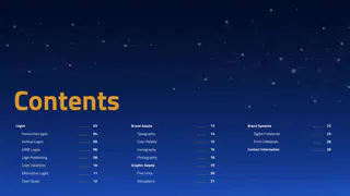
P 02Contents
03
13
22
Logos
Brand Assets
Brand Systems
04
14
23
Digital Collaterals
Typography
Horizontal Logos
05
15
26
Color Palette
Print Collaterals
Vertical Logos
30
Contact Information
06
16
Iconography
GAMI Logos
09
18
Photography
Logo Positioning
10
19
Graphic Assets
Color Variations
11
20
Five Lines
Alternative Logos
12
21
Disruptions
Clear SpaceBrandmarkVERSION 02
Primary Brandmark
ENGLISH HORIZONTAL LOGO
ARABIC HORIZONTAL LOGO
WDS Brandmark and its proper usage is highly significant for us. Consistency and clarity of
communication are essential factors in representing a strong, reputable, and veracious brand.
P 05VERSION 02
Alternative Brandmark
ENGLISH HORIZONTAL LOGO (WITH EVENT DATE)
ARABIC HORIZONTAL LOGO (WITH EVENT DATE)
Preferred logo to be used in all applications
Logo to be used only in formal government and
where possible.
ministerial communications.
Alternative Brandmark displays the Event dates to encourage anticipation.
P 06VERSION 02
Brandmark Structure Variation
THE SYMBOL
ENGLISH AND ARABIC VERTICAL LOGOS
The symbol should never be used in place of the logo. It should
only be used in applications where the logo is present of the
This logo should only be used in applications where due to horizontal
brand presence is clear.
composition constraints the primary logo cannot be used.
P 07VERSION 02
Brandmark Color Variation
There are four colour variations of the logo and each one has been created for a particular application or production process.
Please ensure that you choose the relevant version for your application.
FULL COLOUR POSITIVE
FULL COLOUR REVERSED
BLACK AND WHITE
These versions are mainly reserved for black and white applications. In dark
The full colour version of our logo should be
The colour version of our logo should only be
background applications or on dark images, where using the ‘full color negative’
used on white and light background applications
used in dark background applications.
logo creates contrast issues, the white logo should be used.
wherever possible.
* Please don’t attempt to re-create the logo. Artwork files of the logos and other design elements are available from the World Defense Show communications team.
P 08VERSION 02
Brandmark Color Variation
ALTERNATIVE LOGOS
Note that these versions should not be treated as replacements of the primary logo and are research for application
and production specific scenarios and should only be used with the express permission of the WDS team.
P 09VERSION 02
Logo Clear Space
35mm
LOGO MINIMUM SIZE
CLEAR SPACE
In print, the logo should not be smaller than the size
To ensure prominence and legibility, the logo is always surrounded by an area of clear
detailed here. On-screen, the logo is rendered differently
space which remains free of other design elements, such as type and other logos.
across various types of platforms and devices.
To help maintain consistency across all brand applications, The construction of the
Care should be taken to preserve legibility at small size.
clear space area is based on the size of pentagon present in the middle of WDS
logomark.
P 010VERSION 02
Gami Logos (EN)
COLOUR LOGO
WHITE LOGO
Logo should always be used in the
The white version of the logo lockup should be
used when placed on a coloured and photography
format above.
background, where the colors clash with the logo.
P 011VERSION 02
Gami Logos (AR)
COLOUR LOGO
WHITE LOGO
Logo should always be used in the
The white version of the logo lockup should be
used when placed on a coloured and photography
format above.
background, where the colors clash with the logo.
P 012VERSION 02
WDS and Gami Co-Branding
LOGO POSITIONING
World Defense Show and GAMI logos should appear together and be positioned at the top of the composition whenever
possible. The above alignment and scale should be followed whenever the two logos are present. The relationship
between the above logos should always be consistent and high-resolution.
P 013VERSION 02
Logo Placement (Template)
Grid
This grid is used to determine WDS and Gami logos positon and template margin to
maintain consistency in any size or format. The number of grids will vary depending on
the size and format of material to maintain logos maximum visibility.
P 014VERSION 02
Logo Placement (Template)
Backdrop (Grid)
Grid and Margin will depend on the size of pentagon in the middle of WDS logo.
This is represented by the letter “x“. Backdrop grid is divided into 13 columns.
P 015VERSION 02
Logo Placement (Template)
Roll Up (Grid)
Grid and Margin will depend on the size of
pentagon in the middle of WDS logo. This
is represented by the letter “x“. Roll Up grid
is divided into 10 columns.
P 016VERSION 02
Logo Placement (Template)
Social Media Square Post (Grid)
Grid and Margin will depend on the size of pentagon in the middle of WDS logo. This
is represented by the letter “x“. Square grid is divided into 13 columns.
P 017VERSION 02
Logo Placement (Template)
Powerpoint Presentation (Grid)
Grid and Margin will depend on the size of pentagon in the middle of WDS logo. This
is represented by the letter “x“. Powerpoint grid is divided into 17 columns.
P 018VERSION 02
Logo Placement (Template)
Megacom (Grid)
Grid and Margin will depend on the size of pentagon in the middle of WDS logo. This
is represented by the letter “x“. Megacom grid is divided into 21 columns.
P 019VERSION 02
Logo Placement (Template)
Emailer (Grid)
Grid and Margin will depend on the size of pentagon in the middle of WDS logo. This
is represented by the letter “x“. Emailer grid is divided into 14 columns.
P 020Brand AssetsVERSION 02
We lead with a typeface called Cairo.
It’s a contemporary Sans Serif typeface that’s both a workhorse business typeface and
a human-forward joyful face. Cairo font isn’t afraid to admit it has a personality.
P 022VERSION 02
Primary Typography
Cairo
Headings
Bold
Subheadline Here
Regular
Body copy as demonstrated here.
المحتوى الوصفي كما هو موضح هنا
Lorem ipsum dolor sit amet, consectetuer adipiscing elit, sed
إيبسوم لأنها الم تعطي توزيعا طبيعيا -ما إلى- حد للأحرف عوضا عن زمن طويل
diam nonummy nibh euismod tincidunt ut laoreet dolore
وهي أن المحتوى المقروء لصفحة ما سيلهي القارئ عن التركيز على الشكل
Light
magna aliquam erat volutpat. Ut wisi enim ad minim veniam
الخارجي للنص أو شكل توضع الفقرات في الصفحة التي يقرأها
EQUIPPED FOR TOMORROW
للغد نستعد
Primary Typography (Ideal Type Heirarchy)
As a corporate font, it should be used for external communication and advertising materials,
Cairo font should be used for English and Arabic applications. Our selected brand font is web
safe and google optimized.
P 023VERSION 02
Secondary Typography
Arial
Headings
Bold
Body copy as demonstrated here.
المحتوى الوصفي كما هو موضح هنا
Lorem ipsum dolor sit amet, consectetuer adipiscing elit,
إيبسوم لأنها الم تعطي توزيعا طبيعيا -ما إلى- حد للأحرف عوضا
sed diam nonummy nibh euismod tincidunt ut laoreet
Regular
عن زمن طويل وهي أن المحتوى المقروء لصفحة ما سيلهي القارئ
dolore magna aliquam erat volutpat. Ut wisi enim ad
عن التركيز على الشكل الخارجي للنص أو شكل توضع الفقرات في
minim veniam.
الصفحة التي يقرأها
Secondary Typography (Ideal Type Heirarchy)
In those cases in which it is not possible to use our corporate font; Cairo, such as emails, newsletters, any cloud
based or shareable and editable document (Microsoft Word, etc..) We can use Arial font since it is pre-installed in
any device.
P 024VERSION 02
Colors
PRIMARY COLOUR
SECONDARY COLOUR
SECONDARY COLOUR
R0 G26 B112
R0 G154 B68
R147 G77 B17
Pantone 662 C
Pantone 347 C
Pantone 724 C
PANTONE GRADIENT
LIGHTER OVERPRINT
PRIMARY COLOUR
R214 G154 B45
PANTONE GRADIENT
Pantone 7563 C
LIGHTER OVERPRINT
P 025VERSION 02
Iconography
ICONOGRAPHY STYLE
Icons are an integral part of the brand guidelines of the WDS identity. Icons should be simple and
representative line drawings depicting objects, topics, actions, etc clearly. The thickness of the
stroke should be equal and elegent. Avoid using a very thin stroke or a thick stroke. Please refer to
the above examples for reference.
P 026VERSION 02
Iconography
Advanced
Swarm
Soldier of
Advanced Space
Electronic
Ballistics
Technology
the Future
Systems
Warfare
Urban Air
Industry 4.0
Simulated
Naval
Enhanced
Mobility
Training
Systems
Platforms
Advanced
Rotary
Military
Startups
Unmanned
Manufacturing
Systems
Airshows
Technology
Security
Advanced
Advanced C4ISR
Biodefence
Systems
Weaponry
P 027VERSION 02
Brand Assets
PHOTOGRAPHY STYLE
Part of the identity development of WDS is the above image treatment. Images are to be created with a
duotone of the blue and gold pantones mentioned in the colour palette, with hints of blue on top of the image.
In addition, the wireframe elements and/or the globe and depth lines should always be part of the visual.
Images cannot appear anywhere without the required image treatment.
P 028Graphic AssetsVERSION 02
Graphic Assets
USAGE
The primary graphic elements (wireframes) and its
corresponding colours are our preferred graphic
element.
They should always be used where possible.
P 030VERSION 02
Graphic Assets
COLOR TREATMENT
The above graphic element should be used in all collaterals produced on digital
platforms. Using the wireframes in gold, blue and white will be based on the colours
The white should be at 50% opacity when positioned over the primary blue color, while
of the composition.
the gold if placed on white should be at a 100% opacity. The blue should also be at 100%
opacity if placed on a white background.
P 031Brand SystemsVERSION 02
Digital Collaterals
EXAMPLE SOCIAL MEDIA POST
Every post should contain one or two of three graphic elements (globe, depth lines and
wireframes) depending on the information required to be presented.
P 033VERSION 02
Digital Collaterals
EXAMPLE SOCIAL MEDIA POST
Social media posts will adopt the wireframe style along with the depth
lines to create multi-dimensional posts. Each post will always contain
the World Defense Show logo and the GAMI logo according to logo
positioning rules on pg.09.
P 034VERSION 02
Digital Collaterals
WEBSITE DESIGN GUIDES
With emphasis on our visual identity and strong typography, the website
represents World Defense Show. The look and feel of the sections is consistent
throughout the website design, adopting the brand’s graphic elements.
P 035Print CollateralsVERSION 02
Print Collaterals
P 037VERSION 02
Print Collaterals
PRODUCTION
COLLATERALS
Print collaterals will have the
brand blue as an overarching
color accompanied with our
brand graphic elements like
the examples presented.
P 038VERSION 02
Stationary
P 039VERSION 02
Outdoor
P 040VERSION 02
Pop up and Roll Up
P 041SALES@WORLDDEFENSESHOW.COM
WORLDDEFENSESHOW.COM
@WDS_KSA
WORLD DEFENSE SHOW