elm
Elm
100%
1 / 169
Download PDF
1
2
3
4
5
6
7
8
9
10
11
12
13
14
15
16
17
18
19
20
21
22
23
24
25
26
27
28
29
30
31
32
33
34
35
36
37
38
39
40
41
42
43
44
45
46
47
48
49
50
51
52
53
54
55
56
57
58
59
60
61
62
63
64
65
66
67
68
69
70
71
72
73
74
75
76
77
78
79
80
81
82
83
84
85
86
87
88
89
90
91
92
93
94
95
96
97
98
99
100
101
102
103
104
105
106
107
108
109
110
111
112
113
114
115
116
117
118
119
120
121
122
123
124
125
126
127
128
129
130
131
132
133
134
135
136
137
138
139
140
141
142
143
144
145
146
147
148
149
150
151
152
153
154
155
156
157
158
159
160
161
162
163
164
165
166
167
168
169
Guideline pages
1 Brand Guidelines Version 1 Version 1 Elm Brand Guidelines
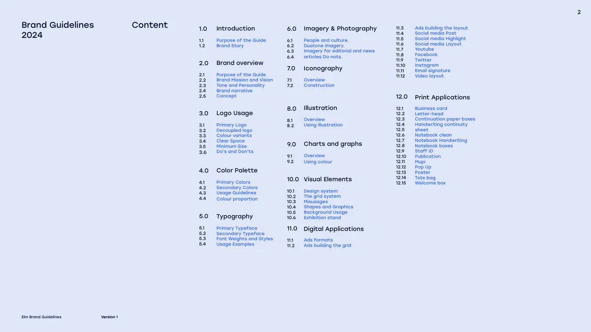
2 Brand Guidelines Content Introduction Imagery & Photography 1.0 6.0 Ads building the layout 11.3 2024 Social media Post 11.4 Social media Highlight 11.5 Purpose of the Guide People and culture. 1.1 6.1 Social media Layout 11.6 Brand Story Duotone imagery. 1.2 6.2 Youtube 11.7 Imagery for editorial and news 6.3 Facebook 11.8 articles Do nots. 6.4 Twitter 11.9 Brand overview 2.0 Instagram 11.10 Iconography 7.0 Email signature 11.11 Purpose of the Guide 2.1 Video layout 11.12 Brand Mission and Vision Overview 2.2 7.1 Tone and Personality Construction 2.3 7.2 Brand narrative 2.4 12.0 Concept 2.5 Print Applications Illustration 8.0 12.1 Business card Logo Usage 3.0 12.2 Letter-head 12.3 Continuation paper boxes Overview 8.1 12.4 Handwriting continuity Using illustration Primary Logo 3.1 8.2 12.5 sheet Decoupled logo 3.2 12.6 Notebook clean Colour variants 3.3 12.7 Notebook Handwriting Clear Space 3.4 Charts and graphs 9.0 12.8 Notebook boxes Minimum Size 3.5 12.9 Staff ID Do’s and Don’ts 3.6 Overview 9.1 12.10 Publication 9.2 12.11 Using colour Mupi 12.12 Pop Up Color Palette 4.0 12.13 Poster 12.14 Tote bag Visual Elements 10.0 Primary Colors 4.1 12.15 Welcome box Secondary Colors 4.2 Design system 10.1 Usage Guidelines 4.3 The grid system 10.2 4.4 Colour proportion Misusages 10.3 Shapes and Graphics 10.4 Background Usage 10.5 5.0 Typography Exhibition stand 10.6 11.0 Digital Applications 5.1 Primary Typeface 5.2 Secondary Typeface 5.3 Font Weights and Styles Ads formats 11.1 5.…
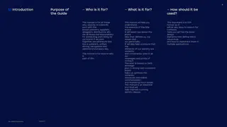
1 3 1.0 Introduction This manual is for all those who, directly or indirectly, work with the brand: partners, suppliers, designers, distributors, etc. We all share the responsibility for protecting and caring for our brand. If we work together, we will ensure Elm has a coherent, unified, strong, recognised and admired brand every day. Elm Brand Guidelines Version 1
4 Purpose of — Who is it for? — What is it for? — How should it be 1.1 Introduction the Guide used? This manual is for all those This manual will help you This document is in PDF who, directly or indirectly, understand format so it work with the the essence of the Site will be very easy to search for brand: partners, suppliers, brand. contents. designers, distributors, etc. It will teach you about the Here you will find the basic We all share the responsibility brand design for protecting and caring for idea that defines us, our elements that define Site’s our brand. If we work values and visual style together, we will ensure Site our personality. and how to implement them in has a coherent, unified, It will also help us ensure that multiple applications. strong, recognised and the admired brand every day. elements of our identity are correctly This manual is for anyone who and consistently used in all is our part of Elm. messages and points of contact. This work is based on Serb strategic plan. A strong and consistent brand helps us optimise the company resources and makes communication and marketing much easier. This manual is an essential tool that will help maintain a strong identity always. Version 1 Elm Brand Guidelines
5 1.0 Introduction 1.2 Introduction Our Story We have redefined the digital lan dscape in Saudi Arabia by creating smart solutions that enable government entities, individuals, and private sector companies to advance forward towards a future abundant in opportunities, where the welfare of communities is attained, and our local and global footprint is established. Elm Brand Guidelines Version 1
2 6 2.0 Brand overview At elm, we believe that imagination is the root of change that enables us to envision unique solutions in a world where disruption has become constant. Inspired by humanity’s ability to dream, we also understand that aspirations need action to come to life. As we advance with our nation’s ambition and growth, our mission is clear: To nurture people’s ability to dream together and make their aspirations of prosperity and progress a reality. At elm, we don’t just innovate; we dream, we imagine, we empathize, we inspire and we transform. Elm Brand Guidelines Version 1
7 Purpose of the Guide 2.1 Brand overview At elm, we believe that imagination is the root of change that enables us to envision unique solutions in a world where disruption has become constant. Inspired by humanity’s ability to dream, we also understand that aspirations need action to come to life. As we advance with our nation’s ambition and growth, our mission is clear: To nurture people’s ability to dream together and make their aspirations of prosperity and progress a reality. At elm, we don’t just innovate; we dream, we imagine, we empathize, we inspire and we transform. Version 1 Elm Brand Guidelines
8 OUR VISION OUR MISSION Brand Mission and 2.2 Brand overview Vision We innovate to empower To be the leading digital communities and streamline enabler for government life. entites and the business sector in Saudi Arabia and the wider region. Elm Brand Guidelines Version 1 Elm Brand Guidelines Version 1
9 Tone and Personality 2.3 Brand overview Depends on the company policy to be determined later Version 1 Elm Brand Guidelines
10 Brand narrative 2.4 Brand overview At elm, we believe that imagination is the root of change that enables us to envision unique solutions in a world where disruption has become constant. Inspired by humanity’s ability to dream, we also understand that aspirations need action to come to life. As we advance with our nation’s ambition and growth, our mission is clear: To nurture people’s ability to dream together and make their aspirations of prosperity and progress a reality. At elm, we don’t just innovate; we dream, we imagine, we empathize, we inspire and we transform. Version 1 Elm Brand Guidelines
11 Concept 2.5 Brand overview Built on three foundational pillars— Imagination, Technology, and Human Inspiration—elm converges to serve as a powerful visual metaphor for the company’s role as a catalyst for future development in Saudi Arabia and beyond. Patterns and textures, woven throughout the visuals, connect the message and add depth and versatility. Human Imagination Technology Inspiration The holding shape spotlights the human element. Version 1 Elm Brand Guidelines
3 12 3.0 Logo Usage Effective and consistent logo usage is critical to maintaining the integrity of your brand identity. Below are detailed guidelines to ensure the correct and impactful use of the logo in all applications: Elm Brand Guidelines Version 1
13 Primary Logo 3.1 Logo Usage Our brandmark should only be produced from the master artworks and should not be redrawn or altered in any way. Version 1 Elm Brand Guidelines
14 Primary Logo 3.1 Logo Usage Version 1 Elm Brand Guidelines
15 Primary Logo 3.1 Logo Usage Version 1 Elm Brand Guidelines
16 Primary Logo 3.1 Logo Usage Version 1 Elm Brand Guidelines
17 Clear Space 3.2 Logo Usage This is the Elm decoupled logo, it comprises of the Icon word- mark (left), and Elm Full name (right). Where possible always use this logo on all Elm owned applications. 24 px Version 1 Elm Brand Guidelines
18 Colour variants 3.3 Logo Usage This is our logo (left) and this is our logo lockup (right). Both are equally as important, and have many different uses, outlined on the following pages. Colour Where possible this colour version should always be used, appearing in Elm Dark Blue on a white background or vice-versa, we never use two colours within the logo lockup. Black and white In some cases on low quality printing, we may need to supply a black and white logo version. Version 1 Elm Brand Guidelines
19 Decoupled logo 3.4 Logo Usage To ensure legibility and maximum brand recognition there are some rules to follow around scaling and placing the decoupled logo. Always allow a clear space equal to one half the height of the word-mark and Full-name 1. Logo minimum size: Print: 9mm (Height) Digital: 70px (Height) 1 Version 1 Elm Brand Guidelines
20 Minimum Size 3.5 Logo Usage Brand personality defines a brand’s identity through human traits, fostering emotional connections and loyalty. Tone adapts this personality to suit different contexts, ensuring messaging remains relatable and appropriate across platforms. 10px 15px 20px 30px 45px Our logo should always be used in a large enough size to allow perfect legibility. It should therefore never be reduced to a height smaller than 15 px.You should always use the Final Arts that have been provided to you and these should not be modified. 1. Logo minimum size: Print: 9mm (Height) Digital: 11px (Height) Version 1 Elm Brand Guidelines
21 Do’s and Don’ts 3.6 Logo Usage In order to maintain the integrity of the Primary Visual Identity, it must never be altered, cropped or reconfigured in any way. Below are some examples of prohibited usage. Additional restrictions apply. 1. Do not add shadow. 2. Do not color logo with unapproved colors. 3. Do not change spacing between lettering. 4. Do not surpass clear space with other logos or any element. 5. Do not stretch. 6. Do not rotate in any way. 7. Do not add glow. 8. Do not use with low quality. 9. Do not fill with gradients or patterns. 10. Do not drop over a shape. 11. Do not add effects. 12. Do not deform the logo. Version 1 Elm Brand Guidelines
4 22 4.0 Color Palette A well-defined color palette is a critical component of your brand’s visual identity. It ensures consistency across all design elements and communicates your brand’s personality effectively. Below are the guidelines for the brand’s color palette. Elm Brand Guidelines Version 1
03.2 23 Oxford Blue Atomic Tangerine Portland Orange Bright Lavender Grape Vivid Cerulean True Blue HEX 0 a1 e0 HEX cc 8b db HEX ff 5d 36 HEX ff a1 68 HEX 5 1d 49 HEX 0 71 ce HEX 76 3c bc RGB 0 161 224 RGB 204 139 219 RGB 255 93 54 RGB 255 161 104 RGB 5 29 73 RGB 0 113 206 RGB 118 60 188 CMYK 74 21 0 0 CMYK 24 50 0 0 CMYK 0 78 82 0 CMYK 0 45 63 0 CMYK 100 91 38 45 CMYK 84 54 0 0 CMYK 67 83 0 0 LAB 61 -24 -44 LAB 67 35 -31 LAB 63 64 57 LAB 76 35 46 LAB 11 6 -31 LAB 45 -5 -59 LAB 39 45 -58 GrayScale 53 GrayScale 34 GrayScale 46 GrayScale 28 GrayScale 90 GrayScale 65 GrayScale 64 Version 1 Elm Brand Guidelines
24 Primary Colors 4.1 Color Palette primary colors are the cornerstone of your brand’s visual identity. They should be used consistently across all brand materials to establish a strong and recognizable presence. PANTONE 2768 C HEX 051D49 RGB 5 29 73 CMYK 100 91 38 45 LAB 11 6 -31 GrayScale 90 %90 %80 %70 %60 %35 %25 %10 %100 PANTONE 1565 C HEX FFA168 RGB 255 161 104 CMYK 0 45 63 0 LAB 76 35 46 GrayScale 28 %90 %80 %70 %60 %35 %25 %10 %100 PANTONE 171 C HEX FF5D36 RGB 255 93 54 CMYK 0 78 82 0 LAB 63 64 57 GrayScale 46 %90 %80 %70 %60 %35 %25 %10 %100 PANTONE 2572 C HEX CC8BDB RGB 204 139 219 CMYK 24 50 0 0 LAB 67 35 -31 GrayScale 34 %90 %80 %70 %60 %35 %25 %10 %100 PANTONE 266 C HEX 763CBC RGB 118 60 188 CMYK 67 83 0 0 LAB 39 45 -58 GrayScale 64 %90 %80 %70 %60 %35 %25 %10 %100 PANTONE 299 C HEX 00A1E0 RGB 0 161 224 CMYK 74 21 0 0 LAB 61 -24 -44 GrayScale 53 %90 %80 %70 %60 %35 %25 %10 %100 PANTONE 285 C HEX 0071CE RGB 0 113 206 CMYK 84 54 0 0 LAB 45 -5 -59 GrayScale 65 %90 %80 %70 %60 %35 %25 %10 %100 Version 1 Elm Brand Guidelines
25 Secondary Colors 4.2 Color Palette secondary color palette supports and complements the primary colors. These colors add flexibility to your design system, providing contrast and depth while maintaining harmony with your brand’s visual identity. HEX 5 1d 49 RGB 5 29 73 CMYK 100 91 38 45 LAB 11 6 -31 GrayScale 90 PANTONE 2768 C HEX A12B2A RGB 0 50 160 CMYK 100 91 2 0 LAB 23 18 -68 GrayScale 82 %100 %90 %80 %70 %60 %35 %25 %10 PANTONE 1565 C HEX 5A2C83 RGB 90 44 131 CMYK 80 99 11 2 LAB 28 34 -41 GrayScale 74 %100 %90 %80 %70 %60 %35 %25 %10 PANTONE 171 C HEX 0032A0 RGB 161 43 42 CMYK 24 95 90 19 LAB 38 49 31 GrayScale 69 %90 %80 %70 %60 %35 %25 %10 %100 Version 1 Elm Brand Guidelines
26 Usage Guidelines 4.3 Color Palette When using font with the Elm colour palette you must always ensure a certain standard of accessibility, the following colour options with typography have been approved to be legible Lorem Lorem Lorem LOREM Lorem ipsum LOREM IPSUM dolor sit amet DOLOR SIT ipsum dolor ipsum dolor ipsum dolor IPSUM AMET sit amet sit amet sit amet DOLOR SIT Green body copy can sit on white. Lorem ipsum dolor sit amet, AMET moditatum recab illesequam do consectetuer adipiscing elit, sed diam nonummy nibh lupta magnam hario. LOREM IPSUM LOREM IPSUM LOREM IPSUM LOREM IPSUM LOREM IPSUM LOREM IPSUM DOLOR SIT DOLOR SIT DOLOR SIT DOLOR SIT DOLOR SIT DOLOR SIT AMET AMET AMET AMET AMET AMET Lorem ipsum dolor sit amet, Lorem ipsum dolor sit amet, Lorem ipsum dolor sit amet, Lorem ipsum dolor sit amet, Lorem ipsum dolor sit amet, Lorem ipsum dolor sit amet, consectetuer adipiscing elit, consectetuer adipiscing elit, consectetuer adipiscing elit, consectetuer adipiscing elit, consectetuer adipiscing elit, consectetuer adipiscing elit, sed diam nonummy nibh sed diam nonummy nibh sed diam nonummy nibh sed diam nonummy nibh sed diam nonummy nibh sed diam nonummy nibh LOREM LOREM LOREM LOREM LOREM LOREM IPSUM IPSUM IPSUM IPSUM IPSUM IPSUM DOLOR SIT DOLOR SIT DOLOR SIT DOLOR SIT DOLOR SIT DOLOR SIT AMET AMET AMET AMET AMET AMET Lorem ipsum Lorem ipsum Lorem ipsum Lorem ipsum Lorem ipsum Lorem ipsum dolor sit amet dolor sit amet dolor sit amet dolor sit amet dolor sit amet dol…
27 Colour proportion 4.4 Color Palette Proportion and appropriate use of colour can be as relevant as the logo-mark itself. When using the Elm palette, try to use a proportion close to the one you can see in this page 1 2 3 Version 1 Elm Brand Guidelines
28 Colour proportion 4.4 Color Palette 1 2 3 Elm Brand Guidelines Version 1
29 Colour proportion 4.4 Color Palette Our primary color and/or secondary must always be present and prominent on external facing comms., the secondary palette always supports but never steals the show. 1. Top left quadrant 2 1 This quadrant of colour combinations includes only primary colours. They should be used for most corporate applications as they offer immediate brand recognition. 2. Top right and bottom left quadrant These quadrants of colour include primary plus secondary colours, they should be used to add versatility to the brand whilst remaining recognisable; for use on such applications like brochures, white papers and web secondary pages. 3. Bottom right quadrant This quadrant of combinations includes no primary colours, they add flexibility and pace to a 2 3 brochure through divider pages or on a web content page. Version 1 Elm Brand Guidelines
applications.5 30 5.0 Typography Consistent typography is essential for creating a unified and professional brand identity. The following guidelines outline the typefaces, font styles, and best practices for typography usage across various Elm Brand Guidelines Version 1
aaa 31 Primary Typeface 5.1 Typography Font name Bold Elm Font Medium Regular Light elm Paragraph Typeface Article Text Basis Grotesque is a modern sansserif font with clean, geometric forms that perfectly align with the brand’s structured and forwardthinking identity. Its balanced proportions and simple, refined shapes communicate clarity, reliability, and approachability, Aa Bb Cc Dd Ee Ff Gg Hh Ii Jj Kk Ll Mm Nn Oo Pp Qq Rr Ss Tt Uu Vv Ww Xx Yy Zz 1234567890.,;!@#$%&*() Version 1 Elm Brand Guidelines
نحو١٢ععع 32 ههههههههههههههه المستقبــل التطور هو !/@؟٪& خط علم بأربع أوزان نهج متعددة ا�ستخدام الشركات الناجحة في ا�عمال Version 1 Elm Brand Guidelines
33 Primary Typeface 5.1 Typography Elm is used across both Arabic and Latin, only ever use Elm to retain a consistent voice across all communications. Usage of the particular font in some programs, for example: Name Font أ ب ت ث ج ح خ م ن ت ي س ش ك م ن و ر ز د ذ ط ظ ص ض ف ق ل Elm Light ع غ ١ ٢ ٣ ٤ ٥ ٦ ٧ ٨ ٩ ! @ # & ٪؟ Any communication apps uses a Adapter font in Arabic and or English. Name Font أ ب ت ث ج ح خ م ن ت ي س ش ك م ن و ر ز د ذ ط ظ ص ض ف ق ل Elm ع غ ١ ٢ ٣ ٤ ٥ ٦ ٧ ٨ ٩ ! @ # & ٪؟ Regular Name Font أ ب ت ث ج ح خ م ن ت ي س ش ك م ن و ر ز د ذ ط ظ ص ض ف ق Elm ل ع غ ١ ٢ ٣ ٤ ٥ ٦ ٧ ٨ ٩ ! @ # & ٪؟ Medium Name Font أ ب ت ث ج ح خ م ن ت ي س ش ك م ن و ر ز د ذ ط ظ ص ض ف ق Elm ل ع غ ١ ٢ ٣ ٤ ٥ ٦ ٧ ٨ ٩ ! @ # & ٪؟ Bold Version 1 Elm Brand Guidelines
aA12New 34 hhhhhhhhhhhhhh FUTure !/@?٪& Evolution is an Elm font with Four weights approach Successful companies for multiple uses In business Version 1 Elm Brand Guidelines
35 Primary Typeface 5.1 Typography Elm is used across both Arabic and Latin, only ever use Elm to retain a consistent voice across all communications. Usage of the particular font in ABCDEFGHIJKLMNOPQRSTUVWXYZ some programs, for example: Name Font abcdefghijklmnopqrstuvwxyz Elm Light 0123456789 .,:;@£#%&*()!? Any communication apps uses a Adapter font in Arabic and or English. ABCDEFGHIJKLMNOPQRSTUVWXYZ Name Font abcdefghijklmnopqrstuvwxyz Elm Regular 0123456789 .,:;@£#%&*()!? ABCDEFGHIJKLMNOPQRSTUVWXYZ Name Font abcdefghijklmnopqrstuvwxyz Elm Medium 0123456789 .,:;@£#%&*()!? ABCDEFGHIJKLMNOPQRSTUVWXYZ Name Font abcdefghijklmnopqrstuvwxyz Elm Bold 0123456789 .,:;@£#%&*()!? Version 1 Elm Brand Guidelines
36 Font Weights and 5.3 Typography We use type weights and sizes consistently to create intuitive type hierarchies that support the importance of the messaging. Styles Headlines and large text use the Medium weights which are too bold for smaller body text use, this differentiates them. Body text and other text levels use the lght weights. Giving preference to arabic Giving preference to english language language Type styles We use sentence case and left align Headline or Title (Latin-based languages) and right Headline or Title Bold alight (Arabic languages) to the Bold Layout grid to create consistency . Colouring type Subheadline Subheadline Medium Medium We must always use our type and background colour pairs to meet accessibility standards. Introduction Introduction Regular Regular Body text Light Body text Light Caption Caption Medium Medium Website Website Version 1 Elm Brand Guidelines
37 Usage Examples 5.4 Typography Typography plays a crucial role in conveying the brand’s voice and personality. Consistent use of typefaces ensures brand recognition and enhances readability across all platforms. Below are the comprehensive guidelines for the brand’s typography. Meaningful growth The alignment of text blocks in x Latin type will always be to the left. The space and location between the blocks will be defined by the grid. However, we We pave the define some minimum spaces to serve as a guide. 2x way for meaningful growth. Lorem ipsum dolor sit amet, consectetuer adipiscing elit, sed diam nonummy nibh euismod tincidunt ut laoreet dolore magna aliquam erat volutpat. Ut wisi enim ad minim veniam, quis nostrud exerci tation ullamcorper suscipit lobortis nisl ut aliquip ex ea Version 1 Elm Brand Guidelines
38 Usage Examples 5.4 Typography Typography plays a crucial role in conveying the brand’s voice and personality. Consistent use of typefaces ensures brand recognition and enhances readability across all platforms. Below are the comprehensive guidelines for the brand’s typography. English format Arabic format Not allowed Giving preference to english Giving preference to arabic language. Align left language. Align right Meaningful growth للنـمـــو معاني Meaningful We pave the نحن نمهد الطريق way for meaningful للنمو المفيد. growth. بعيدة ! growth We pave the way for meaningful growth. هنـــاك حقيقة مثبتة منذ زمـــن طويل وهي أن المحتوى المقروء لصفحة ما ســـيلهي هناك حقيقة Lorem ipsum dolor sit amet, consectetuer adipiscing elit, sed diam Lorem ipsum dolor sit amet, consectetuer adipiscing elit, sed diam مثبتـــة منذ زمن طويل وهي أن المحتوى المقروء لصفحة ما ســـيلهي هناك حقيقة مثبتة منذ زمن nonummy nibh euismod tincidunt ut laoreet dolore magna aliquam erat nonummy nibh euismod tincidunt ut laoreet dolore magna aliquam erat طويـــل وهي أن المحتوى المقروء لصفحة ما ســـيلهي هناك حقيقة مثبتـــة منذ زمن طويل وهي أن volutpat. Ut wisi enim ad minim veniam, quis nostrud exerci tation volutpat. Ut wisi enim ad minim veniam, quis nostrud exerci tation المحتوى المقروء لصفحة ما ســـيلهي هناك حقيقة مثبتة منذ زمن طويل وهي أن المحتوى المقروء ullamcorper suscipit lobortis nisl ut aliquip ex ea Lorem ipsum dolor sit ullamcorper suscipit lobortis nisl ut aliquip ex ea Lorem ipsum dolor sit لصفحة …
39 Usage Examples 5.4 Typography Typography plays a crucial role in conveying the brand’s voice and personality. Consistent use of typefaces ensures brand recognition and enhances readability across all platforms. Below are the comprehensive guidelines for the brand’s typography. English format Arabic format Not allowed Giving preference to english Giving preference to arabic language. Align left language. Align right Meaningful Meaningful للنـمـــو معاني growth growth بعيدة ! We pave the We pave the way for meaningful نحن نمهد الطريق way for meaningful growth. growth. للنمو المفيد. Lorem ipsum dolor sit amet, Lorem ipsum dolor sit amet, هناك حقيقة مثبتة منذ زمـــن طويل وهي أن المحتوى consectetuer adipiscing elit, sed diam consectetuer adipiscing elit, sed diam المقروء لصفحة ما سيلهي هناك حقيقة مثبتة منذ زمن nonummy nibh euismod tincidunt ut nonummy nibh euismod tincidunt ut طويـــل وهي أن المحتـــوى المقروء لصفحة ما ســـيلهي laoreet dolore magna aliquam erat laoreet dolore magna aliquam erat هناك حقيقة مثبتة منذ زمـــن طويل وهي أن المحتوى volutpat. Ut wisi enim ad minim veniam, volutpat. Ut wisi enim ad minim veniam, المقروء لصفحة ما سيلهي هناك حقيقة مثبتة منذ زمن quis nostrud exerci tation ullamcorper quis nostrud exerci tation ullamcorper طويـــل وهي أن المحتـــوى المقروء لصفحة ما ســـيلهي suscipit lobortis nisl ut aliquip ex ea suscipit lobortis nisl ut aliquip ex ea هناك حقيقة مثبتة منذ زمـــن طويل وهي أن المحتوى Lorem ipsum dolor sit amet, Lorem ipsum dolor sit amet, ال…
40 Usage Examples 5.4 Typography English & Arabic format Not allowed Giving preference to Arabic and english language. Meaningful للنـمـــو معاني للنـمـــو معاني بعيدة growth بعيدة Meaningful growth هناك حقيقة مثبتة منذ زمن طويل وهي أن المحتوى المقروء Lorem ipsum dolor sit amet, consectetuer هناك حقيقة مثبتة منذ زمن طويل وهي أن المحتوى المقروء لصفحة ما سيلهي هناك حقيقة مثبتة منذ زمن طويل وهي لصفحة ما سيلهي هناك حقيقة مثبتة منذ زمن طويل وهي أن adipiscing elit, sed diam nonummy nibh euismod أن المحتوى المقروء لصفحة ما سيلهي هناك حقيقة مثبتة منذ زمن طويل وهي أن المحتوى المقروء لصفحة ما سيلهي المحتوى المقروء لصفحة ما سيلهي هناك حقيقة مثبتة منذ زمن tincidunt ut laoreet dolore magna aliquam erat هناك حقيقة مثبتة منذ زمن طويل وهي أن المحتوى المقروء لصفحة ما سيلهي هناك حقيقة مثبتة منذ زمن طويل وهي طويل وهي أن المحتوى المقروء لصفحة ما سيلهي هناك حقيقة volutpat. Ut wisi enim ad minim veniam, quis أن المحتوى المقروء مثبتة منذ زمن طويل وهي أن المحتوى المقروء لصفحة ما سيلهي هناك حقيقة مثبتة منذ زمن طويل وهي أن المحتوى nostrud exerci tation ullamcorper suscipit lobortis Lorem ipsum dolor sit amet, consectetuer adipiscing elit, sed diam nonummy nibh euismod المقروء nisl ut aliquip ex ea Lorem ipsum dolor sit amet, tincidunt ut laoreet dolore magna aliquam erat volutpat. Ut wisi enim ad minim veniam, quis nostrud exerci tation ullamcorper suscipit lobortis nisl ut aliquip ex ea Lorem ipsum dolor sit amet, elm.sa 920012211 elm.sa 920012211 Version 1 Elm Brand Guidelines
41 Usage Examples 5.4 Typography English format Arabic format Not allowed English & Arabic format Giving preference to english Giving preference to arabic Giving preference to Arabic language. Align left language. Align right and english language. للنـمـــو Meaningful للنـمـو معاني Meaningful بعيدة growth growth معاني بعيدة للنـمـــو معاني بعيدة Lorem ipsum dolor sit amet, consectetuer adipiscing هناك حقيقة مثبتة منذ زمن طويل وهي أن المحتوى المقروء لصفحة ما elit, sed diam nonummy nibh euismod tincidunt ut سيلهي هناك حقيقة مثبتة منذ زمن طويل وهي أن المحتوى المقروء لصفحة Meaningful growth laoreet dolore magna aliquam erat volutpat. Ut wisi ما سيلهي هناك حقيقة مثبتة منذ زمن طويل وهي أن المحتوى المقروء Lorem ipsum dolor sit amet, consectetuer adipiscing elit, sed هناك حقيقة مثبتة منذ زمن طويل وهي أن المحتوى المقروء لصفحة ما سيلهي enim ad minim veniam, quis nostrud exerci tation لصفحة ما سيلهي هناك حقيقة مثبتة منذ زمن طويل وهي أن المحتوى 04 04 diam nonummy nibh euismod tincidunt ut laoreet dolore magna ullamcorper suscipit lobortis nisl ut aliquip ex ea Lorem المقروء لصفحة ما سيلهي هناك حقيقة مثبتة منذ زمن طويل وهي أن هناك حقيقة مثبتة منذ زمن طويل وهي أن المحتوى المقروء لصفحة ما سيلهي ipsum dolor sit amet, المحتوى المقروء aliquam erat volutpat. Ut wisi enim ad minim veniam, quis هناك حقيقة مثبتة منذ زمن طويل وهي أن المحتوى المقروء لصفحة ما سيلهي nostrud exerci tation ullamcorper suscipit lobortis nisl ut aliquip هناك حقيقة مثبتة منذ زمن طويل وهي أن المحتوى المقروء لصفحة ما سيلهي e…
42 Usage Examples 5.4 Typography You can choose the font of the Elm and add one of the letters available in the statement in the example below at the end of the text. Lorem ipsum dolor sit amet, consectetuer adipiscing elit, sed diam nonummy nibh euismod tincidunt � ELMLOGOC Lorem ipsum dolor sit amet, consectetuer adipiscing elit, sed diam nonummy nibh euismod tincidunt � Lorem ELMLOGOB ipsum dolor sit amet, consectetuer adipiscing elit, sed diam nonummy nibh euismod tincidunt � Version 1 Elm Brand Guidelines
6.0 Imagery & Photography6 43 Imagery and photography are powerful tools that shape how your audience perceives your brand. Consistent use of style, tone, and subject matter ensures a cohesive visual identity that aligns with your brand’s values. Below are comprehensive guidelines for imagery and photography. Elm Brand Guidelines Version 1
44 People and culture 6.1 Imagery & Photography Converging for Tomorrow Imagery and photography are powerful tools that shape how your audience perceives your brand. Consistent use of style, tone, and subject matter ensures a cohesive visual identity that aligns with your brand’s values. Below are comprehensive guidelines for imagery and photography. Version 1 Elm Brand Guidelines
45 Imagination Human Inspiration Technology Elm Brand Guidelines Version 1
46 Photo Treatments & 6.2 Imagery & To atchieve the effect you mainly need Adobe Photoshop. Effects Photography Before After To atchieve the effect you mainly need Adobe Photoshop. Here is an example: Version 1 Elm Brand Guidelines
47 Photo Treatments & 6.2 Imagery & To atchieve the effect you mainly need Adobe Photoshop. Effects Photography In Photoshop CC Open the “Camera Raw Filter” Every Image has different settings, the designer should see what fits best according to the photo style set. In general: - Adjust the “white balance” to Auto. - In this case, the highlights were very high, thus we lowered Highlights. - To add more texture and details, adjust Texture & Clarity. - For more flexibility, adjust the Color Grading to fit the tone set in previous sections 7.1 & 7.2. Version 1 Elm Brand Guidelines
48 Photography Style 6.3 Imagery & Brand personality defines a brand’s identity through human traits, fostering emotional connections and loyalty. Tone adapts Photography this personality to suit different contexts, ensuring messaging remains relatable and appropriate across platforms. Version 1 Elm Brand Guidelines
49 Image making Ai 6.4 Imagery & There are several AI-powered tools for image creation that you can use to generate or edit images, illustrations, and designs. Photography These tools leverage advanced algorithms, including machine learning, to create stunning visuals tailored to your needs. Use the specified Site to generate images ai artificial intelligence, for example: Midjourney is a generative artificial intelligence program and service Before After Version 1 Elm Brand Guidelines
50 Usage Examples Image making Ai 6.4 Imagery & Photography 1 2 4 1 1 3 2 1- Choose from the model section options Realistic. 2- Choose from the Aspect Ratio section options 16:9 3 Choose a local character’s face image to generate ideas The first step is to open the Midjourney website and subscribe to the paid package to activate the and images of the same character with the colors and premium permissions. theme of the visual identity. 2 1- Image guidance (Select image from your photo library) 2- Select any mode > 3- Face portrait 5 4- Select strength. 5- Advance settings > Number of 4 1 4 Bot: 2 A glowing orange arc surrounds a Boy looking up as if he is floating in the air on a dark blue and purple background. The image gives a sense of technology and artificial intelligence. 5 3 Choose from the Effects section options 1- Styles (#cinematic) 2- Lighting (#neon) 3- Camera (#ground_view) Version 1 Elm Brand Guidelines
51 Rethink sustainability Elm Version 1 Elm Brand Guidelines
52 Image making Ai 6.4 Imagery & Usage Examples Photography Before After Bot: A person seen from the back, standing by a large window and gazing thoughtfully into the distance. They are wearing a traditional white thobe complemented by a red and white checkered ghutrah, elegantly draped across their head and shoulders. The soft early morning light filters through the glass, illuminating the fabric and highlighting the intricate details of the ghutrah’s pattern. The scene conveys a sense of contemplation and cultural pride, with a modern architectural backdrop visible through the window. dark blue and purple background. The image gives a sense of technology and artificial intelligence. Version 1 Elm Brand Guidelines
applications.7 53 7.0 Iconography Icons are an essential part of your brand’s visual language. They simplify communication, enhance usability, and create a cohesive user experience. The following guidelines ensure consistent use of icons across all platforms and Elm Brand Guidelines Version 1
54 Overview 7.1 Iconography Incorporating iconography into your social media layout can make posts visually appealing and easy to digest. Here’s how to effectively use icons in your designs: We recommend the use of Material Sharp Icons because it based on the core material design principles and metrics. Which is simple, modern, friendly. Strocke Icon Fill Icon Elm Brand Guidelines Version 1
55 Icon Strcoke 7.1 Iconography Incorporating iconography into your social media layout can make posts visually appealing and easy to digest. Here’s how to effectively use icons in your designs: Elm Brand Guidelines Version 1
56 Icon Fill 7.1 Iconography Incorporating iconography into your social media layout can make posts visually appealing and easy to digest. Here’s how to effectively use icons in your designs: Elm Brand Guidelines Version 1
57 Construction 7.2 Iconography Incorporating iconography into your social media layout can make posts visually appealing and easy to digest. Here’s how to effectively use icons in your designs: Grid Drawing Corners Thickness 16 x 16 px In this case, we going to use Our stroke will be 2 px and we will try our From 21.7323 mm depending of icon, The thickness must be in pixel size 3.5 concept and shapes. pt. the full area to drawing our icon angles be always to 45 grades. Version 1 Elm Brand Guidelines
brand’s values across all illustrations.8 58 8.0 Illustration Illustrations are a vital element of your brand’s identity, helping to convey complex ideas, evoke emotions, and enhance visual storytelling. These guidelines ensure consistency and alignment with your Elm Brand Guidelines Version 1
59 Overview 8.1 Illustration Brand personality defines a brand’s identity through human traits, fostering emotional connections and loyalty. Tone adapts this personality to suit different contexts, ensuring messaging remains relatable and appropriate across platforms. These are some of the possibilities that can be achieved with our illustration style. Version 1 Elm Brand Guidelines
60 Using illustration 8.2 Illustration If you’re incorporating illustrations into your social media posts, here’s a guide for crafting a visually appealing layout that maximizes the impact of the illustration: Lorem ipsum dolor sit Lorem ipsum dolor sit Lorem ipsum dolor sit amet, consectetuer amet, consectetuer amet, consectetuer adipiscing elit, sed adipiscing elit, sed adipiscing elit, sed diam nonummy diam nonummy diam nonummy enabled Future www.elm.sa www.elm.sa www.elm.sa www.elm.sa Version 1 Elm Brand Guidelines
61 Using illustration 8.2 Illustration If you’re incorporating illustrations into your social media posts, here’s a guide for crafting a visually appealing layout that maximizes the impact of the illustration: Lorem ipsum dolor sit Lorem ipsum dolor sit Lorem ipsum dolor sit amet, consectetuer amet, consectetuer amet, consectetuer adipiscing elit, sed adipiscing elit, sed adipiscing elit, sed diam nonummy diam nonummy diam nonummy enabled Future www.elm.sa www.elm.sa www.elm.sa www.elm.sa Version 1 Elm Brand Guidelines
62 Using illustration 8.2 Illustration If you’re incorporating illustrations into your social media posts, here’s a guide for crafting a visually appealing layout that maximizes the impact of the illustration: Version 1 Elm Brand Guidelines
63 Using illustration 8.2 Illustration Version 1 Elm Brand Guidelines
64 Version 1 Elm Brand Guidelines
legible, and impactful.9 65 9.0 Charts and Clear and well-designed charts and graphs are essential for effectively communicating graphs data in a way that aligns with your brand’s visual identity. These guidelines ensure all visual data representations are consistent, Elm Brand Guidelines Version 1
66 Overview 9.1 Charts and graphs The Elm graphs and charts style has been designed to be as clear as possible, whilst being easily recreatable across many skill sets and softwares. We have a specially developed palette for these graphs and charts, we never use our brand colours. Input 1 Input 2 Input 3 Input 4 Input 1 Input 5 Input 6 Input 2 Input 3 Input 4 Input 5 0 1 2 3 4 5 6 7 8 9 10 11 11 11 10 10 9 9 8 8 7 7 6 6 5 5 4 4 3 3 2 2 1 1 0 0 1 2 3 4 5 6 7 8 9 10 11 12 0 1 2 3 4 5 6 7 8 9 10 11 Version 1 Elm Brand Guidelines
67 Using colour 9.1 Charts and graphs Graphs and tables require a wide and contrasting palette to help the user understand and remember complex data. Never use these colours for anything else but graphs and infographics. Maximum contrast (Right): To achieve maximum contrast use the graphs and charts palette in the following order shown to the right here. Harmony: If you need to show harmony or pairs within your graphs and charts, use the following combinations only. Input 1 Input 2 Input 3 Input 4 Input 1 Input 2 Input 3 Input 4 Input 1 Input 2 Input 3 Input 4 Input 1 Input 2 Input 3 States of Criticality: PANTONE 299 C PANTONE 2119 C PANTONE 286 C PANTONE 1565 C PANTONE 285 C PANTONE 285 C PANTONE 2111 C PANTONE 171 C PANTONE 7628 C HEX 0 a1 e0 HEX 2b 2e 65 HEX 0 32 a0 HEX ff a1 68 HEX 0 71 ce HEX 0 71 ce HEX 46 4d 7e HEX ff 5d 36 HEX a1 2b 2a If you need to show criticality within your RGB 0 161 224 RGB 43 46 101 RGB 0 50 160 RGB 255 161 104 RGB 0 113 206 RGB 0 113 206 RGB 70 77 126 RGB 255 93 54 RGB 161 43 42 graphs and charts, use the following CMYK 74 21 0 0 CMYK 97 93 31 20 CMYK 100 91 2 0 CMYK 0 45 63 0 CMYK 84 54 0 0 CMYK 84 54 0 0 CMYK 83 76 25 9 CMYK 0 78 82 0 CMYK 24 95 90 19 LAB 61 -24 -44 LAB 21 13 -34 LAB 23 18 -68 LAB 76 35 46 LAB 45 -5 -59 LAB 45 -5 -59 LAB 34 8 -29 colours. LAB 63 64 57 LAB 38 49 31 GrayScale 53 GrayScale 80 GrayScale 82 GrayScale 28 GrayScale 65 GrayScale 65 GrayScale 69 GrayScale 46 GrayScale 69 PANTONE 171 C PANTONE 268 C PANTONE 1565 C PA…
68 Using colour 9.1 Charts and graphs These colors are choosen to add diversity in the diagrams, yet toned down to match the brand palette. Version 1 Elm Brand Guidelines
69 Using colour 9.1 Charts and graphs These colors are choosen to add diversity in the diagrams, yet toned down to match the brand palette. Version 1 Elm Brand Guidelines
10 70 10.0 Visual Elements Visual elements such as patterns, textures, shapes, and graphic motifs are crucial to creating a cohesive and recognizable brand identity. These guidelines ensure the consistent and effective use of visual elements across all brand applications. Elm Brand Guidelines Version 1
71 The concept Design system 10.1 Visual Elements Version 1 Elm Brand Guidelines
72 The concept Design system 10.1 Visual Elements The theme concept was created from the original logo in a geometric shape. A theme concept derived from the original logo’s geometric shape creates a cohesive and visually striking brand identity. Geometric designs are versatile, modern, and structured, making them an excellent foundation for a unified theme. Shapes Primary Shapes: Derived directly from the logo. Usage: Frames for text, or images in layouts. Scaling: Maintain proportions when resizing to preserve integrity. Version 1 Elm Brand Guidelines
73 The concept Design system 10.1 Visual Elements Human Human inspiration is the heart of any Inspiration successful brand. It is the driving force behind creativity, empathy, and meaningful connections that make a brand relatable and memorable. Harnessing human inspiration allows brands to stay authentic, resonate emotionally, and evolve with their audiences. Imagination Technology Technology plays a pivotal role in Imagination is the fuel that powers shaping modern branding strategies, innovative branding. It allows a brand enabling brands to reach audiences, to dream big, craft unique narratives, deliver innovative experiences, and and build emotional connections with remain competitive in a fast-paced its audience. Below are some principles digital landscape. and applications of imagination in creating and managing a brand Version 1 Elm Brand Guidelines
74 Example The grid system 10.2 Visual Elements Version 1 Elm Brand Guidelines
75 Example The grid system 10.2 Visual Elements Horizontal shapes theme Side shapes theme Version 1 Elm Brand Guidelines
76 Correct use of design shapes The grid system 10.2 Visual Elements System expansion: The examples here illustrate the flexibility of the design system, demonstrating how a single perspective can seamlessly expand across the isometric grid. This approach allows for adaptable compositions that maintain cohesion while offering versatility in application. Version 1 Elm Brand Guidelines
77 Correct use of design shapes Misusages 10.3 Visual Elements System Extension Mistakes: These examples illustrate the flaws in the design system. This approach does not allow for adaptable combinations that maintain coherence while providing versatility in application. Version 1 Elm Brand Guidelines
78 10.3 Visual Elements The grid The design system is structured on an isometric grid, providing a flexible and dynamic visual language that can expand seamlessly across the grid. This foundation allows for consistent yet adaptable compositions, enabling the brand to convey depth, movement, and cohesion across various applications and media. Version 1 Elm Brand Guidelines
79 10.3 Visual Elements System Flexibility: The design system’s flexibility allows platforms to adopt various perspectives within the isometric grid, including top, left, and right angles. This versatility enhances visual interest and provides dynamic viewpoints, enabling each application to convey a unique yet cohesive brand expression. Top angle Right angle Left angle Version 1 Elm Brand Guidelines
80 10.3 Visual Elements System expansion: The examples here illustrate the flexibility of the design system, demonstrating how a single perspective can seamlessly expand across the isometric grid. This approach allows for adaptable compositions that maintain cohesion while offering versatility in application. Version 1 Elm Brand Guidelines
81 Shapes and 10.4 Visual Elements Here, we demonstrate how the system integrates photography, human cutouts, and abstract tech imagery. Together, these Graphics elements create a cohesive visual language that embodies the brand’s identity, seamlessly blending human connection with tech and imagination Elm Brand Guidelines Version 1
82 Shapes and 10.4 Visual Elements Here, we demonstrate how the system integrates photography, human cutouts, and abstract tech imagery. Together, these Graphics elements create a cohesive visual language that embodies the brand’s identity, seamlessly blending human connection with tech and imagination Elm Brand Guidelines Version 1
83 Background Usage 10.5 Visual Elements Brand personality defines a brand’s identity through human traits, fostering emotional connections and loyalty. Tone adapts this personality to suit different contexts, ensuring messaging remains relatable and appropriate across platforms. 464D7E FBFBFB 2B2E65 763CBC 5D2E8B FF5D36 A12B2A 0071CE BDC9E9 763CBC 5D2E8B FF5D36 A12B2A 0071CE 061040 29 Version 1 Elm Brand Guidelines
84 Exhibition stand 10.6 Visual Elements Human inspiration A functional area dedicated to human connection, networking and information sharing. Technology A suspended ceiling feature illuminates with motion in the brand colours, representing the patterns and textures of the visual system. Imagination An area dedicated to inspiring the imagination. A digital screen displays brand content to captivate an audience. Version 1 Elm Brand Guidelines
85 Exhibition stand 10.6 Visual Elements Human inspiration A functional area dedicated to human connection, networking and information sharing. Technology A suspended ceiling feature illuminates with motion in the brand colours, representing the patterns and textures of the visual system. Imagination An area dedicated to inspiring the imagination. A digital screen displays brand content to captivate an audience. Version 1 Elm Brand Guidelines
11 86 11.0 Digital Digital applications are a core aspect of brand interaction, and maintaining Applications consistency across all digital platforms is vital for a cohesive brand experience. These guidelines ensure that your digital presence aligns with your brand identity while providing a user-friendly experience. Elm Brand Guidelines Version 1
87 Ads formats 11.1 Digital Applications The page layout system provides a strong and flexible foun dation that can be adapted to any required design content. 3 Columns 3 Columns 3 Rows 2 Columns 4 Rows 4 Rows Version 1 Elm Brand Guidelines
88 Ads formats 11.1 Digital Applications The page layout system provides a strong and flexible foun dation that can be adapted to any required design content. examples 3 Columns 3 Columns 3 Rows December 2024 ,7 www.elm.sa يكتب العنوان Digital Business يكتب العنوان الرئيسي في هذا المكان Proposal الرئيسي في هذا المكان Digital Business Proposal يكتب العنوان الفرعي في هذا المكان هـذا النـص هـو مثـال لنـص يمكـن أن يسـتبدل فـي نفـس المسـاحة، لقـد تـم توليـد هـذا النـص مـن مولـد النـص العربـى، حيـث يمكنـك أن تولـد مثـل هـذا النـص أو العديـد مـن النصوص ا�خرى إضافة إلى زيادة عدد الحروف التى يولدها التطبيق. Digital Business Proposal نلهــــــــم العالــــــــــم،، يكتب العنوان الرئيسي ونسهــــــل الحيــــــــــاة. هـذا النـص هـو مثـال لنـص يمكـن أن يسـتبدل فـي نفـس المسـاحة، لقد تم توليد هذا النص من مولد النص العربى. في هذا المكان عنوان النص عنوان النص هـذا النـص هـو مثـال لنـص يمكـن هـذا النـص هـو مثـال لنـص يمكـن أن يسـتبدل فـي نفـس المسـاحة، أن يسـتبدل فـي نفـس المسـاحة، النصHeadline is عنوان written لقــد تــم توليــد هــذا النــص مــن لقــد تــم توليــد هــذا النــص مــن in this place مولــد النــص العربــى، حيــث مولــد النــص العربــى، حيــث نلهــــــــم،، العالــــــــــم يمكنـك أن تولـد مثـل هـذا النـص يمكنـك أن تولـد مثـل هـذا النـص ونسهــــــل الحيــــــــــاة. This text is an example of text that can be أو العديــد مــن النصــوص ا�خــرى أو العديــد مــن النصــوص ا�خــرى replaced in the same space. إضافــة إلــى زيــادة عــدد الحــروف إضافــة إلــى زيــادة عــدد الحــروف Cl…
89 Ads building the grid 11.2 Digital Applications Brand personality defines a brand’s identity through human traits, fostering emotional connections and loyalty. Tone adapts this personality to suit different contexts, ensuring messaging remains relatable and appropriate across platforms. 1.0 Option 2.0 Option 3.0 Option 4.0 Option 5.0 Option 6.0 Option 7.0 Option 8.0 Option Version 1 Elm Brand Guidelines
90 Ads building the grid 11.2 Digital Applications examples Brand personality defines a brand’s identity through human traits, fostering emotional connections and loyalty. Tone adapts this personality to suit different contexts, ensuring messaging remains relatable and appropriate across platforms. 1.0 Option 2.0 Option 3.0 Option 4.0 Option 5.0 Option 6.0 Option 7.0 Option 8.0 Option Version 1 Elm Brand Guidelines
91 Ads building the grid 11.2 Digital Applications examples يكتب العنوان العنوان الرئيسي في هذا المكان يكتب العنوان الرئيسي في هذا المكان الرئيسي هنا يكتب العنوان الفرعي في عنوان النص عنوان النص هذا المكان نلهــم العالــم،، هــذا النــص هــو مثــال لنــص يمكــن أن هــذا النــص هــو مثــال لنــص يمكــن أن يســتبدل فــي نفــس المســاحة، لقــد تــم يســتبدل فــي نفــس المســاحة، لقــد تــم توليد هذا النص من مولد النص العربى. توليد هذا النص من مولد النص العربى. ونسهـــل الحيـــاة. عنوان النص هـذا النـص هـو مثـال لنـص يمكـن أن يسـتبدل فـي نفــس المســاحة، لقــد تــم توليــد هــذا النــص مــن مولد النص العربى. هـذا النـص هـو مثـال لنـص يمكـن أن يسـتبدل فـي عنوان النص عنوان النص 300 نفـس المسـاحة، لقـد تـم توليـد هـذا النـص مـن مولـد 2M هـذا النـص هـو مثـال لنـص يمكـن هـذا النـص هـو مثـال لنـص يمكـن النــص العربــى، حيــث يمكنــك أن تولــد مثــل هــذا أن يسـتبدل فـي نفـس المسـاحة، أن يسـتبدل فـي نفـس المسـاحة، هـذا النـص هـو مثـال لنـص يمكـن أن يسـتبدل فـي نفـس ABOUT لقــد تــم توليــد هــذا النــص مــن لقــد تــم توليــد هــذا النــص مــن YOUR PROJECT النــص أو العديــد مــن النصــوص ا�خــرى إضافــة إلــى المســاحة، لقــد تــم توليــد هــذا النــص مــن مولــد النــص مولــد النــص العربــى، حيــث مولــد النــص العربــى، حيــث زيادة عدد الحروف التى يولدها التطبيق. يمكنـك أن تولـد مثـل هـذا النـص يمكنـك أن تولـد مثـل هـذا النـص العربـى، حيـث يمكنـك أن تولـد مثـل هـذا النـص أو العديـد أو العديــد مــن النصــوص ا�خــرى أو العديــد مــن النصــوص ا�خــرى العربـى، حيـث يمكنـك أن تولـد مثـل…
92 Ads building the layout 11.3 Digital Applications The design must contain textual content that shows the possible dimensions of the content. You must not deviate from what is available in the design except in extreme cases. You must use your design skills. Headline or Title Title: 26pt (Bold) Set the leading : 28pt Headline or Title Headline or Title Bold Bold Set the tracing : 0pt Font Elm Subheadline Title: 12pt (Medium) Subheadline Subheadline Set the leading : 12pt Medium Medium Set the tracing : 0pt Font Elm Body text Light Body text Light Body text Title: 9pt (Light) Set the leading : 12pt Set the tracing : 0pt Font Elm Caption Caption Caption Medium Medium Title: 6.8pt (Light) Set the leading : 12pt Set the tracing : 0pt Font Elm Version 1 Elm Brand Guidelines
93 Ads building the layout 11.3 Digital Applications examples يكتب العنوان Headline is written الرئيسي في هذا المكان in this place. يكتب العنوان Subheadline is written الفرعي في هذا المكان in this place. هـذا النـص هـو مثـال لنـص يمكـن أن يسـتبدل فـي نفـس المسـاحة، لقـد تـم توليـد هـذا This text is an example of text that can be replaced in the same space. This text was النـص مـن مولـد النـص العربـى، حيـث يمكنـك أن تولـد مثـل هـذا النـص أو العديـد مـن generated from the Arabic text generator, where you can generate such text or many النصوص ا�خرى إضافة إلى زيادة عدد الحروف التى يولدها التطبيق. other texts in addition to increasing the number of letters generated by the application. النـص هـو مثـال لنـص يمكـن هـذا، أن يسـتبدل فـي نفـس المسـاحة This text is an example of text that can be replaced in the same لقد تم توليد هذا النص من مولد النص العربى. space. This text was generated from the Arabic text generator. Version 1 Elm Brand Guidelines
94 Ads building the layout 11.3 Digital Applications The design must contain textual content that shows the possible dimensions of the content. You must not deviate from what is available in the design except in extreme cases. You must use your design skills. Headline or Title Headline or Title Bold Bold Headline or Title Title: 26pt (Bold) Set the leading : 28pt Set the tracing : 0pt Subheadline Subheadline Font Elm Medium Medium Subheadline Body text Light Body text Light Title: 12pt (Medium) Set the leading : 12pt Set the tracing : 0pt Font Elm Body text Title: 9pt (Light) Set the leading : 12pt Set the tracing : 0pt Font Elm Caption Title: 6.8pt (Light) Set the leading : 12pt Caption Caption Set the tracing : 0pt Medium Medium Font Elm Version 1 Elm Brand Guidelines
95 Ads building the layout 11.3 Digital Applications examples يكتب العنوان Headline is written الرئيسي في هذا المكان in this place. يكتب العنوان Subheadline is written الفرعي في هذا المكان in this place. هـذا النـص هـو مثـال لنـص يمكـن هـذا النـص هـو مثـال لنـص يمكـن This text is an example of text This text is an example of text أن يسـتبدل فـي نفـس المسـاحة، أن يسـتبدل فـي نفـس المسـاحة، that can be replaced in the same that can be replaced in the same لقــد تــم توليــد هــذا النــص مــن لقــد تــم توليــد هــذا النــص مــن space. This text was generated space. This text was generated مولــد النــص العربــى، حيــث مولــد النــص العربــى، حيــث from the Arabic text generator, from the Arabic text generator, يمكنـك أن تولـد مثـل هـذا النـص يمكنـك أن تولـد مثـل هـذا النـص where you can generate such text where you can generate such text أو العديــد مــن النصــوص ا�خــرى أو العديــد مــن النصــوص ا�خــرى or many other texts in addition to or many other texts in addition to إضافــة إلــى زيــادة عــدد الحــروف إضافــة إلــى زيــادة عــدد الحــروف increasing the number of letters increasing the number of letters التى يولدها التطبيق. التى يولدها التطبيق. generated by the application. generated by the application. هـذا النـص هـو مثـال لنـص يمكـن هـذا النـص هـو مثـال لنـص يمكـن This text is an example of text This text is an example of text أن يسـتبدل فـي نفـس المسـاحة، أن يسـتبدل فـي نفـس المسـاحة، that can be replaced in the same that can be replaced in the same لقــد تــم توليــد…
96 Ads building the layout 11.3 Digital Applications The design must contain textual content that shows the possible dimensions of the content. You must not deviate from what is available in the design except in extreme cases. You must use your design skills. Headline or Title Title: 26pt (Bold) Set the leading : 28pt Set the tracing : 0pt Font Elm Headline or Title Headline or Title Bold Bold Subheadline Title: 12pt (Medium) Set the leading : 12pt Set the tracing : 0pt Body text Body text Font Elm Headline Headline Body text Title: 9pt (Light) Set the leading : 12pt Body text Body text Set the tracing : 0pt Light Light Font Elm Version 1 Elm Brand Guidelines
97 Ads building the layout 11.3 Digital Applications examples يكتب العنوان Headline is written الرئيسي في هذا المكان in this place عنوان النص Headline هـذا النـص هـو مثـال لنـص يمكـن أن يسـتبدل فـي نفـس المسـاحة، لقـد تـم This text is an example of text that can be replaced in the same space. This text توليـد هـذا النـص مـن مولـد النـص العربـى، حيـث يمكنـك أن تولـد مثـل هـذا was generated from the Arabic text generator, where you can generate such النــص أو العديــد مــن النصــوص ا�خــرى إضافــة إلــى زيــادة عــدد الحــروف التــى text or many other texts in addition to increasing the number of letters يولدها التطبيق. generated by the application. عنوان النص Headline هـذا النـص هـو مثـال لنـص يمكـن أن يسـتبدل فـي نفـس المسـاحة، لقـد تـم This text is an example of text that can be replaced in the same space. This text توليـد هـذا النـص مـن مولـد النـص العربـى، حيـث يمكنـك أن تولـد مثـل هـذا was generated from the Arabic text generator, where you can generate such النــص أو العديــد مــن النصــوص ا�خــرى إضافــة إلــى زيــادة عــدد الحــروف التــى text or many other texts in addition to increasing the number of letters يولدها التطبيق. generated by the application. هـذا النـص هـو مثـال لنـص يمكـن أن يسـتبدل فـي نفـس المسـاحة، This text is an example of text that can be replaced in the same لقد تم توليد هذا النص من مولد النص العربى. space. This text was generated from the Arabic text generator. Version 1 Elm Brand Guidelines
98 Ads building the layout 11.3 Digital Applications The design must contain textual content that shows the possible dimensions of the content. You must not deviate from what is available in the design except in extreme cases. You must use your design skills. Headline or Title Body text Body text Title: 26pt (Bold) Headline Headline Set the leading : 28pt Set the tracing : 0pt Font Elm Headline or Title Headline or Title Bold Bold Subheadline Title: 12pt (Medium) Set the leading : 12pt Set the tracing : 0pt Font Elm Body text Title: 9pt (Light) Set the leading : 12pt Set the tracing : 0pt Font Elm Body text Light Body text Light Version 1 Elm Brand Guidelines
Ads building the layout 11.3 Digital Applications examples 99 عنوان النص عنوان النص Headline Headline هـذا النـص هـو مثـال لنـص يمكـن هـذا النـص هـو مثـال لنـص يمكـن This text is an example of text This text is an example of text أن يسـتبدل فـي نفـس المسـاحة، أن يسـتبدل فـي نفـس المسـاحة، that can be replaced in the same that can be replaced in the same لقــد تــم توليــد هــذا النــص مــن لقــد تــم توليــد هــذا النــص مــن space. This text was generated space. This text was generated مولــد النــص العربــى، حيــث مولــد النــص العربــى، حيــث from the Arabic text generator, from the Arabic text generator, يمكنـك أن تولـد مثـل هـذا النـص يمكنـك أن تولـد مثـل هـذا النـص where you can generate such text where you can generate such text أو العديــد مــن النصــوص ا�خــرى أو العديــد مــن النصــوص ا�خــرى or many other texts in addition to or many other texts in addition to إضافــة إلــى زيــادة عــدد الحــروف إضافــة إلــى زيــادة عــدد الحــروف increasing the number of letters increasing the number of letters التى يولدها التطبيق. التى يولدها التطبيق. generated by the application. generated by the application. Headline is written يكتب العنوان الرئيسي في هذا المكان عنوان النص عنوان النص Headline Headline هـذا النـص هـو مثـال لنـص يمكـن هـذا النـص هـو مثـال لنـص يمكـن This text is an example of text This text is an example of text أن يسـتبدل فـي نفـس المسـاحة، أن يسـتبدل فـي نفـس المسـاحة، that can be replaced in the same that can be replaced in the same لقــد تــم توليــد هــذا …
100 Ads building the layout 11.3 Digital Applications The design must contain textual content that shows the possible dimensions of the content. You must not deviate from what is available in the design except in extreme cases. You must use your design skills. Headline or Title Title: 26pt (Bold) Set the leading : 28pt Set the tracing : 0pt Font Elm Headline or Title Headline or Title Bold Bold Subheadline Title: 12pt (Medium) Set the leading : 12pt Set the tracing : 0pt Body text Body text Font Elm Headline Headline Body text Title: 9pt (Light) Body text Light Body text Light Set the leading : 12pt Set the tracing : 0pt Font Elm Caption Caption Medium Caption Medium Title: 6.8pt (Light) Set the leading : 12pt Set the tracing : 0pt Font Elm Version 1 Elm Brand Guidelines
Ads building the layout 11.3 Digital Applications examples 101 Headline is written يكتب العنوان in this place الرئيسي في هذا المكان Headline عنوان النص This text is an example of text that can be replaced in هــذا النــص هــو مثــال لنــص يمكــن أن يســتبدل فــي نفــس the same space. This text was generated from the المسـاحة، لقـد تـم توليـد هـذا النـص مـن مولـد النـص العربـى، Arabic text generator, where you can generate such حيــث يمكنــك أن تولــد مثــل هــذا النــص أو العديــد مــن text or many other texts in addition to increasing the النصـوص ا�خـرى إضافـة إلـى زيـادة عـدد الحـروف التـى يولدهـا number of letters generated by the application. التطبيق. This text is an example of text that can be replaced in the same هــذا النــص هــو مثــال لنــص يمكــن أن يســتبدل فــي space. This text was generated from the Arabic text generator. نفـس المسـاحة، لقـد تـم توليـد هـذا النـص مـن مولـد النص العربى. Version 1 Elm Brand Guidelines
102 Ads building the layout 11.3 Digital Applications The design must contain textual content that shows the possible dimensions of the content. You must not deviate from what is available in the design except in extreme cases. You must use your design skills. Headline or Title Headline or Title Headline or Title Title: 26pt (Bold) Bold Bold Set the leading : 28pt Set the tracing : 0pt Font Elm Subheadline Title: 12pt (Medium) Set the leading : 12pt Set the tracing : 0pt Font Elm Body text Subheadline Subheadline Title: 9pt (Light) Medium Medium Set the leading : 12pt Set the tracing : 0pt Font Elm Body text Body text Caption Headline Headline Title: 6.8pt (Light) Set the leading : 12pt Set the tracing : 0pt Body text Light Body text Light Font Elm Version 1 Elm Brand Guidelines
Ads building the layout 11.3 Digital Applications examples 103 يكتب العنوان Headline is written يكتب العنوان الرئيسي Headline is written في هذا المكان in this place الرئيسي في هذا المكان in this place نلهــــــــم،، العالــــــــــم We inspire the world,, نلهــــــــم العالــــــــــم،، We inspire the world,, ونسهــــــل الحيــــــــــاة. and make life easier. and make life easier. ونسهــــــل الحيــــــــــاة. عنوان النص عنوان النص عنوان النص عنوان النص Headline Headline Headline Headline هـذا النـص هـو مثـال لنـص يمكـن هـذا النـص هـو مثـال لنـص يمكـن هـذا النـص هـو مثـال لنـص يمكـن هـذا النـص هـو مثـال لنـص يمكـن This text is an example of text This text is an example of text This text is an example of text This text is an example of text أن يسـتبدل فـي نفـس المسـاحة، أن يسـتبدل فـي نفـس المسـاحة، أن يسـتبدل فـي نفـس المسـاحة، أن يسـتبدل فـي نفـس المسـاحة، that can be replaced in the same that can be replaced in the same that can be replaced in the same that can be replaced in the same لقــد تــم توليــد هــذا النــص مــن لقــد تــم توليــد هــذا النــص مــن لقــد تــم توليــد هــذا النــص مــن لقــد تــم توليــد هــذا النــص مــن space. This text was generated space. This text was generated space. This text was generated space. This text was generated مولــد النــص العربــى، حيــث مولــد النــص العربــى، حيــث مولــد النــص العربــى، حيــث مولــد النــص العربــى، حيــث from the Arabic text generator, from the Arabic text generator, from the Arabic text generator, from the …
104 Ads building the layout 11.3 Digital Applications The design must contain textual content that shows the possible dimensions of the content. You must not deviate from what is available in the design except in extreme cases. You must use your design skills. Headline or Title Title: 26pt (Bold) Set the leading : 28pt Set the tracing : 0pt Font Elm Subheadline Title: 12pt (Medium) Set the leading : 12pt Set the tracing : 0pt Font Elm Headline or Title Headline or Title Bold Bold Body text Title: 9pt (Light) Set the leading : 12pt Set the tracing : 0pt Subheadline Subheadline Font Elm Medium Medium Caption Body text Body text Title: 6.8pt (Light) Headline Headline Set the leading : 12pt Set the tracing : 0pt Body text Light Body text Light Font Elm Version 1 Elm Brand Guidelines
Ads building the layout 11.3 Digital Applications examples 105 يكتب العنوان الرئيسي Headline is written يكتب العنوان الرئيسي Headline is written في هذا المكان في هذا المكان in this place in this place عنوان النص عنوان النص هــذا النــص هــو مثــال لنــص يمكــن أن يســتبدل فــي نفــس المسـاحة، لقـد تـم توليـد هـذا النـص مـن مولـد النـص العربـى، هــذا النــص هــو مثــال لنــص يمكــن أن يســتبدل فــي هــذا النــص هــو مثــال لنــص يمكــن أن يســتبدل فــي This text is an example of text that can be This text is an example of text that can be حيــث يمكنــك أن تولــد مثــل هــذا النــص أو العديــد مــن replaced in the same space. replaced in the same space. نفس المساحة، نفس المساحة، النصـوص ا�خـرى إضافـة إلـى زيـادة عـدد الحـروف التـى يولدهـا التطبيق. عنوان النص عنوان النص Headline Headline عنوان النص عنوان النص Headline Headline هــذا النــص هــو مثــال لنــص هــذا النــص هــو مثــال لنــص This text is an example of This text is an example of هــذا النــص هــو مثــال لنــص هــذا النــص هــو مثــال لنــص This text is an example of This text is an example of يمكــن أن يســتبدل فــي نفــس يمكــن أن يســتبدل فــي نفــس text that can be replaced in text that can be replaced in يمكــن أن يســتبدل فــي نفــس يمكــن أن يســتبدل فــي نفــس text that can be replaced in text that can be replaced in المســاحة، لقــد تــم توليــد هــذا المســاحة، لقــد تــم توليــد هــذا the same space. This text the same space. This text المســاحة، لقــد تــم توليــد هــذا المســاحة، لقــد تــم توليــد هــذا …
Ads building the layout 11.3 Digital Applications examples 106 يكتب العنوان الرئيسي Headline is written في هذا المكان in this place عنوان النص هــذا النــص هــو مثــال لنــص يمكــن أن يســتبدل فــي This text is an example of text that can be replaced in the same space. نفس المساحة، عنوان النص عنوان النص Headline Headline هــذا النــص هــو مثــال لنــص هــذا النــص هــو مثــال لنــص This text is an example of This text is an example of يمكــن أن يســتبدل فــي نفــس يمكــن أن يســتبدل فــي نفــس text that can be replaced in text that can be replaced in المســاحة، لقــد تــم توليــد هــذا المســاحة، لقــد تــم توليــد هــذا the same space. This text the same space. This text النص من مولد النص العربى. النص من مولد النص العربى. was generated from the was generated from the Arabic text generator. Arabic text generator. عنوان النص عنوان النص Headline Headline هــذا النــص هــو مثــال لنــص هــذا النــص هــو مثــال لنــص This text is an example of This text is an example of يمكــن أن يســتبدل فــي نفــس يمكــن أن يســتبدل فــي نفــس text that can be replaced in text that can be replaced in المســاحة، لقــد تــم توليــد هــذا المســاحة، لقــد تــم توليــد هــذا the same space. This text the same space. This text النص من مولد النص العربى. النص من مولد النص العربى. was generated from the was generated from the Arabic text generator. Arabic text generator. Elm Brand Guidelines Version 1
107 Ads building the layout 11.3 Digital Applications The design must contain textual content that shows the possible dimensions of the content. You must not deviate from what is available in the design except in extreme cases. You must use your design skills. Headline or Title Title: 26pt (Bold) Set the leading : 28pt Set the tracing : 0pt Font Elm Body text Title: 9pt (Light) Set the leading : 12pt Set the tracing : 0pt Font Elm Headline or Title Headline or Title Bold Bold Body text Light Body text Light Elm Brand Guidelines Version 1
Ads building the layout 11.3 Digital Applications examples 108 يكتب العنوان الرئيسي Headline is written يكتب العنوان الرئيسي Headline is written في هذا المكان في هذا المكان in this place in this place هـذا النـص هـو مثـال لنـص يمكـن أن يسـتبدل فـي نفـس هـذا النـص هـو مثـال لنـص يمكـن أن يسـتبدل فـي نفـس This text is an example of text that can be replaced in the same This text is an example of text that can be replaced in the same المســاحة، لقــد تــم توليــد هــذا النــص مــن مولــد النــص المســاحة، لقــد تــم توليــد هــذا النــص مــن مولــد النــص space. This text was generated from the Arabic text generator, space. This text was generated from the Arabic text generator, العربــى، حيــث يمكنــك أن تولــد مثــل هــذا النــص أو العربــى، حيــث يمكنــك أن تولــد مثــل هــذا النــص أو where you can generate such text or many other texts in where you can generate such text or many other texts in العديــد مــن النصــوص ا�خــرى إضافــة إلــى زيــادة عــدد العديــد مــن النصــوص ا�خــرى إضافــة إلــى زيــادة عــدد addition to increasing the number of letters generated by the addition to increasing the number of letters generated by the الحروف التى يولدها التطبيق. الحروف التى يولدها التطبيق. application. application. يكتب العنوان الرئيسي Headline is written يكتب العنوان الرئيسي Headline is written في هذا المكان في هذا المكان in this place in this place هـذا النـص هـو مثـال لنـص يمكـن أن يسـتبدل فـي نفـس هـذا النـص هـو مثـال لنـص يمكـن أن يسـتبدل فـي نفـس This text is an example o…
109 Ads building the layout 11.3 Digital Applications The design must contain textual content that shows the possible dimensions of the content. You must not deviate from what is available in the design except in extreme cases. You must use your design skills. Headline or Title Title: 26pt (Bold) Set the leading : 28pt Set the tracing : 0pt Font Elm Text Text Headline Headline عــنــوان عــنــوان عــنــوان عــنــوان Headline Headline Elm Brand Guidelines Version 1
110 Ads building the layout 11.3 Digital Applications The design must contain textual content that shows the possible dimensions of the content. You must not deviate from what is available in the design except in extreme cases. You must use your design skills. Headline or Title Title: 26pt (Bold) Set the leading : 28pt Set the tracing : 0pt Text Text Font Elm Headline عــنــوانHeadline عــنــوان عــنــوان عــنــوان Headline Headline Elm Brand Guidelines Version 1
111 Ads building the layout 11.3 Digital Applications The design must contain textual content that shows the possible dimensions of the content. You must not deviate from what is available in the design except in extreme cases. You must use your design skills. Headline or Title Title: 26pt (Bold) Set the leading : 28pt Set the tracing : 0pt Font Elm Text Text ،، عنوانHeadline ،، عنوان ،، Headline ،، وعنوان Headline وعنوانHeadline elm elm www.elm.sa www.elm.sa Elm Brand Guidelines Version 1
112 Ads building the layout 11.3 Digital Applications The design must contain textual content that shows the possible dimensions of the content. You must not deviate from what is available in the design except in extreme cases. You must use your design skills. Logo عنوان ا�تفاقية الموقع Textتوقيع اتفاقية تشـــغيل مـــع شـــركة علـــم هنا وتطويـــر منصـــة أنجـــز اسم المركز هنا مع المركز الوطني للفعاليات Elm Brand Guidelines Version 1
113 Ads building the layout 11.3 Digital Applications The design must contain textual content that shows the possible dimensions of the content. You must not deviate from what is available in the design except in extreme cases. You must use your design skills. Logo Logo توقيع اتفاقية تشـــغيل توقيع اتفاقية تشـــغيل توقيع اتفاقية تشـــغيل عنوان ا�تفاقية الموقع ا�تفاقية الموقع عنوانText وتطويـــر منصـــة أنجـــز وتطويـــر منصـــة أنجـــز وتطويـــر منصـــة أنجـــز Text مـــع شـــركة علـــم هنا مـــع شـــركة علـــم هنا مع المركز الوطني للفعاليات مع المركز الوطني للفعاليات مع المركز الوطني للفعاليات اسم المركز هنا اسم المركز هنا Elm Brand Guidelines Version 1
114 Social media Post 11.4 Digital Applications Here’s a sample guideline social media post template for promoting best practices or providing tips for social media users: Elm Brand Guidelines Version 1
115 Social media Highlight 11.5 Digital Applications Here’s a sample guideline social media post template for promoting best practices or providing tips for social media users: Elm Brand Guidelines Version 1
116 11.5 Digital Applications Elm Brand Guidelines Version 1
117 11.5 Digital Applications Elm Brand Guidelines Version 1
118 Social media Layout 11.6 Digital Applications A social media layout refers to the visual and textual structure of your posts, ensuring they’re eye-catching, consistent, and easy to engage with. Here’s a general guide for designing an effective social media layout: Elm Brand Guidelines Version 1
119 Youtube 11.7 Digital Applications We will use our grid system to build the creativities, always respecting the margins and the safety zones avatar header Tablet Desktop minimum and mobile Desktop Max TEXT AND LOGO SAFE AREA 800x800 px JPG, GIF, BMP, or PNG file (not animated GIFs)Square or round image (depending on the device)that renders at 98 X 98 px 1546 x 423 2560×423 1855 x 423 TV Max 2560×1440 Elm Brand Guidelines Version 1
120 Youtube example 11.7 Digital Applications We will use our grid system to build the creativities, always respecting the margins and the safety zones avatar header We inspire the world, to make life easier 800x800 px JPG, GIF, BMP, or PNG file (not animated GIFs)Square or round image (depending on the device)that renders at 98 X 98 px Version 1 Elm Brand Guidelines
121 Youtube example 11.7 Digital Applications We will use our grid system to build the creativities, always respecting the margins and the safety zones Version 1 Elm Brand Guidelines
122 Facebook 11.8 Digital Applications We will use our grid system to build the creativities, always respecting the margins and the safety zones avatar header post visible on mobile (24 px tall) TEXT AND LOGO SAFE AREA Desktop Desktop margins min. 48 px 800x800 px (90px) (90px) JPG, GIF, BMP, or PNG file (not animated GIFs)Square or round image (depending on the device)that renders at 98 X 98 px visible on mobile (24 px tall) Max. Size 820 x 360 We will use our grid system to build the creativities, always respecting the margins and the safety zones Elm Brand Guidelines Version 1
123 Facebook example 11.8 Digital Applications We will use our grid system to build the creativities, always respecting the margins and the safety zones avatar header post enabled We inspire the world, 800x800 px to make life easier JPG, GIF, BMP, or PNG file (not animated GIFs)Square or round image (depending on the device)that renders at 98 X 98 px Future Max. Size 820 x 360 We will use our grid system to build the creativities, always respecting the margins and the safety zones Version 1 Elm Brand Guidelines
124 Facebook example 11.8 Digital Applications We will use our grid system to build the creativities, always respecting the margins and the safety zones We inspire the world, to make life easier enabled Future Elm Brand Guidelines Version 1
125 Twitter 11.9 Digital Applications We will use our grid system to build the creativities, always respecting the margins and the safety zones avatar header post margins min. 48 px margins min. 48 px 800x800 px JPG, GIF, BMP, or PNG file (not animated GIFs)Square or round image (depending on the device)that renders at 98 X 98 px avatar 1500 x 500 px 1770 x 999 px We will use our grid system to build the creativities, always respecting the margins and the safety zones Elm Brand Guidelines Version 1
126 Twitter example 11.9 Digital Applications We will use our grid system to build the creativities, always respecting the margins and the safety zones avatar header post Future We inspire the world, enabled to make life easier Lorem ipsum dolor sit amet, consectetuer adipiscing elit, sed diam nonummy nibh euismod tincidunt ut laoreet 800x800 px dolore magna aliquam erat JPG, GIF, BMP, or PNG file (not animated volutpat. GIFs)Square or round image (depending on the device)that renders at 98 X 98 px 1500 x 500 px 1770 x 999 px We will use our grid system to build the creativities, always respecting the margins and the safety zones Version 1 Elm Brand Guidelines
127 Twitter example 11.9 Digital Applications We will use our grid system to build the creativities, always respecting the margins and the safety zones We inspire the world, to make life easier Elm Brand Guidelines Version 1
128 Twitter example 11.9 Digital Applications We will use our grid system to build the creativities, always respecting the margins and the safety zones Future enabled Lorem ipsum dolor sit amet, consectetuer adipiscing elit, sed diam nonummy nibh euismod tincidunt ut laoreet dolore magna aliquam erat volutpat. Elm Brand Guidelines Version 1
129 Instagram 11.10 Digital Applications We will use our grid system to build the creativities, always respecting the margins and the safety zones avatar landscape square portrait IG stories / IGTv 1080 x 566 px 1080 x 1080 px 1080 x 1350 px 1080 x 1920 px 300 px landscape 800x800 px margins 48 px JPG, GIF, BMP, or PNG file (not animated GIFs)Square or round image (depending square on the device)that renders at 98 X 98 px margins 48 px portrait IG stories / IGTv 110 px 110 px margins 48 px SAFE ZONE 300 px Elm Brand Guidelines Version 1
130 Instagram example 11.10 Digital Applications We will use our grid system to build the creativities, always respecting the margins and the safety zones avatar landscape square portrait IG stories / IGTv 1080 x 566 px 1080 x 1080 px 1080 x 1350 px 1080 x 1920 px We inspire the world, to make life easier We inspire the world, to make life easier 800x800 px JPG, GIF, BMP, or PNG file (not animated GIFs)Square or round image (depending on the device)that renders at 98 X 98 px Comm... Partners Chance About Us To ensure you an easier future Version 1 Elm Brand Guidelines
131 Email signature 11.11 Digital Applications Elm Brand Guidelines Version 1
132 Video layout 11.12 Digital Applications Creating a guideline video layout involves organizing the structure to ensure the content is clear, engaging, and easy to follow. Below is a suggested layout structure for your video: With you can display multiple guests, videos, and screen shares on screen at the same time. You can find the dimensions for some of our popular layouts in this article. For the dimensions of our other layouts Version 1 Elm Brand Guidelines
133 Video layout 11.12 Digital Applications Creating a guideline video layout involves organizing the structure to ensure the content is clear, engaging, and easy to follow. Below is a suggested layout structure for your video: With you can display multiple guests, videos, and screen shares on screen at the same time. You can find the dimensions for some of our popular layouts in this article. For the dimensions of our other layouts Version 1 Elm Brand Guidelines
134 Video layout 11.12 Digital Applications Creating a guideline video layout involves organizing the structure to ensure the content is clear, engaging, and easy to follow. Below is a suggested layout structure for your video: With you can display multiple guests, videos, and screen shares on screen at the same time. You can find the dimensions for some of our popular layouts in this article. For the dimensions of our other layouts اكتب اسم المتحدث هنا اكتب المسمى الوظيفي هنا Elm Brand Guidelines Version 1
135 Video layout 11.12 Digital Applications Creating a guideline video layout involves organizing the structure to ensure the content is clear, engaging, and easy to follow. Below is a suggested layout structure for your video: With you can display multiple guests, videos, and screen shares on screen at the same time. You can find the dimensions for some of our popular layouts in this article. For the dimensions of our other layouts يكتب محتوي نصي هنا عن موضوع الفديو Elm Brand Guidelines Version 1
136 Video layout 11.12 Digital Applications Creating a guideline video layout involves organizing the structure to ensure the content is clear, engaging, and easy to follow. Below is a suggested layout structure for your video: With you can display multiple guests, videos, and screen shares on screen at the same time. You can find the dimensions for some of our popular layouts in this article. For the dimensions of our other layouts النص هو مثال لنص يمكن أن يستبدل في نفس هذا، المساحة، لقد تم توليد هذا النص من مولد النص العربى حيث يمكنك أن تولد مثل هذا النص أو العديد من النصوص ا�خرى إضافة إلى زيادة عدد الحروف التى يولدها التطبيق، إذا كنت تحتاج إلى عدد أكبر من الفقرات يتيح لك مولد النص العربى زيادة عدد الفقرات كما تريد، النص لن يبدو مقسما و� يحوي أخطاء لغوية، مولد النص العربى مفيد لمصممي المواقع على وجه الخصوص، حيث يحتاج العميل فى كثير من ا�حيان أن يطلع على صورة حقيقية لتصميم الموقع. Elm Brand Guidelines Version 1
12 137 12.0 Print Print applications are essential for extending your brand into physical formats, Applications such as business cards, brochures, and packaging. These guidelines ensure all printed materials align with your brand identity and maintain high-quality standards. Elm Brand Guidelines Version 1
138 Business card 12.1 Print Applications Here’s a set of brand guidelines specifically tailored for creating business cards. These guidelines ensure your business cards are Horizontal consistent, professional, and aligned with your overall brand identity. Details A business card that is used for the purpose of enhancing corporate communication and communication between companies and individuals. Emboss & UV Size X2 X2 X2 X2 W: 9 CM H: 5 CM X2 X2 X2 X2 Employee Name Name Typography Details Info Position Name Title: 8pt (regular) Sub-Title: 7.5pt (light) Qr code Font ( EN ) Elm Emboss & UV Phone: +966-5555-6111 Printing Tel: +966-1121-61116 Special color printing Email : name@elm.sa information Saudi Arabia, Riyadh 920000356 www.elm.sa www.elm.sa X2 X2 X2 X2 X2 X2 Version 1 Elm Brand Guidelines
139 Business card 12.1 Print Applications Here’s a set of brand guidelines specifically tailored for creating business cards. These guidelines ensure your business cards are Virtcal consistent, professional, and aligned with your overall brand identity. Back Front Preview Preview Details X2 X2 A business card that is used for the purpose of enhancing corporate X2 X2 communication and communication Employee Name Name between companies and individuals. X3 Info Position Name Size W: 9 CM H: 5 CM Typography Details Title: 8pt (regular) Sub-Title: 7.5pt (light) Font ( EN ) Elm Qr code Printing Emboss & UV Special color printing Phone: +966-5555-6111 Tel: +966-1121-61116 Email : name@elm.sa information Saudi Arabia, Riyadh 920000356 www.elm.sa www.elm.sa X2 X2 X2 X2 Version 1 Elm Brand Guidelines
140 Version 1 Elm Brand Guidelines
141 Version 1 Elm Brand Guidelines
142 Invoice Structure Letter-head 12.2 Print Applications 4X Brand Mark Type Of Document The receiver details information Font: Elm | Book Point Size : 10pt The message and body text Font: Elm | Book All imporant Point Size : 12pt | Tracking 190pt-200pt Information about Elm Information Font: Elm | Book Point Size : 8pt | Tracking 190pt- 200pt Reserved for Elm Need’s to be placed in this column. Hight : 8mm Information about Elm Width: 11mm 4X 2X Version 1 Elm Brand Guidelines
143 Invoice Structure Letter-head 12.2 Print Applications Details Official paper for government and اسم العميل : اسم العميل : السجل التجاري : السجل التجاري : corporate correspondence with the الجوال : الجوال : الرقم الضريبي : الرقم الضريبي : ا�يميل : ا�يميل : العنوان : العنوان : main addresses. لوريم ايبسوم دو�ر سيت أميت لوريم ايبسوم دو�ر سيت أميت INVOICE INVOICE Size ,كونسيكتيتور أدايبا ,كونسيكتيتور أدايبا A4 210021 210021 info @elm.sa info @elm.sa لوريم ايبسوم دو�ر سيت أميت ,كونسيكتيتور أدايبا يسكينج أليايت,سيت دو أيوسمود لوريم ايبسوم دو�ر سيت أميت ,كونسيكتيتور أدايبا يسكينج أليايت,سيت دو أيوسمود 920000356 920000356 تيمبور أنكايديديونتيوت �بوري ات دو�ر ماجنا أليكيوا . يوت انيم أد مينيم فينايم,كيواس تيمبور أنكايديديونتيوت �بوري ات دو�ر ماجنا أليكيوا . يوت انيم أد مينيم فينايم,كيواس .Al Thaghr, Al Nakheel Dis .Al Thaghr, Al Nakheel Dis Paper Stock Digital City 661 Digital City 661 نوستريد أكسير سيتاشن يل�مكو �بورأس نيسي يت أليكيوب أكس أيا كوممودو نوستريد أكسير سيتاشن يل�مكو �بورأس نيسي يت أليكيوب أكس أيا كوممودو كونسيكيوات . ديواس أيوتي أريري دو�ر إن ريبريهينديرأيت فوليوبتاتي في�يت أيسسي كونسيكيوات . ديواس أيوتي أريري دو�ر إن ريبريهينديرأيت فوليوبتاتي في�يت أيسسي Conqueror CX22 Whites - 100 gsm كايلليوم دو�ر أيو فيجايت نيو� باراياتيور. أيكسسيبتيور ساينت أوككايكات كيوبايداتات كايلليوم دو�ر أيو فيجايت نيو� باراياتيور. أيكسسيبتيور ساينت أوككايكات كيوبايداتات نون بروايدينت ,سيونت ان كيولبا كيو أوفيسيا ديسيريونتموليت انيم أيدي ايست نون بروايدينت ,سيونت ان كيولبا كيو أوفيسيا ديسيري…
144 Letter-head 12.2 Print Applications Version 1 Elm Brand Guidelines
145 Letter-head 12.3 Print Applications 4X Details We exist to turn dreams We exist to turn dreams Official paper for government and 2X into meaningful growth into meaningful growth corporate correspondence with the main addresses. Size A4 Paper Stock Conqueror CX22 Whites - 100 gsm Printing Special color printing We exist to turn dreams into meaningful growth Saudi Arabia, Riyadh Saudi Arabia, Riyadh 1X www.elm.sa www.elm.sa 920000356 920000356 Back Front Preview Preview Version 1 Elm Brand Guidelines
146 Cover Letter-head 12.3 Print Applications Cellophane matte Emboss glassy Emboss glassy We exist to turn dreams We exist to turn dreams into meaningful growth into meaningful growth We exist to turn dreams We exist to turn dreams into meaningful growth into meaningful growth Version 1 Elm Brand Guidelines
147 Continuation paper 12.4 Print Applications Brand personality defines a brand’s identity through human traits, fostering emotional connections and loyalty. Tone adapts boxes this personality to suit different contexts, ensuring messaging remains relatable and appropriate across platforms. We exist to turn dreams Details Haedier Page into meaningful growth Official paper for government and corporate correspondence with the main addresses. Size A4 Paper Stock Conqueror CX22 Whites - 100 gsm Printing Special color printing Inside Page We exist to turn dreams into meaningful growth Back Front Preview Preview Version 1 Elm Brand Guidelines
148 Handwriting continuity 12.5 Print Applications Brand personality defines a brand’s identity through human traits, fostering emotional connections and loyalty. Tone adapts sheet this personality to suit different contexts, ensuring messaging remains relatable and appropriate across platforms. We exist to turn dreams Details Haedier Page into meaningful growth Handwriting office paper transcribing meetings Size A4 Paper Stock Conqueror CX22 Whites - 100 gsm Printing Special color printing Inside Page We exist to turn dreams into meaningful growth Saudi Arabia, Riyadh www.elm.sa 920000356 Foter Page Back Front Preview Preview Version 1 Elm Brand Guidelines
149 Notebook clean 12.6 Print Applications Brand personality defines a brand’s identity through human traits, fostering emotional connections and loyalty. Tone adapts this personality to suit different contexts, ensuring messaging remains relatable and appropriate across platforms. Details Handwriting office paper transcribing meetings We exist to turn dreams into meaningful growth Haedier Page Size A5 Paper Stock Conqueror CX22 Whites - 100 gsm Printing Special color printing Inside Page We exist to turn dreams into meaningful growth Back Front Preview Preview Version 1 Elm Brand Guidelines
150 Notebook Handwriting 12.7 Print Applications Brand personality defines a brand’s identity through human traits, fostering emotional connections and loyalty. Tone adapts this personality to suit different contexts, ensuring messaging remains relatable and appropriate across platforms. Details Handwriting office paper transcribing meetings We exist to turn dreams into meaningful growth Haedier Page Size A5 Paper Stock Conqueror CX22 Whites - 100 gsm Printing Special color printing Inside Page We exist to turn dreams into meaningful growth Back Front Preview Preview Version 1 Elm Brand Guidelines
151 Notebook boxes 12.8 Print Applications Brand personality defines a brand’s identity through human traits, fostering emotional connections and loyalty. Tone adapts this personality to suit different contexts, ensuring messaging remains relatable and appropriate across platforms. Details Handwriting office paper transcribing meetings We exist to turn dreams into meaningful growth Haedier Page Size A5 Paper Stock Conqueror CX22 Whites - 100 gsm Printing Special color printing Inside Page We exist to turn dreams into meaningful growth Back Front Preview Preview Version 1 Elm Brand Guidelines
152 Version 1 Elm Brand Guidelines
153 Version 1 Elm Brand Guidelines
154 Staff ID 12.9 Print Applications Creating a Staff ID involves ensuring functionality, security, and brand consistency. Below are detailed guidelines for designing professional staff ID cards: 7 cm 11cm 200221 200221 200221 اسم حامل البطاقة اسم حامل البطاقة اسم حامل البطاقة ID Holder Name ID Holder Name ID Holder Name المسمى الوظيفي | Job Title المسمى الوظيفي | Job Title المسمى الوظيفي | Job Title IF YOU FIND THIS CARD, PLEASE CONTACT US. 920000356 920000356 920000356 920000356 www.elm.sa www.elm.sa www.elm.sa For man For women Version 1 Elm Brand Guidelines
155 Publication 12.10 Print Applications Brand personality defines a brand’s identity through human traits, fostering emotional connections and loyalty. Tone adapts this personality to suit different contexts, ensuring messaging remains relatable and appropriate across platforms. We exist to turn dreams into meaningful growth Text Here We exist to turn dreams 300 2M into meaningful growth ABOUT YOUR PROJECT www.elm.sa Lorem ipsum dolor sit amet, consectetuer adipiscing elit, sed diam nonummy nibh euismod Saudi Arabia, Riyadh tincidunt ut laoreet dolore magna aliquam erat 920000356 Lorem ipsum .volutpat dolor sit am. We exist to turn dreams into meaningful growth Lorem ipsum dolor sit amet, consectetuer adipiscing elit, sed diam nonummy nibh euismod tincidunt ut laoreet dolore magna aliquam erat .volutpat We exist to turn dreams into meaningful growth Employee Name Position Name Lorem ipsum dolor sit amet, Lorem ipsum dolor sit amet, consectetuer adipiscing elit, sed consectetuer adipiscing elit, sed diam diam nonummy nibh euismod nonummy nibh euismod tincidunt ut Phone: +966-5555-6111 tincidunt ut laoreet dolore magna laoreet dolore magna aliquam erat Tel: +966-1121-61116 .aliquam erat volutpat volutpat. Ut wisi enim ad minim veniam, Email : name@elm.sa quis nostrud exerci tation ullamcorper suscipit lobortis Saudi Arabia, Riyadh 920000356 www.elm.sa www.elm.sa We exist to turn dreams into meaningful growth Saudi Arabia, Riyadh www.elm.sa 920000356 Version 1 Elm Brand Guideli…
156 Version 1 Elm Brand Guidelines
157 Mupi 12.11 Print Applications Lorem ipsum Lorem ipsum Lorem ipsum dolor sit amet, consectetuer dolor sit dolor sit adipiscing elit, sed diam nonummy amety amet www.elm.sa www.elm.sa www.elm.sa Version 1 Elm Brand Guidelines
158 Version 1 Elm Brand Guidelines
159 Version 1 Elm Brand Guidelines
160 Version 1 Elm Brand Guidelines
161 Pop Up 12.12 Print Applications Version 1 Elm Brand Guidelines
162 Pop Up 12.12 Print Applications Version 1 Elm Brand Guidelines
163 Poster 12.13 Print Applications نلهم العالم ونسهل الحياة شركة علم، الشركة الرائدة في مجال ابتكار الحلول وتطوير .الخدمات وتحسين ا�جراءات FUTURE POWERED FUTURE ENABLED www.elm.sa www.elm.sa Elm Brand Guidelines Version 1 www.elm.sa www.elm.sa
164 Tote bag 12.14 Print Applications A WINDOW INTO A WINDOW INTO A WINDOW INTO THE FUTURE THE FUTURE THE FUTURE www.elm.sa www.elm.sa www.elm.sa Version 1 Elm Brand Guidelines
165 Tote bag 12.14 Print Applications Version 1 Elm Brand Guidelines
166 Tote bag 12.14 Print Applications Version 1 Elm Brand Guidelines
167 Welcome box 12.15 Print Applications Version 1 Elm Brand Guidelines
168 File Types Thank You Vector files create their shapes by mathematical equations between From everyone at Elm, thank you for your attention to detail, your anchor points. Since they are crafted by ratios, and not a grid of unwavering support, and your commitment to making our brand colored squares, vector images can be infinitely scaled. vision a reality for so many people. Building a brand is like raising a child: it takes a village. Without you, we would not exist. To all of our vendors, creative teams, and outside consultants: we are here for Graphics, like the brand logo, are typically created as vector files. you. If you need any help with our brand at all, especially when Illustrations, iconography, and many of our simple shapes and graphic working on a brand execution, please do not hesitate to reach out elements are created as vector files. The limitations of vector files to our team at. info@elm.sa The limitations of vector files lie in their strengths: because each COPYRIGHT NOTICE relationship is an equation, complex items, gradients, photographs often make vector file sizes too large. Raster images are more efficient in those situations. © 2024 Elm Vector files are typically used for printing or producing the logo or other graphics in most forms. If you’re ever asked for a high-resolution logo file, send a vector file. Typically, vector files end with .ai, .eps and .svg. Without special programs, these files will be difficult to open. Elm Brand Guidelines Versi…
169 Elm Brand Guidelines Version 1
1 / 169