Brand
Guidelines
February 2022 | v10.01
Brand Guidelines
Introduction
The spark for a new era of Saudi digital content
Ignite is here to build a digital content creation sector for the future of the
Kingdom. As a collaboration, we will be the connector, curator, conversation
starter, financier, talent spotter and educator. Propelling Saudi to become
a global player in an ever growing and evolving industry.
These guidelines contain detailed information about the brand assets
available and how to use them. They will help you to create visual and
tonal consistency across everything we do. We ask you to read and apply
the basic rules laid out in this document, paying close attention to the
conceptual pieces that demonstrate how the identity elements are used
together to create the correct look and feel of the brand.
<>
Contents
2
Insight | Brand Guidelines | February 2022 | v10.02
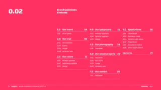
Brand Guidelines
Contents
1.0 Our brand
04
4.0 Our typography
15
8.0 Applications
28
1.01
Kit of parts
4.01 Primary typeface
8.01 Letterhead
4.02 System typeface
8.02 Business cards
2.0 Our logo
06
4.03 Usage
8.03 Social media posts
8.06 PowerPoint
2.01 Introduction
5.0 Our photography
19
8.07 Document covers
2.02 Colors
8.08 Other applications
2.03 Usage
5.01 Overview
2.04 Incorrect use
Contacts
37
6.0 Our visual property 21
3.0 Our colors
11
6.01 Overview
3.01 Primary palette
6.02 Set of six
3.02 Secondary palette
6.03 Usage
3.03 Usage
6.04 Incorrect use
7.0 Our symbol
26
7.01
Overview
<>
Contents
3
Insight | Brand Guidelines | February 2022 | v11
Our brand
<>
Contents
4
Insight | Brand Guidelines | February 2022 | v11.01
Our brand
Kit of parts
Logo
Colors
Typeface
ABCDEFGHIJKLMNOPQRSTUVWXYZ
abcdefghijklmnopqrstuvwxyz
0123456789 !�%*( )_+]:\/?,.
أ ب ت ث ثـ ج ح خ خـ د ز ر ز س ش ص
ض ط ظ ع غ ف ق ك ل م ن ه هـ و ي
0123456789 <> +-؟”{}
[]!@£�٪&*()؟/،=
Visual properties
Symbol
Photography
<>
Contents
5
Insight | Brand Guidelines | February 2022 | v12
Our logo
<>
Contents
6
Insight | Brand Guidelines | February 2022 | v12.01
Our logo
Introduction
The ‘creative spark’ is a catalyst that
Logotype
Spark symbol
ignites digital innovation and creativity.
This concept has inspired the design of
our logo, with the combination of our
logotype and spark symbol. Our logo is
the foundation of our brand identity.
Our logotype uses bold and characterful
type set with an initial capital and lower
case lettering. Our spark symbol is a
graphic representation of the spark of an
idea that starts the creative journey.
These elements have a fixed size and
position relative to one another and
should never be separated to appear
on their own.
Our logo
To build and maintain a strong identity,
it is important that we apply our logo
correctly and consistently across all of
our applications.
Our logo should only ever be reproduced
from our master artwork files.
<>
Contents
7
Insight | Brand Guidelines | February 2022 | v12.02
Our logo
Colors
Our logo has been designed to be
Dark Blue
Magenta
reproduced in a single color, providing
a clean and contemporary look.
In can appear in any one of our four
primary colors; Dark Blue, Blue, Magenta
or Green, as well as black and white.
The black and white versions of our logo
Blue
Green
should only be used when the colors
available are restricted. Black and white
printing may then be necessary.
Our logo should only ever be reproduced
from our master artwork files.
Black
White
<>
Contents
8
Insight | Brand Guidelines | February 2022 | v12.03
Our logo
Usage
Exclusion zone
Exclusion zone
Positioning
To ensure prominence and legibility, our
logo is always surrounded by an area of
X
clear space which remains free of other
design elements, such as type graphics and
12:30
other logos. The only exception to this rule
2X
is that our visual property may appear
behind our logo as part of the background.
5 h
ignite
The construction of the exclusion zone
area is based on the width of the ‘I’ in the
Exclusion
logotype, as shown here.
zone
Be the
Minimum size
2X
digital
There is a fixed minimum size for our logo of
15mm in print and 60px for
spark
on-screen digital applications. These have
2X
2X
been determined to ensure maximum clarity
Ipsum dolor sit amet,
and legibility at small sizes.
consectetuer adipiscing
elit, sed diam nonummy
nibh euismod tincidunt
ut laoreet dolore magna.
Minimum size
Positioning
Ignite.sa
When placing our logo always consider
the exclusion zone and allow extra space
around it where possible.
60px/15mm
<>
Contents
9
Insight | Brand Guidelines | February 2022 | v12.04
Our logo
Incorrect use
Ignite
When using our logo, there are
a number of common mistakes that
should be avoided.
Our logo should only ever be reproduced
from our master artwork files.
Do not change the color
Do not apply a drop
Do not change the typeface
Do use our logotype on
It should never be altered, re-drawn,
shadow or other effects
of our logo
its own
re-colored or manipulated in any way.
Do not disproportionately
Do not alter the size or
Do not add any other
Do not rotate
scale our logo
position of the elements
elements
<>
Contents
10 Insight | Brand Guidelines | February 2022 | v13
Our colors
<>
Contents
11 Insight | Brand Guidelines | February 2022 | v13.01
Our colors
Primary palette
Primary color palette
With consistent use, our color palette will
become an essential tool in building a
distinctive and identifiable brand.
DARK BLUE
BLUE
RGB
Our primary color palette should be used
0 90 250
RGB:
15 | 20 | 100
RGB:
0 | 90 | 250
in all designs and always at full strength
HEX:
0F1464
HEX:
005AFA
(100%), tints should not be used.
CMYK
CMYK: 100 | 95 | 30 | 40
CMYK: 100 | 35 | 0 | 40
00 00 00 00
The appearance of colors across different
media and substrates can vary, so colors
should be matched visually according to
each application. Our recommended color
breakdowns are shown here.
Always use the correct color breakdown
MAGENTA
GREEN
RGB
RGB
for the color space you are working with:
0 200 100
255 50 100
RGB for on-screen, Process color (CMYK)
RGB:
255 | 50 | 100
RGB:
0 | 200 | 100
and Pantone for print.
CMYK
CMYK
HEX:
FF3264
HEX:
00C864
00 00 00 00
00 00 00 00
CMYK: 0 | 90 | 45 | 0
CMYK: 70 | 0 | 90 | 0
<>
Contents
12 Insight | Brand Guidelines | February 2022 | v13.02
Our colors
Secondary palette
Secondary color palette
Our secondary color palette has been
developed for use in charts and graphs.
MID BLUE
LIGHT BLUE
PINK
LIGHT GREEN
ORANGE
Tints
There are set tint values of our secondary
RGB:
45 | 55 | 125
RGB:
50 | 125 | 255
RGB:
215 | 75 | 145
RGB:
90 | 200 | 130
RGB:
255 | 165 | 90
colors, as well as black that can be
HEX:
2D377D
HEX:
327DFF
HEX:
D74B91
HEX:
5AC882
HEX:
FFA55A
used to extend our color palette should
CMYK: 100 | 80 | 20 | 0
CMYK: 80 | 35 | 0 | 0
CMYK: 10 | 75 | 5 | 0
CMYK: 60 | 0 | 55 | 0
CMYK: 0 | 40 | 70 | 0
additional colors be needed.
When using tints to show data ensure
each colour used has sufficient standout.
100%
The appearance of colors across different
media and substrates can vary, so colors
should be matched visually according to
each application. Our recommended color
75%
breakdowns are shown here.
Always use the correct color breakdown
for the color space you are working with:
50%
RGB for on-screen, Process color (CMYK)
and Pantone for print.
25%
<>
Contents
13 Insight | Brand Guidelines | February 2022 | v13.03
Our colors
Usage
All of the colors within our primary color
palette can be used together depending
on the appropriate material represented.
These color combinations enable us to
create a consistent and vibrant identity
across all of our communications.
Always ensure there is sufficient contrast
between the chosen colors, logo and
other elements within your layout design.
<>
Contents
14 Insight | Brand Guidelines | February 2022 | v14
Our typography
<>
Contents
15 Insight | Brand Guidelines | February 2022 | v14.01
Our typography
Primary typeface
AB
Latin
We have a single primary typeface,
Changa that includes both the Latin and
Changa
Arabic characters. It is a contemporary
typeface that is both stylish and robust
which compliments our identity. It can be
ABCDEFGHIJKLMNOPQRSTUVWXYZ
used in light, regular, semibold and bold.
abcdefghijklmnopqrstuvwxyz
Our primary typeface must be used
for all of our typography, it is highly
0123456789 !�%*( )_+]:\/?,.
legible and works well at various sizes
from large headlines down to body text
and captions.
Light | Regular | SemiBold | Bold
ظ غ
Arabic
أ ب ت ث ج ح خ د ذ ر ز س ش ص ض ط ظ ع غ
ف ق ك ل م ن ه و ي
+_)(*&^%$£@! 0123456789
<>
Contents
16 Insight | Brand Guidelines | February 2022 | v14.02
Our typography
System typeface
Latin
In some instances, such as in some
AB
digital applications or for general office
Arial
use, it will not be technically possible
to use our brand typeface, in this case,
we recommend the use of the system
typeface Arial in regular and bold for
ABCDEFGHIJKLMNOPQRSTUVWXYZ
both languages Latin and Arabic.
abcdefghijklmnopqrstuvwxyz
These will be used in programs such
as Word, PowerPoint and Outlook to
0123456789 !$%*( )_+]:\/?,.
ensure consistency.
Regular | Bold
Arabic
ظ غ
أ ب ت ث ج ح خ د ذ ر ز س ش ص ض ط ظ ع غ
ف ق ك ل م ن ه و ي
+_)(*&^%$£@! 0123456789
<>
Contents
17 Insight | Brand Guidelines | February 2022 | v14.03
Our typography
Usage
We have a simple typographic style for
Ignite, with headings being set in Changa
bold and supporting text, such as body
Changa
Heading
text and captions set in Changa regular.
in white
The other available weights; light and
Bold
semibold can be used sparingly for
Changa
highlights or emphasis within the text.
Heading
Bold
Adhering to these basic principles will
in white
give us typographic consistency across all
Supporting text is in
Changa Regular, duis et
consectetuer adipiscing
elit, sed diam nonummy
of our applications and help to strengthen
nibh euismod tincidunt
ut laoreet dolore magna.
Changa
recognition of the Ignite identity.
Bold
Heading in white
Changa Bold,
heading in white
Changa Bold
Supporting text is in
Changa Regular, duis et
consectetuer adipiscing
elit, sed diam nonummy
nibh euismod tincidunt
ut laoreet dolore magna.
Supporting text is in
Changa Regular, duis et
consectetuer adipiscing
elit, sed diam nonummy
nibh euismod tincidunt
ut laoreet dolore magna.
<>
Contents
18 Insight | Brand Guidelines | February 2022 | v15
Our photography
<>
Contents
19 Insight | Brand Guidelines | February 2022 | v15.01
Our photography
Overview
Our choice of imagery represents the
variety of digital sectors that Ignite can
provide support to, whether it’s gaming,
video, audio, or advertising.
Our images should always be natural and
inspiring, they are not staged or contrived.
Our photographic style is to have images
that are clean and well composed, as well
as being aesthetically pleasing.
Interesting crop
Showing real life
Showing details
Showing close ups
Action shot
Human involvement
<>
Contents
20 Insight | Brand Guidelines | February 2022 | v16
Our visual property
<>
Contents
21 Insight | Brand Guidelines | February 2022 | v16.01
Our visual property
Overview
The Ignite visual language reflects our
logo and gives our communications
a unique signature.
A set of six ‘creative spark’ visual
properties have been developed that give
the brand a dynamic and varied visual
look and feel.
They can appear in any one of our four
primary colors; Dark Blue, Blue, Magenta
or Green, as well as black and white.
Our creative spark visual properties
should only ever be reproduced from
our master artwork files. They should
never be altered, re-drawn, re-colored
or manipulated in any way.
<>
Contents
22 Insight | Brand Guidelines | February 2022 | v16.02
Our visual property
Set of six
Gaming Property
Audio Property
Ricochet Property
Video Property
Advertising Property
Swirl Property
<>
Contents
23 Insight | Brand Guidelines | February 2022 | v16.03
Our visual property
Usage
Our visual properties have been created
as vector graphics which make them
totally flexible assets. This allows each
piece of communication to feel unique.
Each property can be scaled to appear at
any size, cropped, flipped and rotated to
any angle.
Only one visual property should be used
per layout design, but several can appear
within a document, such as a brochure.
Scaled: always scale in
Cropped: any part of the
Flipped: either vertically
Rotated: either clockwise,
proportion to any size
visual property
or horizontally
or anticlockwise
<>
Contents
24 Insight | Brand Guidelines | February 2022 | v16.04
Our visual property
Incorrect use
When using our creative spark
visual properties, there are a number
of common mistakes that should
be avoided.
Our creative spark visual properties
should only ever be reproduced from
our master artwork files. They should
Do not use a gradient color
Do not apply a drop
Do not use our visual
Do use a secondary, or any
never be altered, re-drawn, re-colored
shadow or other effects
properties together
other color
or manipulated in any way.
Do not disproportionately
Do not alter the size or
Do not add any other
Do not outline our visual
scale our visual property
position of the elements
elements
property
<>
Contents
25 Insight | Brand Guidelines | February 2022 | v17
Our symbol
<>
Contents
26 Insight | Brand Guidelines | February 2022 | v17.01
Our symbol
Overview
Based on the Spark symbol within our
Dark Blue
Blue
Magenta
Green
logo the symbol is a graphic device that
has been designed for use on its own.
When using the symbol for avatars, social
media and web, it can appear in any one
of our four primary colors; Dark Blue,
Blue, Magenta or Green, as well as black
and white.
Our symbol graphic should only ever be
reproduced from our master artwork files.
It should never be altered, re-drawn,
re-colored or manipulated in any way.
Black
White
Note: our symbol graphic device is
different to the spark symbol within
our logo. The spark symbol should
never be used on its own in place of
our symbol graphic.
<>
Contents
27 Insight | Brand Guidelines | February 2022 | v18
Applications
<>
Contents
28 Insight | Brand Guidelines | February 2022 | v18.01
Applications
Letterhead
<>
Contents
29 Insight | Brand Guidelines | February 2022 | v18.02
Applications
Business cards
<>
Contents
30 Insight | Brand Guidelines | February 2022 | v18.03
Applications
Social media posts
12:30
12:30
12:30
5 h
ignite
5 h
ignite
5 h
ignite
We analyse
trends and
statistics for
e-sports
growth.
Support for
Support for
development
development and
and
production of
production.
VR content, and
fusion creative
projects.
Send message
Send message
Send message
<>
Contents
31 Insight | Brand Guidelines | February 2022 | v18.04
Applications
Social media posts
12:30
12:30
12:30
5 h
ignite
5 h
ignite
5 h
ignite
Building
partnerships
Be the
with content
digital
creators.
spark
Support for
development and
production of
VR content, and
Ipsum dolor sit amet,
consectetuer adipiscing
fusion creative
elit, sed diam nonummy
nibh euismod tincidunt
ut laoreet dolore magna.
projects.
Ignite.sa
Ignite.sa
Ignite.sa
<>
Contents
32 Insight | Brand Guidelines | February 2022 | v18.05
Applications
Social media posts
ignite
ignite
ignite
ignite
ignite
in
The spark
no
for a new era
of Saudi
vate
digital content
ignite
ignite
ignite
ignite
ignite
spark
Discover
your digital
<>
Contents
33 Insight | Brand Guidelines | February 2022 | v18.06
Applications
PowerPoint
Digital content
The spark for a
Lorem ipsum dolor sit amet, consectetuer adipiscing elit,
Support for
sed diam nonummy nibh euismod tincidunt ut lareet dolore
new era of Saudi
small firms
magna aliquam erat volutpat.
3
digital content
Ut wisi enim ad minim veniam, quis nostrud exercitation
ullamcorper suscipit lobortis nisl ut aliquip exea commo.
Governance presentation
01.02.2022
Governance presentation
01.02.2022
2
Governance presentation
01.02.2022
3
Support for small firms
Apprenticeship opportunities
8%
4%
Lorem ipsum dolor consectetuer erat
• Lorem ipsum dolor sit amet, amet
adipiscing elit, sed diam nonummy
consectetuer adipiscing elit, ut
10%
nibh euismod tincidunt ut lareet dolore
sed diam nonummy nibh dolore
Chart title
magna aliquam erat volutpat.
magna aliquam erat volutpat.
5%
56%
• Ut wisi enim ad minim veniam quis
nostrud exercitation ullamcorper
17%
suscipit lobortis nisl ut aliquip exea
commo duis esse.
Item 2
Item 1
Item 3
Item 4
Item 5
Item 6
Governance presentation
01.02.2022
4
Governance presentation
01.02.2022
5
<>
Contents
34 Insight | Brand Guidelines | February 2022 | v18.07
Applications
Document covers
Prospectus:
Digital Media Academy
Digital Media:
Digital
Copyright & Anti Piracy Law
Advertising
Guidelines
Accelerating
eSports
Growth
within KSA
<>
Contents
35 Insight | Brand Guidelines | February 2022 | v18.08
Applications
Other applications
<>
Contents
36 Insight | Brand Guidelines | February 2022 | v1Contacts
Please contact our marketing
Razan AlMosa
team if you have any queries
Director of Digital Media,
regarding these guideline or
Ministry of Communication
the identity in general.
and Information & Technology
E rmosa@mcit.gov.sa
<>
Contents
37 Insight | Brand Guidelines | February 2022 | v1