BRAND
GUIDELINES
April 2020 • Version 001
BRAND
1
GUIDELINESINTRO
Jahez brand guidelines reflects
modern design, dialogue and
interaction principles: simple,
clear and recognisable.
This style guide defines binding
design elements and rules that
ensure the uniform perception
of the brand.
BRAND
2
GUIDELINES1.0
INTRO
Jahez brand guidelines reflects
VISUAL
modern design, dialogue and
interaction principles: simple,
clear and recognisable.
IDENTITY
This Style Guide defines binding
design elements and rules that
ensure the uniform perception
of the brand.
BRAND
3
GUIDELINESVISUAL IDENTITY | THE LOGO
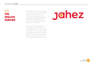
1.1
Jahez logo was developed to be a
modern and future-Proof trademark.
THE
Our new graphic element, the
yellow dot, represents our core
ENGLISH
business as a brand “YOU ARE THE
VERSION
CENTRE OF OUR WORLD” and
reflects the relationship between
Jahez and its customers.
It is important that the logo is
reproduced consistently across all
brand applications. It must always
be applied in its corporate colours,
and used directly from the master
artwork. Any attempt to recreate or
alter it in any way will undermine
the impact and credibility of the brand.
BRAND
4
GUIDELINESVISUAL IDENTITY | THE LOGO
1.2
An Arabic logo was developed
based on the english logo look
THE
and feel.
The yellow dot in the arabic
ARABIC
version should always be same
VERSION
size as in the english one.
BRAND
5
GUIDELINESVISUAL IDENTITY | CLEAR SPACE
1.3
To make sure our logo is legible,
and to maintain its integrity,
CLEAR
keep the area surrounding it
free of other elements.
SPACE
The minimum clearspace is the
diameter of the yellow dot x 2.
BRAND
6
GUIDELINESVISUAL IDENTITY | LOGO VERSIONS
1.4
Depending on different
applications, Jahez logo can be
LOGO
used in these indicated different
versions only.
VERSIONS
BRAND
7
GUIDELINESVISUAL IDENTITY | INCORRECT USAGE
1.5
Recolor
Stretch or skew
Change the proportions
INCORRECT
USAGE
The way that you use the
logo affects the impact of our
communication and our brand
Get creative with shadow
Rotate
Make the dot smaller or bigger
image. It is important that our
logo is always used correctly.
This also applies to the Arabic
logo version.
BRAND
8
GUIDELINESVISUAL IDENTITY | COLORS
1.6
Red has an important part to
play in the visual appearance
COLOR
of our brand. To maintain
consistency and recognition it
PALETTE
should be the lead colour in all
applications.
BRAND
9
GUIDELINESVISUAL IDENTITY | TYPOGRAPHY & FONTS
1.7
MAIN TITLES
SUB TITLES AND BODY COPY
AVENIR
AVENIR
TYPOGRAPHY
BLACK
LIGHT
ARABIC
غينيا واستمر العصبة ضرب قد. وباءت الأمريكي
خلك جاهز
الأوربيين هو به،, هو العالم، الثقيلة بال. مع وايرلندا
الأوروبيون كان, قد بحق أسابيع العظمى واعتلاء. انه
كل وإقامة المواد
جاهزين لكم
REGULAR
غينيا واستمر العصبة ضرب قد. وباءت الأمريكي
الأوربيين هو به،, هو العالم، الثقيلة بال. مع وايرلندا
HEAVY
كان, قد بحق الأوروبيون. أسابيع العظمى واعتلاء
انه كل وإقامة المواد
MEDIUMخلك جاهز
جاهزين لكم
غينيا واستمر العصبة ضرب قد. وباءت الأمريكي
الأوربيين هو به،, هو العالم، الثقيلة بال. مع وايرلندا
كان, قد بحق الأوروبيون. أسابيع العظمى واعتلاء
انه كل وإقامة المواد
BRAND
10
GUIDELINESVISUAL IDENTITY | TYPOGRAPHY & FONTS
1.8
MAIN TITLES
SUB TITLES AND BODY COPY
AVENIR
AVENIR
TYPOGRAPHY
BLACK
LIGHT
ENGLISH
Lorem ipsum is a pseudo-Latin text used
Order food
in web design, typography, layout, and
printing in place of English to emphasise
design elements over content.
We deliver
REGULAR
Lorem ipsum is a pseudo-Latin text used
in web design, typography, layout, and
printing in place of English to emphasise
HEAVY
design elements over content.
Order food
MEDIUM
We deliver
Lorem ipsum is a pseudo-Latin text used
in web design, typography, layout, and
printing in place of English to emphasise
design elements over content.
BRAND
11
GUIDELINESVISUAL IDENTITY | ICONS
1.9
ICONS
The icons displayed here have
been specifically created for
Jahez App.
The Yellow dot must always be
used in the icons.
BRAND
12
GUIDELINESVISUAL IDENTITY | ICONS
1.10
APP
ICON
BRAND
13
GUIDELINES2.0
INTRO
Jahez brand guidelines reflects
CORPORATE
modern design, dialogue and
interaction principles: simple,
clear and recognisable.
APPLICATIONS
This Style Guide defines binding
design elements and rules that
ensure the uniform perception
of the brand.
BRAND
14
GUIDELINESVISUAL IDENTITY | CORPORATE APPLICATIONS
2.1
Size (9cm x 5cm)
These elements must always
BUSINESS
be present on our corporate
business card.
CARD
BRAND
15
GUIDELINESVISUAL IDENTITY | CORPORATE APPLICATIONS
2.2
Size A4 (21cm x 29.7cm)
These elements must always
LETTERHEAD
be present on our corporate
letterHead.
BRAND
16
GUIDELINESVISUAL IDENTITY | CORPORATE APPLICATIONS
2.3
Size DL (23cm x 10cm)
These elements must always
ENVELOPES
be present on our corporate
envelope.
BRAND
17
GUIDELINESVISUAL IDENTITY | CORPORATE APPLICATIONS
BRAND
18
GUIDELINESVISUAL IDENTITY | CORPORATE APPLICATIONS
BRAND
19
GUIDELINES3.0
INTRO
Jahez brand guidelines reflects
IMAGERY
modern design, dialogue and
interaction principles: simple,
clear and recognisable.
This Style Guide defines binding
design elements and rules that
ensure the uniform perception
of the brand.
BRAND
20
GUIDELINESVISUAL IDENTITY | IMAGERY LOOK & FEEL
Our photography
NATURAL
style is an integral
All images must be shot in natural light and
component of our
surroundings, requiring as little retouching as
brand identity.
possible. Color tones are fresh, lights, sunny
Showcasing the
and warm. Each image should always tell
a mini story.
important moments,
ingredients and
HUMAN ELEMENT
settings that define
Shots should feel candid, in the moment
who we are and what
and unposed. Situations are always active or
we do.
spontaneous with a sense of movement.
It is unique in its
Always focus on unique experiences.
approach, capturing
Photographs should be shot in natural light
everyday moments.
with dark and light contrast.
Our photography
should never appear
MOUTHWATERING
posed, it should
Let the food speak for itself and tell its story.
always show a moment
Food should always look appealing,
of real life.
appetizing and fresh.
Its necessarily that Jahez brand elements
(Logo, red color, Jahez app) are present in
every shot.
BRAND
21
GUIDELINESVISUAL IDENTITY | IMAGERY LOOK & FEEL
BRAND
22
GUIDELINESVISUAL IDENTITY | IMAGERY LOOK & FEEL
BRAND
23
GUIDELINESVISUAL IDENTITY | IMAGERY LOOK & FEEL
CONTACT
MARKETING DEPARTMENT
KARIM ABOURIZK
Design Director
karim@wondereight.com
BRAND
24
GUIDELINES