Milk Network· 2024
Adara visual identity
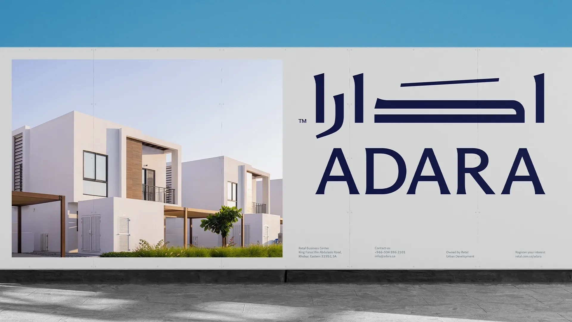
A new visual identity for Adara, Retal's real estate subsidiary, after it moved from the name Tadbeir to Adara, built on a contemporary Arabic typeface drawn from Kufi.
- Work
- Identity systems, Arabic type, Brand guidelines
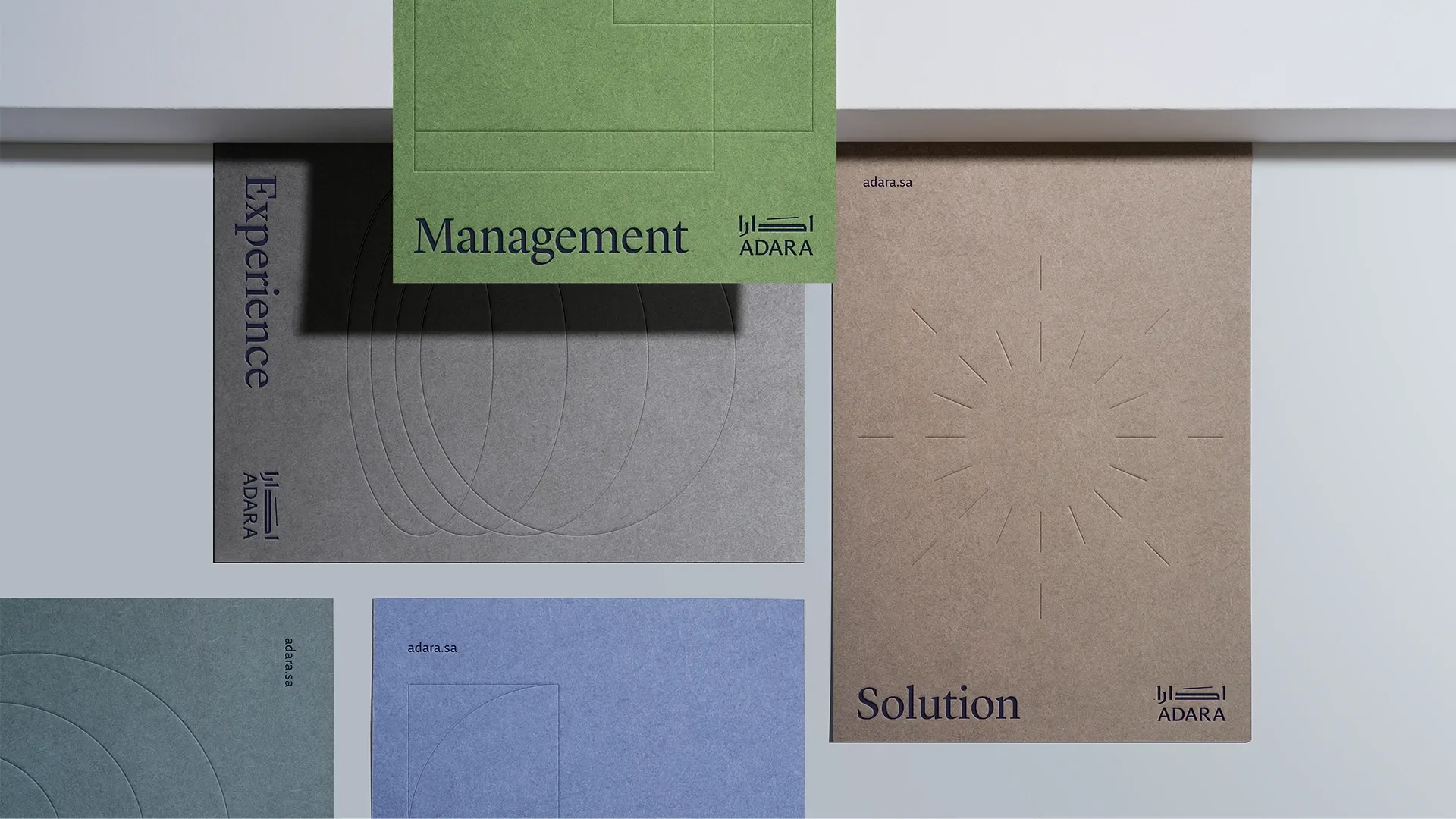
Overview
Adara is a subsidiary of Retal Urban Development Company, based in Al Khobar, working in real estate services and solutions: leasing, sales and marketing, with a scope that extends to consultancy and market studies. It speaks to property owners, landlords, buyers, tenants, developers, agents and corporate clients.
The company had operated as Tadbeir, a name that caused confusion with another company working in a related field with a different scope. It adopted the name Adara internally to clarify its identity, and worked with Milk Network on a new visual identity that moves it away from the old name and supports expansion into the central and western provinces.
Adara wanted a simple, timeless identity that reflects its values — integrity, respect, innovation, creativity, client focus and collaboration — and makes it the first choice for any luxury brand marketing in Saudi Arabia.
Typography and materials
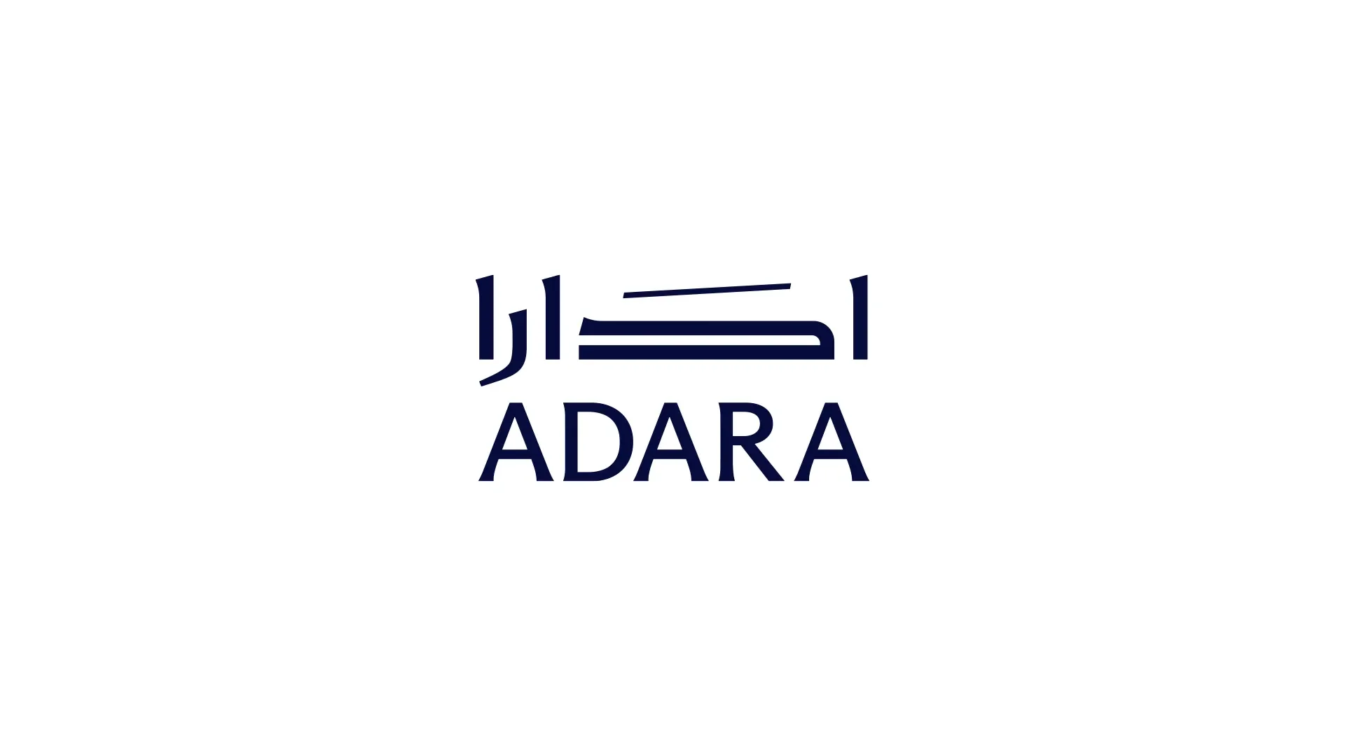
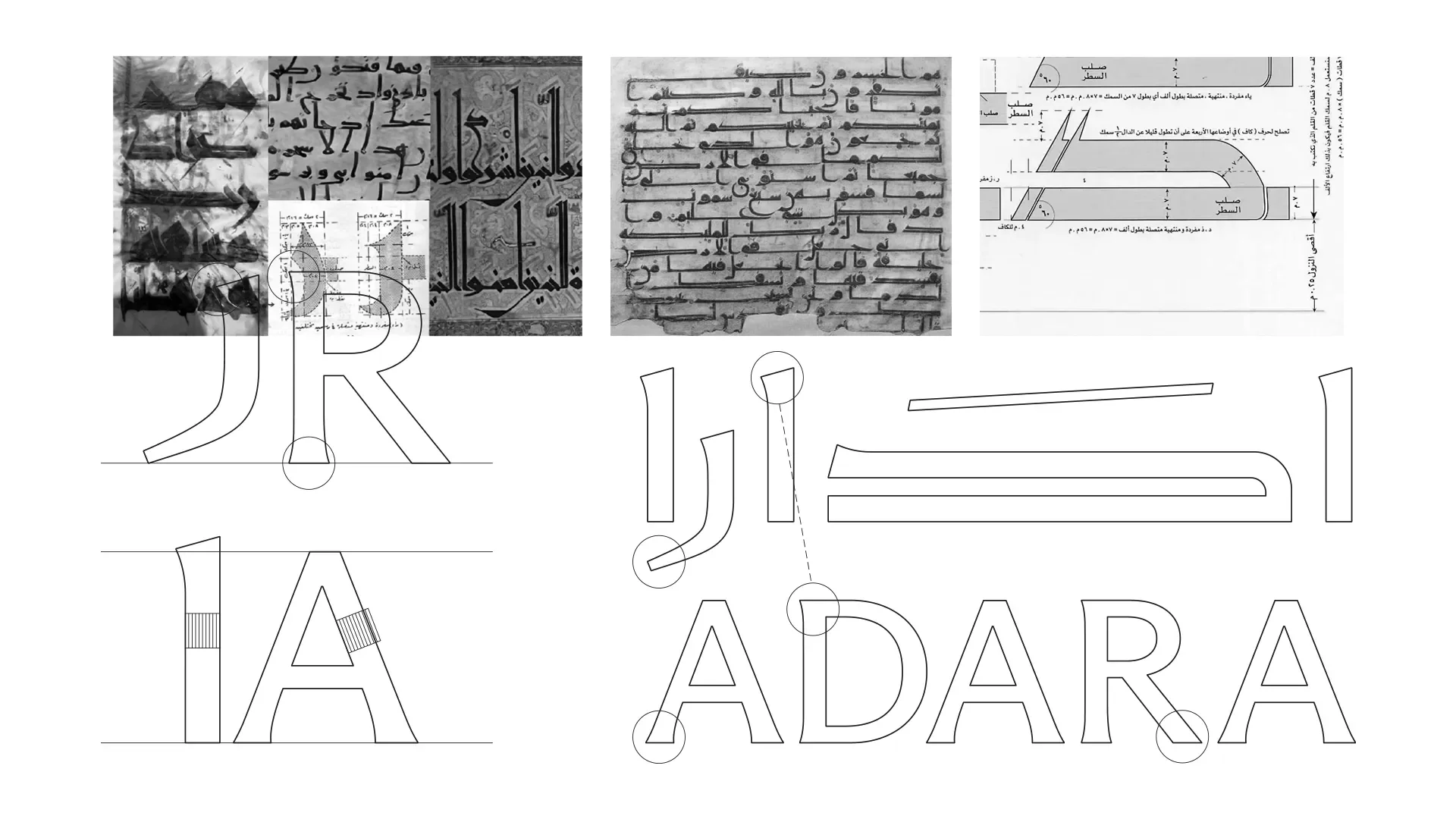
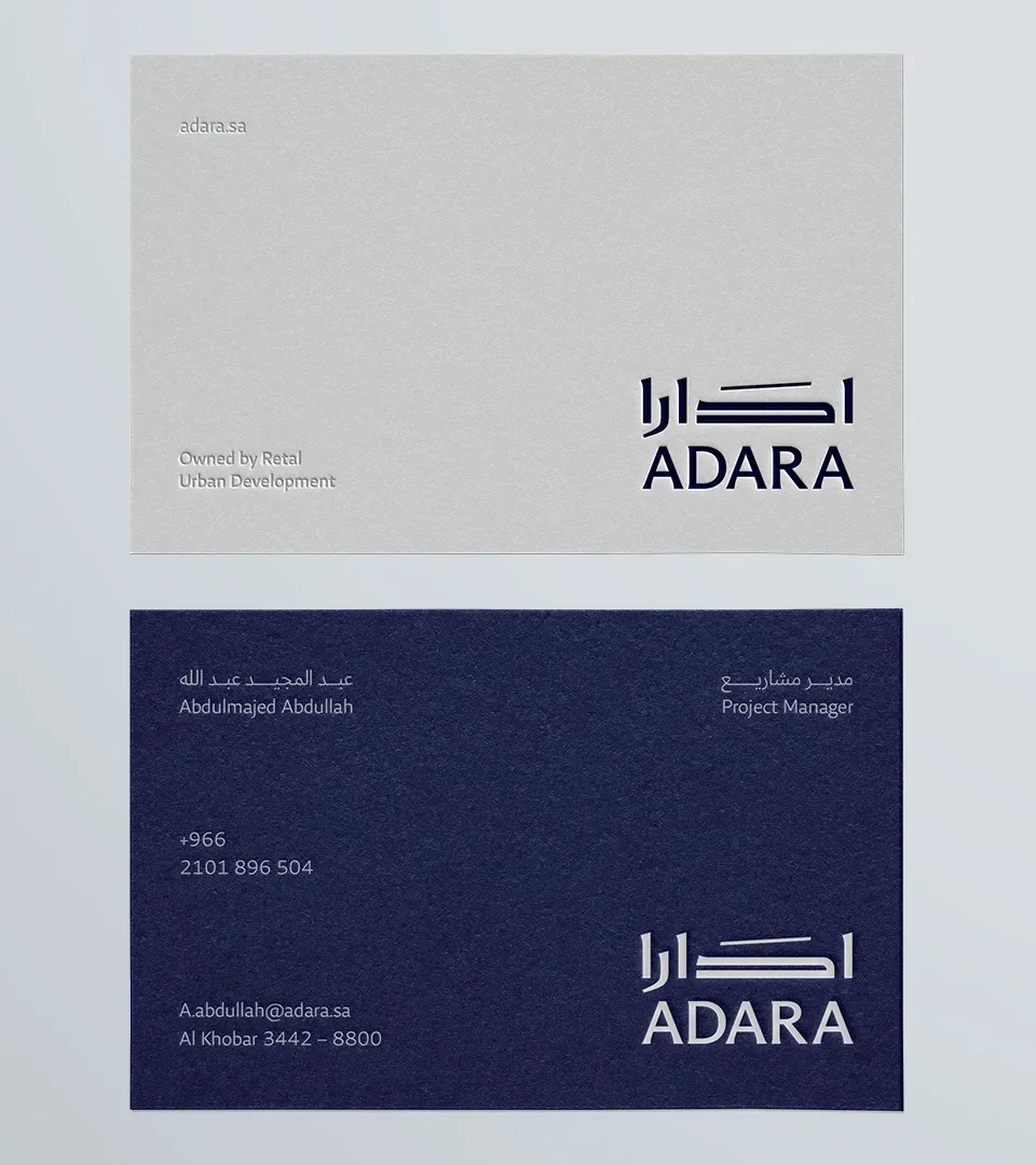
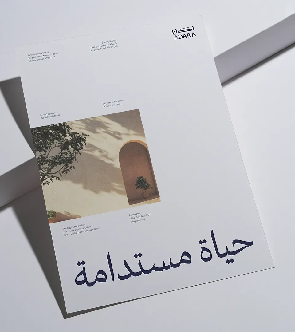
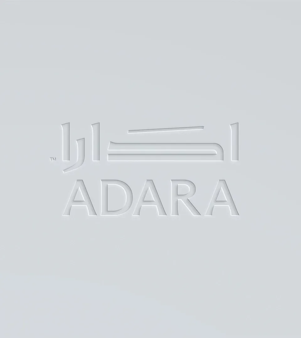
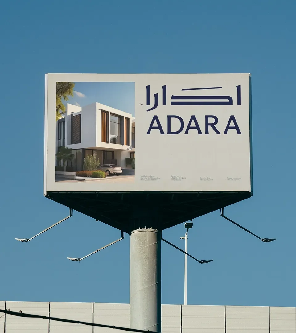
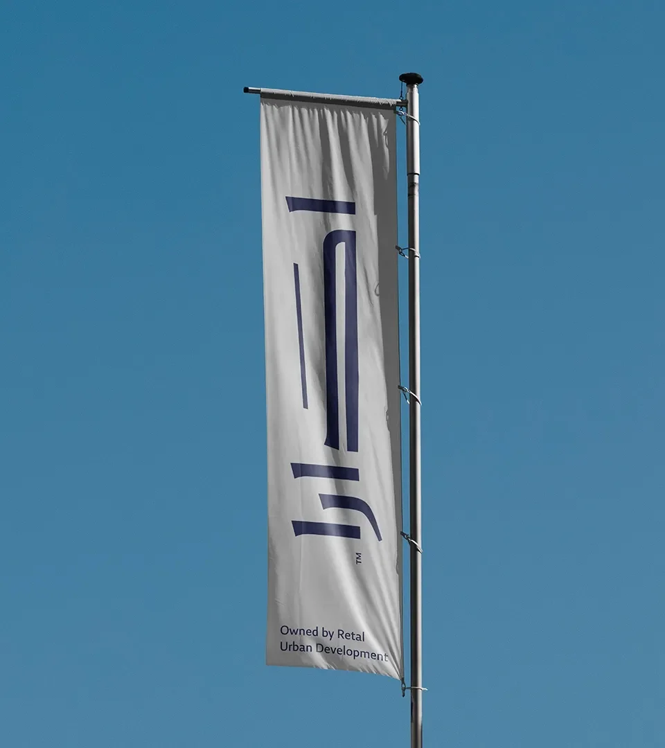
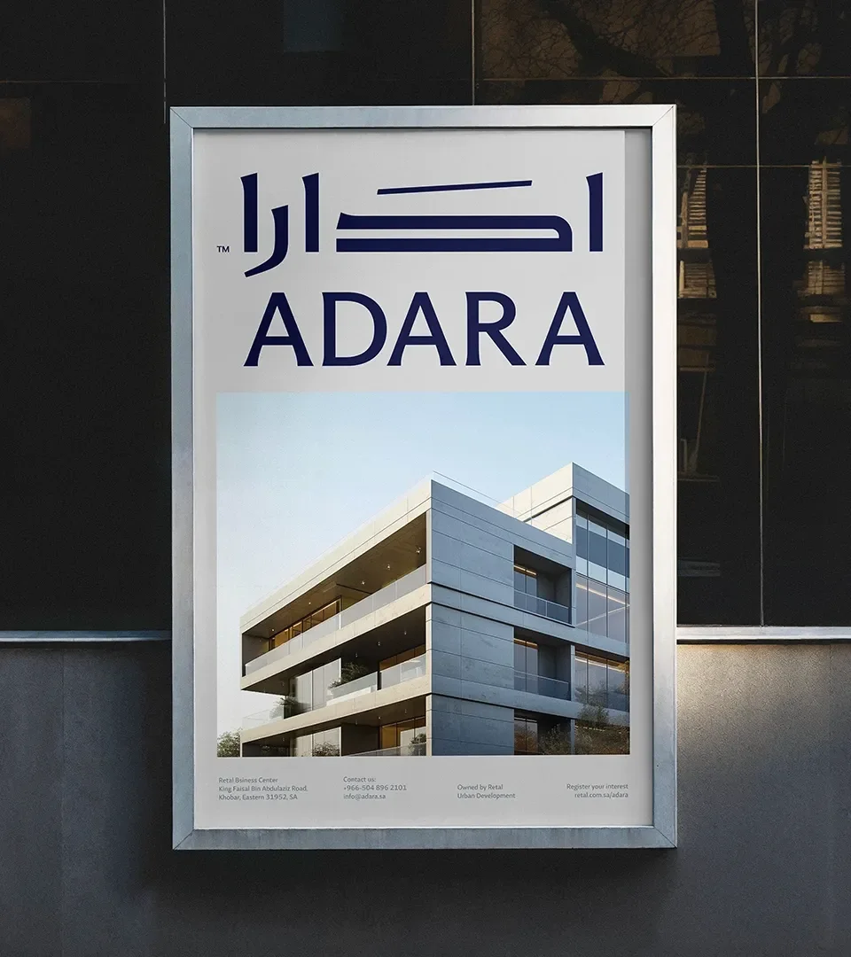
Milk Network built the identity on typography first, with the Arabic component given the greater attention. Work began from Kufi, one of the oldest Arabic scripts; the studio modernised it, extending and customising specific letters to reflect Adara's futuristic vision. The resulting Arabic typeface is bold and premium, carrying both ambition and cultural heritage, and it draws the brand closer to its local audience.
Beside it sits a simple, modern and elegant English typeface for an international audience, with high readability. Together the two fonts form one identity that works for both audiences.
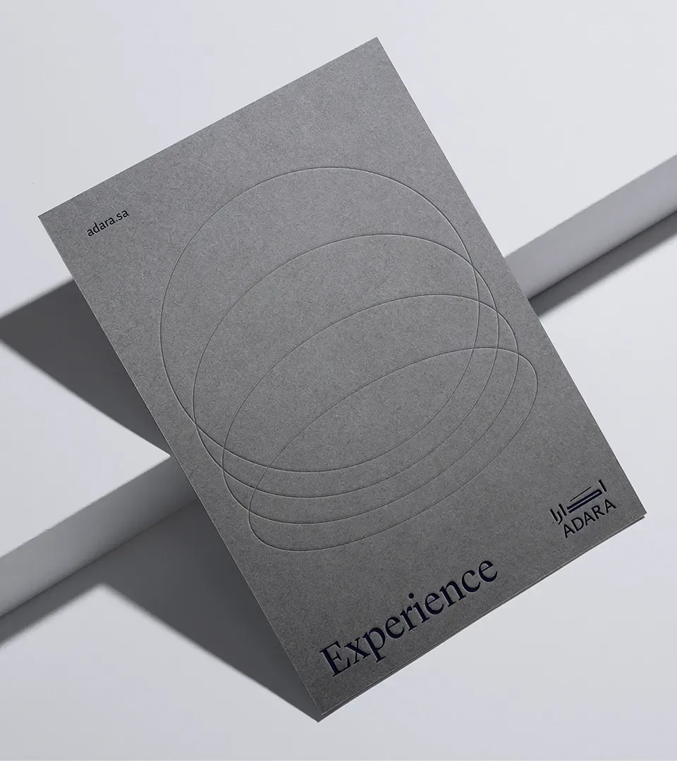
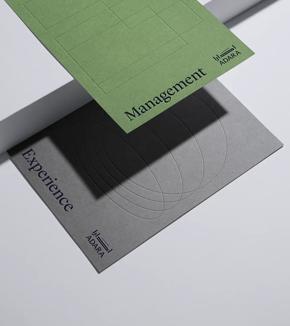
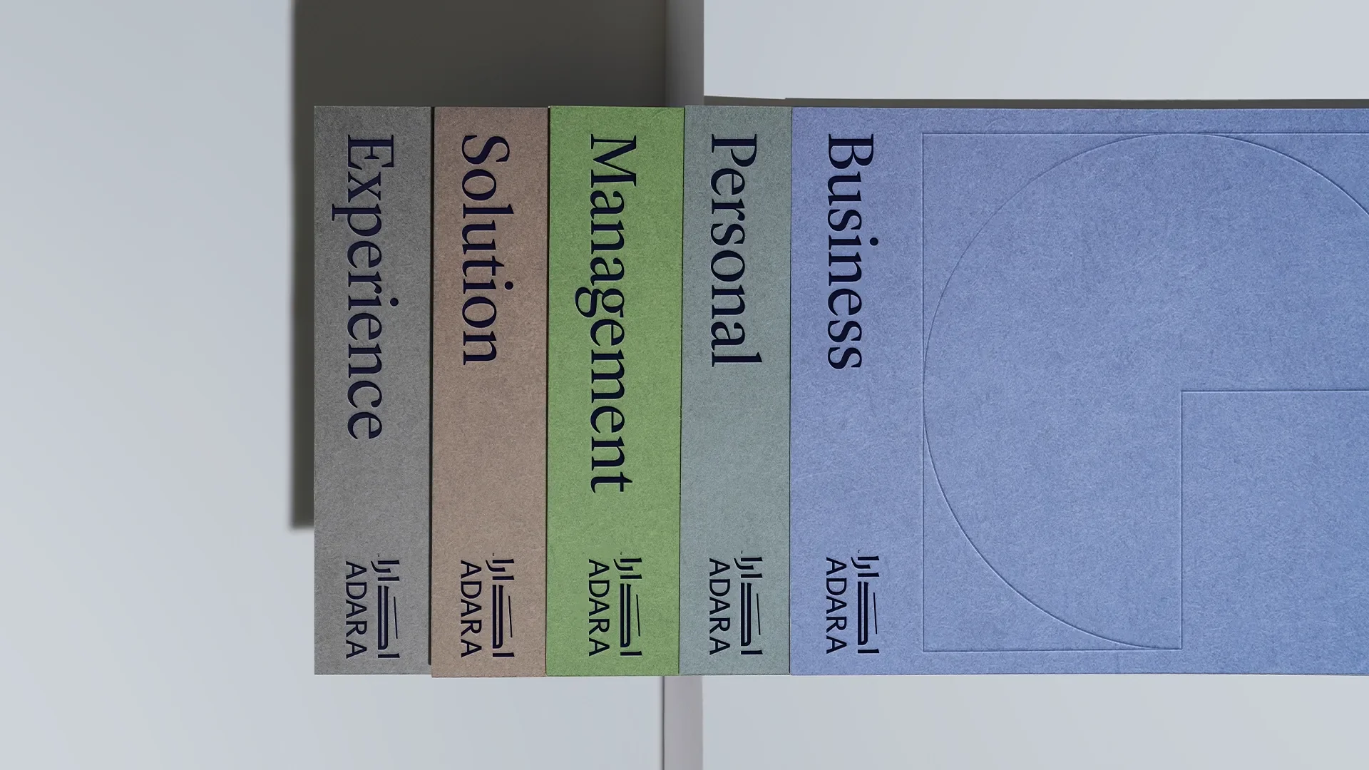
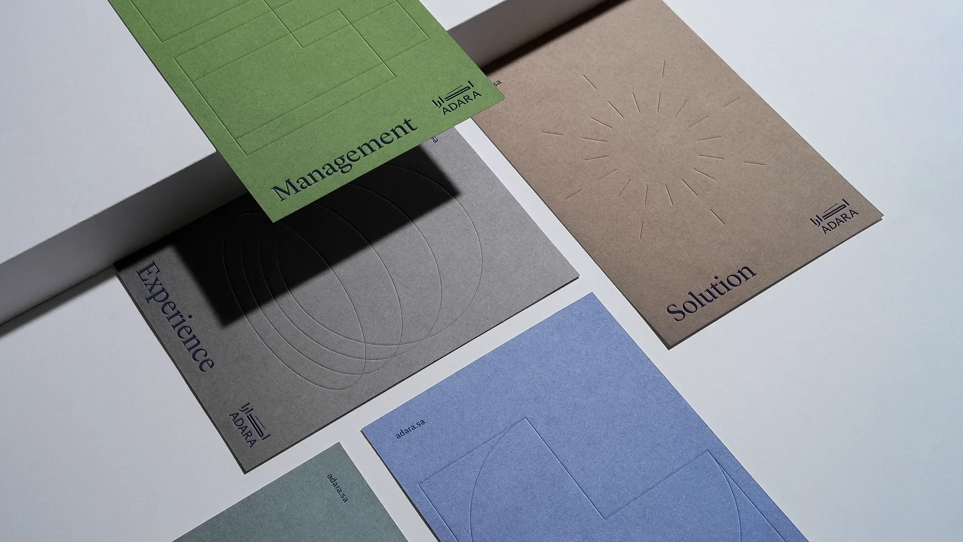
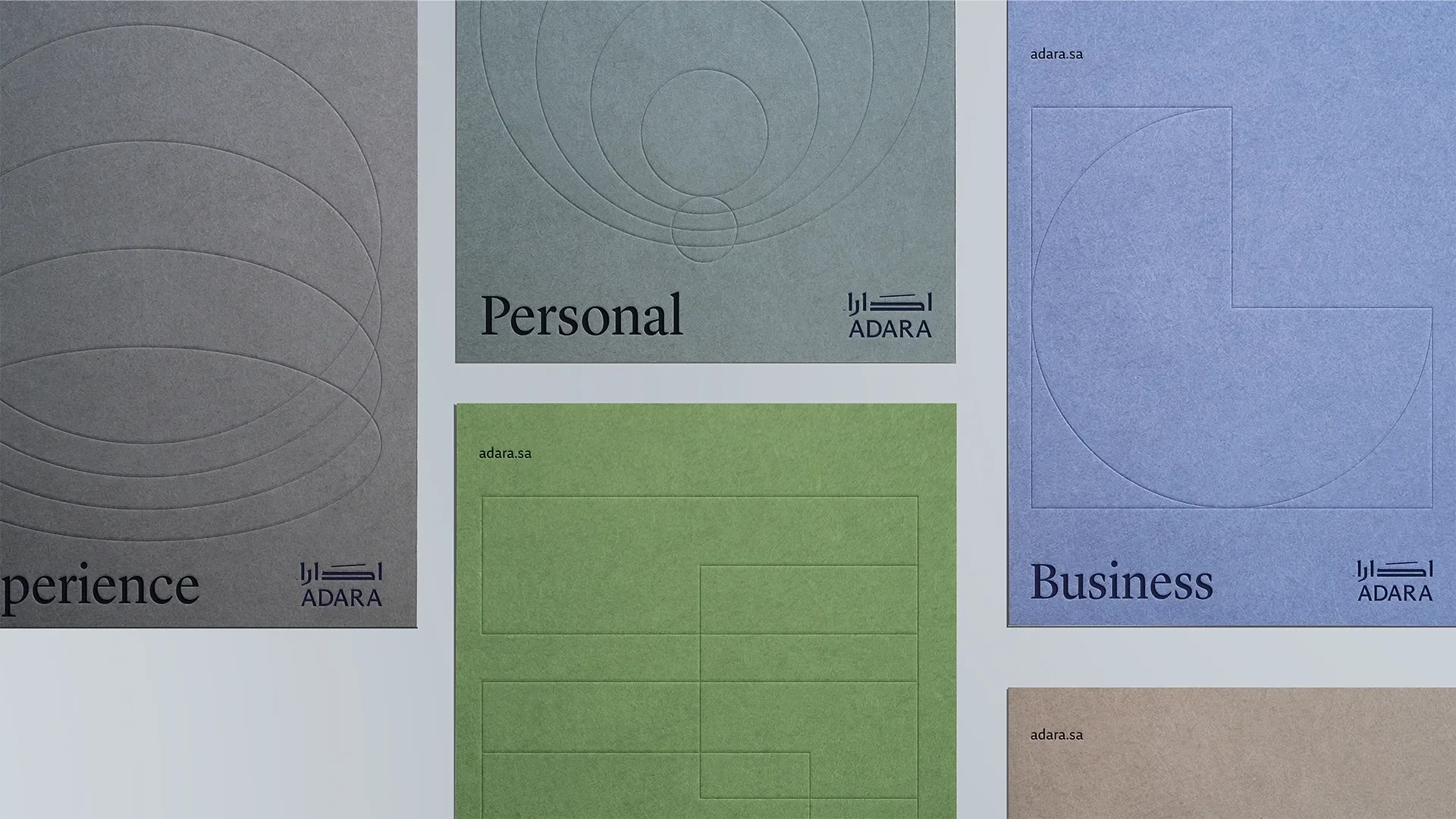
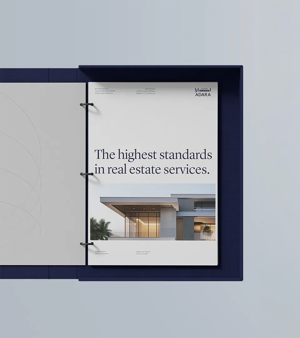
The applications, materials and textures used across the identity were chosen to convey premium luxury, reflecting the company's values and its position as the first choice for sophisticated clients. Milk Network's work covered the stylescape, the visual identity, brand applications and brand guidelines.

Outcome
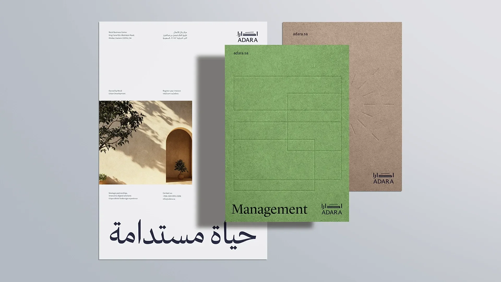
The identity comes out in elegant, modern typography: a bold Arabic typeface inspired by Kufi and a highly readable English one for international presence. With carefully selected materials, these elements form a cohesive whole that conveys luxury and places Adara at the top of the real estate market's choices, aiming at an exceptional experience for sophisticated clients.
Scope of work
- Stylescape
- Visual Identity
- Brand Applications
- Brand Guidelines