Milk Network· 2023
Thmanyah rebrand
Milk Network worked with Thmanyah's creative team on a refreshed visual identity for the Saudi podcast network: a monogram built on an Eastern Arabic numeral, a custom Arabic logotype made with Wael Morcos, and a colour and type system that scales to sub-brands.
- Client
- Thmanyah
- Work
- Brand strategy, Logo design, Identity systems, Arabic type, Brand guidelines
Overview
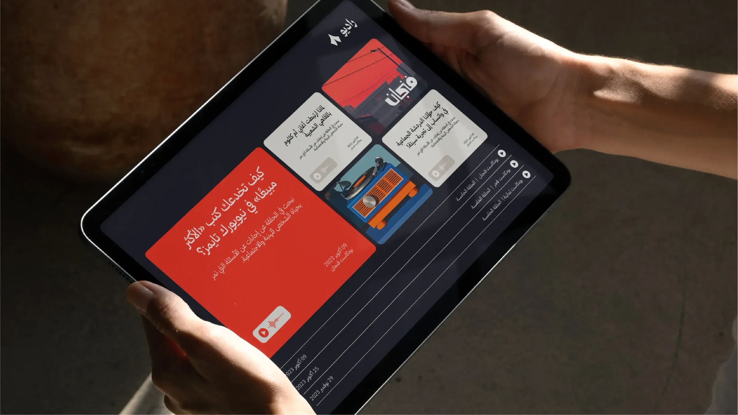
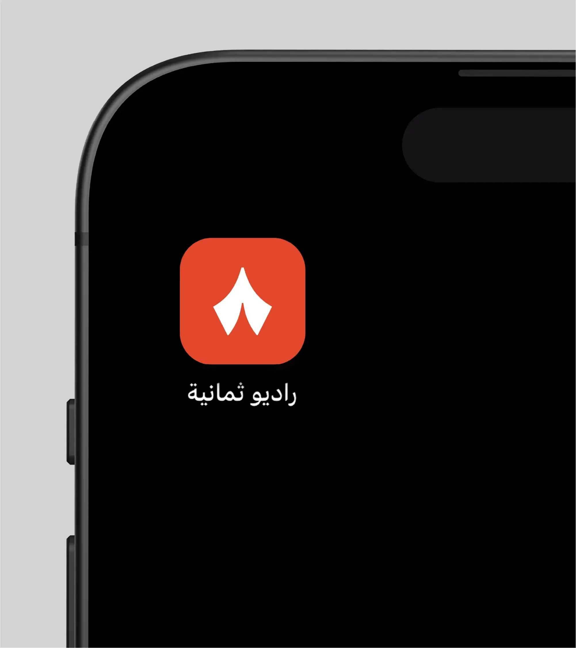
Thmanyah is a Saudi media technology company that builds tools to enrich Arabic content in the region. Its portfolio of more than 20 products spans articles, newsletters, documentaries and podcasts, and aims to document life in Arab societies and change the culture of media journalism. It is the most widespread podcast network in the Arab world and the largest producer of documentary films in Saudi Arabia. It recently launched Radio Thmanyah, an app for Arabic and international podcasts, and a new website where creators can publish original Arabic content and exchange knowledge.
Thmanyah expects significant growth and the arrival of new products and sub-brands. To keep pace, its creative team worked with Milk Network to enhance the existing identity and develop a visual solution that lets the system grow flexibly and at low cost.
Strategy
The work began with a session to understand the brand, analyse what it had, and set a strategy on clear foundations. A competitive and benchmark analysis followed, to position Thmanyah in the market and plan its growth. Because Thmanyah aims to enrich Arabic content locally and globally, the visual solution had to be rooted in local culture and support the brand promise.
Symbol and Arabic logotype
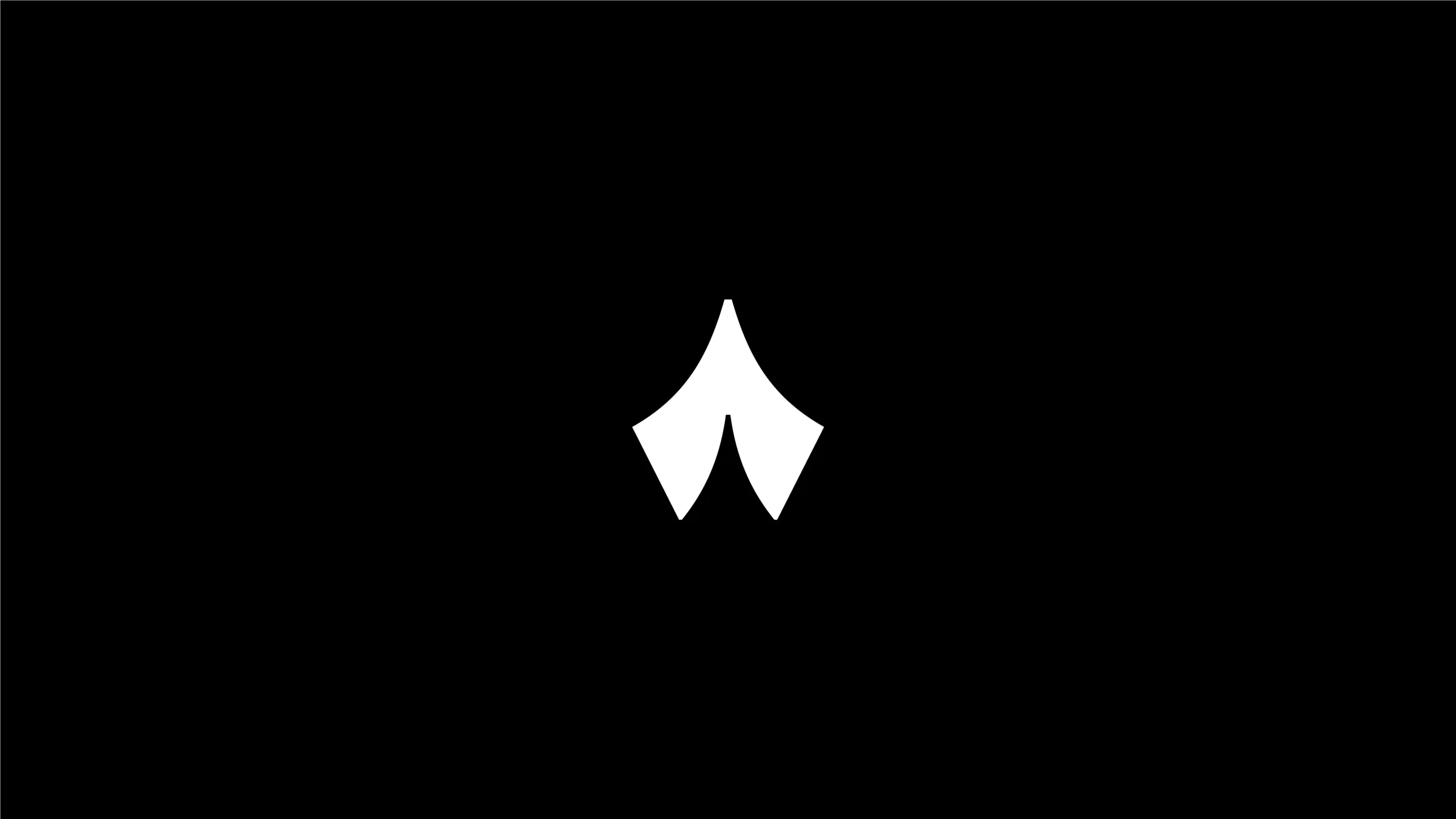
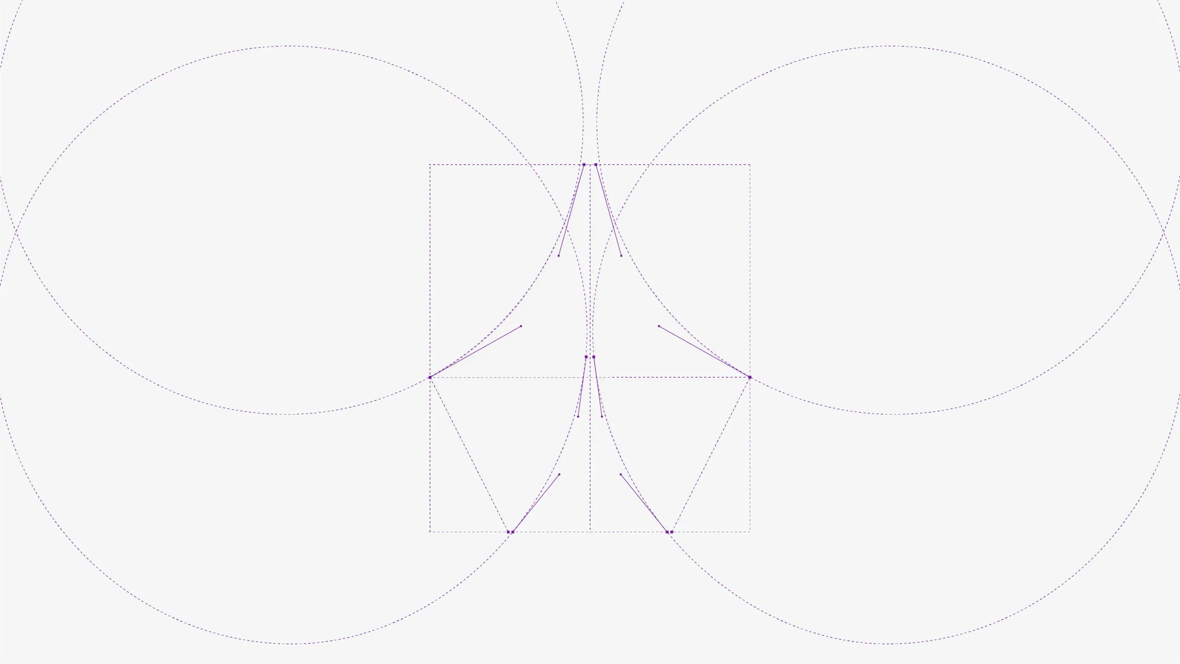
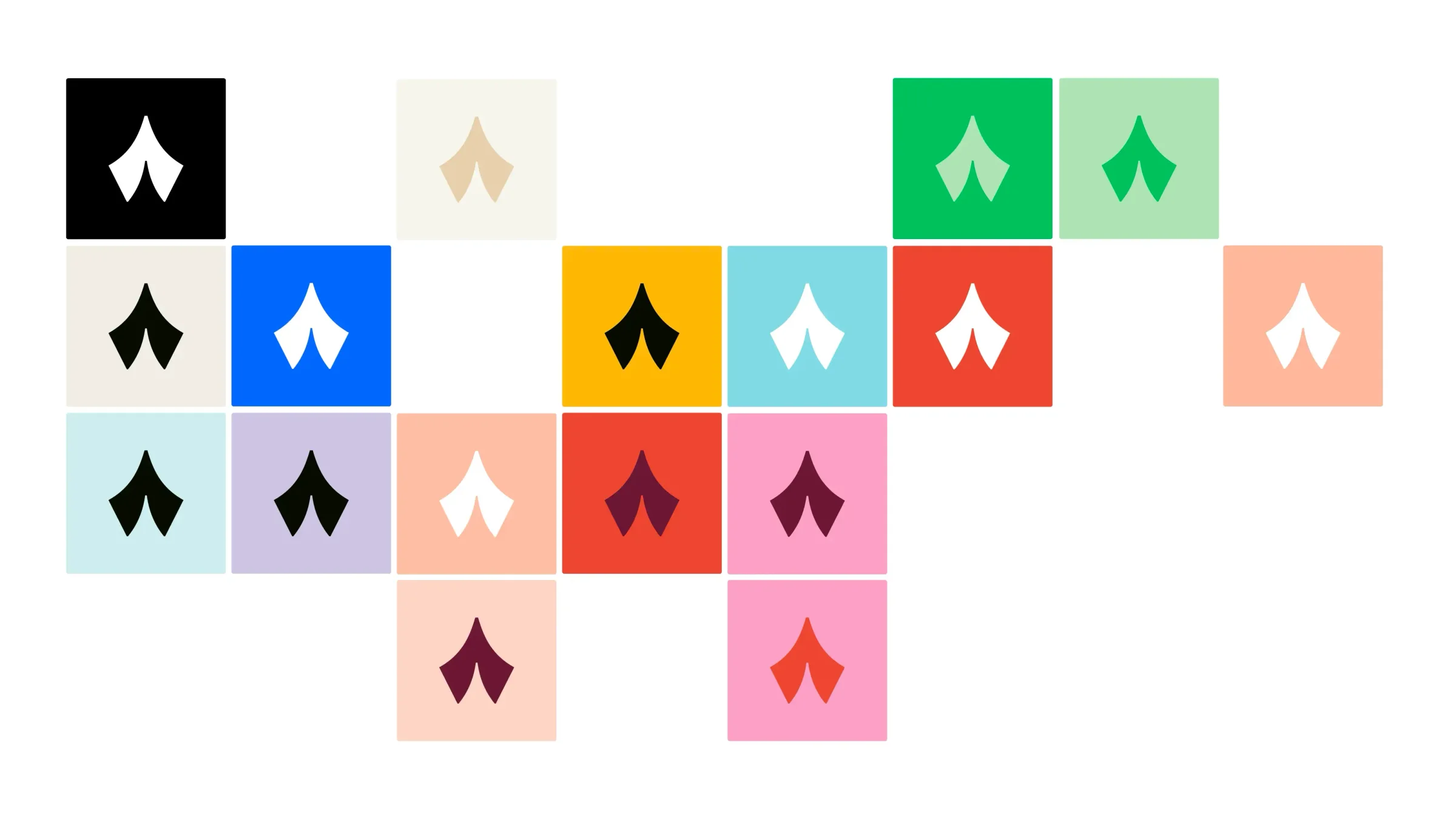
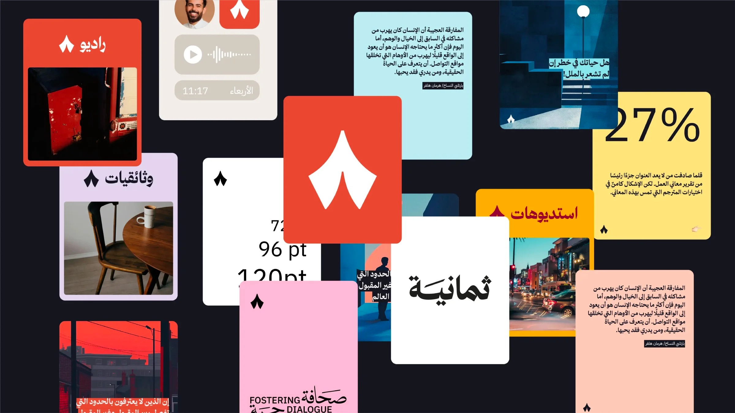
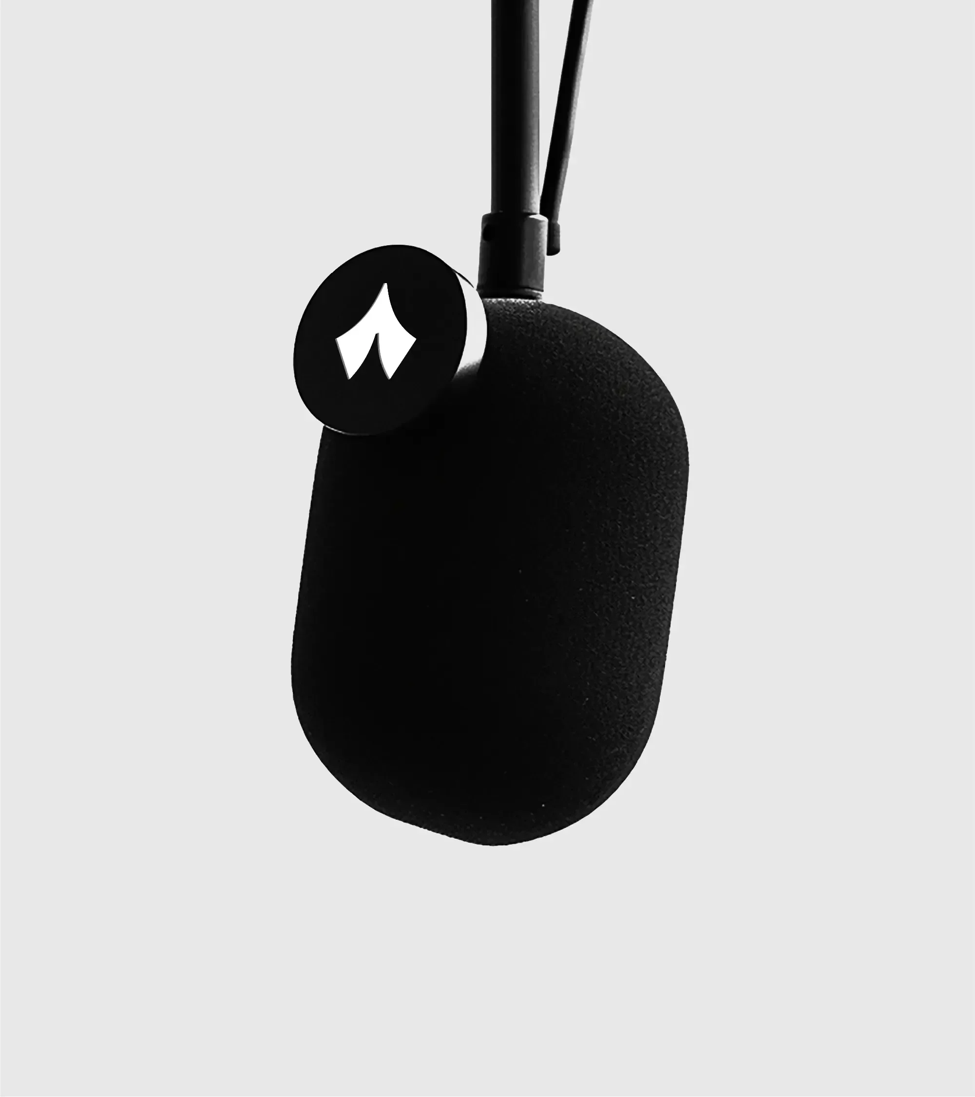
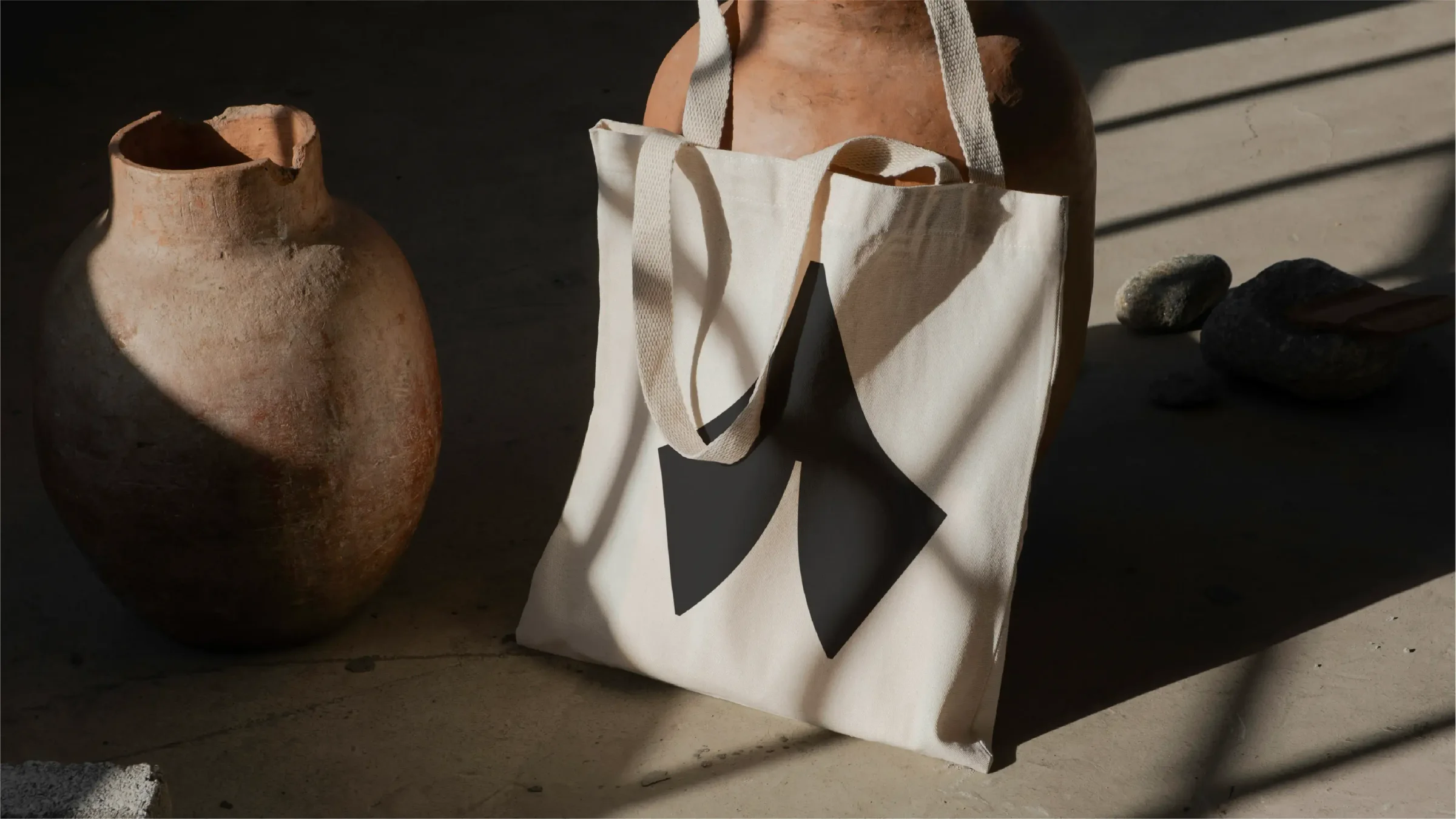
The design focused on a strong mental link between symbol and name: a monogram that brings “Thmanyah” to mind at once. A non-Latin numeral gives the symbol a local cultural identity, producing an original mark that stays simple and distinct.
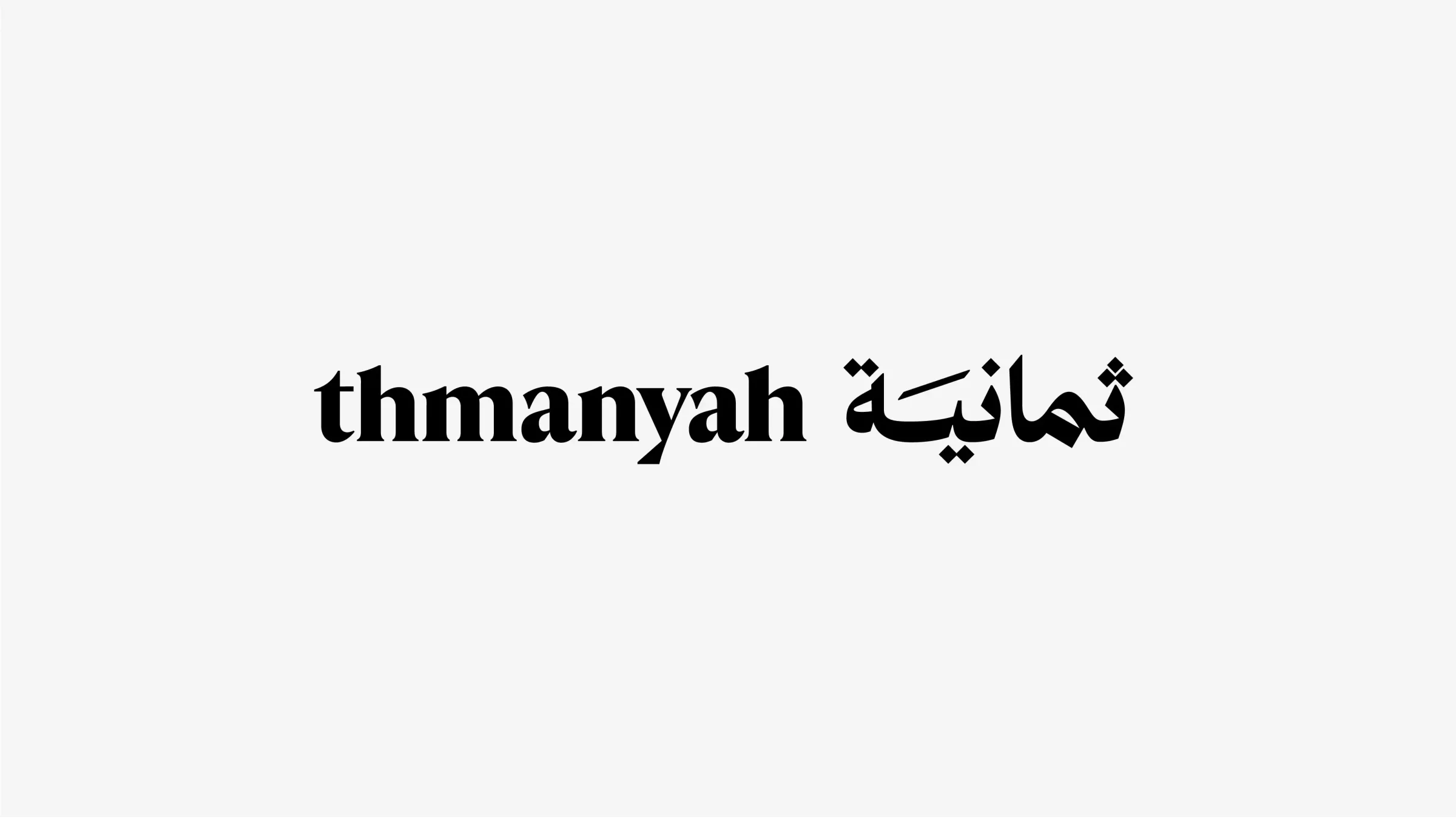
Alongside the symbol, the Arabic logotype was enhanced and modernised while keeping its essence. The team worked with Thmanyah's creative team and type designer Wael Morcos to customise the Arabic logotype to match the symbol's style, drawing on the Naskh script.
Colour and typography
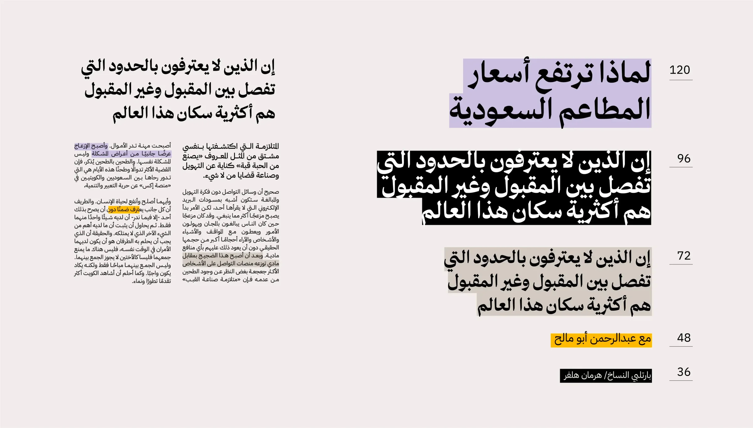
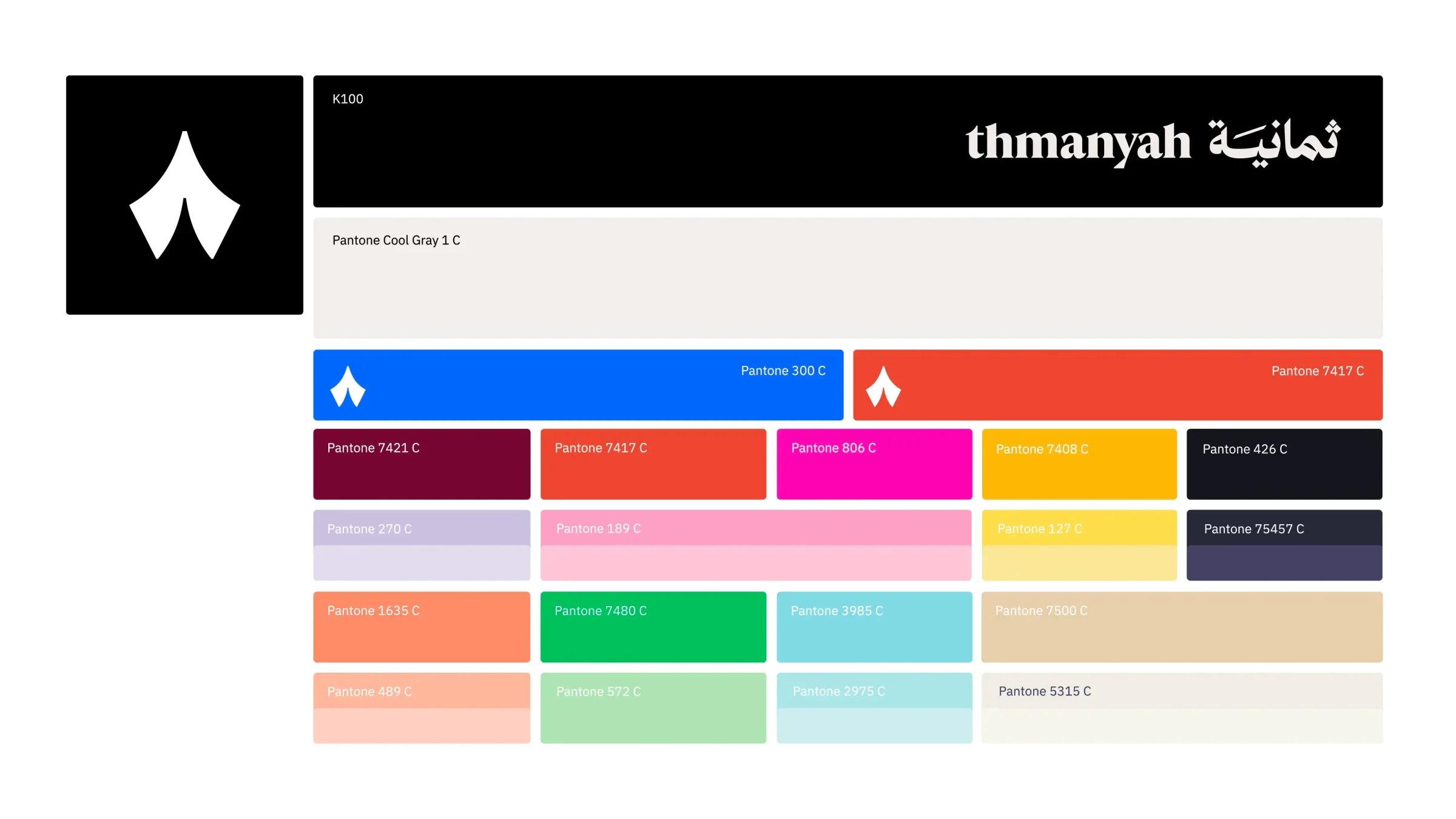
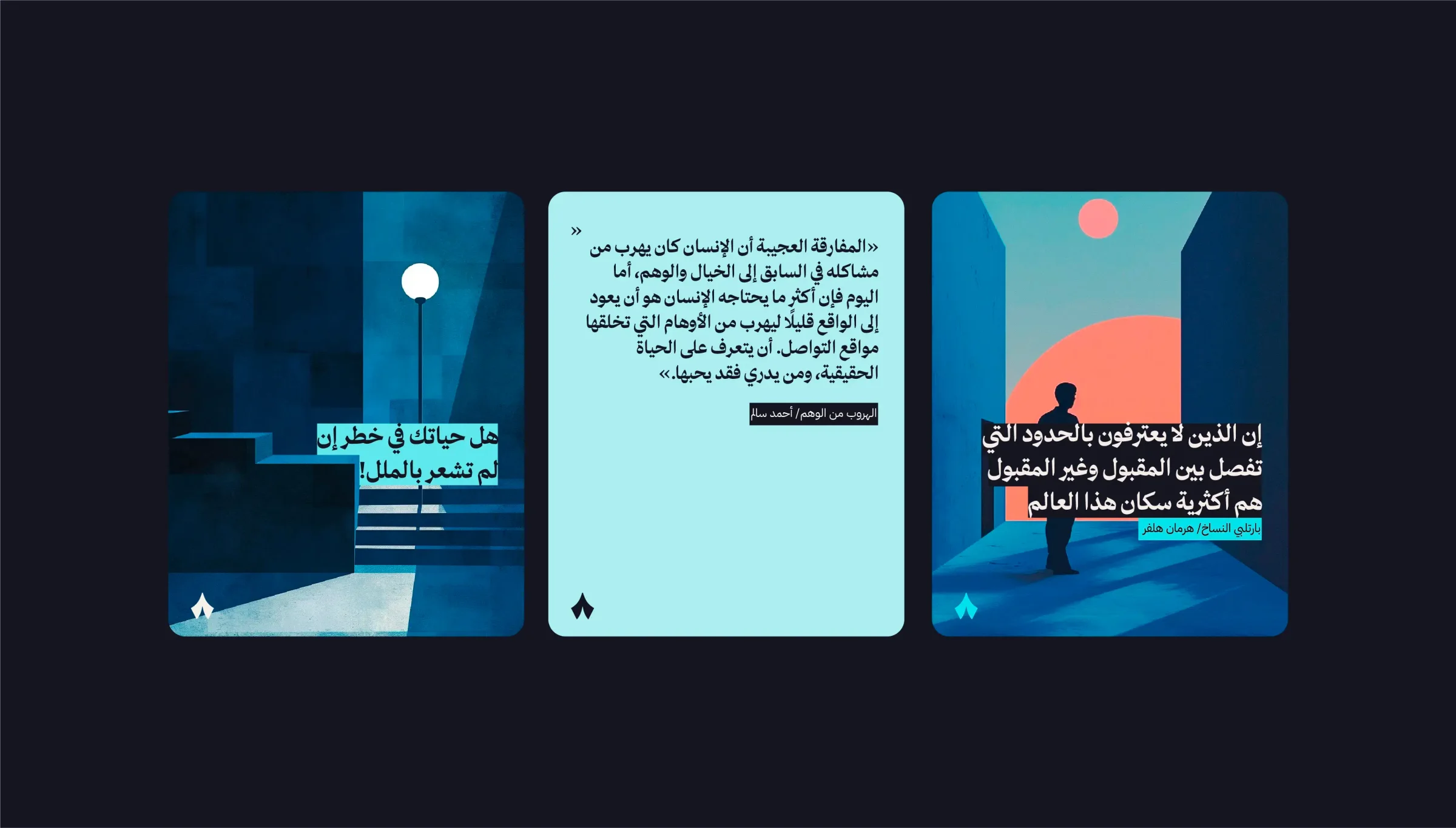
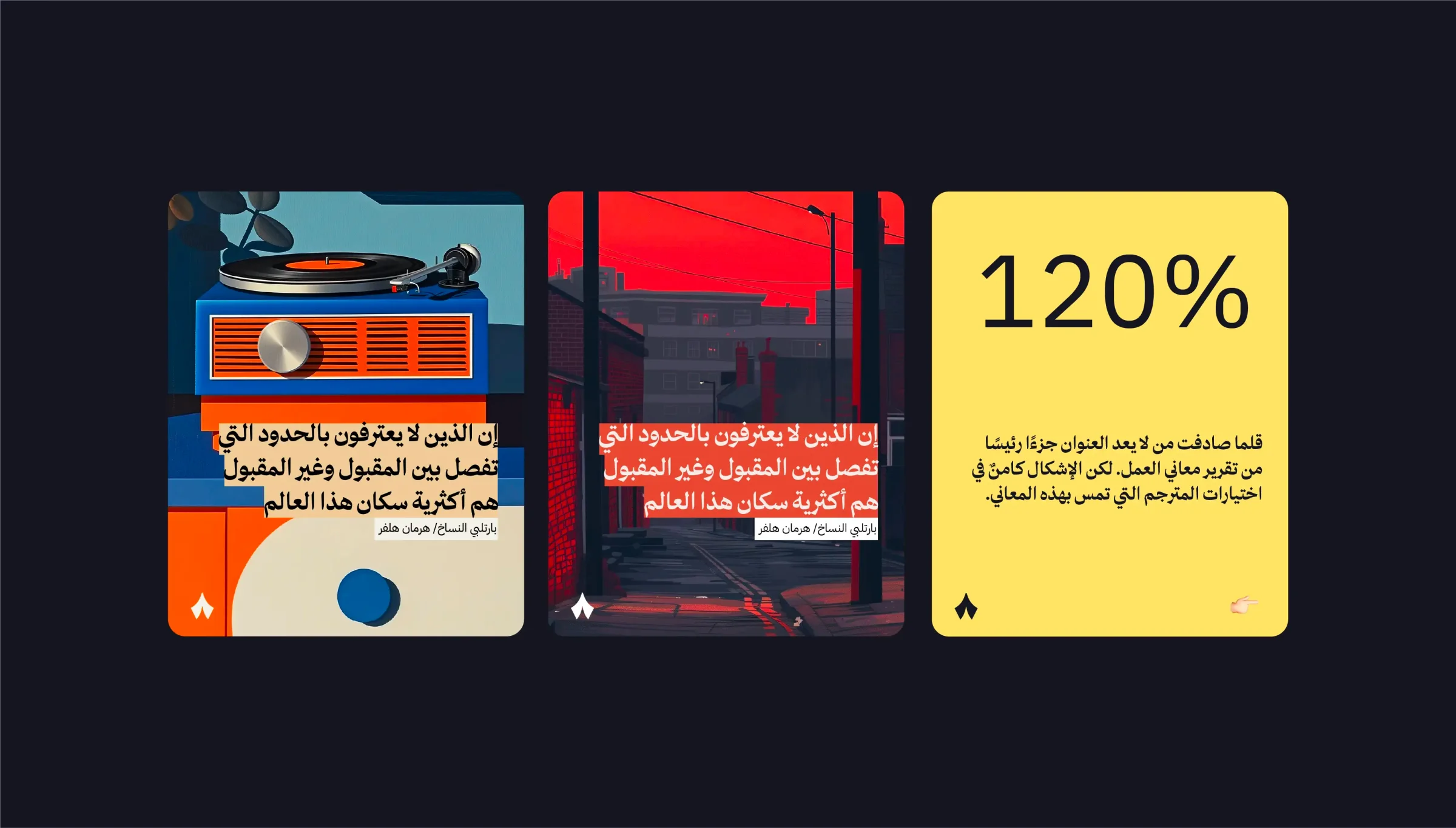
A new, flexible colour palette and a typography system were built to match the upgraded identity, giving the master brand the flexibility its products and sub-brands need while keeping its equity.
Applications
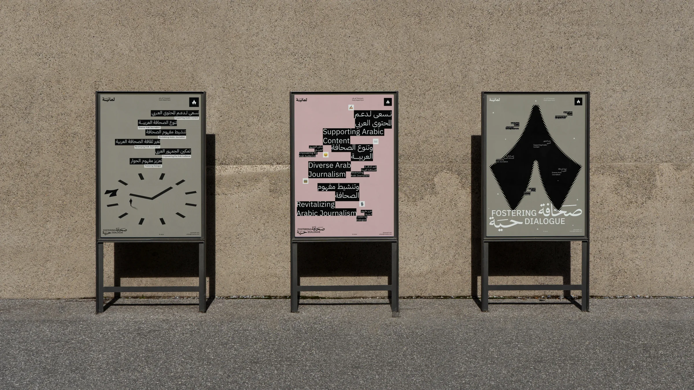
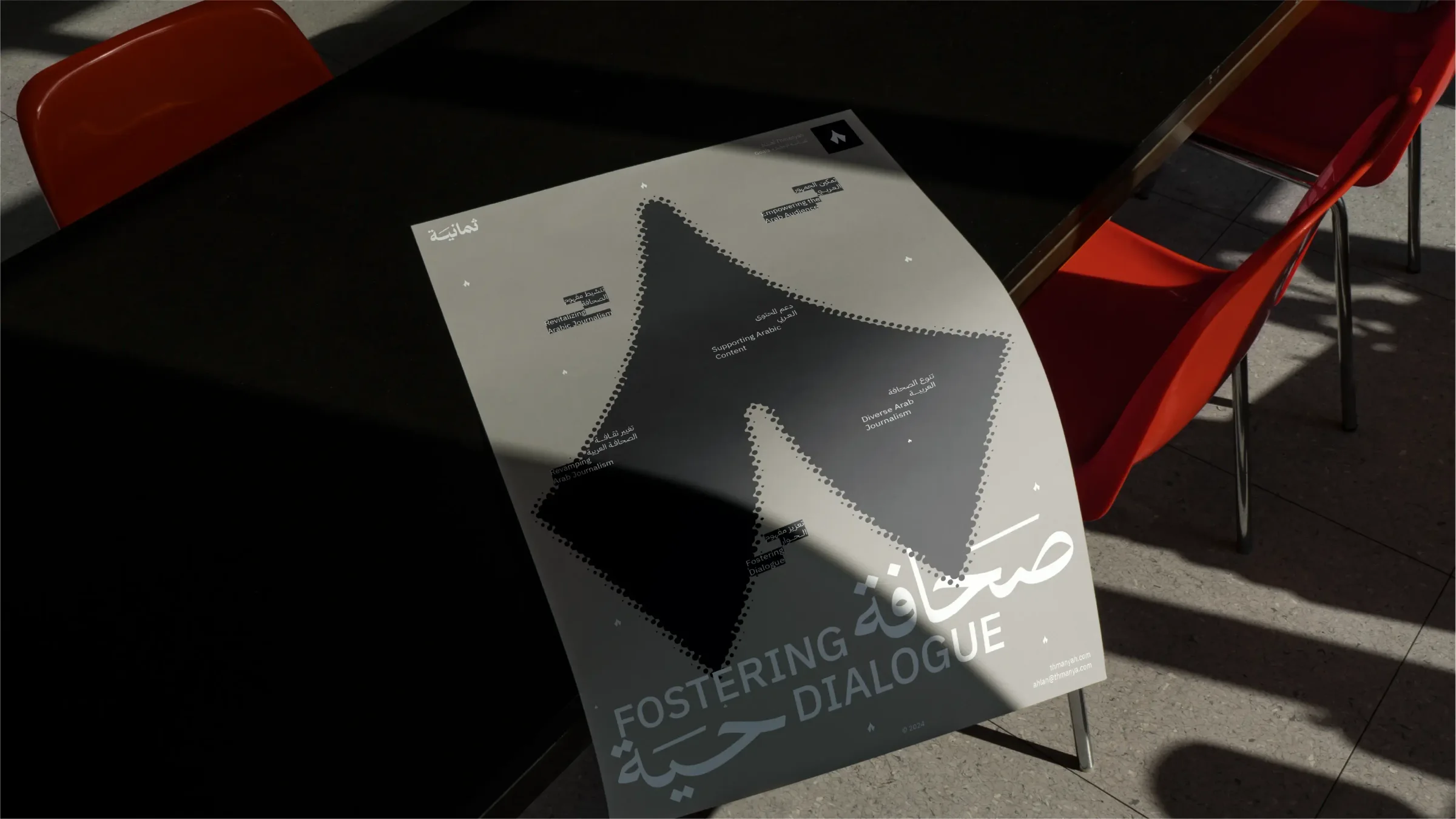
The work included a way-finding system for Thmanyah's offices and applications of the identity across print, posters, tote bags and social media.

Conclusion
The partnership centred on a distinctive monogram and a modernised Arabic logotype that reflect local cultural identity. The refreshed identity supports Thmanyah's growth and expansion plans and its continued prominence in podcasting.
Scope of work
- Strategy alignment session
- Visual identity
- Way-finding system
- Brand guidelines